Bring back the black
You are using an out of date browser. It may not display this or other websites correctly.
You should upgrade or use an alternative browser.
You should upgrade or use an alternative browser.
The Flying Sausage Card Room - Tina Custom Ceramics Set (2 Viewers)
- Thread starter Jabinator
- Start date
I want the $5 to be yellow like the coke giraffes. I really like that set. I have made the 100 blackish blue again and now I really dig this set. I think I am ready to ship it now!
The next part is doing research on how many chips of each denom to order......... I am not interested in topping up if I find out I miscalculated cause shipping is a whopping $180 from China to Denmark. + Import fees etc... ouch..
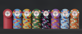
I think this looks great. The earlier mock ups had similiar edge spots from the 0.25 to the 1 so I like that you went with a solid. I was going to suggest a bright white edge spot to help the $25 pop but you've already done this. Maybe play around with some other secondary spot color besides dark green on the lighter green base of the $25 but this does look better than previous mock ups. The $5, $100 and $5000 have some similiar color edge spots in the teal shade, maybe consider something different on the $100 since that'st he only chip I think would be on the same table as either of the other two denoms.View attachment 1478441
I want the $5 to be yellow like the coke giraffes. I really like that set. I have made the 100 blackish blue again and now I really dig this set. I think I am ready to ship it now!
The next part is doing research on how many chips of each denom to order......... I am not interested in topping up if I find out I miscalculated cause shipping is a whopping $180 from China to Denmark. + Import fees etc... ouch..
Remember when I said I was ready to ship this? Well.. During the weekend I started second guessing my decisions on colors. So here goes. It is 1230AM on a monday night. Time flies to quickly playing around with this..
Monday night's experimentations:


Monday night's experimentations:
One man's opinion...


My pref would be the first one, colors seem to pop a little more vs muted tones. Think any would work though.Remember when I said I was ready to ship this? Well.. During the weekend I started second guessing my decisions on colors. So here goes. It is 1230AM on a monday night. Time flies to quickly playing around with this..
Monday night's experimentations: View attachment 1480205View attachment 1480206View attachment 1480207View attachment 1480208
Thank you for your opinion - I took your advice with the frac color - I like it a lot!One man's opinion...
"HUGE IMAGES"
I then proceeded to give the edgespots some enlargement pills. I think I dig this look better.
One of my main concerns is that there are too many yellow edgespots. 1, 5, 25 and 500 all have yellow. Do any of you have a chip in mind with neat colors that would fit this set?
Yeah, actually, you have some combination of yellow and red/pink on the $1, $25 and $500 and three consecutive chips with the same pink edge spot ($25, $100, $500). I think the beige on the $5 is different enough so it is not a problem. I always liked the $500 from my Modern Clay set. (see below) So maybe replace the yellow with some shade of light green or use orange like the D&A $500 below. Black chips really set off any bright color so go with something besides pink, maybe orange with gray or white. See Burgundy club for an idea but I would use a lighter gray.


Last edited:
I really like the first lineup from here! Good luck on the project. I know how it feels constantly thinking you should change something from a very good designed set. Every change you make on one chip, impacts on the rest of the lineup & you keep going in circles that way.Remember when I said I was ready to ship this? Well.. During the weekend I started second guessing my decisions on colors. So here goes. It is 1230AM on a monday night. Time flies to quickly playing around with this..
Monday night's experimentations: View attachment 1480205
MrRossKeys
3 of a Kind
I got here a bit late, but I really hope and pray that I'm not too late....THE CHIPS:
View attachment 1477578
RENDER:
View attachment 1477581
View attachment 1477585
I need feedback and criticism on this set - from the design / decisions I made with the label, the edge spots, the colors, dirty stack issues etc. I would also like to hear from you if you have some experience or regrets from designing and ordering your custom set.
The original set in the first post is one of the best sets I have ever seen. Your chip colors + edge colors are perfect together. Your inlay is fun and well proportioned. The denominations that go with the chip colors are perfect together. I do the same thing as you and continue to tinker and change, and then I think I like what I've changed to, but then I go back to a previous iteration and am amazed at how good it looks. If you liked the original lineup it's probably because it was really good!
Now for the critiques: Yes, I typically build a $20 and a T25 chip if I am planning to use the entire set for cash and tournament... but you don't have to do that with this set. The color for the $25 if superb (and I hate green chips, but yours is fantastic).
Also, in your original post, your $100 and $500 chips will be too dark and too similar. I skimmed your more recent posts, so maybe you've fixed that, but I'd make the saturation and/or darkness of the $500 chip lighter and call it a day.
Lastly, I would pay you money (or send you custom chips) for you to spend an hour of your time teaching me how to make these 3D mockups. I would never stop making chips if I could make mockups as good as yours.
Cheers and good luck!
Thank you for your kind words, mr! It is funny you mention this, because I feel like the more I fiddled with the design, the further away I came from my initial thought and idea. I have landed on this color scheme and added a subtle difference in edgespots from 25 and up while still maintaining the original colors.I got here a bit late, but I really hope and pray that I'm not too late....
The original set in the first post is one of the best sets I have ever seen. Your chip colors + edge colors are perfect together. Your inlay is fun and well proportioned. The denominations that go with the chip colors are perfect together. I do the same thing as you and continue to tinker and change, and then I think I like what I've changed to, but then I go back to a previous iteration and am amazed at how good it looks. If you liked the original lineup it's probably because it was really good!
Now for the critiques: Yes, I typically build a $20 and a T25 chip if I am planning to use the entire set for cash and tournament... but you don't have to do that with this set. The color for the $25 if superb (and I hate green chips, but yours is fantastic).
Also, in your original post, your $100 and $500 chips will be too dark and too similar. I skimmed your more recent posts, so maybe you've fixed that, but I'd make the saturation and/or darkness of the $500 chip lighter and call it a day.
Lastly, I would pay you money (or send you custom chips) for you to spend an hour of your time teaching me how to make these 3D mockups. I would never stop making chips if I could make mockups as good as yours.
Cheers and good luck!
I have sent the .ai files to Tina (or Lyman) to get them to print a sample for me, so I can see if the colors match. I am worried about Tina's magenta, so I need to see this before committing. Tina said it would be $50 for a sample print...... jesus.. I am not even asking the samples to be shipped to me - I just need them to print, take a photo in daylight and show me.. oh well..
I appreciate your interest in learning to do 3D mockups like mine. A couple others have already asked if I would be interested in doing mockups for their custom cpc sets. I am thinking about providing this service to members
")
Attachments
Colquhoun
4 of a Kind
It's not like she has a "print chip" button on her keyboard. Basically all the steps needed to make the chips need to be done even for just a few chips...set up the art, print the substrate, place them in the dye sub press, and that's just for the base chip. She has the labels done by a 3rd party, so she sends those out and may need to pay for that as well.Tina said it would be $50 for a sample print...... jesus.. I am not even asking the samples to be shipped to me - I just need them to print, take a photo in daylight and show me.. oh well..
Frankly, I'm surprised she prints samples at all.
I am not interested in the labels and how they print. Just the colors on the chip. Other vendors on alibobby offer free printing samples to check colors. But yeah - I reckon it is quite some work to setup and complaining about $50 is me being nitpicky. I just want to make sure that the colors I want to pop really do pop IRL. I am trying to look at samples of other ceramics and see what CMYK values the mockup uses, but then I need the actual .ai file of other peoples designs which could be hard to get my hands on.It's not like she has a "print chip" button on her keyboard. Basically all the steps needed to make the chips need to be done even for just a few chips...set up the art, print the substrate, place them in the dye sub press, and that's just for the base chip. She has the labels done by a 3rd party, so she sends those out and may need to pay for that as well.
Frankly, I'm surprised she prints samples at all.

MrRossKeys
3 of a Kind
Tina wouldn't print samples for me. I wasn't aware she started doing that for $50.
I'm curious if @Cratty completed his journey into mapping RGB/CMYK colors to the color wheel chips he order from Tina last year. The hope was that we could map the colors that printed the best back to some values we could use for future orders...
Good work and congrats again on your chip-set! Hope it comes out as good as all the hours of investment you put into it! And yes, keep me posted on your services/offerings for mockups in the future.
Tina migrated to a new printer, so tossed out any learnings I might have had from sample wheels. That said, does seem like the new printer performs relatively closer to provided values, but still learning some nuances.Tina wouldn't print samples for me. I wasn't aware she started doing that for $50.
I'm curious if @Cratty completed his journey into mapping RGB/CMYK colors to the color wheel chips he order from Tina last year. The hope was that we could map the colors that printed the best back to some values we could use for future orders...
Good work and congrats again on your chip-set! Hope it comes out as good as all the hours of investment you put into it! And yes, keep me posted on your services/offerings for mockups in the future.
Unless someone is trying to (stupidly) match inlays to the chip colors, the actual samples I'd expect to be close enough. Ha
MrRossKeys
3 of a Kind
That is good news then. Hopefully her blues and greens print more accurate to original color.Tina migrated to a new printer,
Thank you so much!One of the best inlays I’ve seen on here, bravo!
BigGrizz
Sitting Out
This might be a controversial opinion, but I honestly think its fine to use Paulson molds for a personal ceramic set. GPI is a big corporation and the ceramic vs clay is a pretty big difference. Using it for personal custom chips doesnt hurt the secondary market and GPI is big enough for me to not care. They clearly only care about casinos so why care about them. Drink up me hardies yo ho!I have been thinking about using the RHC mold, but since that is a bit unethical, I will go for either web or sun. Since I can't get hold of any samples here in Europe, I have to render it out. Good thing I work with this every day
Now CPC, that's a mom and pop operation. Don't mess with someone's small business. Same with other owned designs like BRPro.
So I am shipping this set now with this proof. I have to stop second guessing every decision all the time. So here it is: The Flying Sausage Cardroom.... I am now realising I am missing the "The" in the "Flying Sausage"..


Next project is to make a dealer button and custom table mat. Thank you all for your feedback! It has been quite a ride and I am looking forward having these sets in my hand!
Next project is to make a dealer button and custom table mat. Thank you all for your feedback! It has been quite a ride and I am looking forward having these sets in my hand!
Me likey.
Colquhoun
4 of a Kind
I never sausage a set!
")
PixelatedPunk
High Hand
Is that a sausage on your poker chip, or are you just happy to see me?
dmcl924
Pair
Personally I’ve never thought I would like the sun mold more than the web on a chip, but it looks damn good with those edge spots .I have been thinking about using the RHC mold, but since that is a bit unethical, I will go for either web or sun. Since I can't get hold of any samples here in Europe, I have to render it out. Good thing I work with this every day
View attachment 1478091
MrRossKeys
3 of a Kind

Jesus... I will never finish this set.. I got tired of looking at the other label - tried something completely different. How does this work compared to the original label?


*what is up with the colors after I upload this image here?! It is waaaaay too dull*
*what is up with the colors after I upload this image here?! It is waaaaay too dull*
The cartoon is fun but I think the top looks a little bunched up now, and the distance between the denom and the title look different when shrunk onto the chip.
I prefer the original. It just looks more classy to me and something about the monochrome red dog bugs me a little. I assume the chip colors are just for modeling, as they'd be a dirty stack nightmare.
Jesus... I will never finish this set.. I got tired of looking at the other label - tried something completely different. How does this work compared to the original label?
View attachment 1488468View attachment 1488470
*what is up with the colors after I upload this image here?! It is waaaaay too dull*
I still say this is screaming for the Italian text
Similar threads
- Replies
- 9
- Views
- 556
- Replies
- 16
- Views
- 476
- Replies
- 12
- Views
- 478
- Replies
- 2
- Views
- 268