CPC design feedback request - Rising Tide Poker (1 Viewer)

Joined
Aug 5, 2022
Messages
156
Reaction score
329
Location
Wilmington, NC
Looking for feedback on my first custom set. I really enjoy reading about the inspiration from other people's sets, so I'll give you mine.

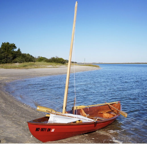
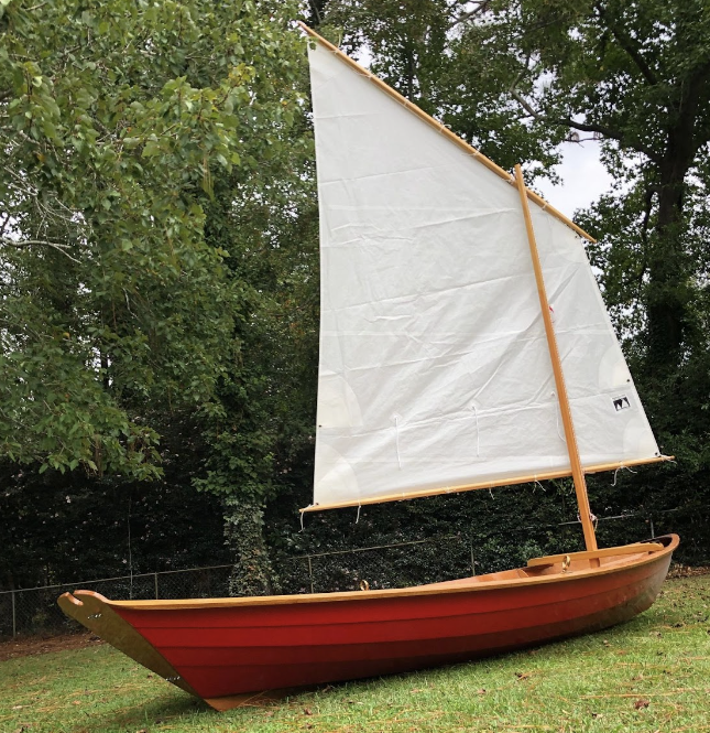
Several years ago we moved from the midwest to coastal North Carolina. There's a long story to this, but I've always, going back over 20 years, wanted to build a sailboat. That never made any sense for a number of reasons until we moved here. This thing took over two years to build, with many humid sweaty hours of cutting, fitting, gluing, sanding, painting, and more. Also did I mention that I'd never once been in a sailboat before this one? It was a leap of faith, but somehow I just *knew* it would be perfect, and it has been. Me, my wife, and my daughter take this out on the Intracoastal waters and find little secluded islands and beaches and absolutely dissolve into the sun and sand and softly rippling waves. This little boat has become my defining icon for everything I stand for at this point in my life. Slow down, enjoy everything around you, instill that process and those feelings into everything you do and everyone around you.
1673457839103.png
1673457875959.png


In parallel to this, I had been without a regular poker game for nearly 10 years. I've taken poker as seriously as I have anything else I've done since the late 90's. So going 10 years without a steady group to play with has been tough. Eastern North Carolina is a poker desert also which doesn't help. But after a few years here I've gotten a fledgling group of poker wannabes together and I'm hosting games regularly now. I found this forum while searching for a nice set of chips. I bought Majestic blanks from Apache, and I planned on having them labeled with a custom design.

So with that we have Rising Tide Poker.

I hired @Johnny5 for the design work and he has done an incredible job. It's just perfect and I can't wait to see it on a chip!

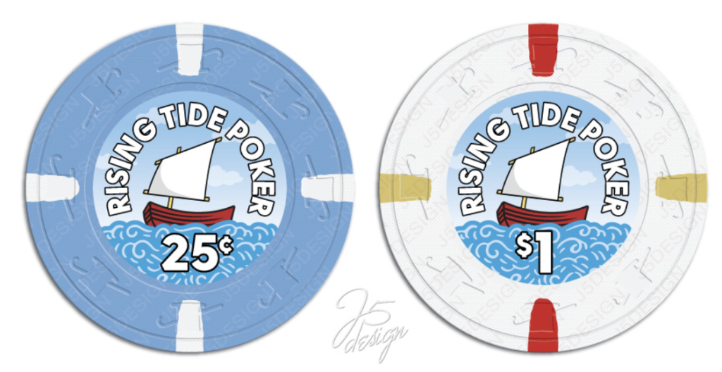
But through the design process I felt like it wasn't worth investing in the Majestics any more and just I should just get a "real" set going right out of the gate. Seeing so many inspiring sets here have absolutely steered me towards making the most of this effort. I was very interested in harvesting and murdering THC's, and I was inspired by the Paris and Venetian $1's to be my frac and $1.
1673458853049.png


The colors just fit the theme well, and both of these would be relatively easy to get. But I got stuck on the $5, I really want that to be *perfect* for the red boat, and there really aren't any I've seen that would offer that punch and also be affordable in good numbers. And also getting a workable $20 or $25 that makes sense was tough. Plus I enjoy the work of designing and building things of my own so I bought color samples of CPC's and I've been working on a fully custom design. And here's where I'm at so far. The colors are trying to match the sky/water blue and the boat red/white. The edge spots I'm starting with are representing the horizon line you'd see behind the boat, and increasing in "motion" up the denominations as the boat might be pitching/rolling in the water creating an angle to the horizon.

RIght now we play $.25/$.25 and the $1's are the workhorse chip. But I expect the game to grow such that the $5 will take over that role.
colo
(ignore the denoms on these, I just used the $.25 logo for all of them for mock-ups so far)

Fracs:

I'm not super sold on the CPC "light blue" but that's the closest I have to the soft blue sky/ocean blue that I'm looking for. The third one here is based on the Paris $2 colors which I *love* but I'm not sure how well the light gray would go next to the bright white $1's below. Something about the gray and pink is very appealing though, so that's still in contention.

fracs.png


$1's

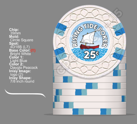
I also really like the Bally's $1's in simplicity and color, so this is inspired by that one. Edge spots are meant to evoke the rocking motion of the little boat on the waves. Colors complementary to the theme and it has a nice balance to me. I landed on this one and I really don't see anything to change here (but open to feedback!). I'm aware of the risk of split spots with this color and that's fine. It will give it more of a homemade look which goes well with the homemade boat. It will feel true to life to have some blemishes.
ones.png


$5's

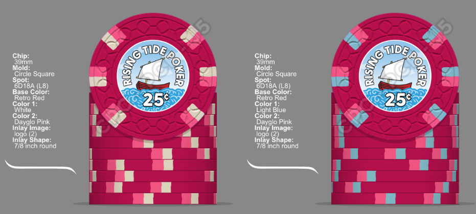
I really want the $5 to POP. I like the red to match the boat, and it's the typical color for $5's anyway. I'm not sold on any of these edge colors, or even the spot pattern here. I've made probably 20 versions of this and I'm just not sold yet.
fives.png


$20's

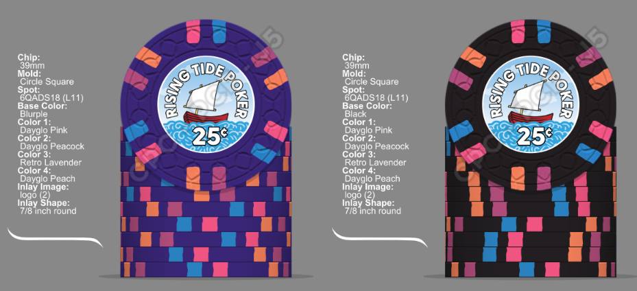
One of my favorite things to do on the boat is to sail to an uninhabited island and camp out next to the ocean waves. Build a fire, cook something delicious, and just drift into the night. So I like the idea of a sunset/nighttime vibe for the $20's. And with more traditional color schemes so far I like taking more bold color/spot liberties with this one. This is the best I've got so far. But again I'm not quite sold on either of these yet.
twenties.png


Overall, I feel like with the exception of maybe the gray frac/white $1, there is little chance of dirty stack issues. I'm no purist on spot progressions or coloration, but I feel pretty locked on the white $1 with blue spots and a base red $5 to match the boat. Besides that I'm all ears and look forward to hearing what more seasoned CPC artists have to say. So let 'er rip!

Thanks!
 
Love this story and looking forward to seeing how these turn out!

As someone who has arguably been building a custom CPC set for like 5 years (funny and sad!), I'm very familiar with the samples. And you're spot on about the light blue, it's kind of flat and often looks more grey. With the right combo of edge spots, it takes on more of a blue tone, but I've pretty much given up on it as a base color.

Weirdly, the CPC grey has some nice blue tones to it and when used as edge spots I often confuse it for light blue! Plus the grey/dayglo pink combo always looks sharp. In a vacuum, it's the clear winner for the frac. And even with the white $1, I think you'll have enough contrast.

Attached is my take on your preferences, taking into account your comments as well as some of the coloring of the boat. I also noticed you had some pretty expensive edge spot patterns, so I substituted with simpler edge spots that I think look good, too. Obviously, it's your project, you do what you want! :-)

For the $1, in addition to the spot pattern change, also substituted light green (one of CPC's best colors) for the light blue, still maintains the sea water vibe, but with a little more contrast/visual interest.

For the $5, went with mandarin red vs the retro red because (a) it seems like a better color match to your boat and (2) it's a brass weighted color so will be a heavier chip (and CPCs are pretty light to begin with, so every ounce counts lol). I went with the 614 pattern because it's not only classic and inexpensive, but simultaneously evokes the sun and a ship's steering wheel (which your boat doesn't have, but still, nautical!). Added the yellow spots to represent the natural wood masts, etc. in your boat, and dayglo tiger because it pops so well on the red (and tigers are all the rage these days apparently lol).

Thought both your blurple and black chips looked good, my take is just a less expensive pattern (though one of my faves) that hopefully evokes sunset/dusk/night in a similar manner.

Good luck!


sailboat_chips.png
 
Cool story and accomplishment.

I don't think a light base (like white or grey) provides enough contrast to be next to a light blue. At the same time, I've always liked the light blue and retro red combo, and went with it on my last set. Maybe larger blue spot helps bring out the light blue base more?

PXL_20220505_205829930.jpg


Have you considered light blue workhorse to represent the vastness of the sea/sky? For an alternative frac, check out the butterscotch and chocolate key West nickle colour combo.

Maybe Imperial blue/Peacock would go better with a white or grey dollar, but I think retro red may be too much for imperial blue.

I agree that Mandarin red looks more like your boat's color in the pics you posted, but if you want pop retro red is where it's at.
 
Last edited:
Love this story and looking forward to seeing how these turn out!

As someone who has arguably been building a custom CPC set for like 5 years (funny and sad!), I'm very familiar with the samples. And you're spot on about the light blue, it's kind of flat and often looks more grey. With the right combo of edge spots, it takes on more of a blue tone, but I've pretty much given up on it as a base color.

Weirdly, the CPC grey has some nice blue tones to it and when used as edge spots I often confuse it for light blue! Plus the grey/dayglo pink combo always looks sharp. In a vacuum, it's the clear winner for the frac. And even with the white $1, I think you'll have enough contrast.

Attached is my take on your preferences, taking into account your comments as well as some of the coloring of the boat. I also noticed you had some pretty expensive edge spot patterns, so I substituted with simpler edge spots that I think look good, too. Obviously, it's your project, you do what you want! :)

For the $1, in addition to the spot pattern change, also substituted light green (one of CPC's best colors) for the light blue, still maintains the sea water vibe, but with a little more contrast/visual interest.

For the $5, went with mandarin red vs the retro red because (a) it seems like a better color match to your boat and (2) it's a brass weighted color so will be a heavier chip (and CPCs are pretty light to begin with, so every ounce counts lol). I went with the 614 pattern because it's not only classic and inexpensive, but simultaneously evokes the sun and a ship's steering wheel (which your boat doesn't have, but still, nautical!). Added the yellow spots to represent the natural wood masts, etc. in your boat, and dayglo tiger because it pops so well on the red (and tigers are all the rage these days apparently lol).

Thought both your blurple and black chips looked good, my take is just a less expensive pattern (though one of my faves) that hopefully evokes sunset/dusk/night in a similar manner.

Good luck!


View attachment 1057283
Thanks! I'm probably going to go back and forth on the gray/pink frac and a more contrasty one so many times.
 
Cool story and accomplishment.

I don't think a light base (like white or grey) provides enough contrast to be next to a light blue. At the same time, I've always liked the light blue and retro red combo, and went with it on my last set. Maybe larger blue spot helps bring out the light blue base more?

View attachment 1057417

Have you considered light blue workhorse to represent the vastness of the sea/sky? For an alternative frac, check out the butterscotch and chocolate key West nickle colour combo.

Maybe Imperial blue/Peacock would go better with a white or grey dollar, but I think retro red may be too much for imperial blue.

I agree that Mandarin red looks more like your boat's color in the pics you posted, but if you want pop retro red is where it's at.

Your chips go great together! My boat is definitely more retro red in person.

For the butterscotch/chocolate nickel, I've thought of that, getting a sandy beach vibe, but I just don't like any of the CPC yellows for that. I'll keep trying though...
 
This is a fantastic theme with great artwork. Love it!

What about a half pie $0.25 with retro blue and light blue? Kinda has a calm ocean horizon look to it, and helps set it apart from the $1.

Either way these look great. Love retro red as a base too that's what I went with :)
 
LOVE the inlay! Inlay design is always the most difficult part of the custom process for me (and arguably the most critical); you nailed it! J5 never disappoints.

Looking forward to seeing how the rest of this set turns out.
 
After @ninedeuce reminded me how much L7's and L11's cost, here's a pass with every chip L5 or lower. I could live with this lineup.

The spots get gradually darker as you progress through denoms, maybe that's getting out to deeper water, until you get to the $20 which is basically the finish line, enjoying your coastal sunset.

Thanks again for the feedback everyone, this is going much better than I expected when I started out.

L5_lineup.png
 
I feel like your inlay is screaming for the SCROLL mold, personally! Would be a perfect fit if you look at the mold as being waves.

Have you tried any of the xx14 spots? I feel like they really stand out well in stacks and the spot levels are excellent value vs thinner spots.

a535310a-9486-468c-b6c1-4d6f4eed0de8.png
 
I feel like your inlay is screaming for the SCROLL mold, personally! Would be a perfect fit if you look at the mold as being waves.

Have you tried any of the xx14 spots? I feel like they really stand out well in stacks and the spot levels are excellent value vs thinner spots.

View attachment 1058335
I honestly haven't put much thought into the mold yet, but scroll mold has been on my mind as the next option, and once I see it here I agree with you. I've been looking at colors and spots exclusively so far.

As for the xx14 spots, I agree they look good in stacks, and I may come back to them. But something about the thinner spots' simplicity and minimalism speaks to me.
 
A note about the scroll (diamond square and some other molds too). The inner recessed ring is very close to the inlay edge which can affect the apperance of off center inlays "falling over the edge." Lots of people are OK with that but best to understand it and decide for yourself.
 
A note about the scroll (diamond square and some other molds too). The inner recessed ring is very close to the inlay edge which can affect the apperance of off center inlays "falling over the edge." Lots of people are OK with that but best to understand it and decide for yourself.
Thanks for pointing this out. I think I’d be okay with this. I’m very far from OCD about such things. Any idea what percentage of chips might be off center?
 
Looking for feedback on my first custom set. I really enjoy reading about the inspiration from other people's sets, so I'll give you mine.

Several years ago we moved from the midwest to coastal North Carolina. There's a long story to this, but I've always, going back over 20 years, wanted to build a sailboat. That never made any sense for a number of reasons until we moved here. This thing took over two years to build, with many humid sweaty hours of cutting, fitting, gluing, sanding, painting, and more. Also did I mention that I'd never once been in a sailboat before this one? It was a leap of faith, but somehow I just *knew* it would be perfect, and it has been. Me, my wife, and my daughter take this out on the Intracoastal waters and find little secluded islands and beaches and absolutely dissolve into the sun and sand and softly rippling waves. This little boat has become my defining icon for everything I stand for at this point in my life. Slow down, enjoy everything around you, instill that process and those feelings into everything you do and everyone around you.

View attachment 1056790 View attachment 1056791

In parallel to this, I had been without a regular poker game for nearly 10 years. I've taken poker as seriously as I have anything else I've done since the late 90's. So going 10 years without a steady group to play with has been tough. Eastern North Carolina is a poker desert also which doesn't help. But after a few years here I've gotten a fledgling group of poker wannabes together and I'm hosting games regularly now. I found this forum while searching for a nice set of chips. I bought Majestic blanks from Apache, and I planned on having them labeled with a custom design.

So with that we have Rising Tide Poker.

I hired @Johnny5 for the design work and he has done an incredible job. It's just perfect and I can't wait to see it on a chip!

But through the design process I felt like it wasn't worth investing in the Majestics any more and just I should just get a "real" set going right out of the gate. Seeing so many inspiring sets here have absolutely steered me towards making the most of this effort. I was very interested in harvesting and murdering THC's, and I was inspired by the Paris and Venetian $1's to be my frac and $1.

View attachment 1056812

The colors just fit the theme well, and both of these would be relatively easy to get. But I got stuck on the $5, I really want that to be *perfect* for the red boat, and there really aren't any I've seen that would offer that punch and also be affordable in good numbers. And also getting a workable $20 or $25 that makes sense was tough. Plus I enjoy the work of designing and building things of my own so I bought color samples of CPC's and I've been working on a fully custom design. And here's where I'm at so far. The colors are trying to match the sky/water blue and the boat red/white. The edge spots I'm starting with are representing the horizon line you'd see behind the boat, and increasing in "motion" up the denominations as the boat might be pitching/rolling in the water creating an angle to the horizon.

RIght now we play $.25/$.25 and the $1's are the workhorse chip. But I expect the game to grow such that the $5 will take over that role.
colo
(ignore the denoms on these, I just used the $.25 logo for all of them for mock-ups so far)

Fracs:

I'm not super sold on the CPC "light blue" but that's the closest I have to the soft blue sky/ocean blue that I'm looking for. The third one here is based on the Paris $2 colors which I *love* but I'm not sure how well the light gray would go next to the bright white $1's below. Something about the gray and pink is very appealing though, so that's still in contention.

View attachment 1056816

$1's

I also really like the Bally's $1's in simplicity and color, so this is inspired by that one. Edge spots are meant to evoke the rocking motion of the little boat on the waves. Colors complementary to the theme and it has a nice balance to me. I landed on this one and I really don't see anything to change here (but open to feedback!). I'm aware of the risk of split spots with this color and that's fine. It will give it more of a homemade look which goes well with the homemade boat. It will feel true to life to have some blemishes.

View attachment 1057263

$5's

I really want the $5 to POP. I like the red to match the boat, and it's the typical color for $5's anyway. I'm not sold on any of these edge colors, or even the spot pattern here. I've made probably 20 versions of this and I'm just not sold yet.

View attachment 1057264

$20's

One of my favorite things to do on the boat is to sail to an uninhabited island and camp out next to the ocean waves. Build a fire, cook something delicious, and just drift into the night. So I like the idea of a sunset/nighttime vibe for the $20's. And with more traditional color schemes so far I like taking more bold color/spot liberties with this one. This is the best I've got so far. But again I'm not quite sold on either of these yet.

View attachment 1057265

Overall, I feel like with the exception of maybe the gray frac/white $1, there is little chance of dirty stack issues. I'm no purist on spot progressions or coloration, but I feel pretty locked on the white $1 with blue spots and a base red $5 to match the boat. Besides that I'm all ears and look forward to hearing what more seasoned CPC artists have to say. So let 'er rip!

Thanks!
I really love your initial 25c and $1 chip design.
 
I feel like your inlay is screaming for the SCROLL mold, personally! Would be a perfect fit if you look at the mold as being waves.

Have you tried any of the xx14 spots? I feel like they really stand out well in stacks and the spot levels are excellent value vs thinner spots.

View attachment 1058335

X2 everything here^^

I really liked the quarter/dollar combo you had set with those relabels. While there's not a good CPC substitute for dolphin blue, I think you could still easily get the same type of vibe going.

d25faa8e-4011-42e7-9975-2be10717de3a.png


Though you do seem to have a preference for the smaller spots. I would consider a slight bump up to the 3/16" size double split spots, they're similar in style to the S18 spots and IMHO tend to look a little more consistent. I find the smaller 1/8" spots (especial when they're either single spots or double split) tend to not hold they're shape quite as well when they're pressed. Probably more difficult to work with (hence the higher price for them).

8b694589-ac2a-474c-bfff-2969145b93cf.png


I also wouldn't shy away from a higher level spot for your high end chip, since you're likely not ordering a large quantity of those. A level 11 chip is going to be $$$, but if you're only ordering a few barrels or a rack, it's likely only going to be a small overall increase to the set price. Buy once, cry once :)

Just some food for thought, my 2¢ worth (love the inlay design!)
 
X2 everything here^^

I really liked the quarter/dollar combo you had set with those relabels. While there's not a good CPC substitute for dolphin blue, I think you could still easily get the same type of vibe going.

View attachment 1059149

Though you do seem to have a preference for the smaller spots. I would consider a slight bump up to the 3/16" size double split spots, they're similar in style to the S18 spots and IMHO tend to look a little more consistent. I find the smaller 1/8" spots (especial when they're either single spots or double split) tend to not hold they're shape quite as well when they're pressed. Probably more difficult to work with (hence the higher price for them).

View attachment 1059148

I also wouldn't shy away from a higher level spot for your high end chip, since you're likely not ordering a large quantity of those. A level 11 chip is going to be $$$, but if you're only ordering a few barrels or a rack, it's likely only going to be a small overall increase to the set price. Buy once, cry once :)

Just some food for thought, my 2¢ worth (love the inlay design!)
While I love the look of scroll I wish it was smaller like medium or small Greek key vs large Greek key. I got a sample of the rounders chips on scroll and think it’s the worst mold CPC offers. Feels terrible. Just my humble opinion. If it was smaller with an outer ring it could be great. Just not a fan of it as is though.
 
While I love the look of scroll I wish it was smaller like medium or small Greek key vs large Greek key. I got a sample of the rounders chips on scroll and think it’s the worst mold CPC offers. Feels terrible. Just my humble opinion. If it was smaller with an outer ring it could be great. Just not a fan of it as is though.
It's definitely a polarizing mold, I've found people either love it or hate. I'm in the former group, I love my Rounders scroll mold set, both in terms of looks (the impression/details are incredibly sharp) and feel. But it is very different from their other molds. OP if you consider scroll I'd highly recommend getting samples first.
 
It's definitely a polarizing mold, I've found people either love it or hate. I'm in the former group, I love my Rounders scroll mold set, both in terms of looks (the impression/details are incredibly sharp) and feel. But it is very different from their other molds. OP if you consider scroll I'd highly recommend getting samples first.
Same
 
I really like your inlay! If I remember correct, you were originally going to do a relabel project? I like the switch. I am 3/4 done with my relabel project and am not ashamed to admit it is taking much longer than expected. Your mock ups are coming along nicely.
 
I’m curious if your inlay is 100% finished? With the name Rising Tide, I’m wondering if you could work that in somehow… Maybe have the water a little higher on each chip as a part of the progression?
 
Though you do seem to have a preference for the smaller spots. I would consider a slight bump up to the 3/16" size double split spots, they're similar in style to the S18 spots and IMHO tend to look a little more consistent. I find the smaller 1/8" spots (especial when they're either single spots or double split) tend to not hold they're shape quite as well when they're pressed. Probably more difficult to work with (hence the higher price for them).

That's interesting about the 1/8 spots not having a consistent shape... I love them on the designer, but I wonder how irregular they'd have to be before it mattered to me.

While I love the look of scroll I wish it was smaller like medium or small Greek key vs large Greek key. I got a sample of the rounders chips on scroll and think it’s the worst mold CPC offers. Feels terrible. Just my humble opinion. If it was smaller with an outer ring it could be great. Just not a fan of it as is though.

It's definitely a polarizing mold, I've found people either love it or hate. I'm in the former group, I love my Rounders scroll mold set, both in terms of looks (the impression/details are incredibly sharp) and feel. But it is very different from their other molds. OP if you consider scroll I'd highly recommend getting samples first.

Haha.... Oh no!!! Now I'll need to order a sample stack of each of these molds. The look of the scroll is perfect for these, but if they don't feel right I don't know if I'll be able to pull the trigger. It's alright, I have time to get it right.

I really like your inlay! If I remember correct, you were originally going to do a relabel project? I like the switch. I am 3/4 done with my relabel project and am not ashamed to admit it is taking much longer than expected. Your mock ups are coming along nicely.

Thanks! And yes, I was going to do a relabel. I was set on Paris $1's for fracs and Venetian $1's for $1's. I couldn't find a $5 that just fit for me, so I started looking at CPC's. And here I am.

For now my home game is putting blank Majestics out there (that I'd initially thought of custom labeling), and I need to upgrade (I'm hooked!). I'm going to Vegas on Saturday and I am more than halfway convinced to harvest a playable set of $1's/$5's for my home game while I get my CPC order put together (plus if I have $1k in live chips that need to get cashed in when my CPC set arrives what better reason is there to fly back to Vegas again????). Let's just hope I run good and make it easily justified.
 
I should add here's where I'm at...

First --
lineup_light_blue_frac.png


And if I take @Irish 's advice and go with wider spots that may be more regularly sized and shaped (except for the $20 which has to stay that way, right?):

lineup_wider_spots.png


Oh man I can't wait to watch someone scoop a 500BB pot full of these...
 
Really like that 4D18 with the light blues. A bit pricey, but oh so lovely.

Bottom, top, bottom, bottom

And it still fits. 2 1/4s- 4 1/4s (spots begin to rotate, 2 colors each foreshadowing a split) - the 4 spots split (spots shrink) - and the 4 splits become 6 (spots shrink)
 
Haha.... Oh no!!! Now I'll need to order a sample stack of each of these molds. The look of the scroll is perfect for these, but if they don't feel right I don't know if I'll be able to pull the trigger. It's alright, I have time to get it right.

Fyi this is available:
https://www.pokerchipforum.com/threads/cpc-mold-color-sample-set.6088/

And just to further clarify on the 1/8" spots, it's likely more of a perception kind of thing. CPC's production process involves lots of heat and pressure, pretty much all the spots squeeze and distort ever so slightly when they're pressed, to varying degrees (lots of variables involved, I won't pretend to know even half of them). I find those small distortions are slightly more noticeable on the single & double split 1/8" spots. They're probably to the same overall degree as the bigger spots, but when the spot itself is so thin, it's more visible.

Single 1/8" spots (whether single or double split single) are also slightly smaller in "depth"- they don't extend as far to the center of the chip as most other spots.
Some examples:

6DSA18 - you can see the 1/8" spots here go from the edge of the chip to about halfway to the inlay:
full


3143DS18 & 414418 - Here you can really see the "depth into the chip" difference between a 1/4" spot and a 1/8" spot:
full


4DSA316 - the 3/16" spots I mentioned in my last post extent further into the chip, very similar to the 1/4" and 1/2" spot depth:
full


No right or wrong answer here, and I obviously own lots of CPC chips with 1/8" spots and they're awesome (and you'd be hard pressed to find a bigger overall CPC supporter on this site :) ). Just wanted to point out some of the characteristics of these spots in real life vs the chip designer, you just have to remember that you're dealing with an artisan product, the chips won't look 100% like those in the chip designer.
 

Create an account or login to comment

You must be a member in order to leave a comment

Create account

Create an account and join our community. It's easy!

Log in

Already have an account? Log in here.

Back
Top Bottom