CPC Design Feedback (1 Viewer)

Which lineup do you prefer?

  • A

    Votes: 2 7.4%
  • B

    Votes: 3 11.1%
  • C

    Votes: 5 18.5%
  • D

    Votes: 1 3.7%
  • E

    Votes: 6 22.2%
  • F

    Votes: 10 37.0%

  • Total voters
    27

FestiveKnight

Full House
Supporter
Joined
May 7, 2021
Messages
2,564
Reaction score
4,489
Location
United States
Trying to get closer to "done" with the next phase of my chip design as I'm getting further along on work with J5 on inlays. I don't want to share too much on inlay/theme now, its still largely in flux and will be based a lot on the chips themselves. I play games at .10/.20 or 1/2 depending on group. I posted another thread a few weeks back asking about this breakdown and even though its nontraditional I'm quite happy with it. My group won't care much and I think going the custom route, it will be cool to make it something atypical like this. That being said, I'm open to any and all feedback.

As I've mentioned in other threads, I am quite colorblind; I see many blues, purples, pinks, and greys as the same color and to a lesser extended I similarly mix up greens, oranges, reds, and some yellows. This means that I like combinations of colors with higher contrast and I like brighter colors in general which are easier to differentiate in darker rooms (like poker settings).

Lastly, I think its clear that what I am struggling with the most is the 50c chip. I really like the design for the 10c I have and I'm thinking about getting the right breakdown of chips to make a limit set that plays with 10c and $2 chips as a way to mix up the low stakes we play so I want to keep that chip more interesting. But I think its causing mw problems that the first chip is relatively complex already.

I know most of these are pretty similar and I haven't really organized them enough to show only one change at a time but curious what lineup people like the most and also whatever other comments you have. Thanks!
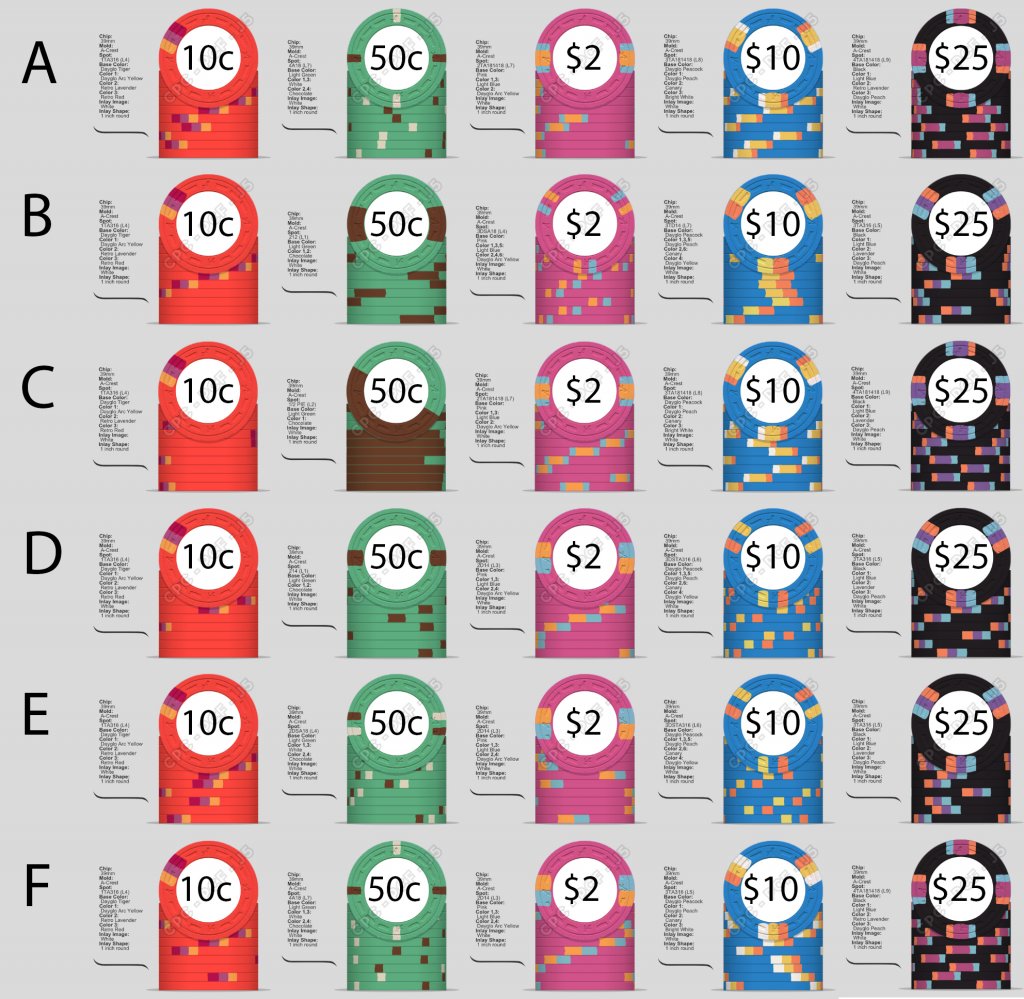

Grey Options 0810.jpg
 
Specific chips, in order: A E B A B
 
This? Is 3ta181418 considered "before" 3ta316 in spot progression? The 3TA316 at the end feels kinda like a slight fall off for an endingView attachment 752348
Ah, I thought the peacock was a 316, I missed that. It’s interesting, either way, starting with the 316 and ending with the 316 and the 18s in the middle. I was trying to pull some themes together and be mindful of levels. There’s something in there, and this many not be it, but hopefully this look moves you towards the right next step.
 
A E B F F is what I would choose, will be following to see the inlay design when it’s revealed :)
 
A E B F F is what I would choose, will be following to see the inlay design when it’s revealed :)
That's what I was liking the most too, messing around also now with 2D14, that second chip remains such a thorn in my side lol. Changed up colors a bunch, really embracing the opportunity to mess with the colors. I have some traditional tournament sets and another on the way so it's fun mixing it up.

index9.png


index10.png
 
I've been messing around with this a bunch more. I thought I was starting to really feel good about where I was going but then I received a sample set of @chipinla's andy and red's and one thing I loved about it is the shared colors across the chips so I took a swing at narrowing the range of colors being used and making it so the chips share elements more.

A) Current working version
2.2.png


B) Condensed color range
2.3.png


On the one hand, I think I like the colors and overall design more in set A but there's something I really like about shared-colors in B that I think pull the chips together more. I'm also really liking 2A12 for the 50c but I'm feeling like the 3DSA18 looks a bit squished/overshadowed.
 
I'm also finding it somewhat difficult that 1) some of these colors in particular seem very different IRL than in the design tool (at least on my monitor), 2) with so many shared colors I'm finding it hard to get a feel for what it will all look like because I only have one of each sample chip, 3) with my relative newness to the edge spot options I'm finding it hard to always imagine them just when holding chips up to each other.

I think next step is to take pictures of the color sample piles for each chip and I might also try messing around with mocking the chips up from that as I've seen others do (much easier said than done).
 
Colours are nice but the denominations are horrible. Sorry, don’t mean to crap on your thread.
just some feedback.
 
the denominations are horrible.
Not for a game that ranges 10¢/10¢ - 20¢/20¢.

(Missed the issue with the $25 as noted below.)
 
Last edited:
I would want to change the top denomination to $50 or $20. There is no easy way call a $25 bet with smaller chips if someone doesn’t have a $25 themselves.
 
Colours are nice but the denominations are horrible. Sorry, don’t mean to crap on your thread.
just some feedback.
No, any feedback is welcome feedback but I posted another thread at some point about this. I know the denoms are an odd breakdown but they make a lot of sense for my low stakes 10¢/10¢ and 10¢/20¢ and for 2/4 or 3/6 limit games that play with dimes.

That being said, I forgot I had already gotten similar feedback about the $25 and so with 10c/50c/2/10/20 all I think you could say is missing is a $1 chip but I just don't think its that necessary with the games this will be used in and I think one opportunity of a custom set is to do things like cali colors and odd denoms. I'm working on multiple rhc/leaded thc sets separately that will have traditional colors and denoms and I don't think this set needs to be that.


Not for a game that ranges 10¢/10¢ - 20¢/20¢.

(Missed the issue with the $25 as noted below.)

I would want to change the top denomination to $50 or $20. There is no easy way call a $25 bet with smaller chips if someone doesn’t have a $25 themselves.
 
@warma can I get you 2¢ on colors and spots again? I have this nagging feeling there's something better for the $2 spot than 3DSA18 but I can't figure out what. Do you like the colors on the $20 (currently labeled $25 above)?

Hope you don't mind me asking, I've seen your feedback on other sets all over the place on here and you always seem to make anything you comment on better.
 
You’re kind. First… after reading what you wrote above, will you need the $25 (or it’s replacement)? I just ordered a 10¢/50¢/$2.50/$10 for my 10¢/20¢ crowd (h/t @Saoliver). Not sure I’ll even get many $10 in play, even if we go 20¢/20¢. Based on what you said, I’d drop the $20/$25 unless you feel you need it.

Spots are tough. What feels off on the $2?

1. How much do you love the 50¢? What I noticed was how much the 50¢ stood out as different. Moving my eye from the three 16s to two 12s to the S18s, I felt an abrupt transition to the 50¢ and then felt the 18s on the $2 looked dainty and almost not there. I think was feels off with the $2 might be the 50¢. What how do you feel about the $2 if you make the 50¢ a 214?

2. I’ve really come to appreciate the split 18s when chips are stacked. They’re clean, they can pop. When they really shine (at that size) for me is when they have a nice bright contrast (your option B) or when it’s super subtle on bright white (Jack Cincinnati $1). Have you perused the ChipGuide, filtered to US/pink/and the H&C options? Might be inspired there. I just looked at my samples- I like the DG pink/DG Arc Yellow/gray combo at 14, but not sure they pop enough at 18. Did you look at DG Yellow in place of Canary? What do you think about DG Green in place of the DG Peacock (as you already have a lot of blue in there)?

You’ll keep tinkering, so the goal is just to move another step or two forward. Don’t need to solve this overnight. :)
 
Last edited:
I just rediscovered your earlier thread. Your split 18s progression could work with 4 chips (dropping the $20/$25). If you keep 5 chips, then the first could be either a solid, a 118 (if David can do that), or a single color 1S18. So save for the 10¢, they’ll be L4s. Using 2 spot colors on each could help.

More time playing with the chip designer. :)
 
You’re kind. First… after reading what you wrote above, will you need the $25 (or it’s replacement)? I just ordered a 10¢/50¢/$2.50/$10 for my 10¢/20¢ crowd (h/t @Saoliver). Not sure I’ll even get many $10 in play, even if we go 20¢/20¢. Based on what you said, I’d drop the $20/$25 unless you feel you need it.

Spots are tough. What feels off on the $2?

1. How much do you love the 50¢? What I noticed was how much the 50¢ stood out as different. Moving my eye from the three 16s to two 12s to the S18s, I felt an abrupt transition to the 50¢ and then felt the 18s on the $2 looked dainty and almost not there. I think was feels off with the $2 might be the 50¢. What how do you feel about the $2 if you make the 50¢ a 214?

2. I’ve really come to appreciate the split 18s when chips are stacked. They’re clean, they can pop. When they really shine (at that size) for me is when they have a nice bright contrast (your option B) or when it’s super subtle on bright white (Jack Cincinnati $1). Have you perused the ChipGuide, filtered to US/pink/and the H&C options? Might be inspired there. I just looked at my samples- I like the DG pink/DG Arc Yellow/gray combo at 14, but not sure they pop enough at 18. Did you look at DG Yellow in place of Canary? What do you think about DG Green in place of the DG Peacock (as you already have a lot of blue in there)?

You’ll keep tinkering, so the goal is just to move another step or two forward. Don’t need to solve this overnight. :)

Ah! Thank you so much for all this input. Some responses:

0) I doubt the $25 would ever see play but A) moar chips, B) I really like the design of that chip, it feels like it really closes out the set, C) it’s a pricey chip so I’ll probably be getting a quite minimal amount, D) there’s an argument it helps “future proof” the set or make it the tiniest bit more flexible if it ever plays higher stakes but that’s probably stupid, if those are really in play the bottom of the set has no reasonable workhouse for them to be with, idk how I’d ever get there, E) moar chips

1) I don’t love the 50¢, as in the sets from above in this same thread when I last posted, it’s what’s given me the most trouble and I think I know why…..

If you keep 5 chips, then the first could be either a solid, a 118 (if David can do that), or a single color 1S18. So save for the 10¢, they’ll be L4s. Using 2 spot colors on each could help.

Since I started the foundation for the set has been the 1TA316 10¢. I know that the dimes will see by far the most play and I’m planning to get a lot of them for the limit games so I didn’t want it to be a bland chip even though it’s the first chip and I wanted it relatively simple. There’s a reason the spotted birds and Buddha club etc use that. IMO it’s maybe the sexiest low denom spot patter I’ve seen (though rn I’m in love with VLV $1 soooo).

The other detail as I’ve mentioned a bunch is that I’m quite colorblind so I want to make sure there’s a really clear spot progression, but that gets me in a bind. How do I get from 1TA316 to something 4 chips later with a smooth progression? I’m thinking the key is probably using 2DSA16. Which gets me to 2)….

2) One of the reasons for 18 spots on the $2 was because I love the DG Pink base and wanted it to really shine and the spots to really be a highlight but then every time I put something like the bright yellows on it and tried to imagine they just seems too sharp. I think I need to just play with this one a lot more. I’ve not really used the chip guide in that way yet, that’s a great idea. Thank you!

Re: peacock, I have a bunch of blues on the other chips because when I first started I was designing each chip very much in a vacuum from each other (color-wise) and I’ve been striving to tie them together better and so I wanted the presence of blue on the other chips. I also love DG Peacock, I don’t think I could see myself changing the base color of anything except the 50¢ at this point. That’s all I’m certain on lol.


As you said, a lot more time in the designer :D!

Thank you for coming to my Ted talk
 
Almost forgot- limit stakes play 3-4x that of NL stakes. I can’t remember the thread I found that in, so something to consider. Don’t get too focused on dimes. ;)
1631466688960.gif
 
@warma thoughts? After thinking about the stakes I decided the $20 really didn't have a place, so that's one change I've found I really like. 3TA316 is a pattern I really like and it let's the $10 shine more. At this point I don't know why I ever had the $2 with 18 spots instead of 16s. I think this spot pattern is the best I've got it to. I feel like it's a bit straightforward but it's definitely smoother and better than before.

2.5.png
 
Agreed... it's refreshing and nice to see, a much better flow. At this point- I'm almost out of questions, so if you love it, ship it. :)

Are you ok with the lack of progression in the number of colors per chip and the use of 316 v split 16s? If you made the 10¢ a 1DSA316 and removed one of the three colors, it might flow better.

You're colorblind, if I recall? The spot colors on the 10¢ don't have a lot of contrast, nor does the peach on the pink $2. Those are the weakest chips. I'm not sure what to recommend as my eyes see differently. The 50¢ and $10 pop nicely.

But again, if you're happy, ship it.
 
2.5.png

I have been looking at this ^^^^ a lot and thinking:

A) the spot progression is really smooth but not so interesting
B) there is a reason people use tri moon a lot. After getting some samples with it, I actually really like it.

So I've been messing with the option below instead, but I'm struggling to pick 3 spot colors for the $2. I really like the green with pink and I think DG Peach is an alright 3rd color, but I can't figure out a 4th color I like with those. I also have been finding my previous color combo for the $10 kind of boring. Anyone can make a chip look hot with peacock, peach, and arc yellow. This doesn't feel quite right but I'm liking the direction.

I am seeing the notice about split spots and I've read what CPC has on their website. Is this 50¢ plan too risky?

index11.png
 
View attachment 790831
I have been looking at this ^^^^ a lot and thinking:

A) the spot progression is really smooth but not so interesting
B) there is a reason people use tri moon a lot. After getting some samples with it, I actually really like it.

So I've been messing with the option below instead, but I'm struggling to pick 3 spot colors for the $2. I really like the green with pink and I think DG Peach is an alright 3rd color, but I can't figure out a 4th color I like with those. I also have been finding my previous color combo for the $10 kind of boring. Anyone can make a chip look hot with peacock, peach, and arc yellow. This doesn't feel quite right but I'm liking the direction.

I am seeing the notice about split spots and I've read what CPC has on their website. Is this 50¢ plan too risky?

View attachment 790832
I’d work on the $2 a little more. Hard to see the peach with 2 DG green inserts already. Looks odd to me with 2 green and 1 peach
 
I’d work on the $2 a little more. Hard to see the peach with 2 DG green inserts already. Looks odd to me with 2 green and 1 peach
It will definitely not be only 2 colors of spots. I like the DG Green and I'm alright on the DG Peach but I don't think they're great together and no clue what the third spot color should be.
 

Create an account or login to comment

You must be a member in order to leave a comment

Create account

Create an account and join our community. It's easy!

Log in

Already have an account? Log in here.

Back
Top Bottom