Dead Guy Milanos (1 Viewer)

cascadiapoker

Two Pair
Joined
Nov 14, 2018
Messages
424
Reaction score
437
Location
Tucson, AZ
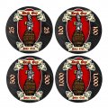
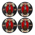
I’m not rich, and call me crazy but I really like the Milanos over the Majestics for my price range, so that’s the base chip I want to go with. I have a mockup for the Dead Guy Poker Club but I’m not sure on the alignment for the chip values. It will be a tournament set, 25, 100, 500, and 1,000. Any thoughts?
 

Attachments

  • EAFBEE3C-4641-435C-90DF-553E9D5F12B9.jpeg
    EAFBEE3C-4641-435C-90DF-553E9D5F12B9.jpeg
    207.1 KB · Views: 192
  • 1D26D22E-2DEE-4735-A04D-32BC87F21A1D.jpeg
    1D26D22E-2DEE-4735-A04D-32BC87F21A1D.jpeg
    206.9 KB · Views: 200
  • 2661AD0F-BD1D-4F44-91D3-4F52B672CC19.jpeg
    2661AD0F-BD1D-4F44-91D3-4F52B672CC19.jpeg
    207.2 KB · Views: 213
I decided I’m not a fan of the first one, so here is a full inlay mockup for the other 2 options.

Strongly advise printing out a label onto a piece of paper (actual size) and puttn* on a chip... I’d guess your text and images will be nearly impossible to read (too small...).
I actually already did that and it’s not even bad at all, maybe on the Dead Guy Poker Club text but the values look perfectly fine. I’m not too worried on the Dead Guy text though. It’s the image I really like.
 

Attachments

  • 5688A96D-A210-4A79-903D-F2A5DF7B676F.jpeg
    5688A96D-A210-4A79-903D-F2A5DF7B676F.jpeg
    218.1 KB · Views: 209
  • FEB56CDA-66AF-4D7B-8627-7401C5D33292.jpeg
    FEB56CDA-66AF-4D7B-8627-7401C5D33292.jpeg
    214.8 KB · Views: 204
Maybe do the words on one side and image on the other.
That was the original plan actually. I tried several mockups with that but I didn’t like it all with that background. I don’t want to change the background for just the text for continuity purposes and I’d still need to add text inside the banners anyway.
 
That was the original plan actually. I tried several mockups with that but I didn’t like it all with that background. I don’t want to change the background for just the text for continuity purposes and I’d still need to add text inside the banners anyway.
I’d suggest talk to Gear or someone else that does designs before you pull the trigger.
 
But you should be.. if the text isn’t readable, then ditch it. Use the space to make features you DO like discernible. Having a feature like text that’s unreadable just looks like poor design on your part.
It’s not unreadable. It’s not to small. If you can read the text on these comments on these pages, then you can read the text on the inlay because the printed out version isn’t any smaller, and that’s only “poker club”. The Dead Guy text is bigger, and the values are even bigger.

Feel free to print and see for yourself. At 25 mm across. Just makes sure the dpi is set to at least 300 so your printer doesn’t blurr the quality.
 
Last edited:
#2
And it is hard to read
I don’t know how you printed it, but the ones I have, the text isn’t any smaller than any of the the real Las Vegas casino chips I have. Bellagio, Ceasars, etc.

I don’t know how you printed it, but the ones I have, the text isn’t any smaller than any of the the real Las Vegas casino chips I have. Bellagio, Ceasars, etc. I really do thank you for looking out. I know you’re only trying to be helpful.
 
At size, I honestly cannot tell the difference - and I can read the text on screen (though admittedly I have it at 110% sizing).

Go with what you like, but us old guys simply cannot read stull that small.

...and for the record, Mrs Zombie (who didn't see the title of the thread guessed it said "Bad Day". She couldn't read anything on the lower banner, lol'ed when I told her the barrel also had text.

The denoms were readable though, so you have that going.
 
Lol. The whole chip is an homage to Rogue Dead Guy Ale a very popular beer here in Oregon. Everyone here knows what it is without even having to read.
 
It’s not unreadable. It’s not to small. If you can read the text on these comments on these pages, then you can read the text on the inlay because the printed out version isn’t any smaller, and that’s only “poker club”. The Dead Guy text is bigger, and the values are even bigger.

Feel free to print and see for yourself. At 25 mm across. Just makes sure the dpi is set to at least 300 so your printer doesn’t blurr the quality.
I have to echo the comments of @Trihonda... I have a hard time reading the text both on my screen real size and printed real size (300 DPI). Because of the font and dark colors, I can't read any of the text unless I hold it less than 10" from my face. I also can't tell if that's a skeleton or Pinocchio unless again I bring it super close to my face.

As for which I prefer, it's horizontal denoms, although I'm not feeling the denoms being printed twice.
 
Just here to say I love Rogue beer. Not a big Dead Guy fan, but most of their stuff is great. The Brutal IPA is my favorite beer.
 
big fan of Dead Guy Ale. The text on the bottle is hard to read....only fitting that the image on the poker chip should be the same haha. Horizontal denoms btw
 
I mean, who takes the time to want to reas what’s written on the chip and hold it close, reegardless of the sose of the text? Who decides the want to read the text on the chips of the oerson next to them or 2 seats down? If you’re pkaying poker and what to see what a chip is about, do not automatically pick up a chip and hold it close anyway? Or is it, “Hey you across the table, hold up one of your chips, I want to read it from afar . . .?”
 
And I’m thinking the vertical denoms might be the best suited for the design. Tbh, I didn’t want to put the value twice on the chip, but there was no real correct color combination that stood out enough by putting it over the center of the chip without making the dead guy on the barrel logo completely irrelevant. That’s the star of the beer and ergo, the star of the chip. the only logical step then was to put the value on the side, but just one side looked too offputting so adding the value to both sides gave it balance. I think the horizontal values could be perceived as redundant or even confusing (is this a 25 chip or a 2525 chip?) Where as the vertical values again still give the balance but doesn’t seem as reduntant or confusing. Though I have still liked the horizontal values more often as I go back and forth.
 
Thanks, but the font is very specific the beer as well. And the whole look is the dead guy on too of the Rogue barrel. I did find that same pic online but I didn’t like the outlines at all. And pure black with the Milano chips doesn’t seem to fit well.
 
If you want an accurate depiction of the beer label, then you already got that. If you want advice, you are going to get a lot of suggestions to make it reminiscent of Dead Guy ale, but readable.

Your chips, do what makes you happy, but dont expect our advice to be 100% in your favor.
The difference between affirmation and advice....

I came on here to get advice on the breakdown for my first set of Poker Knights. Kind of listened to what was said to me. Still happy with it, but wish I had paid more attention to the advice.
 
Since this is a recreation of a label that's an institution in Oregon, then I agree that there's no need to be able to read the text. Everyone knows at a glance what it is, just like you don't have to read the word "beer" to know what's inside. Besides, if it's an existing logo, changing it would alter the design and look messed up. The denominations should be legible though, but even then, you only go by color when playing anyway. But I would try to make it larger if possible.

Personally, I can't tell the difference between 1 and 2, but I like the vertical denom
 
A bit more advise.....

PRINT OUT YOUR LABELS AT ACTUAL SIZE BEFORE YOU CALL THEM GOOD..........

Just on a piece of regular paper, although I found photo paper is a bit better and closer to a label...... This will help you to see or not see details, denoms, and other things that you wanted on your label.
 

Create an account or login to comment

You must be a member in order to leave a comment

Create account

Create an account and join our community. It's easy!

Log in

Already have an account? Log in here.

Back
Top Bottom