If you want to save $, then have a rolling edge design that does not require edge alignment with either fave. Do something special, like a stack of 4 or 6 or 8 chips creating a special stack graphic.
-
PCF is an Amazon Associate and an eBay Partner. If you make a purchase through one of our links, we may earn a commission at no extra cost to you. Thank you for your support!
You are using an out of date browser. It may not display this or other websites correctly.
You should upgrade or use an alternative browser.
You should upgrade or use an alternative browser.
ECHO Haven & Gambling Hall Cash Set (1 Viewer)
- Thread starter ChipperMarten
- Start date
ChipperMarten
Pair
Samples
So I ordered some samples from BRProPoker. They have been absolutely delightful to work with and I am so happy that I'll be using them to order the final design! I love the feel of these ceramics and I think I'll leave the cards mold to a more experimental 'for fun' set.
So here's how the samples look.
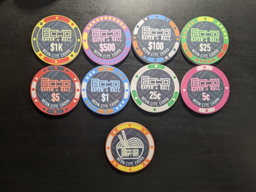
On first glance I was incredibly happy at how they turned out. However, I have given it a couple of weeks to stew (and for me to look at some other set designs) and there's been some things I've decided that maybe I don't like so much. Now that I've done an evaluation, I think I can evaluate this with fresh eyes and go back to the drawing board if necessary.
An obvious point is the distance from my 'edge spots' to the edge of the chip, which is a little close for my liking. I've since modified them to give additional clearance so that the inlay is slightly smaller, which I think is totally alright. I'm also just generally a fan of these edge spots, while I still love classic clay-looking spots, I think these are unique and fit the theme of the set.
There is a key design aspect that I'm realizing might prove a disconnect between the way it looks on a computer and the way it actually turns out. I think that the neon aesthetic I was going for with the core logo is just not something that's going to end up turning out good with dye sublimation printing. I'm sure there's some combination of settings I could go with, or some pop-art shading hack that could get it close, but I just know they aren't going to look the way I want them too when all is said and done.
I'm honestly thankful that I didn't jump the gun and order the first design that came to mind (looking back it's wild to see how much the set has progressed). I've also been a fan of chips with bold lines and blocky colors, 'simple' inlays that are also unique in their own right. So I decided to step back and try to make something work.
Trying Something New
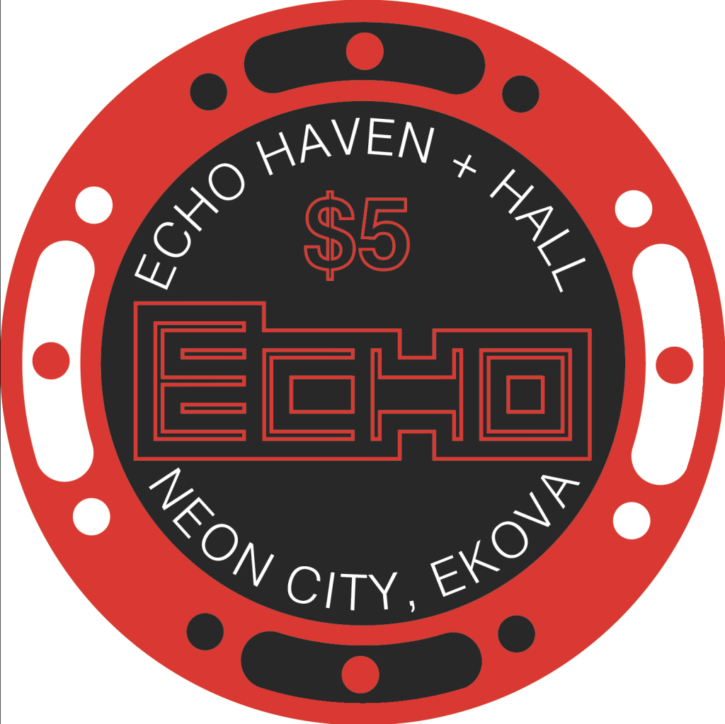
I knew that I wanted to try and maintain the original logo since it was the inspiration behind the set. (Using the $5 chip because I enjoy the red color for prototyping). So I tried a blocky version without the faint ECHO in the background. I also tried a white inlay version since I've been liking that as of late. (And I also tried to do just the original lines of the ECHO logo and it felt way too sparse without the added color of the neon sign aesthetic.
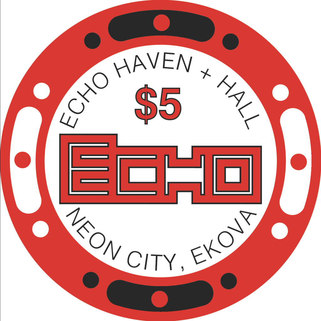
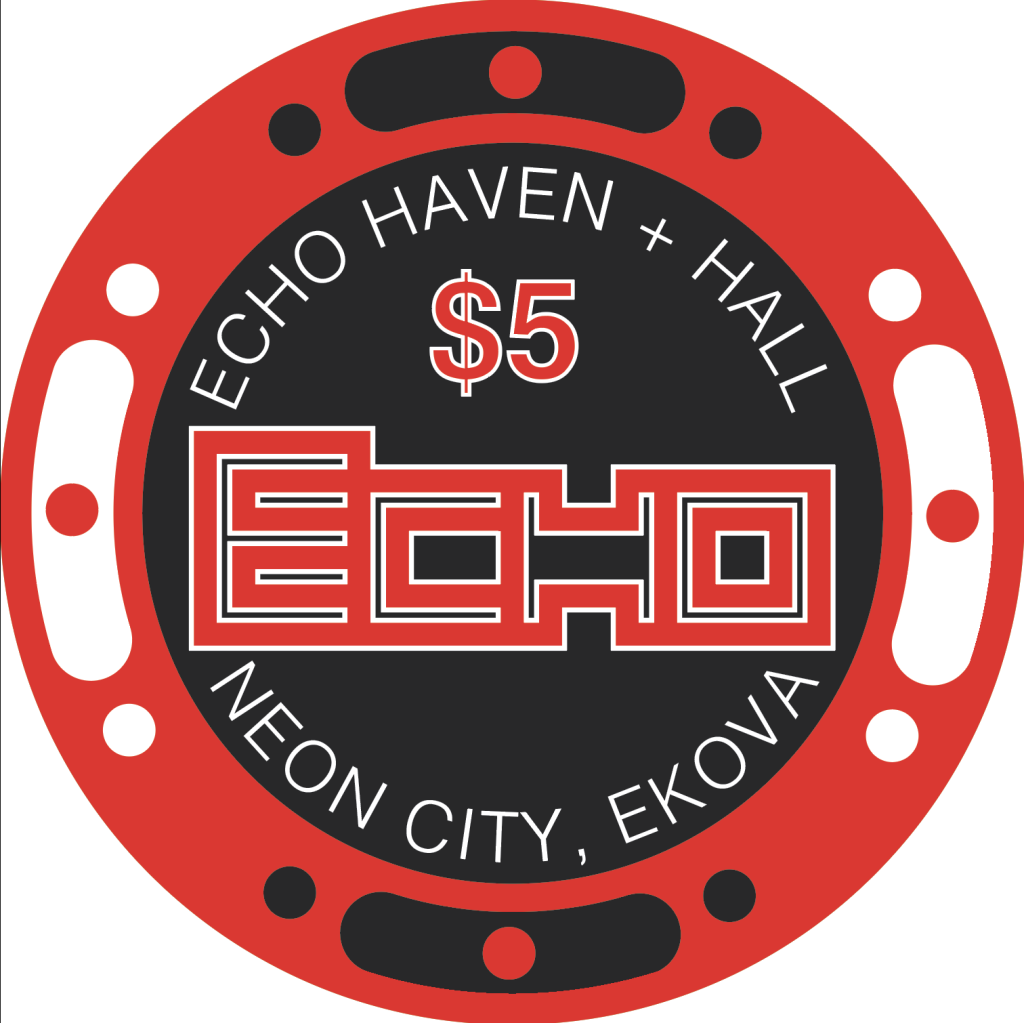
While I don't hate this, there is that negative space in the bottom that I'm sure could be rectified by adjusting the text, though it just doesn't feel right. The white version is cool, though still just doesn't feel quite the way I want it to. I also decided to see if a line-only version worked, though at that point it just ended up feeling like it was an incomplete sketch. I think it doesn't quite fit the vibe on a light background. The black background version I don't hate actually, though without the feather effect making it look like a neon sign, the lines-only design just feels empty to some degree.
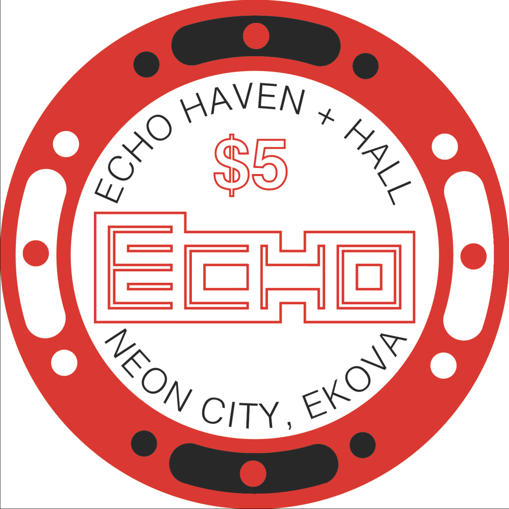
So I decided to throw a curveball at myself and try something completely different - redesigning the logo.
Logo
I know, it changes the face of ECHO from the original design I love so much. But I have an old piece of art I did as I was learning the different features of Illustrator that I remembered, and I decided to try and apply the same style I did with that one. For sake of staying on topic (and copyright concerns), I'm going to refrain from posting that piece, but here's the logo I came up with.

In this case I omitted any spacing between the letters mainly because it clashed weirdly at the intersection of the E and the H, but there's something rather interesting to me about seeing this thing as simply a symbol. Sure, ECHO was used in its design and construction, but hey, I like that it's a breath of fresh air.
I tried to implement this at it's current orientation and found that I do prefer the logo to go across the chip. No matter, the 45˚ rotation simply adds to the 'it's a symbol and not a word'. I thickened it up as well to give it some more body, and let me tell you I am quite excited with how this iteration came out. I did try a version of this with the white inlay, and while I don't hate it, I plan to stick with the dark inlay for the time being.
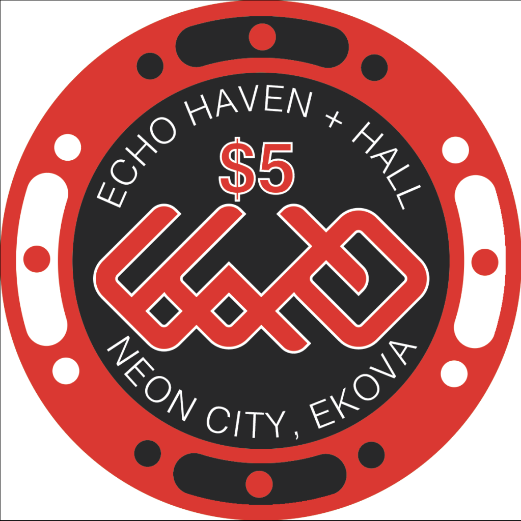
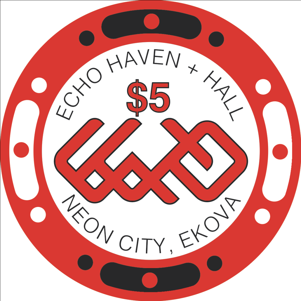
So as of the current moment, I haven't made any final decisions on the state of this set. I really like the look of the potential new ECHO (and am crossing my fingers that it doesn't mimick some sort of harmful symbolism that I am unaware of), but also the classic logo is the tribute to the original base.
Cent Chip
During my last visit to Las Vegas, me and some buddies made a visit to CasinoQuest which is a cool spot where you can learn casino games. Since we all wanted to learn craps but didn't know how to play, we took an hour lesson and found it to be insanely fun. However, in craps, 6 is a common bet multiple (at least from playing a lot of place bets), and since I want this to be my home set for someday when I have a proper man cave/play space, I want to be able to play quantum stakes craps.
So even though it's not the most useful chip ever, I made a one cent chip for the set to facilitate quantum stakes games with friends. I wanted to go for a quasi-hot stamped look, where there isn't a proper inlay and the chip stands out in the sense that it is simple. I tried to make it brown but didn't like the color, and ended up on a dark blue. I'm actually quite a fan of the aesthetic and I'm excited to get them into play.

Like I said, it isn't the most necessary chip, but this aims to be my versatile set and I feel the need for a 1¢ chip to satisfy that versatility.
Final Thoughts
This is where I thank you again for following the set's development and also ask for any feedback because I truly am at a crossroads here. I could continue the legacy of the original ECHO haven and hall, or take off in a new direction. To some degree I'm sad that my taste in chips keeps changing, though this has been a very informative design exercise and I'm happy with how far my skills are advancing as a result. I don't anticipate I'll be able to choose without making mockups of each variation, printing them out, and hanging them on my wall for an extended period of time.
Let me know your thoughts, and if you have any additional ideas or wisdom that you'd like to share. Thank you all again for reading!
So I ordered some samples from BRProPoker. They have been absolutely delightful to work with and I am so happy that I'll be using them to order the final design! I love the feel of these ceramics and I think I'll leave the cards mold to a more experimental 'for fun' set.
So here's how the samples look.
On first glance I was incredibly happy at how they turned out. However, I have given it a couple of weeks to stew (and for me to look at some other set designs) and there's been some things I've decided that maybe I don't like so much. Now that I've done an evaluation, I think I can evaluate this with fresh eyes and go back to the drawing board if necessary.
An obvious point is the distance from my 'edge spots' to the edge of the chip, which is a little close for my liking. I've since modified them to give additional clearance so that the inlay is slightly smaller, which I think is totally alright. I'm also just generally a fan of these edge spots, while I still love classic clay-looking spots, I think these are unique and fit the theme of the set.
There is a key design aspect that I'm realizing might prove a disconnect between the way it looks on a computer and the way it actually turns out. I think that the neon aesthetic I was going for with the core logo is just not something that's going to end up turning out good with dye sublimation printing. I'm sure there's some combination of settings I could go with, or some pop-art shading hack that could get it close, but I just know they aren't going to look the way I want them too when all is said and done.
I'm honestly thankful that I didn't jump the gun and order the first design that came to mind (looking back it's wild to see how much the set has progressed). I've also been a fan of chips with bold lines and blocky colors, 'simple' inlays that are also unique in their own right. So I decided to step back and try to make something work.
Trying Something New
I knew that I wanted to try and maintain the original logo since it was the inspiration behind the set. (Using the $5 chip because I enjoy the red color for prototyping). So I tried a blocky version without the faint ECHO in the background. I also tried a white inlay version since I've been liking that as of late. (And I also tried to do just the original lines of the ECHO logo and it felt way too sparse without the added color of the neon sign aesthetic.
While I don't hate this, there is that negative space in the bottom that I'm sure could be rectified by adjusting the text, though it just doesn't feel right. The white version is cool, though still just doesn't feel quite the way I want it to. I also decided to see if a line-only version worked, though at that point it just ended up feeling like it was an incomplete sketch. I think it doesn't quite fit the vibe on a light background. The black background version I don't hate actually, though without the feather effect making it look like a neon sign, the lines-only design just feels empty to some degree.
So I decided to throw a curveball at myself and try something completely different - redesigning the logo.
Logo
I know, it changes the face of ECHO from the original design I love so much. But I have an old piece of art I did as I was learning the different features of Illustrator that I remembered, and I decided to try and apply the same style I did with that one. For sake of staying on topic (and copyright concerns), I'm going to refrain from posting that piece, but here's the logo I came up with.
In this case I omitted any spacing between the letters mainly because it clashed weirdly at the intersection of the E and the H, but there's something rather interesting to me about seeing this thing as simply a symbol. Sure, ECHO was used in its design and construction, but hey, I like that it's a breath of fresh air.
I tried to implement this at it's current orientation and found that I do prefer the logo to go across the chip. No matter, the 45˚ rotation simply adds to the 'it's a symbol and not a word'. I thickened it up as well to give it some more body, and let me tell you I am quite excited with how this iteration came out. I did try a version of this with the white inlay, and while I don't hate it, I plan to stick with the dark inlay for the time being.
So as of the current moment, I haven't made any final decisions on the state of this set. I really like the look of the potential new ECHO (and am crossing my fingers that it doesn't mimick some sort of harmful symbolism that I am unaware of), but also the classic logo is the tribute to the original base.
Cent Chip
During my last visit to Las Vegas, me and some buddies made a visit to CasinoQuest which is a cool spot where you can learn casino games. Since we all wanted to learn craps but didn't know how to play, we took an hour lesson and found it to be insanely fun. However, in craps, 6 is a common bet multiple (at least from playing a lot of place bets), and since I want this to be my home set for someday when I have a proper man cave/play space, I want to be able to play quantum stakes craps.
So even though it's not the most useful chip ever, I made a one cent chip for the set to facilitate quantum stakes games with friends. I wanted to go for a quasi-hot stamped look, where there isn't a proper inlay and the chip stands out in the sense that it is simple. I tried to make it brown but didn't like the color, and ended up on a dark blue. I'm actually quite a fan of the aesthetic and I'm excited to get them into play.
Like I said, it isn't the most necessary chip, but this aims to be my versatile set and I feel the need for a 1¢ chip to satisfy that versatility.
Final Thoughts
This is where I thank you again for following the set's development and also ask for any feedback because I truly am at a crossroads here. I could continue the legacy of the original ECHO haven and hall, or take off in a new direction. To some degree I'm sad that my taste in chips keeps changing, though this has been a very informative design exercise and I'm happy with how far my skills are advancing as a result. I don't anticipate I'll be able to choose without making mockups of each variation, printing them out, and hanging them on my wall for an extended period of time.
Let me know your thoughts, and if you have any additional ideas or wisdom that you'd like to share. Thank you all again for reading!
Your tastes are evolving; this is excellent- especially the part where you didn’t buy a $5K set of custom clay poker chips you don’t like. 
The possibilities are endless, chips are like art, and our tastes evolve. You’ll get there.
PS. You’ve got some interesting thoughts. I’m certain your set will be awesome.
The possibilities are endless, chips are like art, and our tastes evolve. You’ll get there.
PS. You’ve got some interesting thoughts. I’m certain your set will be awesome.
Last edited:
bernielomax
Full House
This set is looks great. You really put a lot of time into this. Congrats.
The $1 and $100 will look almost identical in stacks.
ChipperMarten
Pair
Y'know I didn't believe you at first but I plugged it into the chip simulator and I can see where you're coming from. The brown does appear orange in context to some degree. I can't see a $100 passing in a stack of $1, but that $1 can surely get lost in the fray of a barrel of hundreds.The $1 and $100 will look almost identical in stacks.
I'm cycling through my colors trying to figure out how to make it stand out, it seems like I'm having the best success with changing the brown pips to yellow, though I don't know if I'm particularly fond of it out of personal taste. I also feel like the yellow pops up too frequently in the high denoms to put on the $1 chip.
I also realize the $100 can be changed too. I've seen this color combo on a few $100 chips and I don't hate it? I do miss the Orange/Blue/White combo as it's one of my favorite sets of colors generally.
I feel like the dirty stack issue becomes a lot less of a problem with this configuration though the common white pip does still blend.
I don't know, I feel like this is something I'll have to think about.
bernielomax
Full House
Can you show a picture of the sample stack?
ChipperMarten
Pair
Unfortunately BRProPoker doesn't actually print edges until the full order, so I don't have samples with printed edgesCan you show a picture of the sample stack?
bernielomax
Full House
Do you think the $1's and $100's will be on the table at the same time? I have never had a $100 on the table at a home game (outside of a tourney).
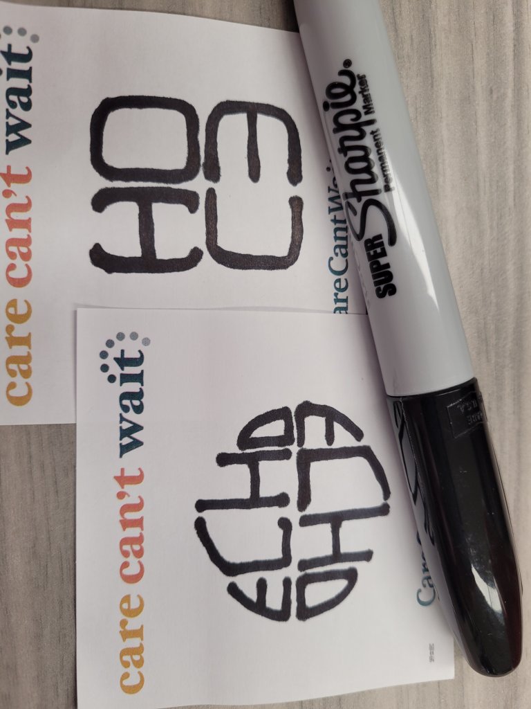
Just pissing around on a lazy lunch hour
ChipperMarten
Pair
Okay but you may be onto something.Just pissing around on a lazy lunch hour
I'm hesitant to go for a 2-sided chip but I want to figure out a way to incorporate this if I can. Tourney set maybe? Glassware? Cut cards?
Also I'm wondering if I should just ditch any edge printing and go for solid edges to try and combat dirty stacks...
Actually not sure. I admittedly don't play a lot of poker so I can't say I have a ton of personal experience. I know in Blackjack it's pretty rare, at least from my experience and the tables I've played.Do you think the $1's and $100's will be on the table at the same time? I have never had a $100 on the table at a home game (outside of a tourney).
Don't ditch the rolling edge, it's one of the design strengths of ceramics.
Why not try using one of the logos and dividing it vertically into 4 sections, with each quarter section printed at compass points on the edge. Then, when you look at a stack from the side, you see a 4 chip tall complete logo (from any side).
Why not try using one of the logos and dividing it vertically into 4 sections, with each quarter section printed at compass points on the edge. Then, when you look at a stack from the side, you see a 4 chip tall complete logo (from any side).
ChipperMarten
Pair
Okay I take back what I said about double-sided chips. I'm taking a solid 180˚ turn from where the set was at in pursuit of this which I think might be even better than the faux-neon was.
@allforcharity you are a genius for the hot-stamp-inspired double-sided ECHO!!
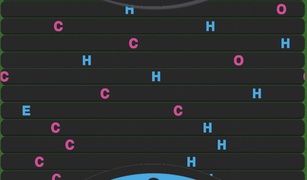
Also I went for the stack-chips-for-logo idea for just a letter for now since I don't know how much tolerance to leave for the edge to roll but I think it looks very very cool so far. (though I couldn't get it to exactly line up in the chip visualizer).
I think for now I'm in 'wait for a couple days and see how you feel' mode. Again, complete 180 but this is looking very, very promising!!
@allforcharity you are a genius for the hot-stamp-inspired double-sided ECHO!!
Also I went for the stack-chips-for-logo idea for just a letter for now since I don't know how much tolerance to leave for the edge to roll but I think it looks very very cool so far. (though I couldn't get it to exactly line up in the chip visualizer).
I think for now I'm in 'wait for a couple days and see how you feel' mode. Again, complete 180 but this is looking very, very promising!!
SeanGecko
4 of a Kind
The double echo is a lovely addition.
I'm glad you like it. It was a flash of inspiration that turned into a doodle.
If you want to indicate chip value on that side, you can put it on the rim in text or shrink the logo a bit and wrap the text around that.
If you want to indicate chip value on that side, you can put it on the rim in text or shrink the logo a bit and wrap the text around that.
ChipperMarten
Pair
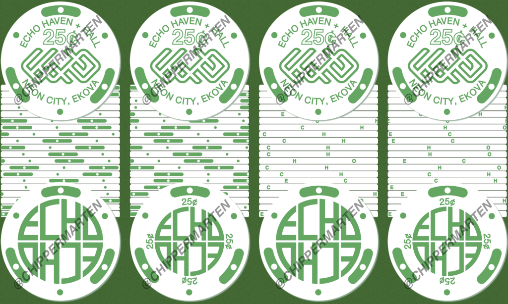
These are all amazing suggestions. I feel like currently, I am in a situation where I have different roads for the edge and back and just have to choose between them.
Right now I am leaning towards design edge / denomination on back (2nd from Left). I like the idea of the chips saying ECHO when stacked, though it kind of makes them feel like coins and I'm worried on how to make a more complex logo line up vertically. Additionally, some of the edge spot designs are based in groups of 3 instead of 4, though maybe I could change something to accommodate that?
Again, I think I'm going to let it sit for a bit longer, then order samples, and maybe by then I will finally have a final 'version' (at least one good enough for now).
SeanGecko
4 of a Kind
Or......These are all amazing suggestions. I feel like currently, I am in a situation where I have different roads for the edge and back and just have to choose between them.
Right now I am leaning towards design edge / denomination on back (2nd from Left). I like the idea of the chips saying ECHO when stacked, though it kind of makes them feel like coins and I'm worried on how to make a more complex logo line up vertically. Additionally, some of the edge spot designs are based in groups of 3 instead of 4, though maybe I could change something to accommodate that?
Again, I think I'm going to let it sit for a bit longer, then order samples, and maybe by then I will finally have a final 'version' (at least one good enough for now).
View attachment 1123477
MOAR CHIPS!!!!!!!!!!!!!!!!!!
ChipperMarten
Pair
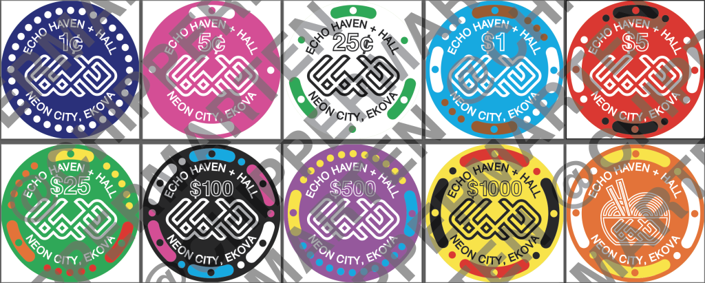
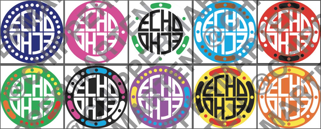
Resurrecting this thread to post updates. Can't believe this has been chilling since April of last year. I have said this many times before but I think this chipset is finally reaching a stopping point.
Samples
I ordered another sample set from BRPro which helped me fine tune colors and line weights and such. Admittedly these arrived in May and I never posted an update on them, but they helped me realize that having the denominations be only outlined was a poor call and maybe some of the colors had to be tweaked like the brown/orange on the $1 chip. I also adjusted the distance from the edge 'spots' to the edge of the chip since it was cutting it a little bit close for my liking still.
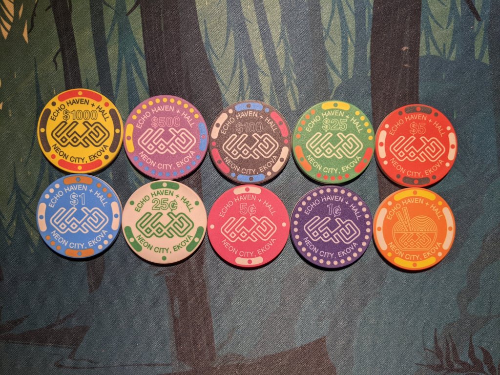
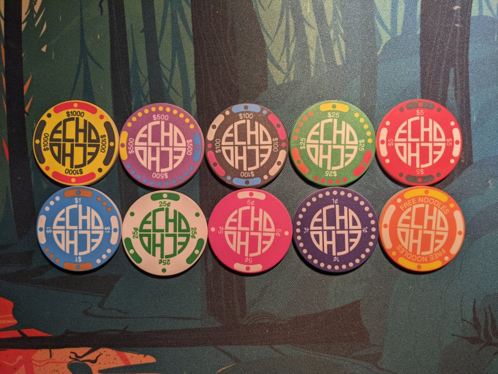
And so I've been making minor tweaks over the last six months, changing a color or lineweight and then letting a render sit in my gallery for a few weeks before going back to change something else. But now I think I've finally settled on a final version, at least the last version I really want to make on this set since it's been sitting in purgatory for so long and there's other chip projects I plan to move onto.
Thanks for everyone who's submitted feedback for the development on this set! I'll keep you posted once they are on their way to me, though it may be just a bit more time while I build up savings a bit over the holidays!
Samples
I ordered another sample set from BRPro which helped me fine tune colors and line weights and such. Admittedly these arrived in May and I never posted an update on them, but they helped me realize that having the denominations be only outlined was a poor call and maybe some of the colors had to be tweaked like the brown/orange on the $1 chip. I also adjusted the distance from the edge 'spots' to the edge of the chip since it was cutting it a little bit close for my liking still.
And so I've been making minor tweaks over the last six months, changing a color or lineweight and then letting a render sit in my gallery for a few weeks before going back to change something else. But now I think I've finally settled on a final version, at least the last version I really want to make on this set since it's been sitting in purgatory for so long and there's other chip projects I plan to move onto.
Thanks for everyone who's submitted feedback for the development on this set! I'll keep you posted once they are on their way to me, though it may be just a bit more time while I build up savings a bit over the holidays!
SeanGecko
4 of a Kind
Dollar should be black.Resurrecting this thread to post updates. Can't believe this has been chilling since April of last year. I have said this many times before but I think this chipset is finally reaching a stopping point.
Samples
I ordered another sample set from BRPro which helped me fine tune colors and line weights and such. Admittedly these arrived in May and I never posted an update on them, but they helped me realize that having the denominations be only outlined was a poor call and maybe some of the colors had to be tweaked like the brown/orange on the $1 chip. I also adjusted the distance from the edge 'spots' to the edge of the chip since it was cutting it a little bit close for my liking still.
View attachment 1242701
View attachment 1242702
And so I've been making minor tweaks over the last six months, changing a color or lineweight and then letting a render sit in my gallery for a few weeks before going back to change something else. But now I think I've finally settled on a final version, at least the last version I really want to make on this set since it's been sitting in purgatory for so long and there's other chip projects I plan to move onto.
Thanks for everyone who's submitted feedback for the development on this set! I'll keep you posted once they are on their way to me, though it may be just a bit more time while I build up savings a bit over the holidays!
Similar threads
- Replies
- 3
- Views
- 195
- Replies
- 8
- Views
- 369
- Replies
- 22
- Views
- 714
- Replies
- 2
- Views
- 394
