eightyWon's CPC mockup feedback thread (1 Viewer)

eightyWon

Straight
Joined
Jul 17, 2021
Messages
829
Reaction score
2,301
Location
Chicagoland
I've committed to the idea of having CPC customs made. Someone here mentioned in another thread and it rung true with me - while CPC seems to be here to stay, you never know what the future holds in terms of retail custom clays. I'd be really sad to miss the chance to have a set made.

Since this is my first time working up custom CPCs I wanted to take advantage of the experience and talent on the forums. I'm hoping to use this thread to solicit feedback from the community at large.

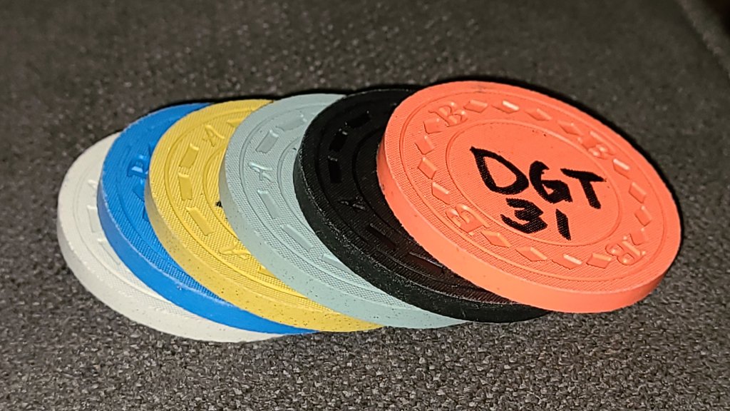
I recently got my CPC color sample set and mocked up the following as my initial attempt at colors and spots. Please ignore the inlay, it's just a placeholder as I'm still working through various themes/ideas and haven't even started working with a designer yet.

wapQd7u.png


Base color stack:

stack.jpg


Thanks in advance to anyone who takes a moment to share feedback throughout this thread ;)
 
Looks pretty good to me! Only thing perhaps try to avoid using same colors on several different chips, maybe dayglo green instead of bright white on the hundo?
 
I really like the $1, day glow Peacock is a great color.
The red on the inlay and the red edge spot work great on the quarter.
 
maybe dayglo green instead of bright white on the hundo?
Funny you mention that color specifically. Dayglo green looks so good in person with tiger and arc yellow, it was one of my original options. Still 100% in the running, the $500 is far from locked in.

Thanks!!
 
I like each of your chips individually, but it feels like you limited your color choices a little too much. I don’t like repeating similar colors on chips next to each other. 3 chips have white, 2 with DG tiger, 2 with a yellow.

Spot variety is great. I’d just try to mix in some other colors and see what you like.

I like the theme you have started. Looks fun.
 
I like each of your chips individually, but it feels like you limited your color choices a little too much. I don’t like repeating similar colors on chips next to each other. 3 chips have white, 2 with DG tiger, 2 with a yellow.

Spot variety is great. I’d just try to mix in some other colors and see what you like.
Yes, this is such a weakness of mine. I have my favorite CPC colors and it's been so hard not to put them on every chip.

--

Some tweaks:

$5 - base changed from Canary to (the forum darling) Butterscotch, red spot changed from Mandarin Red to Retro Red (because I thought it looked better with the new base). Goal here was to cut down slightly on the overall yellow in the set.

$500 - changed Bright White spot to Light Green to cut down on overall white usage. Considered DG Green but thought Light Green looked better in person


1SsUz2M.png


New base stack:

yd4ZVef.jpg
 
Try the light blue on the 100, as well as maybe mandarin red, or if your bold dayglo pink lol. Looking good, remember they your chips at end of day, get what you like and what makes you happy imo.
 
25c and 100 are great... Rest just not my taste.
Thoreau said "Simplify, simplyfy....."
 
Took a mental break from base and spot colors and started messing around with one possible theme. Different color matching options front vs. back:

61OFSkN.png
 
Like the $20 spots better... fits more with the progression
I think using the cent symbol on the frac is more common than $.25 to avoid confusion
I'd try to make the denominations a little bigger if possible

Just my 0.02
 
Hopping back to the original theme, $500 removed (it'll never see the felt and I wanted to simplify the set design some, may work it back in later or do an addon when I design some tournament chips), couple of new options for the hundo. I'm starting to feel pretty decent about the frac-$20, like but don't love the $100 yet:

J0LwkIz.png
I felt so strongly about that cool hundo, I had to make a meme.
61399b264f6e2075360934.gif
 
Last edited:
Hopping back to the original theme, $500 removed (it'll never see the felt and I wanted to simplify the set design some, may work it back in later or do an addon when I design some tournament chips), couple of new options for the hundo. I'm starting to feel pretty decent about the frac-$20, like but don't love the $100 yet:

J0LwkIz.png
have you mocked up a white hundo? different colour for frac? not sure how much play your frac will get but from a cleaning point of view white chips that get used a lot will get dirtier quicker. Also, you seem to have opted for Cali colours for $1-$20, maybe you want to continue that for the rest of the set? For contrast with the grey, I would go purple over black. for a frac maybe red with white spots?
 
Good point about the white frac.

I have two groups, one will use the quarter as the typical ante so it'll get quite a bit of play (along with the 1 and 5)

In one of my original lineups before starting this thread I had a DG Pink frac and I really like it, especially in a splashed pot next to the DG Peacock 1. I'll toy with that and reconsider the hundo (the bright white above is sharp)
 
Last edited:
More tinkering. Reemergence of the 3trim hundo. Struggling to pick colors for the $20 and $100. Don't hate them, though.

yzBl3QY.png
 
Whatever you decide i suggest keeping the $1 as is. I used those exact colors on my new s crowns and they came out awesome. For this set i think having similar or same colors on adjacent chips is inviting dirty stacks imo. Maybe make the $20 base the lavender, with dayglo green spot and dayglo pink. This looks like a cali set, so hundo can be white. Just take your time, its a lot of money. I now have 2 custom CPC sets, and i love them both, but there coulda been a few refinements if i didnt rush em.
 
For this set i think having similar or same colors on adjacent chips is inviting dirty stacks imo.

Which ones in particular worry you? I thought they looked pretty safe but all I'm really going by is my color sample set and the mockups.
 
They should be ok if this is the lineup you like. Just note you have bright white 20, then bright white on hundo tri moon. Not sure what stakes you looking to play but if you get a lot of high denoms out there could cause some issues. Remember on your phone or computer monitor they look a lot brighter than they will in real life, in a potentially dimmer than normal room, with smoke mayhaps? Just something to consider.
 
Did a quick stack and splashed pot mockup and I think it's helping me realize I could indeed use some more contrast/color variation. Not terrible, but still room for work obviously:

viVeTYT.png


Thanks everyone for the advice so far! Enjoying the process.
 
Anyone with CPC customs experience have comments on how a textured inlay background like this would play? I know the process used to set the inlay creates a slight texture, just wondering how these would interact (this began as an experiment in giving the inlay an aged look):

100L.png
 
Last edited:
Anyone with CPC customs experience have comments on how a textured inlay background like this would play? I know the process used to set the inlay creates a slight texture, just wondering how these would interact (this began as an experiment in giving the inlay an aged look):

View attachment 779938
I’m hoping well- I have a little something in mine order. Don’t forget that David’s printing 7/8” at 300dpi. Take a look at that perspective and see if you like it.
 

Create an account or login to comment

You must be a member in order to leave a comment

Create account

Create an account and join our community. It's easy!

Log in

Already have an account? Log in here.

Back
Top Bottom