You are using an out of date browser. It may not display this or other websites correctly.
You should upgrade or use an alternative browser.
You should upgrade or use an alternative browser.
My second attempt. What do you guys think? (1 Viewer)
- Thread starter Natuie
- Start date
DrunkleWade
Two Pair
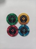
Bear in mind we all don't live in North America mate. Not everything has to be NV or CA colour ways (yeah I used a u in colorI cannot in good conscience be involved in a serious design project using that combination of colors and denominations.
 )
)Agreed, this set needs some work but if it doesn't meet a "traditional" American chip set I don't think it's going to matter what the colours are....unless Natuie's mates are used to NV sets of course.

All the fonts need to be bigger or bolded or something. They look too hard to read. Are they legible at arm's length? Personally I don't like the fonts you chose.
The different colour symbols don't stand out enough either.
The blue and green chips look like they'll cause dirty stack issues.
Other than on the yellow chip, the darker clover colours don't have enough contrast with the black background. It makes the clover look unbalanced.
What's the lighting like in your poker room? If it's soft I think a lot more contrast for the label colours is needed.
DrunkleWade
Two Pair
@Natuie Mate, I'm not sold on the font; it's a little typewriter-ish for me and not bold enough. But, if it's simplicity you're after then it works. I kinda dig the monochrome colours. I've seen it done before on here. I think the edgespots are different enough to be interesting but in a stack might present a little mundane.
I was thinking along the same lines as far as colours in that I want a Yellow 10c / Purple 50c / Green $2 / Orange $10 so same same.
I was thinking along the same lines as far as colours in that I want a Yellow 10c / Purple 50c / Green $2 / Orange $10 so same same.
DrunkleWade
Two Pair
What about this? These colours...

Then shift the dark colour two down the line to keep the theme but add some interest?

Then shift the dark colour two down the line to keep the theme but add some interest?
I had I weird idea lmk what you think. What if I made the lower denoms (10c and 50c) lighter chips and higher ones darker, kind of like now. Then what if I adjusted the background colour to light for darker chips and dark for lighter chips? I think it'd either look really good or disgustingWhat about this? These colours...
View attachment 1403878
Then shift the dark colour two down the line to keep the theme but add some interest?
View attachment 1403885
Also I don't love those colours you picked but I really like the idea. Maybe I try turn it into kind of 2 sets in 1 somehow by relating the 10c, 50c and $2, $10?
What do u think
ontheriver51
Pair
Is there a specific game you play that these denominations are particularly good for?
10/10, 10/20, 20/50. We dont play high stakes usually $10, $20 or $25 buy inIs there a specific game you play that these denominations are particularly good for?
AlbinoDragon
Flush
I think the problem most of the users are having with the denominations here are they aren't nickel/quarter/dollar etc., but the bulk of the folks commenting they hate the denoms are based in North America and the US where those are standard units of currency.Is there a specific game you play that these denominations are particularly good for?
The OP is clearly in Australia and the dime/half/two/ten breakdown is clearly better because of the currency they use. I'm OK with it, despite being used to what we have here in the States. Use the breakdown that works with your native currency and f*#& the comments otherwise.
On the design front, the typeface you picked is terribly plain. @DrunkleWade said, it does look like it's straight from a typewriter. Try someplace like https://www.dafont.com/ or https://www.1001fonts.com/ for free fonts to download and use. Something as simple as a different typeface can change a rather simple design into something that has some pop.
I don't mind the black background, I've used it myself twice, but it can dominate a chip quite easily, especially if the chip itself is rather dark. I'm not sure what to suggest at this moment and without a bit more thought, but overall the design seems rather plain and easily forgettable. Lots of folks here love the super bright and saturated colors, and you don't have to go there, but an inlay that pops and stands out more than what you have so far is an important first step.
The clover logo is a start, but it's a small component to the design with rather plain text making up the other 2/3. There's just something I can't quite pin down that's missing other than what you have here is just kind of plain.
Hope this helps, though there's nothing constructive here to help aim you that way and for that I'm sorry.
THANK YOU for the denomination point.I think the problem most of the users are having with the denominations here are they aren't nickel/quarter/dollar etc., but the bulk of the folks commenting they hate the denoms are based in North America and the US where those are standard units of currency.
The OP is clearly in Australia and the dime/half/two/ten breakdown is clearly better because of the currency they use. I'm OK with it, despite being used to what we have here in the States. Use the breakdown that works with your native currency and f*#& the comments otherwise.
On the design front, the typeface you picked is terribly plain. @DrunkleWade said, it does look like it's straight from a typewriter. Try someplace like https://www.dafont.com/ or https://www.1001fonts.com/ for free fonts to download and use. Something as simple as a different typeface can change a rather simple design into something that has some pop.
I don't mind the black background, I've used it myself twice, but it can dominate a chip quite easily, especially if the chip itself is rather dark. I'm not sure what to suggest at this moment and without a bit more thought, but overall the design seems rather plain and easily forgettable. Lots of folks here love the super bright and saturated colors, and you don't have to go there, but an inlay that pops and stands out more than what you have so far is an important first step.
The clover logo is a start, but it's a small component to the design with rather plain text making up the other 2/3. There's just something I can't quite pin down that's missing other than what you have here is just kind of plain.
Hope this helps, though there's nothing constructive here to help aim you that way and for that I'm sorry.
I know the designs a bit plain but I'll work on it and get it eventually. Also I agree with you and @DrunkleWade that the font is a problem and needs to be changed.
I'm just very unsure what to do with the colours because I like the simple colours but also hate it. Thanks for the help anyway
DrunkleWade
Two Pair
What about this one, Komika Title? It’s simple, bold, loungey and free!

Yea thats really nice thanks mate. I'll give it a go and I'll keep looking as well.
First of all, coming from the other side of the world. Pick denominations that work for your game, if you stick with 4-5x between chips you are good. As long as there is no standard color for each denomination already, pick colors you like. I live in a country where there is no standard on colors. Sure grey/white/black is often used for 100 and pink is usually 5k. I would get some heat if I used a pink 100kr chip in my set. But these things are yours to play with and we can have our opinions but they don't overrule yours in any way.
So pick the denoms you know will work based on your game. Pick the colors you like as long you are not confusing the hell out of your players.
When it comes to design, hues of colors, edge spots, inlay, fonts and so on. Listen to the experience here. If the chips are hard to read or dirty stacks are a problem a great set becomes a bad one really fast. You have 4 chips in this set, you should be able to make them very different in colors and hue without problem. A wise man one said - Inlay ties the chips together, colors and spots are to set them apart!
ontheriver51
Pair
I wasn’t trying to hate on the denoms. It’s clear that he is using them and doesn’t care that some people don’t like it. I was just curious because I’ve never seen denoms like that and figured there was a good reason behind itI think the problem most of the users are having with the denominations here are they aren't nickel/quarter/dollar etc., but the bulk of the folks commenting they hate the denoms are based in North America and the US where those are standard units of currency.
The OP is clearly in Australia and the dime/half/two/ten breakdown is clearly better because of the currency they use. I'm OK with it, despite being used to what we have here in the States. Use the breakdown that works with your native currency and f*#& the comments otherwise.
On the design front, the typeface you picked is terribly plain. @DrunkleWade said, it does look like it's straight from a typewriter. Try someplace like https://www.dafont.com/ or https://www.1001fonts.com/ for free fonts to download and use. Something as simple as a different typeface can change a rather simple design into something that has some pop.
I don't mind the black background, I've used it myself twice, but it can dominate a chip quite easily, especially if the chip itself is rather dark. I'm not sure what to suggest at this moment and without a bit more thought, but overall the design seems rather plain and easily forgettable. Lots of folks here love the super bright and saturated colors, and you don't have to go there, but an inlay that pops and stands out more than what you have so far is an important first step.
The clover logo is a start, but it's a small component to the design with rather plain text making up the other 2/3. There's just something I can't quite pin down that's missing other than what you have here is just kind of plain.
Hope this helps, though there's nothing constructive here to help aim you that way and for that I'm sorry.
Similar threads
- Replies
- 12
- Views
- 468
- Replies
- 9
- Views
- 2K
- Replies
- 13
- Views
- 596