CallingStation614
Two Pair
Ahoy PCF,
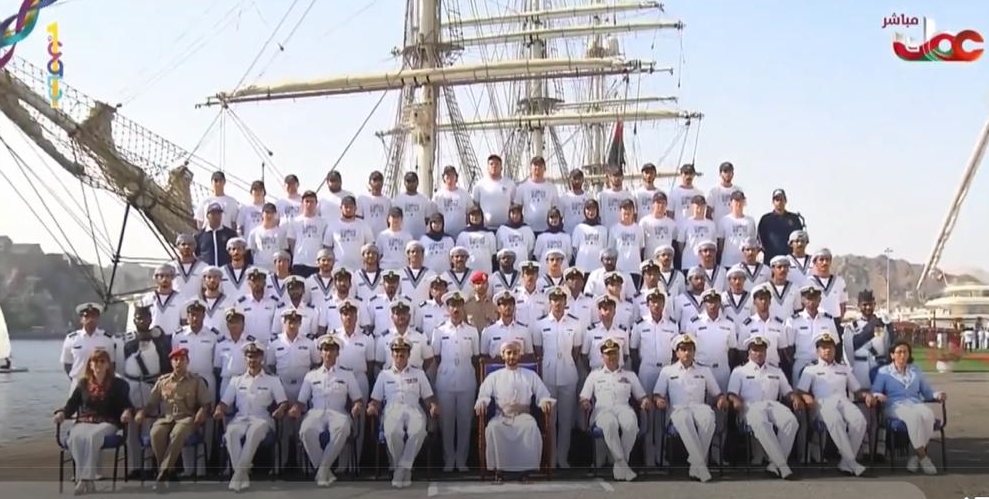
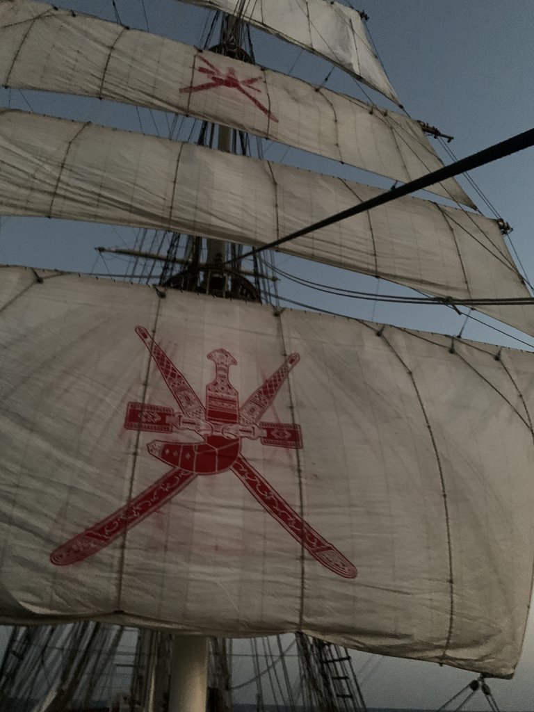
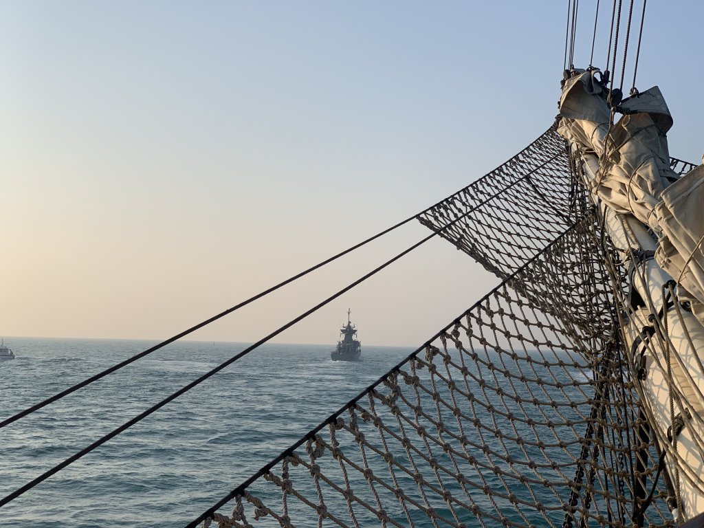
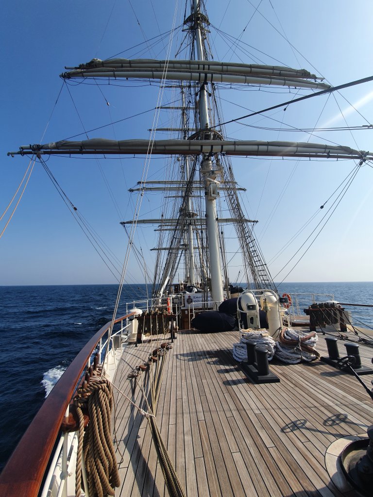
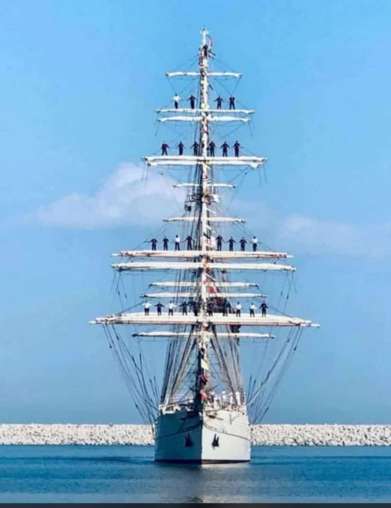
I've had a lot of time to spare on the weekend and I dug up some photos. I stumbled upon pictures of my sailing trip on the Sailing Training Ship of the Royal Navy of Oman (Shabab Oman II for those interested), and it gave me the inspiration to start another set of chips. I love sailing and everything related to it, my dad was a sailor and he brought me with him onto different ships when I was still a child, so I have a special connection to this theme and I want to make it a reality.
After some thought the name "The Ocean Club" stuck with me and I think I'll go with that one. Other varations were "Oceans Club" and "Oceans Cardroom". I like The Ocean Club most, it's a fictional Club for everyone that is in love with the sea and playing poker.
For the theme I had some broad imagination: T25-set, no flashy colors, nautical theme, darker colors & simple/elegant chips, white inlay, Rebuy-, Bounty-, Seat-Chip
I recently read a thread discussing denoms on only one side/both sides, and I wanted to explore different options. So I designed a main front side and 2 alternative back sides in case I'd decide against using the front side front&back.
I mocked up my first idea and would love to have some feedback on the design and theme.
General Logo (I plan on doing a big wall-piece in the future):

Fonts:

Front Inlay:

Alt. Back 1 & 2: (I would lie, if I'd say the first one isn't inspired by the Rounders design...)


Rebuy, Bounty, Seat:
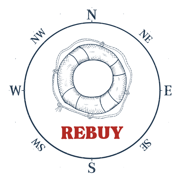

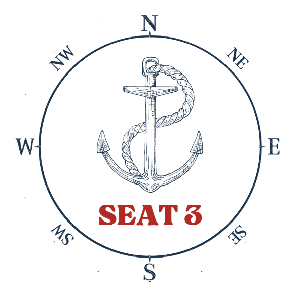
And here the chip set:
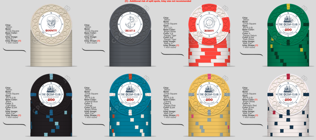
Front/Back comparison:

I am still tweaking a lot of things as this post goes online, but I am very thankful for any comments and feedback on the work. I am not happy with the yellow chip, maybe it's just that yellow in the CPC design tool which I don't like.
I will probably not be able to afford real clay chips, which is why I am currently looking into a ceramic hybrid, maybe the web mold, the structure is similar to a rope after all. I think this offers the benefit of being able to print the inlay with a very high resolution, since it does have a lot of fine lines.
For now, I'll go and grab a glass of whisky and wait for some responses.
Cheers,
Daniel
P.S.: some pics from sailing
I've had a lot of time to spare on the weekend and I dug up some photos. I stumbled upon pictures of my sailing trip on the Sailing Training Ship of the Royal Navy of Oman (Shabab Oman II for those interested), and it gave me the inspiration to start another set of chips. I love sailing and everything related to it, my dad was a sailor and he brought me with him onto different ships when I was still a child, so I have a special connection to this theme and I want to make it a reality.
After some thought the name "The Ocean Club" stuck with me and I think I'll go with that one. Other varations were "Oceans Club" and "Oceans Cardroom". I like The Ocean Club most, it's a fictional Club for everyone that is in love with the sea and playing poker.
For the theme I had some broad imagination: T25-set, no flashy colors, nautical theme, darker colors & simple/elegant chips, white inlay, Rebuy-, Bounty-, Seat-Chip
I recently read a thread discussing denoms on only one side/both sides, and I wanted to explore different options. So I designed a main front side and 2 alternative back sides in case I'd decide against using the front side front&back.
I mocked up my first idea and would love to have some feedback on the design and theme.
General Logo (I plan on doing a big wall-piece in the future):
Fonts:
Front Inlay:
Alt. Back 1 & 2: (I would lie, if I'd say the first one isn't inspired by the Rounders design...)
Rebuy, Bounty, Seat:
And here the chip set:
Front/Back comparison:
I am still tweaking a lot of things as this post goes online, but I am very thankful for any comments and feedback on the work. I am not happy with the yellow chip, maybe it's just that yellow in the CPC design tool which I don't like.
I will probably not be able to afford real clay chips, which is why I am currently looking into a ceramic hybrid, maybe the web mold, the structure is similar to a rope after all. I think this offers the benefit of being able to print the inlay with a very high resolution, since it does have a lot of fine lines.
For now, I'll go and grab a glass of whisky and wait for some responses.
Cheers,
Daniel
P.S.: some pics from sailing

