HypothesisNo8
Waiting List
Hi everyone! I just joined up after lurking for a while and admiring the amazing designs by forum members). At this rate I don't think I'll be able to resist jumping into a CPC set at some point, but I'd like to tap into some of the collective wisdom of the community before jumping in head first.
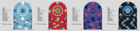
I'd like to use the set to run small cash games, but just as importantly I'd be using them as game currency for board games and the like. The existing options for this (e.g. Apache Bank chips) haven't scratched the itch, so I wanted to design a set that wouldn't look out of place in the board game context, which meant a pretty pared down design for the inlay.
Cash games would be 1/2, would these denominations (1/5/20/100) be serviceable? I was playing around with adding a fifth (50? 10?), but I'd like to keep the set as compact as possible for portability. Haven't thought much about the chip breakdown for the set yet, so would appreciate suggestions.
All feedback is welcome! I slapped the inlay together pretty quickly, but any feedback there is especially appreciated.
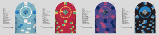

 )
)
") . I think I'd mostly be using them for Netrunner, until a euro or 13XX works its way into my rotation. What about you? Any designs in mind for our use-case?
. I think I'd mostly be using them for Netrunner, until a euro or 13XX works its way into my rotation. What about you? Any designs in mind for our use-case? ")