You are using an out of date browser. It may not display this or other websites correctly.
You should upgrade or use an alternative browser.
You should upgrade or use an alternative browser.
Felt Design Feedback (1 Viewer)
- Thread starter CraigT78
- Start date
Snapplefacts
Pair
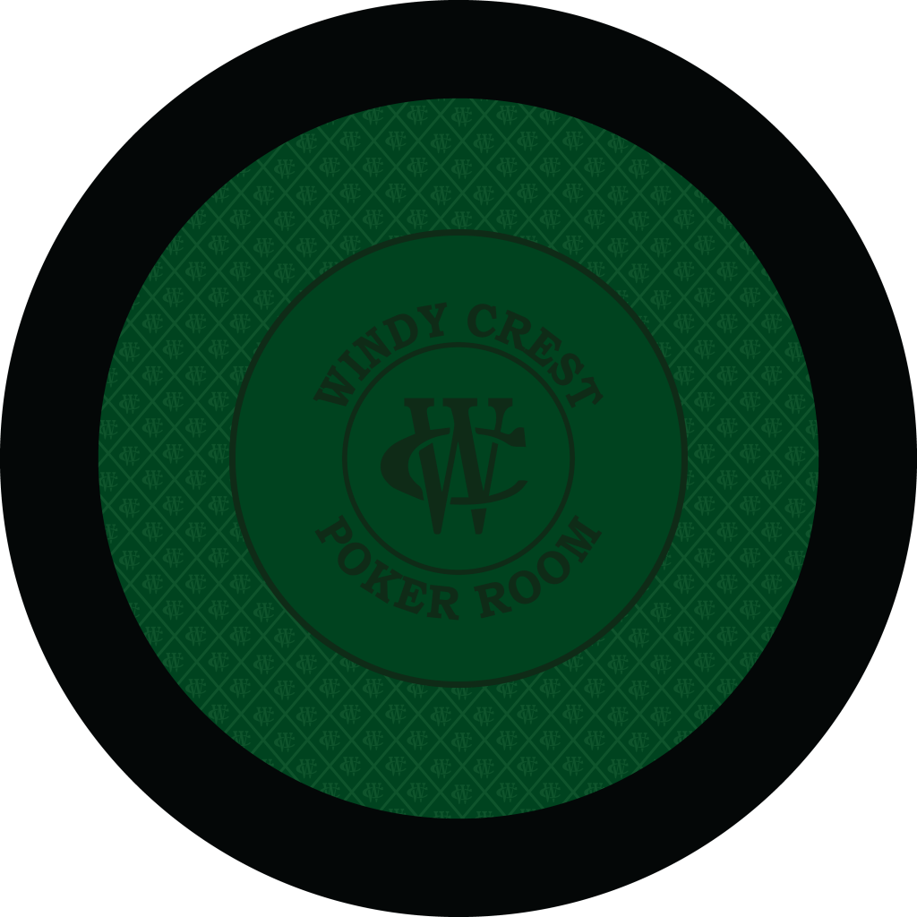
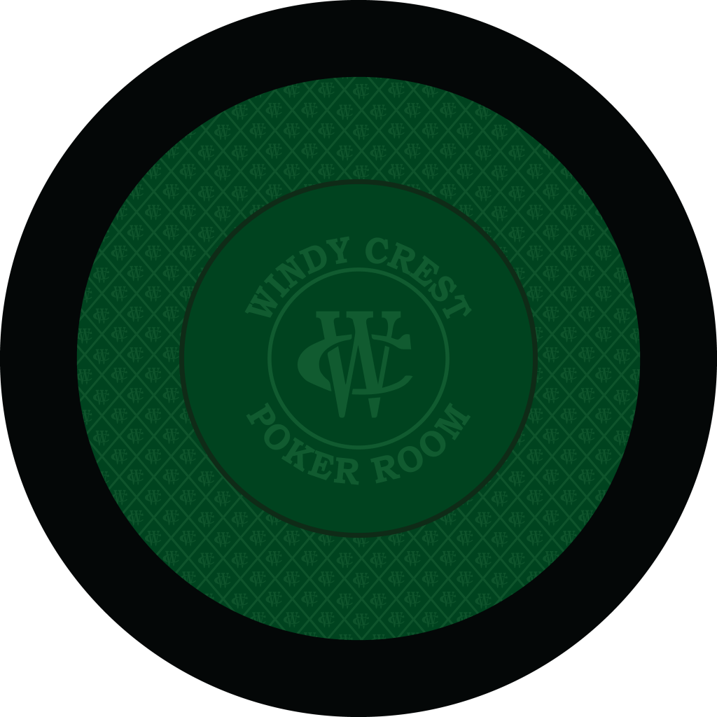
I love the WC logo where the suits would usually be in the speed cloth.
Where does one go to get custom cloth like this? I recently re-felted my dad’s old stud table and I wanted to put his monogram on it but couldn’t figure out how to go about it
Where does one go to get custom cloth like this? I recently re-felted my dad’s old stud table and I wanted to put his monogram on it but couldn’t figure out how to go about it
I was thinking changing the text to a lighter color for a subtle pop.I think they perfect... No changes needed
@T_Chan is your man.I love the WC logo where the suits would usually be in the speed cloth.
Where does one go to get custom cloth like this? I recently re-felted my dad’s old stud table and I wanted to put his monogram on it but couldn’t figure out how to go about it
bsdunbar1
4 of a Kind
This must mean two new tables as well

very nice, how about using the second tone as the grid outlines
might work or might make it look to much like a checker board
might work or might make it look to much like a checker board
Agree with @surfik, both of those look great as is. Would be curious to see how they are with a lighter colour text/betting line, just for comparison.I was thinking changing the text to a lighter color for a subtle pop.
bsdunbar1
4 of a Kind
First thought is too much of the same colors for me. Not enough contrast
bsdunbar1
4 of a Kind
I love the WC logo where the suits would usually be in the speed cloth.
This is a Lock
Yes. 56" round.
Better?


I switch my vote to light text!
krafticus
Straight Flush
Is this like Brazilian bbq places? Green table to keep playing, flip it to red when you’re tapped out?? 
I prefer felt colors that aren’t the color of the chips that get used the most.
i'm nobody
Flush
I agree. Light text looks much nicer. Great design.I switch my vote to light text!
I struggled with this when designing my own table. In the end I went with the colour I wanted anyways (blue) after mocking up photos with my various blue chips and seeing @WhiteMamba1646 ’s blue table.I prefer felt colors that aren’t the color of the chips that get used the most.
In the end, while a valid point to consider, I think you have to go with what you like the best.
I have a blue and grey table already. What colors would you suggest?I prefer felt colors that aren’t the color of the chips that get used the most.
100% a lock. This will not be changed.This is a Lock
bsdunbar1
4 of a Kind
100% a lock. This will not be changed.
You should throw in like 8-10 random beer mugs in the mix just for fun.
WhiteMamba1646
4 of a Kind
love your design Craig. your tables were the inspiration on why I chose to do HC on my table on the outside of my betting line. Maybe a purple design? its unique but think it would look awesome.
Another consideration should be rail width, player's area width and betting area diameter.
I 'd push the rail and the betting area to be as small as tolerable (or as big as absolutely necessary, however you see it), in favor of the player's or "racetrack" area.
Color-wise I 'd go with as dark hues as possible, to reflect as little strong lighting from above as possible.
Only you have your chips in hand, so make sure there is contrast between at least workhorse chips and the felt.
I do like purple.love your design Craig. your tables were the inspiration on why I chose to do HC on my table on the outside of my betting line. Maybe a purple design? its unique but think it would look awesome.
This is my online design.
Maybe this one instead of the red one.
I’m working on a similar round design with artifacts inside of a grid pattern outside the betting line. One issue I’m considering is the orientation of the artifacts inside the grids. Right now they are all facing one direction. For players at the top of the table will be upside down. Do you care about that? I’m trying to solve it by using artifacts that work any direction.
FWIW - YMMV 
51in, 7-player round

51in, 7-player round
Since you asked, Craig:
I love the design and they look great the way they do. However, when I look at the two concentric circles, I believe the "Windy Crest Poker Room" might look better being equidistant in between them. That could be accomplished by several ways: maintaining the size of the larger circle and augmenting the rest (Name, smaller circle and logo), making the larger circle a little smaller, or even keeping the circles the same and increasing the font size of the name. That decision will depend on how large you want the racetrack/betting area ratio to be I guess.
Again, just nitpicking as the felts already look great.
Hope I can one day play live on those, man!
Edit: another alternative might be to add a third circle closer to the top of the name with the same width of the smaller circle and making the smaller circles/name/logo a bit smaller. Just spitballing...
Last edited:
TeamNapoli
Straight
looks great as is but some interesting suggestions listed above
I do not care about that. The center logo only faces one way - and it does not bother me.I’m working on a similar round design with artifacts inside of a grid pattern outside the betting line. One issue I’m considering is the orientation of the artifacts inside the grids. Right now they are all facing one direction. For players at the top of the table will be upside down. Do you care about that? I’m trying to solve it by using artifacts that work any direction.
I'll have to think this through. I want to maintain the existing bet line distance, as it's one rack plus a few inches. Thanks for the feedback and your opportunity to play on these is in August...........Since you asked, Craig:
I love the design and they look great the way they do. However, when I look at the two concentric circles, I believe the "Windy Crest Poker Room" might look better being equidistant in between them. That could be accomplished by several ways: maintaining the size of the larger circle and augmenting the rest (Name, smaller circle and logo), making the larger circle a little smaller, or even keeping the circles the same and increasing the font size of the name. That decision will depend on how large you want the racetrack/betting area ratio to be I guess.
Again, just nitpicking as the felts already look great.
Hope I can one day play live on those, man!
Edit: another alternative might be to add a third circle closer to the top of the name with the same width of the smaller circle and making the smaller circles/name/logo a bit smaller. Just spitballing...
I'll have to think this through. I want to maintain the existing bet line distance, as it's one rack plus a few inches. Thanks for the feedback and your opportunity to play on these is in August...........
I would want to do the same and it seems you already have the betting line placed perfectly. As I said, they already look great and the issue I brough up was the only thing that cough my eye. The two circles, the name and the logo might look like they are just one design and not one design inside or a betting line.
I wish I could make it in August, man... It's a bummer... Hopefully one day, my friend...
Similar threads
- Replies
- 27
- Views
- 646
- Replies
- 4
- Views
- 192
- Replies
- 8
- Views
- 430
