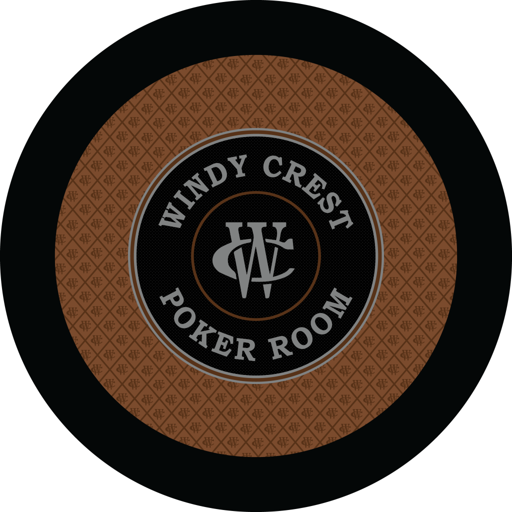
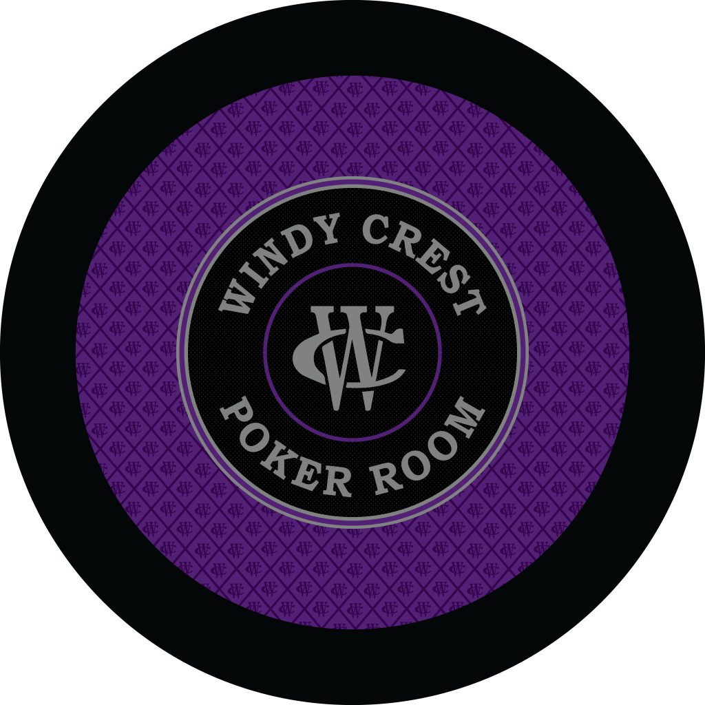
I see what you are saying. We took the center logo from my tournament set - and that's why the text is not centered between. I'll have to see what it looks like doing so.I would want to do the same and it seems you already have the betting line placed perfectly. As I said, they already look great and the issue I brough up was the only thing that cough my eye. The two circles, the name and the logo might look like they are just one design and not one design inside or a betting line.
I wish I could make it in August, man... It's a bummer... Hopefully one day, my friend...
You are using an out of date browser. It may not display this or other websites correctly.
You should upgrade or use an alternative browser.
You should upgrade or use an alternative browser.
Felt Design Feedback (2 Viewers)
- Thread starter CraigT78
- Start date
TheDuke
Full House
I think they look great.
Perhaps making the inner circle (and logo) a little larger. Thereby moving the wording of Windy Crest a bit closer to the betting line. Not alot - just enough to reduce the empty space that exists by about half. Or making the text of Windy Crest bigger to as to minimize that space.
If that makes any sense? I think that's my long winded way of saying I think there's too much space from the betting line to the stuff in the middle.
I have a blue and grey table already. What colors would you suggest?
View attachment 668246View attachment 668247
Grey/silver, platinum, copper, tan. Pretty much anything but red & green lol.
Love em. I’d try out a contrasting betting line and ship it
Copper is not a bad idea.Grey/silver, platinum, copper, tan. Pretty much anything but red & green lol.
Very dark "forrest" green should be OK with most green chips.Grey/silver, platinum, copper, tan. Pretty much anything but red & green lol.
Is this like Brazilian bbq places? Green table to keep playing, flip it to red when you’re tapped out??
I went to a Brazilian “lunch box” and left hungry and more aerodynamic
WhiteMamba1646
4 of a Kind
Darker gray in this case, please
I'm not sure I'm keeping the red. I may try a copper as @Rhodeman77 suggested, or perhaps another shade of blue.Darker gray in this case, please
bsdunbar1
4 of a Kind
That Purple 

bsdunbar1
4 of a Kind
The black powder coated cup holders in your rail blend right in 
I like the purple design as well.
No rail cup holders. I'm a slide in kind of guy.The black powder coated cup holders in your rail blend right in
No rail cup holders. I'm a slide in kind of guy.
that’s what she said!
Don't be sad @bsdunbar1 it allows you pick what side to put your beer on!! Some of us use TWO cup holdersNo rail cup holders. I'm a slide in kind of guy.
I like the original green felt in the OP. But must say, I never expected you to go for a round table, is there a story involved or just trying something different?
Round tables are great for 8 players or less that self deal. Much easier to deal, especially 4+ card games.
Cash games. Circus. Really took off with my group. So I want these for cash only nights.I like the original green felt in the OP. But must say, I never expected you to go for a round table, is there a story involved or just trying something different?
I had the very same thoughts.First thought is too much of the same colors for me. Not enough contrast
We always use round tables for self-dealt games. However, I prefer 60".Round tables are great for 8 players or less that self deal. Much easier to deal, especially 4+ card games.
If given the choice, I 'd prefer 59" (150cm)We always use round tables for self-dealt games. However, I prefer 60".
RadicusScout
Flush
I know I like this!I think I like this!
View attachment 669568
SixSpeedFury
Full House
Winner!I think I like this!
View attachment 669568
Playing around a little more


stonker
Two Pair
I really like the purple one
Similar threads
- Replies
- 27
- Views
- 1K
- Replies
- 4
- Views
- 262
- Replies
- 8
- Views
- 629
