bummer on not being able to do aligned edges, so based on this and the fact a black $25 already exist I went back to designing.
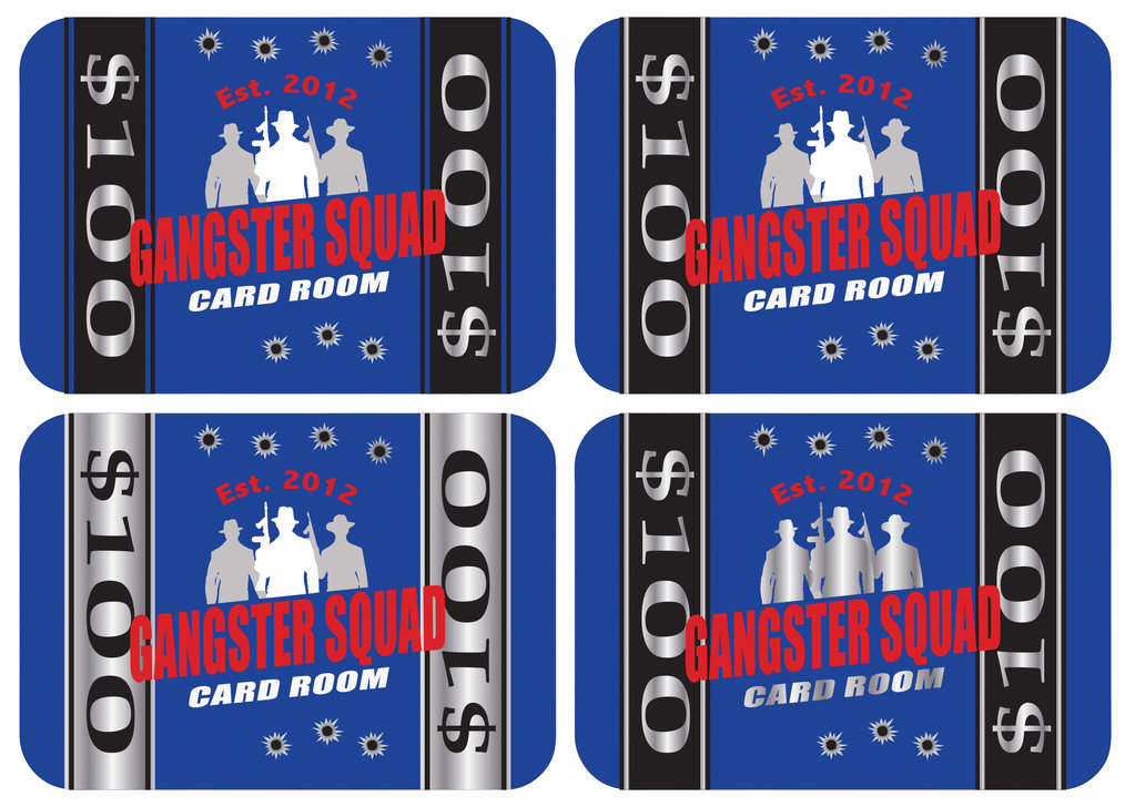
First group I changed from black to blue background and played around a little bit with different options.

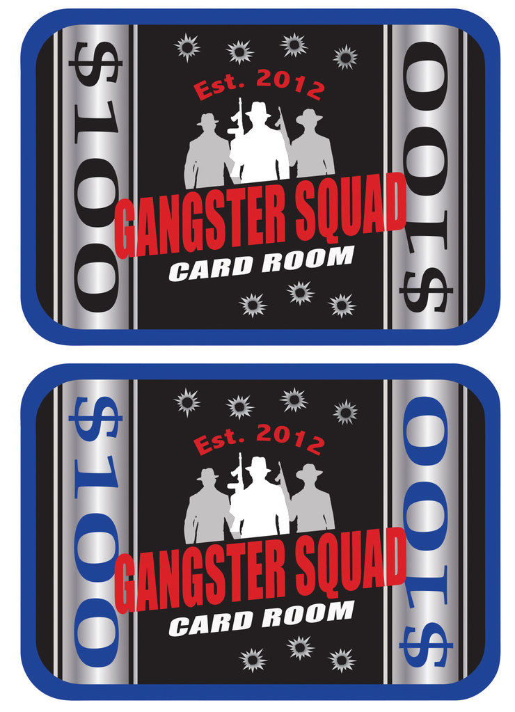
Keeping with the black inlay theme from the chips, kept the center black and outside edge is blue, 2nd one I changed the denomination to be color matched like his chips (FYI I think this one is my favorite)

First group I changed from black to blue background and played around a little bit with different options.
Keeping with the black inlay theme from the chips, kept the center black and outside edge is blue, 2nd one I changed the denomination to be color matched like his chips (FYI I think this one is my favorite)
