Nex
Flush
I will be re-evaluating the possibility of using that scrapped edge spot design for seating chips. The mockups I've made just look too good.
My OCD still gets triggered at the thought of taking factory-dusty chips and cutting their inlays out only to replace them with stickers, but having seen some higher resolution/closeup photos in @Gear's testimonial thread, I'll at least check out his samples in person. I'll sure receive a bunch of reject chips among my order again so I'll have some material to test with.
If it does at all, this will happen sometime next year alongside a possible set expansion to cover three tables. I was just bored and played a bit with Adobe Illustrator and the mockup tool.
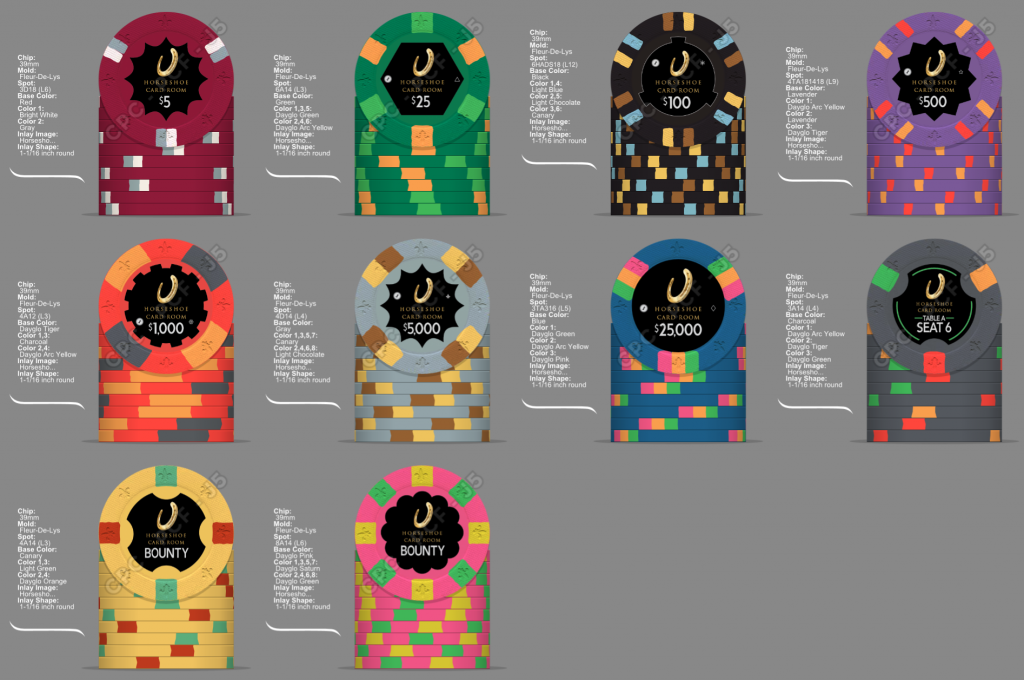
Base and two highlight styles:

Full highlight:


Subtle highlight:


Full highlight in full set mockup:

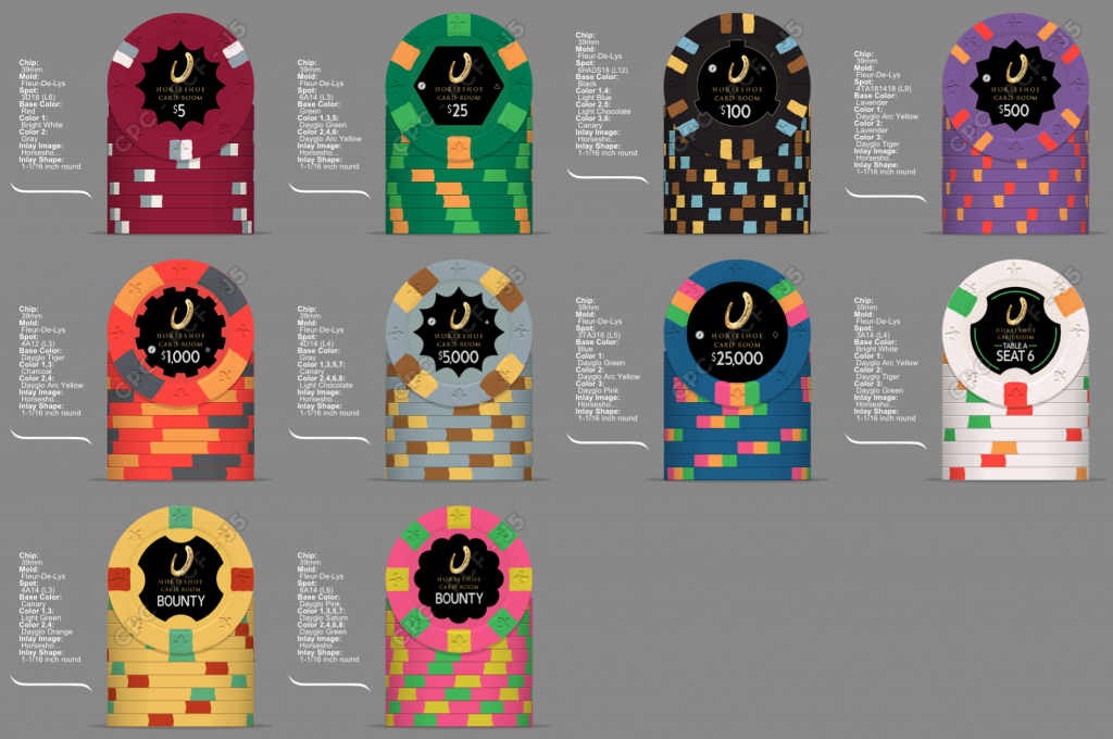
And with white base:

Leaning strongly towards full highlight and charcoal base.
Don't think the two thin lines to the left and right of the table label alone will cut it. Must be easy to identify at a quick glance which table a particular seating chip is for, without having to actually read the label. Color-coding is a supreme candidate for that goal, but of course the color needs to be recognizable enough. I've considered symbol-coding like Triangle, Circle, Square, but couldn't find any good spot on the inlay for the symbols that didn't kill the overall visual balance.
The white base version might just have a too strong contrast with the inlay; it looks borderline wild. The reference chip has somewhat more muted spot colors so the contrast isn't so overly strong there, but I want to color-code the tables and having three dayglo colors instead of random mixed DG/non-DG for that appears to be the most straightforward choice. Balanced look under blacklight too.
Edit: I've also decided to adjust the chip numbers in my set a bit.
Comparing with WSOP starting stacks and reading up on theory, I had way more T500s than really needed in my initial breakdown. Freeing up some money with that, I didn't have to drop too much extra in order to upgrade the starting stacks from eight T25s and T100s to twelve each. Practical side effect is that I won't have to order any more of those two denoms if I decide to expand the set to three tables later on.
I'm still keeping the colorup chips for every denom. While it'd probably be possible to make it work even without the most of them, the process sounds just too complicated to make for an enjoyable game. I'll try it out, but rather have the extra chips at hand to have a fallback.
My OCD still gets triggered at the thought of taking factory-dusty chips and cutting their inlays out only to replace them with stickers, but having seen some higher resolution/closeup photos in @Gear's testimonial thread, I'll at least check out his samples in person. I'll sure receive a bunch of reject chips among my order again so I'll have some material to test with.
If it does at all, this will happen sometime next year alongside a possible set expansion to cover three tables. I was just bored and played a bit with Adobe Illustrator and the mockup tool.
Base and two highlight styles:
Full highlight:
Subtle highlight:
Full highlight in full set mockup:
And with white base:
Leaning strongly towards full highlight and charcoal base.
Don't think the two thin lines to the left and right of the table label alone will cut it. Must be easy to identify at a quick glance which table a particular seating chip is for, without having to actually read the label. Color-coding is a supreme candidate for that goal, but of course the color needs to be recognizable enough. I've considered symbol-coding like Triangle, Circle, Square, but couldn't find any good spot on the inlay for the symbols that didn't kill the overall visual balance.
The white base version might just have a too strong contrast with the inlay; it looks borderline wild. The reference chip has somewhat more muted spot colors so the contrast isn't so overly strong there, but I want to color-code the tables and having three dayglo colors instead of random mixed DG/non-DG for that appears to be the most straightforward choice. Balanced look under blacklight too.
Edit: I've also decided to adjust the chip numbers in my set a bit.
Comparing with WSOP starting stacks and reading up on theory, I had way more T500s than really needed in my initial breakdown. Freeing up some money with that, I didn't have to drop too much extra in order to upgrade the starting stacks from eight T25s and T100s to twelve each. Practical side effect is that I won't have to order any more of those two denoms if I decide to expand the set to three tables later on.
I'm still keeping the colorup chips for every denom. While it'd probably be possible to make it work even without the most of them, the process sounds just too complicated to make for an enjoyable game. I'll try it out, but rather have the extra chips at hand to have a fallback.
Last edited:
