Irish Guys Poker Club (1 Viewer)

DuffCal

3 of a Kind
Supporter
Joined
Nov 25, 2019
Messages
579
Reaction score
1,355
Location
Chicago, IL
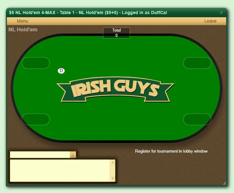
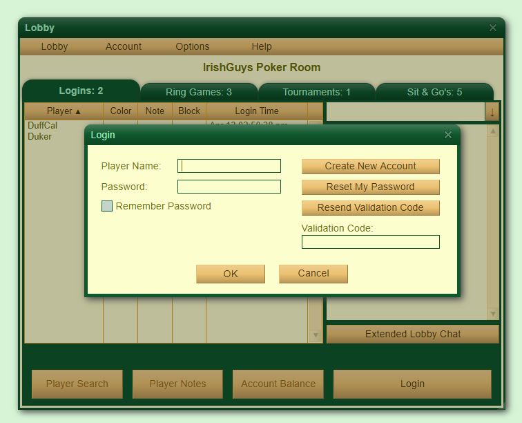
So with everything that is going on in the world, I and some of my friends started to get back into online poker. Well after struggling to find a site that we could truly customize I came across Poker Mavens software on the PCF and let me just say it is AWESOME. It has taken me almost 24hrs to get it set up how I like and I will say my IT skills are not the best. Regardless we are not up and running. Last night we were able to play our first Sit & Go tournament. I just wanted to share with you guys how my poker room looks now. I am sure I will continue to make changes and I am open to any suggestions.

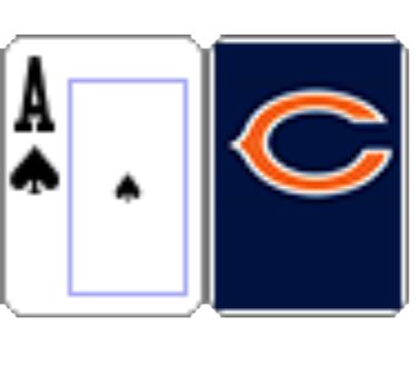
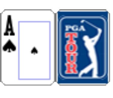
Currently, I am working on having a final table design created, five new custom decks of cards and possibly customizing the chips.

Poker Room
IGPR_1.JPG


IGPR_4.JPG

fiverr_pokertable_rev7.png


Cards - UPDATED 4/14/20
bears.JPG

PGA.JPG

Masters.JPG

Sox.JPG

Hawks.JPG

fiverr_TwoColorCards_bw.png

fiverr_TwoColorCards_chi.png

fiverr_TwoColorCards_gold.png
 
Last edited:
So I am contracted a graphic designer to create a logo for my poker room. Looking for feedback on the following two. Which one do you like? Would you change anything?

I am open to all suggestions.

Draft 5
Draft5.png


Draft 6
Draft6.png
 
Green drop shadow around the outer edge might be too much. I think it should be more subtle (or maybe not green).

I've always loved the "Poker Club" / "Card Room" labels - so +1 on the name change!

Watch the logo sizing. I think you'd want the chips just above the logo, and I think with this size, it would be inside of the logo. That makes the chip count harder to read.

Thanks. I will reach out to my graphic designer and get some changes made. I agree the logo needs to be resized so people can read the chips easier.
 
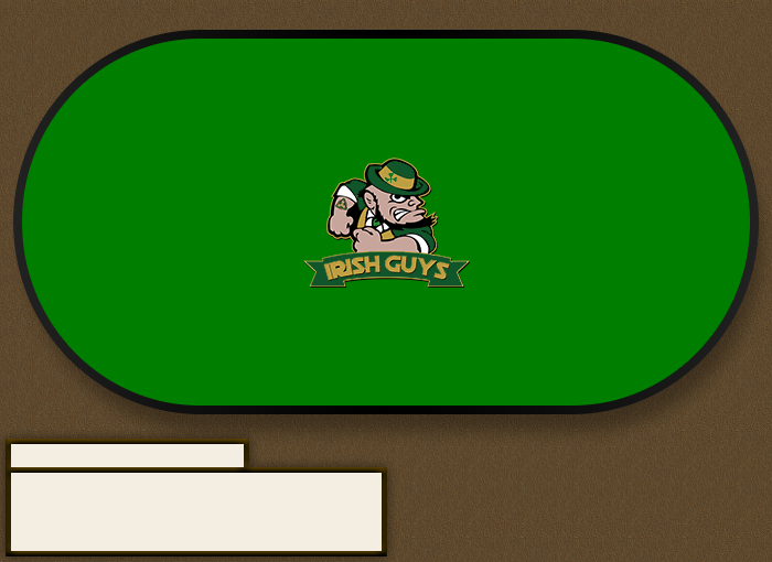
I have had another table designed and I'm looking for feedback from people. Today I also hope to have a modified version of 'Table 1' done in a more 3D style, similar to 'Table 2'

Table 1
1589291798563.png


Table 2
IG Table 2.jpg
 
Wow, I thought I was making some nice tables on my PM site but yours make mine look like crayon drawings, seriously beautiful, great job!!
 
I also paid my graphic designer for a flyer to be created for our Saturday game. I would love to get some feedback on this as well. I just had it made to make our Poker Club have a more 'real' feel. I just use it to text and email my friends to remind the knuckleheads to sign up. :)

SaturdayLD.png
 
Wow, I thought I was making some nice tables on my PM site but yours make mine look like crayon drawings, seriously beautiful, great job!!

I wish I could take the credit for the design work but I can't. I found someone to create the main logo and also to create the tables. It was NOT cheap by any means but I am happy with the progress. There is still a lot of work to do and I just upgraded to the 'GOLD' version of the Poker Mavens software this morning and now need to work on the background image for my site.
 
I think your logo looks awesome. Love the colors and Chicago skyline. There was one thing that struck me. Perhaps you know this already but traditionally it's the shamrock (3 leaves) that is tied to all things Irish rather than the 4 leaf clover. The 4 leaf clover certainly is a symbol for luck but it's not Irish.
 
Last edited:
Very nice, I wish I had one ounce of artistic ability because that final table is gorgeous. I'm sticking with the Pro version but I understand why you wanted to upgrade.
 
I think your logo looks awesome. Love the colors and Chicago skyline. There was one thing that struck me. Perhaps you know this already but traditionally it's the shamrock (3 leaves) that is tied to all things Irish rather than the 4 leafed clover. The 4 leafed clover certainly is a symbol for luck but it's not Irish.

Thanks! I am happy with it for now. I also had a circular version of it created yesterday. I am not as happy with it and think it needs some works still.

IrishGuysLogo_Circular.png


Yes, I was aware of that. I have debated on if I should have it changed to a traditional shamrock. I thought the four-leafed clover was an interesting spin on the shamrock. It isn't 'Irish' but I thought it worked well with the whole poker/gambling aspect. What do you think @AllHoosier? Would you change it to a traditional shamrock and not use the four-leafed clover?

I also had this image created so that when my site is added to an iOS home page or bookmarked on someone's browser it uses this image rather than the stock Poker Mavens image/icon.

Shamrock.png


IMG_9303.jpg
 
What do you think @AllHoosier? Would you change it to a traditional shamrock and not use the four-leafed clover?

If it were me, I would change to the shamrock but I'm a bit of a traditionalist and into showing my Irish pride that way. In fact, I'd even consider changing the Ace of clubs to have a shamrock instead of a club. And also use a shamrock in the middle of the poker chips at the four corners of the poster. But maybe that's too much? I don't know. I guess I'm just into shamrocks. :D

Sean
 
Very nice, I wish I had one ounce of artistic ability because that final table is gorgeous. I'm sticking with the Pro version but I understand why you wanted to upgrade.

Thanks. I do not have much artistic ability haha! That is why I reached out to a few graphic designers and paid for their services. It wasn't cheap but I think it was worth it.

To be honest I don't really need the 'GOLD' version but I like the software so much that I really wanted to support Kent and his company so I just decided to upgrade this morning. It will be nice to allow other admins so hopefully, now all my friends won't ask me for a million different things. Now I will be able to hopefully get one of my friends to help out.
 
To be honest I don't really need the 'GOLD' version but I like the software so much that I really wanted to support Kent and his company so I just decided to upgrade this morning. I

Whoa, that's a bump! Time to hire some web designers to customize your entire site!
 
Whoa, that's a bump! Time to hire some web designers to customize your entire site!

That's what I was thinking! Do you know anyone who would be good for this? I was thinking a custom splash page with a custom login would be sweet! Im not even sure if that would be possible to do.
 
So I was able to get the upgrade to the 'gold' version live on my site! I really like the fact that I can put our club logo on the background. Just gives it a much more professional look.

1589299143341.png
 
Like, real physical dealer buttons? ABC Gifts / BR Pro!

Yeah, I think it would be cool to get a dealer button made from that.

I may have to have the image edited a bit and add 'DEALER' somewhere on it.

I will check out both sites. It looks like BR Pro will let me do small runs. I may get 12-24 and give some away too.
 
Here is an image of the new table that I had designed for my site and also a 3D image of it. Obviously I can't use the true 3D image but it is just cool to look at in my opinion.

1589407787655.png


IGPC 3D.png
 
Here is an image of the new table that I had designed for my site and also a 3D image of it. Obviously I can't use the true 3D image but it is just cool to look at in my opinion.

Hah! Just send that image to Tony and you'll have a beautiful table in a few months.
 
Here is an image of the new table that I had designed for my site and also a 3D image of it.

So I think that the wood grain is better than what you had before. The previous background could cause (ie I was getting) eye strain. But why is the logo not centered anymore? I know you want to make room for the chips above it, but you have space to move the whole table down and keep the logo centered.
 
So I think that the wood grain is better than what you had before. The previous background could cause (ie I was getting) eye strain. But why is the logo not centered anymore? I know you want to make room for the chips above it, but you have space to move the whole table down and keep the logo centered.

I think it isn't centered for the pot of chips to be able to be read. I will check with the designer and ask him to center it. Good catch!

Looking forward to you seeing it in action tonight with the tournament. I assume you are going to win again! HAHA!
 
YES!!! Poker Mavens sent out an update today... BOUNTY TOURNAMENTS are now an option! This is great! I'm so pumped!

Version 6.19
  • Added "Bounty" field to tournaments.
  • Eliminated ties for Knockout Callback bounty.
  • Added "Next Break" time to table stats page.
  • Fixed Net chip calculation bug in RingGameLeave callback event.
  • Fixed mobile gui bug that only rendered right half of table chat.
  • Adjusted console window constraints to prevent statusbar panel overlap.
 

Create an account or login to comment

You must be a member in order to leave a comment

Create account

Create an account and join our community. It's easy!

Log in

Already have an account? Log in here.

Back
Top Bottom