Hi guys,
I am looking at purchasing a mixed set of PGI compression clays over the summer (colors are still subject to change) but something like this with solids, 8Vs and Great Wall edge spots. I may need to double up on one of the chip styles as I'm looking at 4 denoms ($.25, $.50, $1 and $2) but I may eliminate the $2. These are the denoms that work for our crew as we are low stakes but I want the most chips on the table with a good array of colors. I feel that I don't need to stick with standard colors for this particular set:
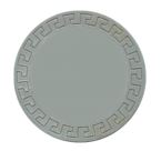
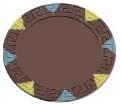
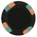 or
or
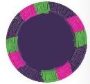
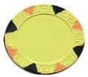
or just all 8Vs because they are damn sweet chips:

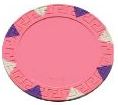
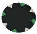 or
or
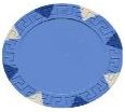
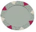
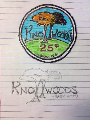
Just looking for some advice on my label design before I enlist the efforts of our PCF resident experts so I am looking for some PRE-preliminary advice. Quick background on what I have done so far. Since I moved into my house 12 years ago on Knollwood Ave, we have referred to my poker room as Knollwoods. Snappy and simple and I like it a lot. In my backyard, I have these 2 awesome oaks that reside on a little hill (a knoll if you will). Perfect. A pre-preliminary design was born. Obviously its a REAL rough sketch but hey, it's all I could do with a pencil and some highlighters.
 The elements I am think of using are obviously the knoll, the 2 oaks, a red denom. I would need some fancy font for "Knollwoods" and arced to follow the curve of the knoll. Once everyone is done laughing at the sketch, any thoughts? No color? Color? Do the 2 oaks read OK to represent the 2 "L's" in "Knollwoods"?
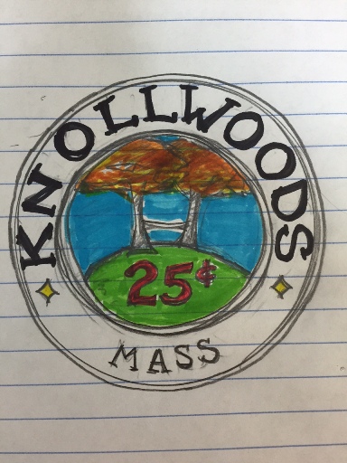
Thanks for any thoughts. I figured I would try to get the design as complete as possible so as not to waste too much of the experts time when that comes.
I am looking at purchasing a mixed set of PGI compression clays over the summer (colors are still subject to change) but something like this with solids, 8Vs and Great Wall edge spots. I may need to double up on one of the chip styles as I'm looking at 4 denoms ($.25, $.50, $1 and $2) but I may eliminate the $2. These are the denoms that work for our crew as we are low stakes but I want the most chips on the table with a good array of colors. I feel that I don't need to stick with standard colors for this particular set:
or just all 8Vs because they are damn sweet chips:
Just looking for some advice on my label design before I enlist the efforts of our PCF resident experts so I am looking for some PRE-preliminary advice. Quick background on what I have done so far. Since I moved into my house 12 years ago on Knollwood Ave, we have referred to my poker room as Knollwoods. Snappy and simple and I like it a lot. In my backyard, I have these 2 awesome oaks that reside on a little hill (a knoll if you will). Perfect. A pre-preliminary design was born. Obviously its a REAL rough sketch but hey, it's all I could do with a pencil and some highlighters.
Thanks for any thoughts. I figured I would try to get the design as complete as possible so as not to waste too much of the experts time when that comes.
Last edited:
