Looking for Design Feedback - Cherry Hills Card Room (1 Viewer)

First of all, amazed you're doing these with Powerpoint!

I started off loving the cash set and hating the tourney set but the evening sky has made it my favourite currently.

As for the cash set, the coloured ring seems a bit "harsh" compared to the gentle fade of the colour in rest of the chip. Would a similar fade, colour matched to the chip, work instead of a solid ring? Just my 2c.

Overall fantastic so far!
 
As for the cash set, the coloured ring seems a bit "harsh" compared to the gentle fade of the colour in rest of the chip. Would a similar fade, colour matched to the chip, work instead of a solid ring? Just my 2c.

Agreed. My eye is drawn to the ring. Gentle fade looks much better, IMO.
 
Thanks for the extra ideas....

Cash: keep the branch, don't color match the background, color match the outer ring, but a little softer. Can you also have a gradient on the blue background, maybe a morning light?

There's a slight light blue gradient on the cash chip sky already. But maybe it's a bit too subtle if you're not picking it up. I'll play around with emphasizing it a bit more - thanks.

Will you be making a sample set for purchase?

Well... these will be labels over existing chips - not a CPC custom set. I suppose I could send you some extra labels if you'd like... :D

Also, where's the custom dealer button? :eek:

Helz yes there will be a dealer button! :wow: (eventually)
 
I think it would look good to curve the words on the label to follow the edge of the chip.

Like this:
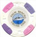
pbcl 1.jpg
 
As for the cash set, the coloured ring seems a bit "harsh" compared to the gentle fade of the colour in rest of the chip. Would a similar fade, colour matched to the chip, work instead of a solid ring? Just my 2c.

Nice idea...

So here's the version with just a color matched fade (no rim)
1544546497636.png
1544546505333.png
1544546518766.png


and compared to the original with the colored rim
1544546592247.png
1544546599759.png
1544546608791.png
 
Continuing to iterate....

PowerPoint served its purpose for the proof of concept but it had reached the limit of what it can do elegantly. So I've moved the building over to Inkscape where I can really fine-tune the placements and colors. Export quality is also much better out of Inkscape. So here's the latest

OneMountains.png
One.png


I've added some background mountains and reflection. I'm not sure if they're going to stay or not as I can’t decide if the added complexity makes the label more interesting or just too busy. But hey... when you live in Colorado you have to try and get a mountain on the label somewhere. :)
 
Last edited:
Awesome concept and design. I’m late to the party. I love the inlays thus far, but the only thing nagging at me is the .25 and $1 coming from a similar color family (both essentially varieties of blue). If it were me, I’d look to a different frac, but if you’re sold on the blurple, and it doesn’t tilt you (and guessing it doesn’t), then go for it.
 
Awesome concept and design. I’m late to the party. I love the inlays thus far, but the only thing nagging at me is the .25 and $1 coming from a similar color family (both essentially varieties of blue). If it were me, I’d look to a different frac, but if you’re sold on the blurple, and it doesn’t tilt you (and guessing it doesn’t), then go for it.

Hadn’t really considered that, but doesn’t tilt me at all. Maybe I’m just seeing what I want to see ... to me they’re more ‘urple’ than ‘blu’. :D
 

Create an account or login to comment

You must be a member in order to leave a comment

Create account

Create an account and join our community. It's easy!

Log in

Already have an account? Log in here.

Back
Top Bottom