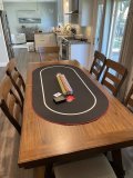
I received the custom toppers I designed. Overall, I am happy with them. There are a few design things I would have done differently if I had known how the final print would look. But no way to tell the difference between computer screen and real life until you have them in hand. Tip of advice, design with more contrast as the actual print comes out a bit darker. I measured and ordered for Barringtons. The side to side is perfect, the ends are about 1/4 short on each end, but nothing that really effects play. Excuse the photos, I set up 1 table in the garage for photo purposes due to having shoulder surgery a week ago and only having the use of my left arm right now.
View attachment 1115989
View attachment 1115990
View attachment 1115991
View attachment 1115992
I also designed and ordered a mat for the top of my buddy's pool table. This is the largest size you can order which is 9'x4'. It came out nice and fit his 9 foot table end to end perfectly.
View attachment 1115995View attachment 1115996
Yep, contrast is king, also not turning every slider on the scale to 100. (For anyone out there doing their designs). Also, only add black when you want to really add black. A cymk file is a Subtractive color file. You are never adding color "on top" of white, you are "removing" white from showing through. Every bit of color takes out brightness. Combine that it a non standard printing surface (this material) and a non standard printing method (dye sublimation) and the affects are even more noticeable. One of the best things you can do when you're happy with what you see is turn your brightness way way down on your screen and see what you think. The less backlight, the closer to reality (kinda).. then convince yourself to make this part an little brighter, and that part a little brighter. Btw I think they look fine, and the design element is nicely done as well. "Ghost" items (e.g. your race tracks) are always tricky and you really only begin to get it down after many many prints.
Also kick ass Raiders.


