Messing with inlay/label designs (1 Viewer)

Taghkanic

Straight Flush
Supporter
Joined
Jul 11, 2017
Messages
8,130
Reaction score
11,856
Location
Hudson Valley, NY
I wanted to explore inlay/label design a bit more, to develop some better chops in anticipation of a couple long-delayed milling projects.

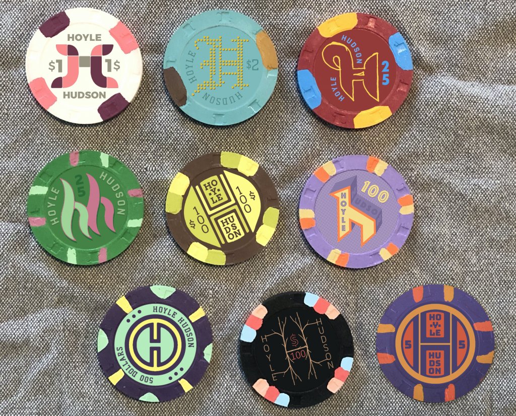
To help brainstorm, I used the names of two places I’ve lived recently, using either a capital H or double H as the central element, along with various RHC chips I have on hand.

Below is a first pass on trying out a wide variety of ideas. Thoughts? A couple of these I really like, and a couple I really hate, but I kept them all in the mockup just for sake of comparison.

RHC-HH.jpg
 
There are some obvious mistakes here I did not correct. For example, the HUDSON type on a curve on the Ysabel blue-green chip should be flipped. The red chip should not be a 25, etc.

The only consistent concepts here are that the background would match, as much as possible, the base color; and the main type or graphic elements try to pick up/work with the spot colors.
 
Also, I don’t actually have the purple Cleveland at lower right in hand, so the chip is Photoshopped in. Thinking of using these as unconventional 5s in a set dominated by magentas and purples.
 
I'd say the middle chip from the top row and right chip from the middle row are my faves. I love the classic look and feel of the $2 inlay — and love what youve done with the double use of the 'h' and 'n' in the hundo.
 
It’s funny—two out of three picked out my least favorite! Might have to reconsider my thinking...
 
I’m not a fan of digits being vertical vs horizontal so that knocks out a few. I actually really like the $1 a lot. The $500 too.
 
Yes, the idea was to consistently use the base color as the background, and the edgespot colors on the graphics and text. In a couple instances I added darker or lighter versions of the bsss color.

Overall I think I only used one color (a grey on the white chip) which did not correspond. The color of the dots on the $2 blue chip would need correcting as they don’t match the spot correctly... Also might turn that into a 25c or 50c frac instead.

I’m kind of tempted at this point to create a custom mixed set where the name and overall color formula is the same (per above), but each chip has a different logo and design. Might be too busy, but it would be a nice design showcase.
 
fresh designs. keep iterating and you will eventually end up with something you love! it's all good to get feedback from the forum but when attempting such unique and unconventional inlays you should decide on something that ultimately excites those creative juices!
 
These are fantastic... and for someone who is not used to looking at chips, the color and schematic make perfect sense and are really pleasing. Thank you for giving me a different way to look at chip style!
 
More messing around with designs. I’m not likely to use these, but it brings me closer to understanding what I want for this THC set, with a nonconventional color scheme.

One subtle idea I’m trying to develop here is using design elements corresponding to denoms—a single line on the $1, double line on the $2, pentagon on the 5, double pentagon on the $25, 100 dots on the $100. (Actually, I didn’t count the dots, but it’s close enough to get an idea.)

This also uses various iterations of one typeface (Bungee) to create a better sense of cohesion across inlays which are otherwise quite different, as a group.

Except for the two, the inlay uses the chip base color as a background, and they all are picking up edgespot colors except the solid frac of course.

C4B4547B-9EFB-471D-9C5A-343FB67A31A8.png
 
I'm a fan of the "Hoyle Road" leaf designs. Although maybe drop "Club"?

Yeah... We sometimes refer to it as the Hoyle Book Club, but I went with Road instead... I felt like it needed one more element to not look too bare. But maybe I should remove it, or try something else in that space.
 
Some design notes/struggles:

The 1 has a single line
The 2 has a double line
The 5 has a pentagon
The 25 has a 25-pointed thingamajig
The 100 has a 100-pointed starburst thingamajig

• I am not sure whether to make the solid a 25c or 50c piece... And didn’t really stick to my number thing above with it. The thin single line broken into four pieces would make more sense for quarters. I just don’t know if I’ll ever spread a game that uses quarters.

• I’m trying to be mindful of making variations of light-on-dark vs dark-on-light type.

• Each chip picks up the base color and both spot colors, but not always in the same scheme. For example, I would have preferred a canary yellow base for the $2 inlay/label, but was concerned that it could wind up being confused for the $1 chip in certain light (since they both have some narrow gray spots, and the white spot on the yellow chip could disappear). So I used a dark gray label, picking up the edge spot, to differentiate the 2 from the 1.

• On the 5, I initially wanted the peach color to be the main highlight over the brown base, but I felt emphasizing the blue would differentiate it more from the other chips, which have various oranges and yellows. In particular, I was concerned that the brown 5 and black 100 could be confused.

• Several people have suggested using the browns as $20s instead, which I like, but this was the only spotted THC chip I could find in excellent condition, in enough quantity (300). If I could find enough of something else to use as a 5, which fits into the color scheme, I might go that route and either use my two racks of CDM 5s as 2s instead, or just sell them and stick with the AST1000s.

• I’m still playing with leaf arrangements... At first they were all in the same upright/top position, but with oak leaves flying everywhere here in the Hudson Valley, I had some fun making some of them tumble across the face of the chip.


• For the denoms—a grudging concession, as I’m on record as hating them—I tried to keep them discreet. It was not possible to place them consistently, since only single digits fit within the “O” of Hoyle. So I had to bump the numerals down for the 50c/$25/$100.

• These are also non-lining or “antique” numerals, meaning that they are not all the same height, as they would be if printed in a stock table or financial report... So for example, the 5 descends lower than the 2. I find it more elegant that way, but I can imagine to some eyes it might look like a mistake.

• I may have to bump up the point size of the dollars and cents signs, as they will be pretty tiny once printed.

• I have a barrel of hot orange Jack Cincy 1KPs which I was going to use as 500s, and might still do a mockup of those, but the truth is I’m very unlikely to ever need 500s. It would just be for fun.
 

Create an account or login to comment

You must be a member in order to leave a comment

Create account

Create an account and join our community. It's easy!

Log in

Already have an account? Log in here.

Back
Top Bottom