My first custom set - I need guidance from you, wise PCFers ! (1 Viewer)

Doumsey

High Hand
Joined
Sep 24, 2019
Messages
84
Reaction score
115
Location
Paris, France
Hey PCFers

So here we go, I want to take the next step and tailor my very own custom set!

Long time poker player here in France, but I really got the chip fever a few years ago during my first trip to Vegas, where I had the chance to put my hands on some Paulson beauty for the very first time. My session at the Bellagio especially left a vivid memory of the feel, the sound...
Once back in France I had to get my hand on a real paulson clay set.

Bought a Top Hat & Cane classic cash set, built it up with fracs here and there... discovered CC specials with Apache.. some more Paulson... and here I am with way more chips that I need in my living room and friends that glady come back for late night sessions with those awesome clay beauties (in France probably 90% of friends only know plastic or ceramic).

Anyway, with the birth of my very first little girl (Josephine!) 3 weeks ago, I feel now is the time to take it to the next level and celebrate with a brand new custom set in her "honor".
I also want to recreate the vibe and feels I got during my very first session at the Bellagio as well. Thus, I will try to keep that in mind during the design process, both for labels and edgespots.

I found my designer thanks to you with @timinater with the mission to find a classy dark/grey tone label Bellagio/Aria-like inspired around her name (something with "Jo" maybe).

I was initially going for a relabel job of the great Apache Royals chips ! But I couldnt wrap my head around a lineup I really really loved in terms of color associations. And I thought, allright, if I want to do my first custom set, lets go all the way, lets fo a FULLY customized set with CPC ! F*** my budget !
I'm not really surprised with myself here haha. Every damn time I find myself a new passion, I spend countless days trying to figure out a "cheap" or alternative entry to this new passion... before skipping directly to the top option! So even though Royals chips are definitely bangers and awesome for their price, lets do things properly shall we !


Anyway, enough about me, lets go in the edgespots brainstorm. I'm a total noob in the process, so I may very well be totally in the wrong regarding progression, dirty stack, etc...

1st idea :
Going as close as possible to the Bellagio vibe. This set is just class and elegant. That would be the easiest way to pay tribute to this amazing experience.
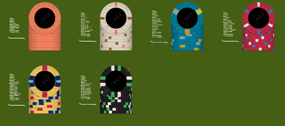
Jo 1.png


Denoms are 5c / 25c / $1 / $5 / $20 / $100
$1 to $100 are obvious copies. For fracs, I went for a classic solid for the nickel. Cant go wrong there I guess. Peach is sexy here.
For the quarter, I played a bit with the chip tool and came up kinda accidentally on this and felt like the buttersotch/peach on small spots like this looks great. Peach here does a nice callback to the nickel, while butterscotch sticks with the classy vibe of the set. iI guess it could do a great $1 in some sets as well.


2nd idea :
The "problem" with a Bellagio copycat, is that color used (even for the real set) are a little bit dull so to be speak. They lack the vibrant look of some Paulson home sets.
So for the second one, I went with some variations using the Unweighted/Dayglo colors but I tried to keep the spirit of each chip as close as possible. The idea was to give it a more "cali" vibe.
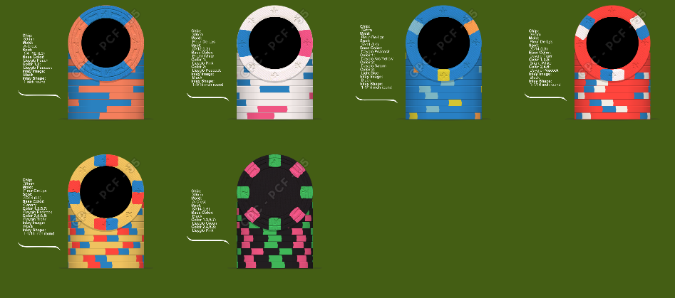
Jo 2.png

Fracs here are more possible alternatives, as they were already "originals" in the 1st design. The 25c is maybe closer to what you would expect from a frac.
For the $1, I went with Dayglo Peacock instead of Imperial blue as the base. And I kept same edgespots but switched colors for more vibrant ones.
Really dig the 5's with the Dayglo Tiger! Kept the white and blue edgespots but with a new configuration.
For the $20, kept the Canari yellow for the base, as there are no Dayglo yellows that really stick out. Tiger and peacock for spots make it really pop.
The hundo is the most reworked one as I switched white for dayglo pink here. Feels good, but we are getting further from the spirit I guess...


3rd idea:
I went full "cali" style here and it has nothing to do with Bellagio chips anymore haha.
Wanted to see maybe something bright, vibrant, shiny to have something totally different as I absolutely loved going through multiple pages of pr0n on this forum on Sunset Beach chips and other cali sets.
I dont close any doors in this project, I wrote a lot about the Bellagio feel and style, but if I nail a good bright set, I could definitely go with that.
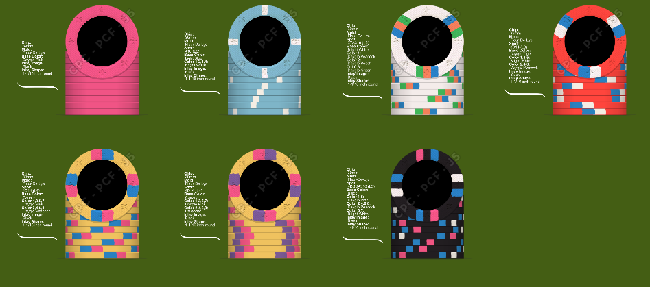
Jo 3.png

Pink solid would be the nickel and the light blue Paris style would be the quarter.
I find the Sunset beach hundo absolutely tremendous and I wanted to make it my $1 for the set.
I kept my 5 from before which feels good
Two different ideas for the $20. Peacock and pink is inspired from the Sunset beach 5. But lavander and pink feels great also here and maybe avoid the overly present Dayglo peacock once again.
Hundo is not great I feel. Tried a lot of things, but I feel kinda not inspired for hundos.
Problem here is maybe edgespots progression due to the $1 I chose which messes things up maybe ?
 
Last edited:
My first reaction is to recommend getting CPC color samples as well as some samples of the Bellagio lower denoms, if you’re trying to imitate them your colors are quite a ways off. The $3 is a light gray base, I believe the edgespots on the $5 are apricot and lavender not white and blue, the $20 base is arc yellow not canary and I’d go with DG Tiger over peach for the frac to mimic the orange of the $10. DG peacock would also probably make a nice base for the $1. Good luck!
BB3C3650-D954-4899-A702-3547FA1A887E.jpeg
 
Thanks!
Well I did not remember spots on the 5 are apricot and lavender. Looking at your pic indeed my mockup is quite off! Its actually way cooler with those I will adapt my design #1 and #2 to put at least lavender instead of blue. Maybe use peach instead of white.
For the 1, I guess I should use my design #2 $1 which is DG Peacock base.

Good idea to use DG Tiger for the nickel in order to mimic the $10.

And I did not know the existence of the $3 chip !! I actually did not have it in mind while designing the 25c in my design #1. It looks great. I think I will keep the white base.

More generally speaking, I'm not aiming to do a 100% perfect copy of Bellagio chips. Design #1 is obviously very heavily aiming towards it, but as I said, I could go with a copy just as much as a revisited one.
 
FYI your 3rd idea has nothing to do with Cali colors. You have a white $1/red $5/yellow $20/black $100, which are all standard “Vegas” colors
 
Woops ! When I say I'm a total noob in this, I'm not lying :p

Actually I though cali themes were more about flashy colors than a specific color by denomination scheme.
Purists around here must have freaked out reading my piece hahaha

So screw my design #3 ! Haha
 
Woops ! When I say I'm a total noob in this, I'm not lying :p

Actually I though cali themes were more about flashy colors than a specific color by denomination scheme.

So screw my design #3 ! Haha

Uh, you really need to start paying more attention to those pron threads :)
 
Uh, you really need to start paying more attention to those pron threads :)

Haha definitely!

Well so taking into account comments above, I adjusted designs 1 and 2.

#1
Jo.png


Adapted especially the $5 which looks actually even better like this I believe. Changed the blue for the $1 for DG Peacock. Put the nickel with DG Tiger, its fire indeed. Two propositions for the quarter side by side. Not sure if I will stick with those due to those edgespots being expensive, but they look good.

#2
Jo 2.png


Changed the $5 as well, digging the peach/lavander spots on DG Tiger.
Two propositions of hundos.
 
Man that is so cool ! Great to see the $20 I had in mind in action !
Is that canary yellow as base as well ? If so they look great.

Cheers for your daughter!
 
It’s just regular CPC yellow. It’s got a nice old school look, definitely far from vibrant.
 
Little bump to get a bit of feedback!

I've come up with a new frac idea for the 25c to honor the french flag, could be a nice touch, dont know! And it bridges nicely between the DG tiger of the nickel and the DG Peacock of the $1.

Jo 1.png


As the general idea is more or less settled on the main chips (1/5/20/100), I focused a bit on the fracs with other ideas :
Jo fracs.png

I will probably settle with a solid flashy color for the nickel (Tiger or Pink which feel like the best options).
From there, I tried some variations of spots to bridge from the nickel (either Tiger or Pink) to the $1 DG Peacock, with sometimes the yellow from the $1 spots.
A base grey quarter could be something to explore as well so I inserted some, but all variations could be seen either bright white or grey.
 
Anyway, with the birth of my very first little girl (Josephine!) 3 weeks ago
UNREAL! Congratulations!!! I've got an almost 4 year old boy. Seems only yesterday I was holding him in my palm...don't watch the time, let it soak into your soul because the moments slip away FAST! Welcome Josephine:)

Every damn time I find myself a new passion, I spend countless days trying to figure out a "cheap" or alternative entry to this new passion... before skipping directly to the top option! So even though Royals chips are definitely bangers and awesome for their price, lets do things properly shall we !

Effing love this line of thinking mate. I also did it kind of the same way. In retrospect, I wish I too had gone full custom for my first set too. Why not, I've spent way more than I ever thought possible. When I priced out a Custom set from CPC, I didn't like the price. Looking back I was just dumb and really didn't know a single thing about what I would want and like. I LOVE my Rounders Stockers...but I wish I had gone custom

Kudos on taking control, going for exactly what you want! Wish I had that same resolve not 7 months ago.

Im still in awe of the CPC quality though. The chips seem tough. Used them now for my regular Tournament game.

I'm the same way though with hobbies...I think..."I can't afford this...what am I doing??" That's what I was saying in March...
 
Definitely get color samples from CPC. You will find that the DG Peach, DG Tiger and DG Pink tend to look fairly similar under low light, which could lead to dirty stacks. And as per @allforcharity 's advice to me, avoid using edge colors that are close to or the same as nearby denom's base colors (especially when the edge spots are quite wide, as some of your 2nd ideas are), as that can also lead to dirty stacks (single chip of different denom getting mixed up in a stack) .

Best of luck with your custom set!!!
 
Yeah I found a french PCFer who has a sample available so I will get my hands on it ASAP!

Dirty stacks is a concept I recently discovered actually. Im used to buy premade set (even with Paulson), never done mixed set or custom projects, so I wouldnt know how to avoid that for sure. A big part of this feeling made me post on this section for advice actually.

UNREAL! Congratulations!!! I've got an almost 4 year old boy. Seems only yesterday I was holding him in my palm...don't watch the time, let it soak into your soul because the moments slip away FAST! Welcome Josephine:)

Thanks you so much, means a lot haha! I try to enjoy every minute indeed ;)

Regarding the rest of your message, yeah now that I'm hooked and want to make myself a great gift for my future home games, I kinda want to go all the way.
Part of this definitely relies on the fact I'm quite fortunate to be able to spend 1500 to 2000$ for what is at the end of the day mostly a hobby (even though I wont be able to anytime soon after that haha!). If money was a little bit shorter, I would definitely not go down the "F*** that!" road haha.
But yeah I came to the conclusion that I got some cash on the side, I want to gift myself with something really special, lets do this properly!
So lets go!

Still hesitating a lot on both designs.
#1 feels like a great hommage to the Bellagio set, just go full copycat and call it a day. Cant go wrong with that.
But I like for instance the look of the $5 and brightening up the $1 (replacing gray and gold edgespots by light blue and arc yellow) from design #2 feels also really nice and could do a nice revisit of this iconic set.
Maybe a mix of both I dont know!
 
I know I’ve posted these before but here are some Cali color ideas I’ve put together...most are complete rips from other existing casinos...maybe they’ll give you some inspiration?
6322AFCB-7587-4C04-885D-C5B859CE508F.png
52D063FD-20FA-4063-9B98-BD235B7398A7.png
21CA9EF9-8EFA-48D7-BF9E-DF45C93EE628.png
F5813029-2E25-4F43-B7FD-AE7AA8B6CAB8.png

8882BFF9-A2A5-4B8A-AB34-5B81374F70BD.png
 
I'd recommend keeping the bigger picture in mind. Doing half copies from one coherent set and then throwing a couple different or own designs in without much thought puts the result in danger of looking odd.

I have seen a good bunch of really weird/incoherent/random-looking custom sets of other people that just make me scratch my head... but my current explanation for it is, these guys are so consumed with adoring their custom chips that they don't realize they're merely one out of 6... 9... 10... or even more people that are playing with them at the table. Noone else at the table has experienced the situations these guys have been in, the experiences they have made, that drove the weird design (weird because it doesn't make sense to anyone but the designer himself), so neither can they figure it out nor relate. All that is left is the material quality they could positively notice. And I think that's a pity.

It's surprising how few options there are that will truly "work" if you were to replace any single denomination in some existing casino set. Especially when you are limited to the few color options CPC has. In a well-designed casino set, every single denom works well with each of the other chips and they all give a very similar vibe.

If you want your set to look really flashy (be it traditional or cali colors - but expecially for the latter), use many dayglo colors and definitely take the bright white over the regular white at any time. Do not hesitate taking dayglo or bright white for the base color of a chip, and use them in broad spots. As you will see when the color samples arrive, the regular weighted colors are mostly fairly dull. I would certainly try to avoid making a chip design that used only regular weighted colors, although making an all-dayglo chip doesn't look good either. You have to carefully balance both color types on a chip to end up with something nice-looking - at least that's my experience after making three CPC sets.
If you need any more convincing to use dayglo colors, buy an UV lamp for your color samples ;)

Final recommendation: when designing chips with the design tool, change the display settings and choose the dark gray or light gray background instead of a colored one. It makes a huge difference for the way the chip designs themselves will look. Grays are neutral colors that don't skew your perception, that's also why professional media creation software like Photoshop has an interface that is all in gray tones. Of course you should still absolutely verify that your color choices work with the color samples - some colors look completely different on screen - but it will still make developing your design easier.
 
Oh wow thanks @JoeBGo ! If I go out of the Bellagio mockup route I have for sure a big dose of inspiration here.

@Nex
Thanks you so much for all those advices!! I'll consider them carefully. Especially when it comes to considerations to mix my two design ideas. Could be risky if done wrong.
Will do a bit of design tool rework with a grey background as well.
I see you look like a custom set veteran !! Maybe a bit of preference between my different design choices?? :)
 
Wouldn't consider or call myself a veteran - I may have gathered some experience, but there is so much more, and I haven't been around for that long yet either.

Preferences: I'm just one of many, plus I do have some opinions that the majority apparently does not share. And while I have no problems with faithfully copying/making hommages to great existing chip designs per se - see my Horseshoe and Paradise sets - I wouldn't try that with the Bellagio/Aria lineups. With the limited color choices it is hard if not impossible to make CPC clones that do not look dull. (Personal opinion: I even find many of the originals kind of dull - simply lots of muddy colors and muddy color combinations, like on the $5 and $3.)

I personally would explore the "flashy colors" route more. No matter if you choose to go with traditional or cali colors. Although I believe cali color sets will profit a little more from that than traditional color sets.

If you like the Bellagios that much, trying to incorporate the $10/$20 has probably the best chances of success. They're good candidates for dayglo base color chips.

I also like your bright white 1TA316 tiger/saturn/peacock, although 1) I personally don't like asymmetric/unbalanced edge spot placement so would rather go for 3TA316 instead of 1TA316, and 2) I would swap saturn for DG yellow instead. Saturn has a puke green shine to it, it doesn't really go well with the look of tiger/peacock - you will see when the samples arrive. Saturn's only advantage in my eyes is that it actually glows yellow under blacklight, while DG yellow glows mostly green.
 
Allright so I got a bit of progress on the inlay design side with some propositions I want to run through you !

First the background of the inlay
inlay back.png


As you know by now, I want to mimic the Bellagio style and replace the iconic "B" by a reference to my newly born daughter Josephine.
I initially wanted to go for a simple "J", but I got this cool proposition of "Jo's" instead which works quite nicely actually. Makes a bit more personal.
But there is still possibility to go back to the J.
2 different styles of "J" and 2 different styles of "o's". Would love your advice on this.

Regarding text above :
inlay text style.png

Colors and spots are still work in progress. I will probably explore a bit more the mixed route between my two designs (pure copycat of the Bellagio set and brightening up colors).
For the text, 3 ideas
- Just her name : Josephine. Grows on my because I obviously LOVE her name. But it may be a bit "cheesy" to have her name on a poker chip in the long run; especially for instance for my friends or possible unknown players I may invite to play a home game. It has a super personal ring to me personally, but it may not score as many points to others. Not a total fan, but not excluding it just yet.
- Jo's Room : my favorite so far. Direct reference to the Bobby's room, the iconic high stakes cash game room at the Bellagio. Simple, effective, to the point.
- Bella Jo : a play on words proposed by my designer ! Actually quite clever, didnt think of it ! Sounds nice, nice ring to it.. Bella Jo's maybe ? Doesnt make much sense, dont know. Definitely something to explore here.


A nice touch proposed by him as well is her birth date in the detailed background :
inlay detail.png

Not much advice needed here, I just love the little "easter egg" in the inlay and it will definitely make the final design.


I will continue to work on color and spots, but regarding the inlay I would absolutely love some advices from you guys

Cheers
 
I love the way this is shaping up! I’d go with Jo’s room myself. Bellajo might be too close to the original for CPC to legally create but you won’t know until you ask
 
Personally I think that Josephine works nicely, followed by Bella Jo’s (Beautiful Jo in Italian and Spanish, I think)

I do think that the font size for the Dollars and Cents is too large in relation to the denomination text size ( or more accurately the denom text is too small in relation to the Dollars and Cents). Should all be the same size IMO.
 
The play on words Bella Jo works actually very nicely in different ways you are right!
Bellagio sound, but also means Beautiful Jo you are right!
Growing on me definitely.

Got your point for the denom text and DOLLARS / CENTS on the bottom of the inlay.
It was to mimic the Bellagio classic design, which works this way. But we could maybe tend to close the size gap a bit more between both texts yes.
 
Allright on the color/spots question, I'm starting to becoming more and more keen to do a revisit instead of a straight copy of the Bellagio.

Thus, here are some ideas brewing!
Fracs are definitely where I'm totally lost, as I have no "basis" to get inspiration from.

Fracs :
Jo fracs.png

First line are solid nickels. Probably wont shoot for any spots on those.
For quarters, dont know about bright white ones, or colorful ones. For now it feels like I'm just shooting colors left and right to see what fits but dont really know what Im doing.
If some of you know cool fracs I could maybe use for this set, please feel free to contribute :)

The $1 I'm quite happy with, will be my workhorse chip mostly and I like the fact it will be the most heavily inspired from the Bellagio original.

For 5's :
JO 5.png

Dayglo Tiger base feels much cooler than the original, even though I find it super classy. Now its all about spots...

For 20's :
Jo 20.png

Keeping some retro blue (darker blue) in there might be something to consider instead of going full Dayglo.. dont know!

For 100's :
Jo 100.png

Only chip where the original one (design 1) could be the way to go... very cool spots !
But I like 4 and 5 with some pink in there as well!
 
  • Like
Reactions: Nex
Your last iteration is a large step forward in my eyes.

I like the Pink 2A12, Lt Green 2D18 and bright white 2A12 fracs. I wouldn't take a solid colored chip for the lower frac with all the other chips having spots, it just looks odd in my eyes.

For the $5 chips the tri-moon looks best, but I think with a dayglo base color having all three spots non-dayglo could look better. I.e. swap the peach spot with maybe canary.

$20 favorite is the 3TA316, but I'd swap out the light blue spot for DG green or light green maybe. Three different color hues for the spots - not two plus one.

$100 definitely the 414418.

The picks don't all work together however, so I made some spot modifications for this...

bellajo.png

bellajo2.png

Edit: Actually, for pic #2, if going with 6A18 $5 it might be better to go with 3TRIM on the $1.
 
Last edited:
Nice catch indeed, didnt think about putting black in the middle spot !
Something to consider as I like the original hundo
 
Thanks a lot @Nex for your time

Dont know if I'm super thrilled about including a green spot on the yellow $20, as it is not present at all on the original chip. But I get your point about 2 different blues on a triple edgespots.. Maybe it wont come out as good as in my mind.
For the spot progression it feels good.
I really had in mind to keep the nickel solid, but why not go full spots on the full set. Maybe a single spot instead of a dual ? I will include some variations in my next iteration.

A light green quarter could be cool next to the blue $1.
At the end of the day, I need to really nail the 25c because both 25c and $1 will be my workhorse chips for my home games as we play mainly .25/.25.
So both chips needs to feel great together and form a good combo.
For now I cant say I found the perfect duo yet.


Also, dont know what you guys think about it, but some people told me the little birthdate in the inlay background (which is a wonderful detail that I want to keep) may be too small and be almost invisible on the chip once produced.
A clever way to maybe present it differently with more visibility ? I will try to have some variations proposed.
 
Last edited:
Triple post!
I came up with some quarters Im starting to dig. So here are some propositions presented in columns, where I try to respect the spot progression.

Jo fracs.png

For #4 on the right, Im afraid base DG Arc Yellow will cause major dirty stack issues with the future $20 chip (even though they will be rarely in play together).
Even a DG Peach base would be a bit too clause and in between the already taken DG Tiger for the $5 and Canary for the $20.
So I'm probably better with sticking to unused base colors yet such as DG Green and DG Pink !

For #3, a white quarter with those spots seems kinda sexy as well.
 
Reworked of my fracs ideas after seing some custom CPC sets. I think I overuse flashy DG colors, trying to mix yellow, pink, green all over the place.

Jo fracs.png


I initially wanted a flashy base quarter, but this bright white is becoming more and more sexy to me. Problem maybe, it bridges less nicely with the $1 chip. Example of line up with it :
Jo set 2.png


Pink and Peach fracs could work, but maybe overusing "hot" bases with the DG Tiger $5 coming after ?
Jo set.png


My sexy white quarter could work with blurple instead of retro blue maybe as well, as blurple fits nicely with pink :
Fracs alt.png


I take this opportunity to relist all my options for 1/5/20/100 chips as David from CPC told me I need to place my order before end of week if I want to take advantage of the FDL mold !! (much tighter than expected!!)

Jo 1.png

Jo 5.png

Jo 20.png

Jo 100.png


I dont know how to use polls for so many options. I will probably need to make up my mind and come up with a limited number of full lineups and ask for popular vote !

Also, I know its common practice here but I could absolutely order more chips to ship samples if some of you like the set.

Cheers
 

Create an account or login to comment

You must be a member in order to leave a comment

Create account

Create an account and join our community. It's easy!

Log in

Already have an account? Log in here.

Back
Top Bottom