Northwoods Hideaway... (2 Viewers)

MrWookie69

High Hand
Joined
Jun 6, 2024
Messages
73
Reaction score
94
Location
Wisconsin
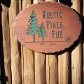
I'm not completely shelving my other design, but I had this swirling around in my head as it's a bit more personal with the family. We love to spend time in the northwoods, and spend two weeks throughout the summer fishing, swimming, playing mini golf, and eating too much ice cream... So really wanted to see what I could come up with for a "Northwoods Hideaway" theme. I didn't want to get to specific on any activity, as it varies quite a bit. I did want the theme to have a bit of a modern woodcarved feel. It's "Old Wisconsin" - when you get out of the touristy areas, the colors aren't shiny neon, so I preferred the "aged feel" of the non-DG colors - like they've been around for a while, fading it a bit... TI think I have one set of spots with DG Yellow for the .25¢ chip...

Unknown.png


Detailed images

Unknown-2.png


Unknown-1.png


Unknown-3.png


Unknown-4.png


Unknown-5.png


Unknown-6.png
 
Last edited:
I wouldn't pair the inserts for the visual impaired, and I think the green clashes with some of the chips

I would take the yellow off the 100, because of the other 3 times you use the color

The label is nice though!
 
The inlay needs some depth to the background beyond just white. I'm a HUGE fan of white space, but the inlay definitely needs something a bit more...

Played with the background a bit, and switched to the respective chip's base color...just pushed it back a bit so it wasn't so vibrant.

Unknown-8.png
 
The inlay needs some depth to the background beyond just white. I'm a HUGE fan of white space, but the inlay definitely needs something a bit more...

Played with the background a bit, and switched to the respective chip's base color...just pushed it back a bit so it wasn't so vibrant.

View attachment 1351843
It looks much better this way :tup:
 
Really worked the typography and overall feel of this.

The trees have an organic brush feel to the illustration, wanted to find a font that worked with it, and one I could really play around with.

Also...after seeing the Flamingo Lounge Tina Hybrids - I just had to give it a go...

I'm still on the fence about a white $1 vs a blue $5.

Screenshot 2024-07-02 at 5.14.58 PM.png


Screenshot 2024-07-02 at 5.15.40 PM.png


Detail of the blue $1 and $20 inlays

Screenshot 2024-07-02 at 5.27.32 PM.png
 
Change the $25 to 25¢... and darkened up the $1 on the blue chip. ...going with the blue, dropping the white...

Screenshot 2024-07-02 at 8.40.01 PM.png


Definitely running with this one over the "The Casino" chip. ...will probably get around to that one again later...
 
Ended up looking at the inlays, and the tiny text. So changed up the tiny text font to something cleaner and more readable, and would allow me to make it larger without adding clutter to make it more readable.

Also made the "The Northwoods Hideaway" a bit larger.

Screenshot 2024-07-02 at 9.13.26 PM.png


Detail views of all chips...

Screenshot 2024-07-02 at 9.15.49 PM.png


Screenshot 2024-07-02 at 9.16.40 PM.png


Screenshot 2024-07-02 at 9.17.20 PM.png


This is WAY too fun... and it's a good bet these are going to production at some point. ...Still unsure of the spots, will eventually need help with the edges, and need a contact at TINA...

That's it for today. LOL
 
To clarify . So you’re going with the someone with a paintbrush on a wooden board look over the classy design you started with ?
 
To clarify . So you’re going with the someone with a paintbrush on a wooden board look over the classy design you started with ?

People don't go to the northwoods for a "classy experience". ...It's friendly, fun, relaxing, can be boisterous at times. :p
 

Attachments

  • Shop-1.jpg
    Shop-1.jpg
    161 KB · Views: 12
  • o.jpg
    o.jpg
    230.9 KB · Views: 11
  • l.jpg
    l.jpg
    66.5 KB · Views: 11
  • IMG_7476.JPG
    IMG_7476.JPG
    179.7 KB · Views: 10
  • 20190604_083456.jpg
    20190604_083456.jpg
    176.8 KB · Views: 11
  • 1000s.jpg
    1000s.jpg
    290.2 KB · Views: 10
Yep, definitely a slapped together and "open when they feel like it" environment. I personally like the new font.

I would consider changing the purple edge spot on the $100 to another color (e.g. yellow) just to get some more contrast to the $500 chip
 
Trying to think if there's a way to work-in one of the "direction" signs that are so common up here as well.

May look neat as a background to "Hideaway", pointing to the right? Wish I had my computer with me right now to play around with mockups.

1000010738.jpg
 
Yep, definitely a slapped together and "open when they feel like it" environment. I personally like the new font.

I would consider changing the purple edge spot on the $100 to another color (e.g. yellow) just to get some more contrast to the $500 chip


I definitely need to work on the $100 and $500 spots. Not entirely grooving on those. Everything that contrasts is orange and pink. I should put pink on every chip. LOL


Trying to think if there's a way to work-in one of the "direction" signs that are so common up here as well.

May look neat as a background to "Hideaway", pointing to the right? Wish I had my computer with me right now to play around with mockups.

View attachment 1352683


My big concern is making that tiny 1" space too busy. But that is a cool idea.

I will never understand how people expect drivers to read those signs at 60 MPH. LOL

White-Arrows-in-Autumn.jpg
 
Played around with new fonts to boost readability. Checked these at 1", and the readability is much better.

Screenshot 2024-07-03 at 11.49.06 AM.png


Detailed view of each chip...

Screenshot 2024-07-03 at 11.49.43 AM.png


Screenshot 2024-07-03 at 11.50.38 AM.png


Screenshot 2024-07-03 at 11.51.15 AM.png


I'm really happy with the 25¢, $1, $5, and $20 chips.

Really need to work on those $100 and $500 spots. But this is getting closer...
 
Happy Fourth of July update... Reworking the spots...

Screenshot 2024-07-04 at 1.49.42 PM.png


Now it's time to fire-up the cooker for some Texas mopped direct heat ribs. :)
 

Create an account or login to comment

You must be a member in order to leave a comment

Create account

Create an account and join our community. It's easy!

Log in

Already have an account? Log in here.

Back
Top Bottom