I've been working on recreating some chip designs from old school casinos, either for my own purposes or to potentially offer them in one of the cards mold group buys that have been running regularly. I decided to tackle the Flamingo because it's one of my best poker buddies' favorite place to stay, and I really like the old-school design. I took these two old inlay designs...
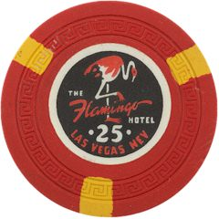
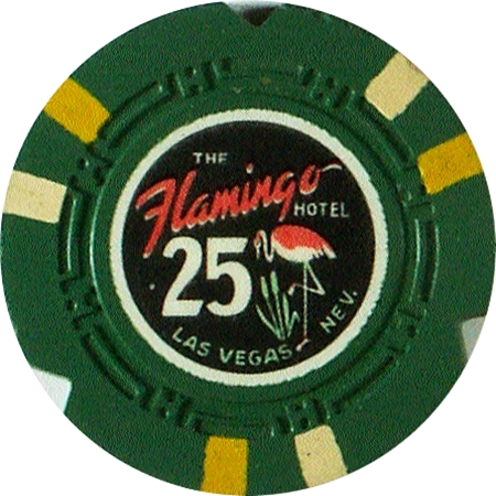
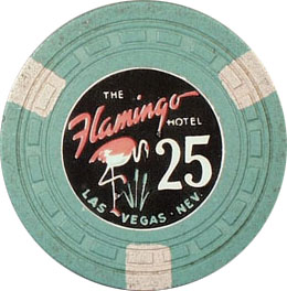
[Photos above (and some below) courtesy of ChipGuide.]
...and recreated them, putting a different design on each side. Since there's left/right facing versions of the non-centered flamingo design, I created a left-facing version of the centered flamingo design, so I could pair with the opposite facing design for the other side:

Took me a while to get the label design how I wanted it to look, trying to find the right fonts for the text and the denoms, getting the flamingos' placement correct, etc. Finally I got to working on the actual chip colors, edge spots, etc., which took even longer. Ultimately, I decided to find inspirations for each chip, after I had decided on the chip colors for each denom. Below are the final (for now) results.
For the lower denoms, I knew I wanted a quarter pie for my 25¢ chip, and tri-moons for my $1, for which I wanted to use the edge spots colors from the spotted modern Flamingo $1. The Golden Eagle $5 was an easy inspiration!
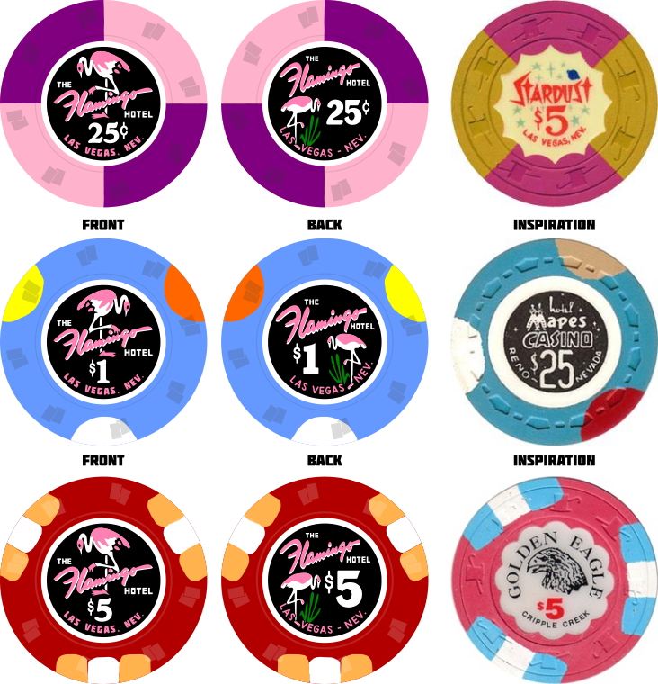
No shaped inlays in this set, which is a big part of the charm of the Stardust $20, but I still like the color combination. The $25 was hard to nail down, but ultimately I went with a 618. And can't go wrong with a 4-color bearclaw $100!
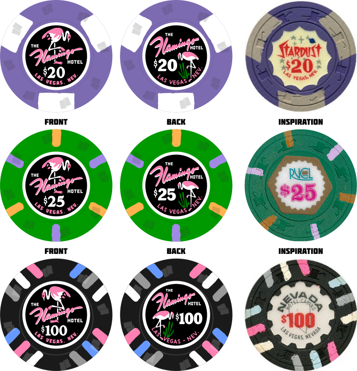
(You may have noticed the direction of the flamingos alternating with each denom, except for the $20 and $25. Obviously I don't expect these two denoms to be used at the same time, so I made them the same orientation so people can choose either one and still keep the alternating designs.)
The high-denom chips were somewhat more difficult, though mostly it was the $1000 chip. I knew I wanted an 814 and 8V, and based on the Grand Casino $500 inspiration I used the same design on my $500, and the 8V for the $5000. Even though people associate the 4V418 with the Majestic CC chips nowadays, it shows up a lot in higher-denom chips, so I used that for the $1000.
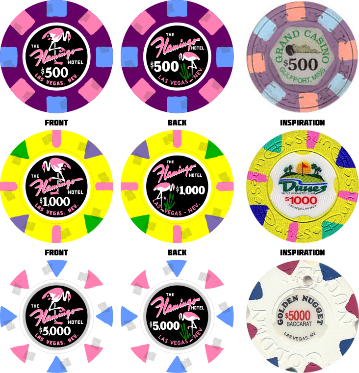
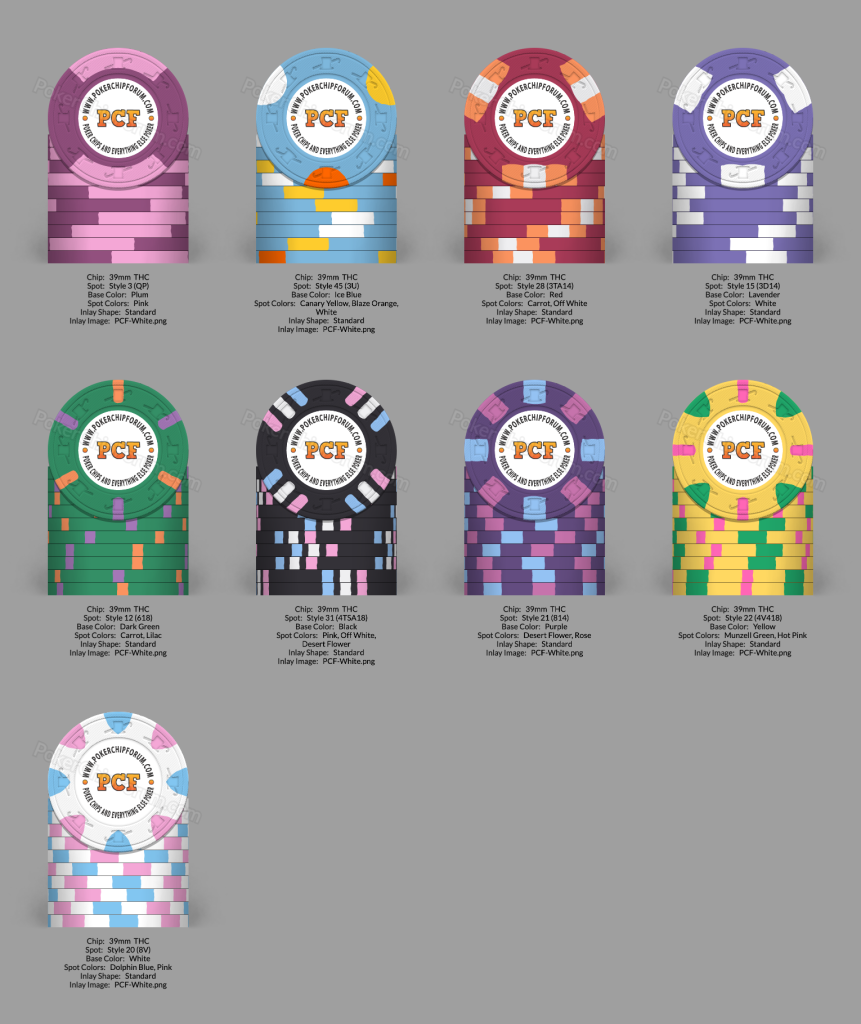
As I said, I spent a lot of time on this, and am pretty settled on the above design. I'm not 100% sure on the $1000 edge spots, but everything else I'm good with. I did try to approximate these chips in the Paulson tool to see what the stacks would look like, and maybe the $20 and $500 might have dirty stack issues? Should I go with a lighter purple on the $20s or darker on the $500s, or both?
[Photos above (and some below) courtesy of ChipGuide.]
...and recreated them, putting a different design on each side. Since there's left/right facing versions of the non-centered flamingo design, I created a left-facing version of the centered flamingo design, so I could pair with the opposite facing design for the other side:
Took me a while to get the label design how I wanted it to look, trying to find the right fonts for the text and the denoms, getting the flamingos' placement correct, etc. Finally I got to working on the actual chip colors, edge spots, etc., which took even longer. Ultimately, I decided to find inspirations for each chip, after I had decided on the chip colors for each denom. Below are the final (for now) results.
For the lower denoms, I knew I wanted a quarter pie for my 25¢ chip, and tri-moons for my $1, for which I wanted to use the edge spots colors from the spotted modern Flamingo $1. The Golden Eagle $5 was an easy inspiration!
No shaped inlays in this set, which is a big part of the charm of the Stardust $20, but I still like the color combination. The $25 was hard to nail down, but ultimately I went with a 618. And can't go wrong with a 4-color bearclaw $100!
(You may have noticed the direction of the flamingos alternating with each denom, except for the $20 and $25. Obviously I don't expect these two denoms to be used at the same time, so I made them the same orientation so people can choose either one and still keep the alternating designs.)
The high-denom chips were somewhat more difficult, though mostly it was the $1000 chip. I knew I wanted an 814 and 8V, and based on the Grand Casino $500 inspiration I used the same design on my $500, and the 8V for the $5000. Even though people associate the 4V418 with the Majestic CC chips nowadays, it shows up a lot in higher-denom chips, so I used that for the $1000.
As I said, I spent a lot of time on this, and am pretty settled on the above design. I'm not 100% sure on the $1000 edge spots, but everything else I'm good with. I did try to approximate these chips in the Paulson tool to see what the stacks would look like, and maybe the $20 and $500 might have dirty stack issues? Should I go with a lighter purple on the $20s or darker on the $500s, or both?
Last edited:
