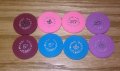
Wanted to add some solid quarters to my horseshoe set. Just wanted to see what your thoughts/opinions were. I've amassed a bunch of different Paulson solids on various molds...see below. On a side note, I had non laminated matte labels made for the brown spotted BCC's. I do like the way they turned out (thanks @Gear), but would also like a solid color option. I will most likely be milling these to accept a laminated label for longer durability. Not sure what the official names are for the colors. From left to right light pink, blaze orange, peach, lavender, yellow, hot pink & light blue. I'm leaning toward the lavender samples and leaving them as is. So if you had to choose one of these colors, which one would it be? Thanks!


You are using an out of date browser. It may not display this or other websites correctly.
You should upgrade or use an alternative browser.
You should upgrade or use an alternative browser.
Opinions on frac color choice (4 Viewers)
- Thread starter duffman
- Start date
links_slayer
4 of a Kind
i like the yellow and the peach (3rd in from the left) best
peach, yellow, lavender, blue, in that order.... not enough contrast with orange or the pinks imo. I'd go with either solids or a matching dark label - white inlays look weird with a dark inlay set.
Marius L
4 of a Kind
I prefer yellow, lavender and blue, in that order
light blue
Jambine
Full House
I've always liked yellow for quarters. It fits for most cash sets (unless you're using Cali colors with a yellow $5)
RowdyRawhide
Full House
yellow, blue, peach, lavender
ranger764
Flush
Blue lavender
Psypher1000
Straight Flush
Lavendar > yellow > blue > peach
I would vote Yellow because that is my all time favorite, BUT.....
With this set I think the peach works in a bit better than any of the other colors. It hits a color in between two of the spot colors on the ones and also works well with the spots on the $5.
Then again I have some Gold Coast grey fracs that would work!
David
With this set I think the peach works in a bit better than any of the other colors. It hits a color in between two of the spot colors on the ones and also works well with the spots on the $5.
Then again I have some Gold Coast grey fracs that would work!
David
ranger764
Flush


I had this same struggle. I never found an option I liked and ended up selling the set.
That being said I like peach, then lavender out of the options you have here. The splashed pot sold me on lavender as my number 2 favorite as it brings out the spot on the $5 a bit.
That being said I like peach, then lavender out of the options you have here. The splashed pot sold me on lavender as my number 2 favorite as it brings out the spot on the $5 a bit.
I had this same struggle. I never found an option I liked and ended up selling the set.
That being said I like peach, then lavender out of the options you have here. The splashed pot sold me on lavender as my number 2 favorite as it brings out the spot on the $5 a bit.
I had that same thought about the lavender. I'm guessing that spot on the $5 is Hawaii flower? The lavender are by far in the best condition of the bunch.
detroitdad
Royal Flush
Peach then light pink
Marius L
4 of a Kind
on a second look the blues does look really good on the splashed pot photo
Yes, anything too bright and the set does not work! The gray is not a favorite but it work well with the spots on the $5. If you want something brighter the Peach is your best option IMO. Blue, Pink and Yellow do look great but do not fit with the other chips and I think the light pink do not pop enough.Here are some (uncleaned) splashed shots.
Agreed @BGinGA, I can rule out the blaze orange and pink. Clash too much with the $5's.
@David O I added some grey's. A little too bland imo.
My wife and I do like the peach, just wish I had more of them.
View attachment 78749 View attachment 78750 View attachment 78751 View attachment 78752 View attachment 78753 View attachment 78754 View attachment 78755 View attachment 78756
My preference for fracs is generally yellow (if there's no yellow chip in the set), with pink second.
But that can be overridden by coordination with the $1's spots -- and in this case, the peach grabs that somewhat darker-toned spot on the $1 just so nicely, that it won my vote.
I'd go peach.
But that can be overridden by coordination with the $1's spots -- and in this case, the peach grabs that somewhat darker-toned spot on the $1 just so nicely, that it won my vote.
I'd go peach.
")
Put out a want to buy ad. I know some one out there has to have a rack available.
Good luck. PrOn, when you get the set together!
Good luck. PrOn, when you get the set together!
Mental Nomad
Full House
I like the yellow, lavender, blue... but do you have a $20 or $25? Maybe save yellow for a future $20?
On seeing the splash pot, the lavender gets extra credit for being on the same mold.
On seeing the splash pot, the lavender gets extra credit for being on the same mold.
I like the yellow, lavender, blue... but do you have a $20 or $25? Maybe save yellow for a future $20?
On seeing the splash pot, the lavender gets extra credit for being on the same mold.
I have all the Horseshoe denoms up to $500, so I'll be ok there. Those lavender chips would be an easy re-label and I agree with you on the mold. Just don't know if I have the heart to put a sticker over that old paul-son inlay. I like it. I was thinking of leaving them alone, sort of like a NCV chip and use them for either a .25 or .50 chip. I know it wouldn't match the black inlay's, but I'm not too picky.
Last edited:
RainmanTrail
Straight Flush
Yellow, not close.
Why am I not surprised to see you with the same answer as mine? Haha (y) :thumbsup:
joxx12
Sitting Out
Yellow and Blue
Similar threads
- Replies
- 50
- Views
- 2K
- Replies
- 87
- Views
- 5K
- Replies
- 55
- Views
- 4K