Hi, everyone. I could use some advice on a set of inlays that I am trying to color match to a set of CPC chips that I ordered. Specifically, some of the DG colors are making me a bit nervous, which I know is to be expected. I just want to make sure I am doing everything that you all would recommend to maximize the chances of a great outcome.
I got a lot of great advice on the design of the chips and inlays themselves on a separate thread. And I was pointed to this older thread that contained the approximate CMYK values for CPC’s chips. I used those values to color-match the inlays. And then I printed samples of the inlays at FedEx to match up to my physical color sample set of CPC chips. A huge thanks to @timinater for the excellent results on most of these with no edits needed.
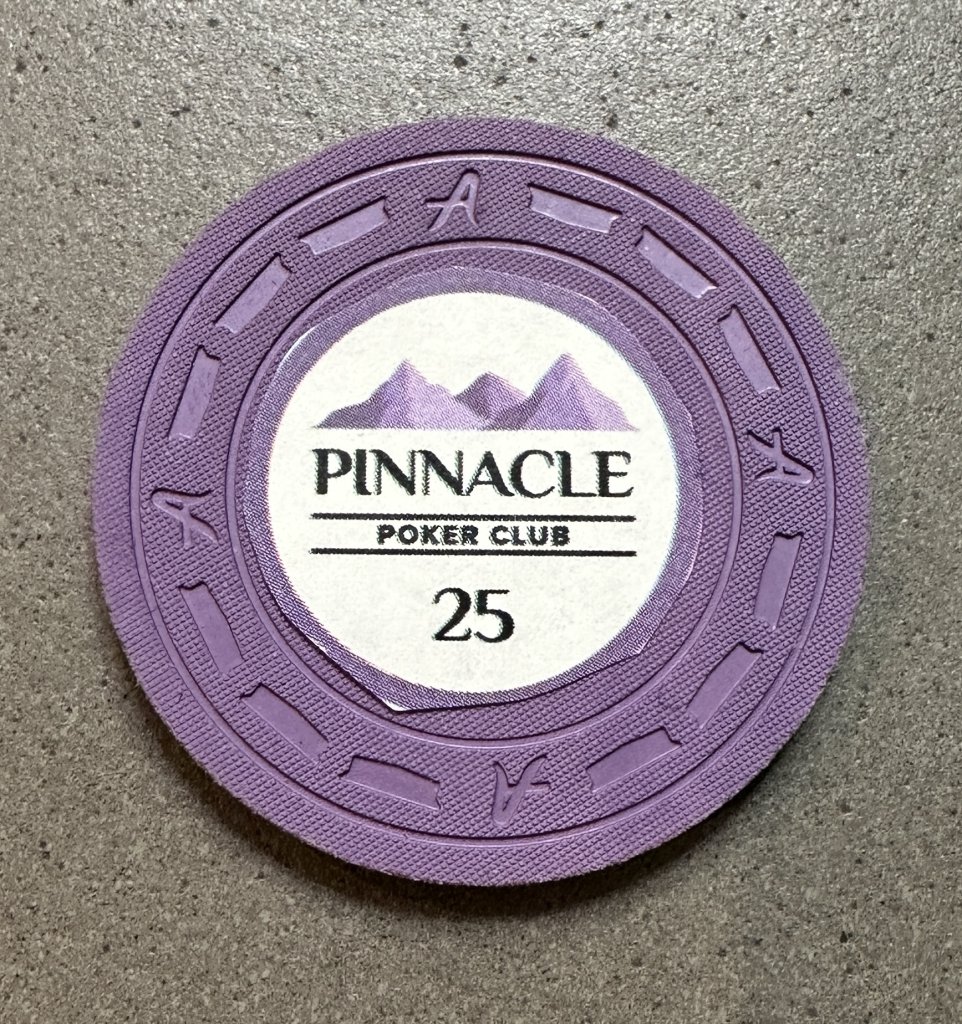
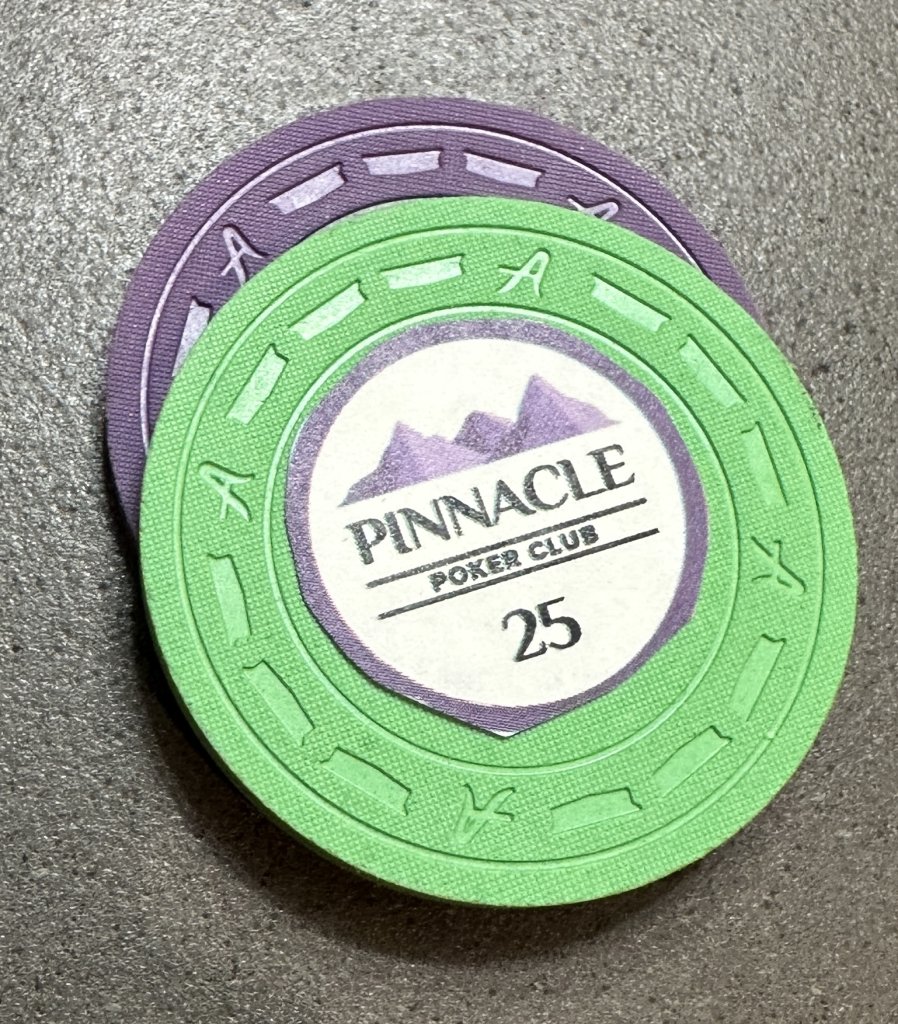
A couple of my inlays came out perfect with those CMYK values. Specifically, these lavender and retro lavender inlays are great (each inlay is shown first against just the matching color chip and then in a away that simulates how it will appear on my final chips with body and edge spot colors):
A couple others are probably close enough, given that I am color matching to edge spot colors, not to body colors. For example, the DG Peacock here looks perhaps a touch dark, but close enough that I won't mess with it, especially once placed on the body chip colors that it will be up against.
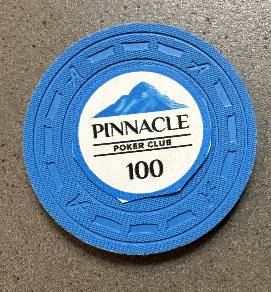
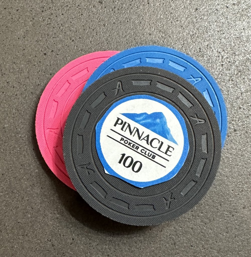
This DG Green is a bit more “faded” (for lack of a better word) than the chip itself, but perhaps that is because I am not using DG ink or CPC’s printers? Again, when placed directly on the relevant chip body color, it seems close enough to the edge spot color that I am inclined to perhaps leave that one alone, though I would ideally like to see this one just a touch brighter/lighter.
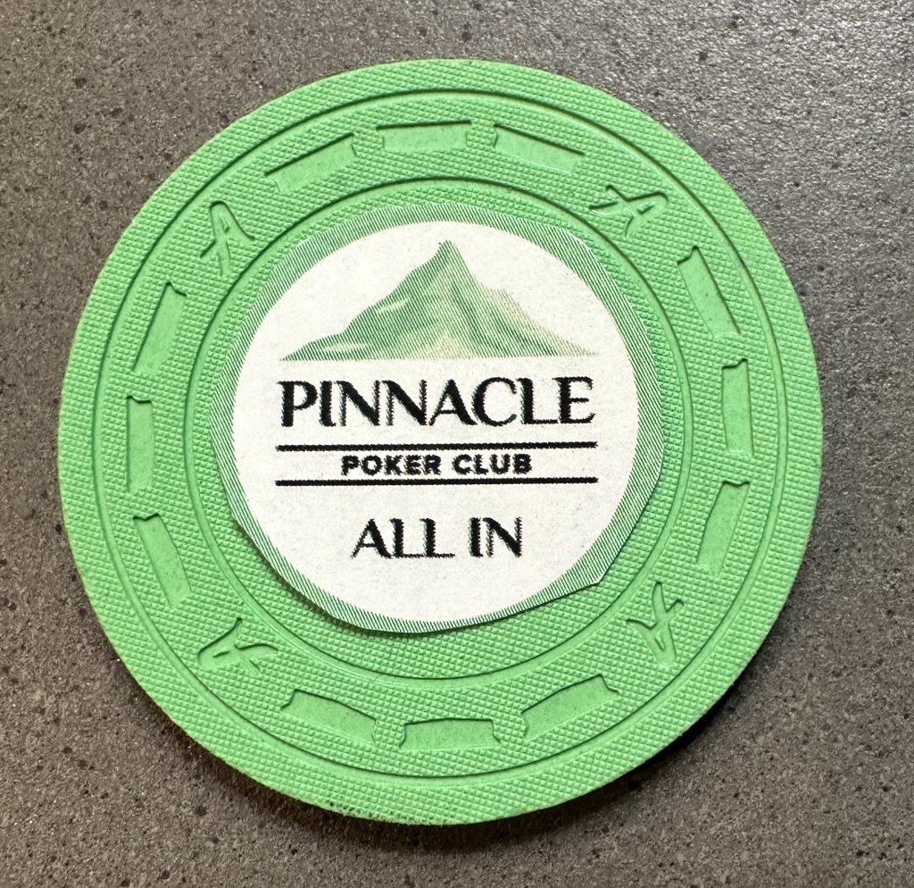
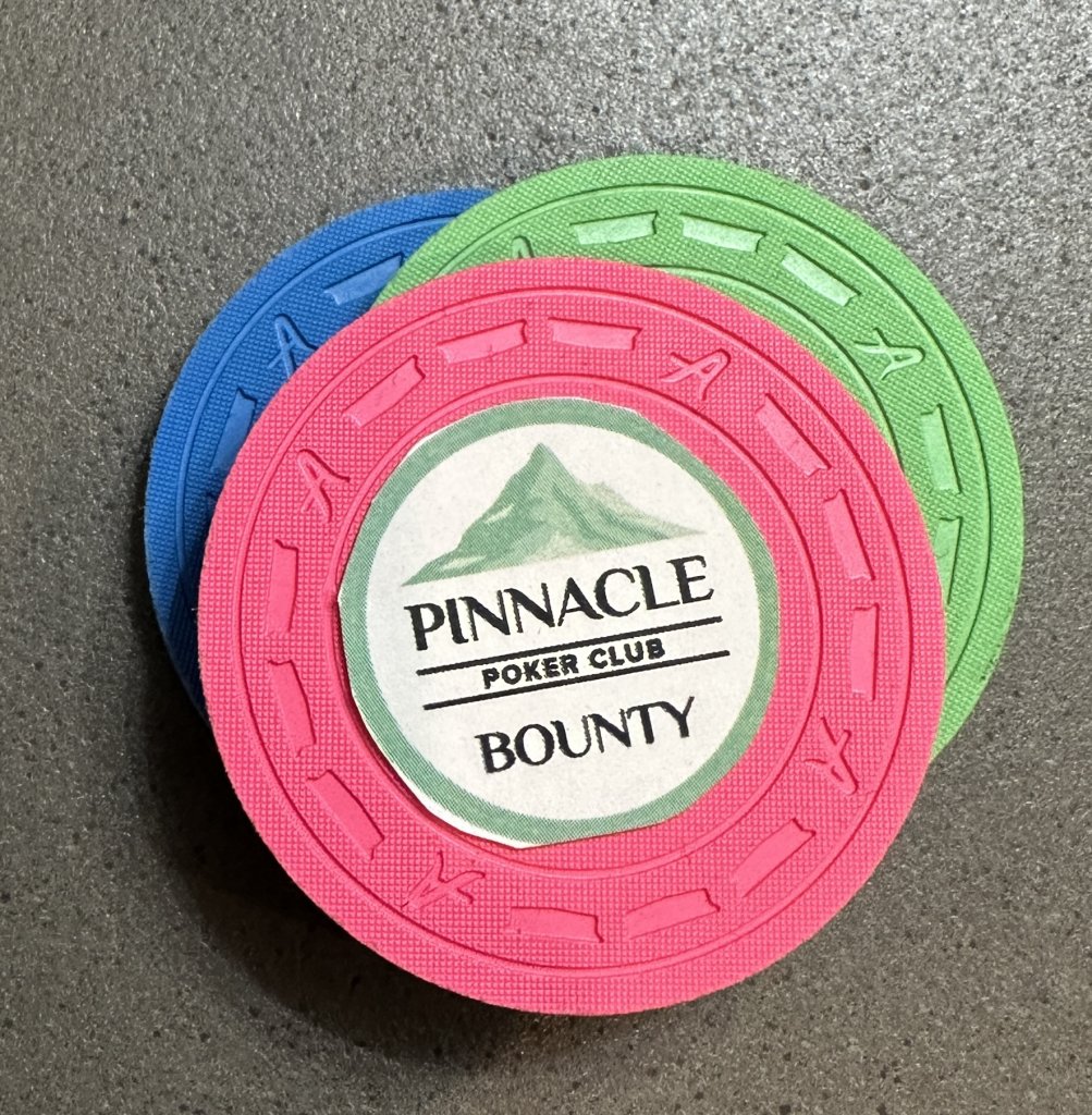
There are two others, however, that seem far enough off that I am wondering whether to try to mess with them or to trust that they will look good when they are printed with DG ink on CPC’s printers.
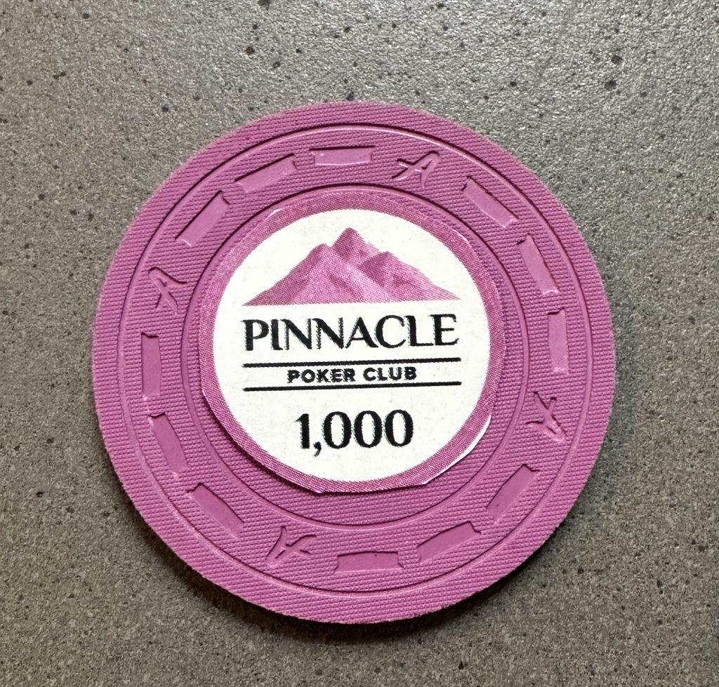
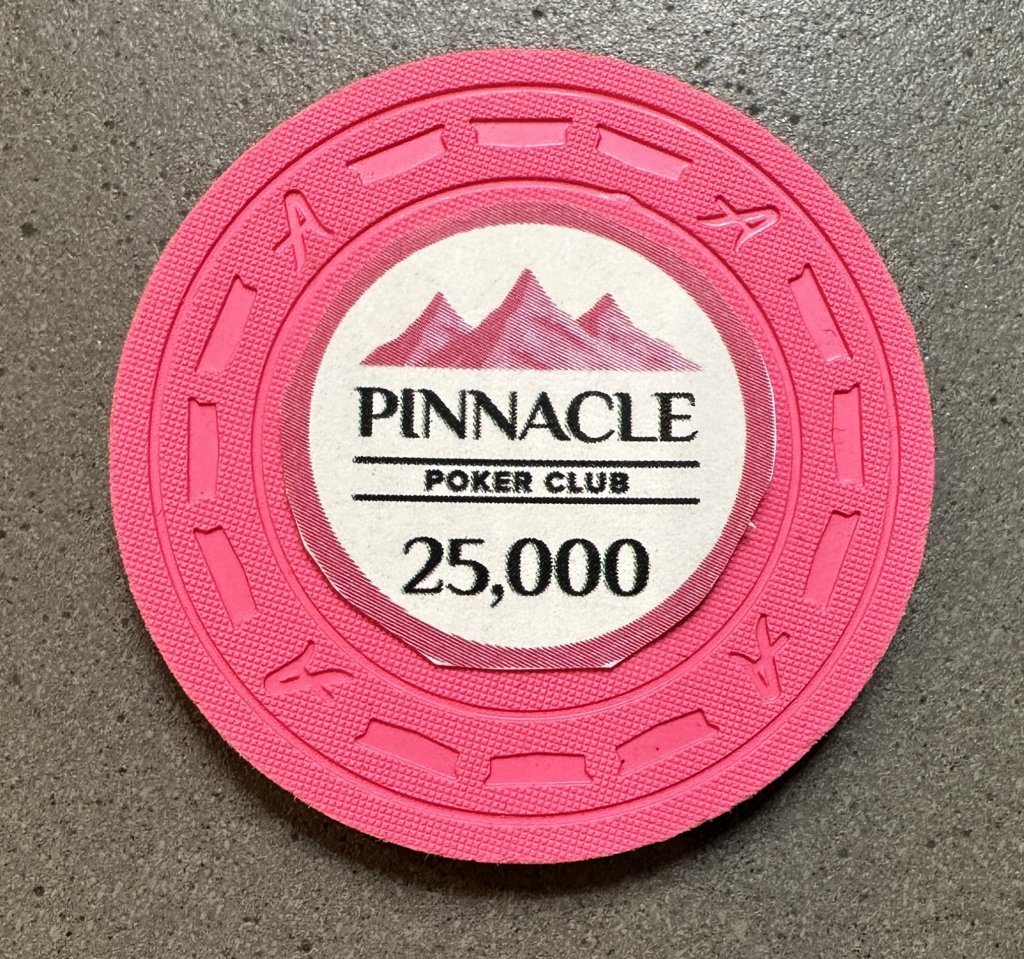
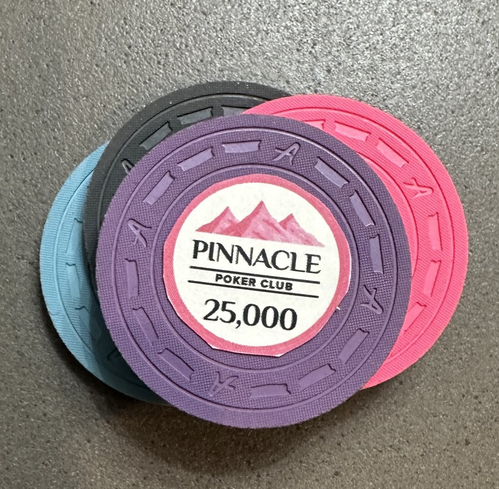
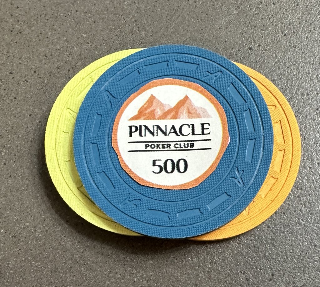
This DG pink inlay seems a bit dark, both when matched on the chip itself and when placed on the relevant chip body with the DG Pink chip nearby (simulating the edge spot that I’ll be matching).
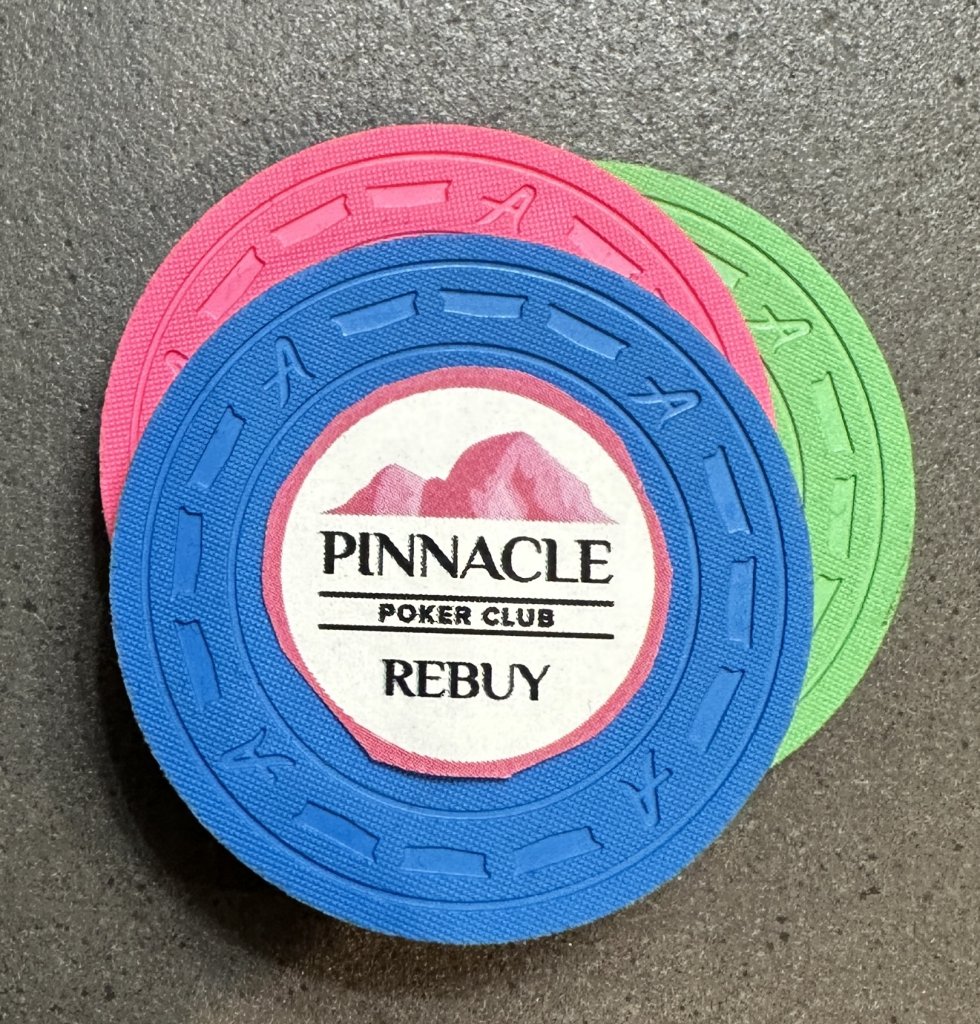
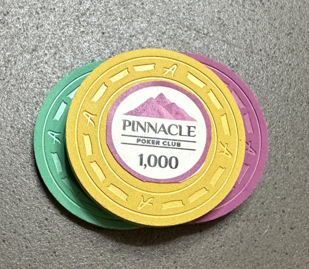
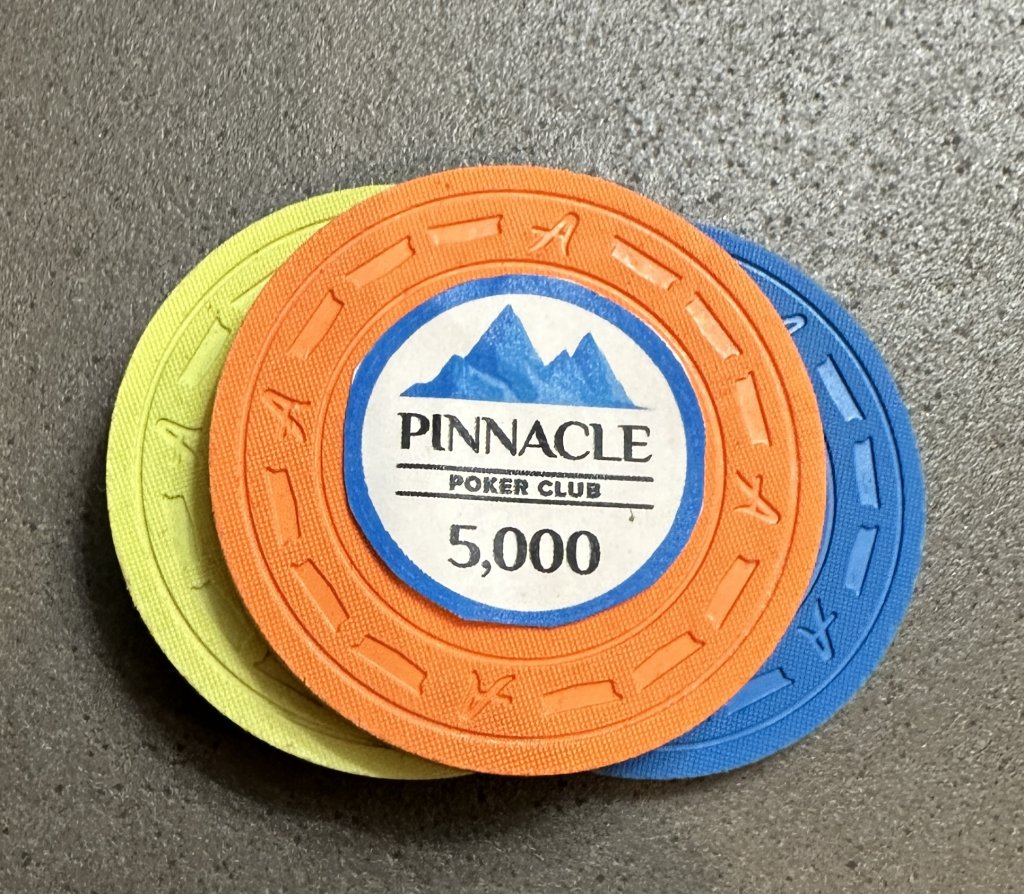
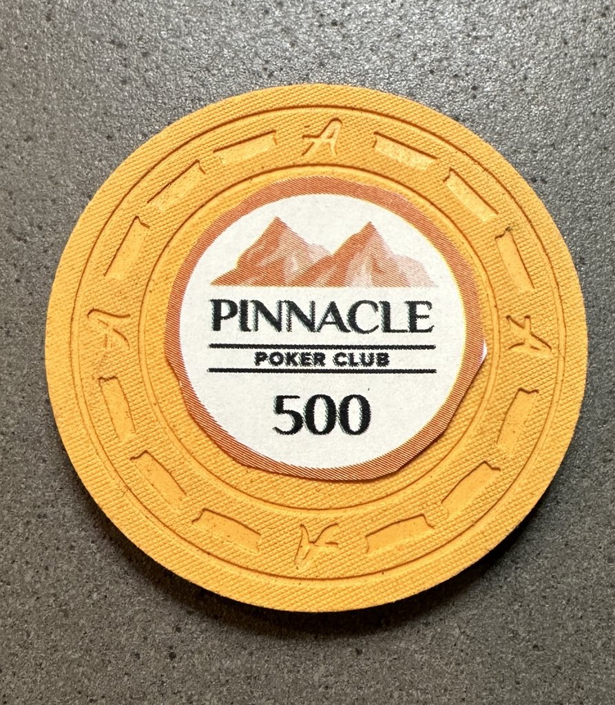
This DG Arc Yellow is even more worrisome; it seems both too dark and possibly also too orange (not yellow enough).
I guess my ultimate question is this: Do I trust the CMYK values, even though I know they are only approximate, in combination with CPC’s DG inks/printers? Or do I try to lighten/brighten some of these colors up a bit? Any advice is welcome.
Thanks!
I got a lot of great advice on the design of the chips and inlays themselves on a separate thread. And I was pointed to this older thread that contained the approximate CMYK values for CPC’s chips. I used those values to color-match the inlays. And then I printed samples of the inlays at FedEx to match up to my physical color sample set of CPC chips. A huge thanks to @timinater for the excellent results on most of these with no edits needed.
A couple of my inlays came out perfect with those CMYK values. Specifically, these lavender and retro lavender inlays are great (each inlay is shown first against just the matching color chip and then in a away that simulates how it will appear on my final chips with body and edge spot colors):
A couple others are probably close enough, given that I am color matching to edge spot colors, not to body colors. For example, the DG Peacock here looks perhaps a touch dark, but close enough that I won't mess with it, especially once placed on the body chip colors that it will be up against.
This DG Green is a bit more “faded” (for lack of a better word) than the chip itself, but perhaps that is because I am not using DG ink or CPC’s printers? Again, when placed directly on the relevant chip body color, it seems close enough to the edge spot color that I am inclined to perhaps leave that one alone, though I would ideally like to see this one just a touch brighter/lighter.
There are two others, however, that seem far enough off that I am wondering whether to try to mess with them or to trust that they will look good when they are printed with DG ink on CPC’s printers.
This DG pink inlay seems a bit dark, both when matched on the chip itself and when placed on the relevant chip body with the DG Pink chip nearby (simulating the edge spot that I’ll be matching).
This DG Arc Yellow is even more worrisome; it seems both too dark and possibly also too orange (not yellow enough).
I guess my ultimate question is this: Do I trust the CMYK values, even though I know they are only approximate, in combination with CPC’s DG inks/printers? Or do I try to lighten/brighten some of these colors up a bit? Any advice is welcome.
Thanks!
