Post mockups for fun/science? (2 Viewers)

Don't remember what inspired these:

cpc-acf-png.102160


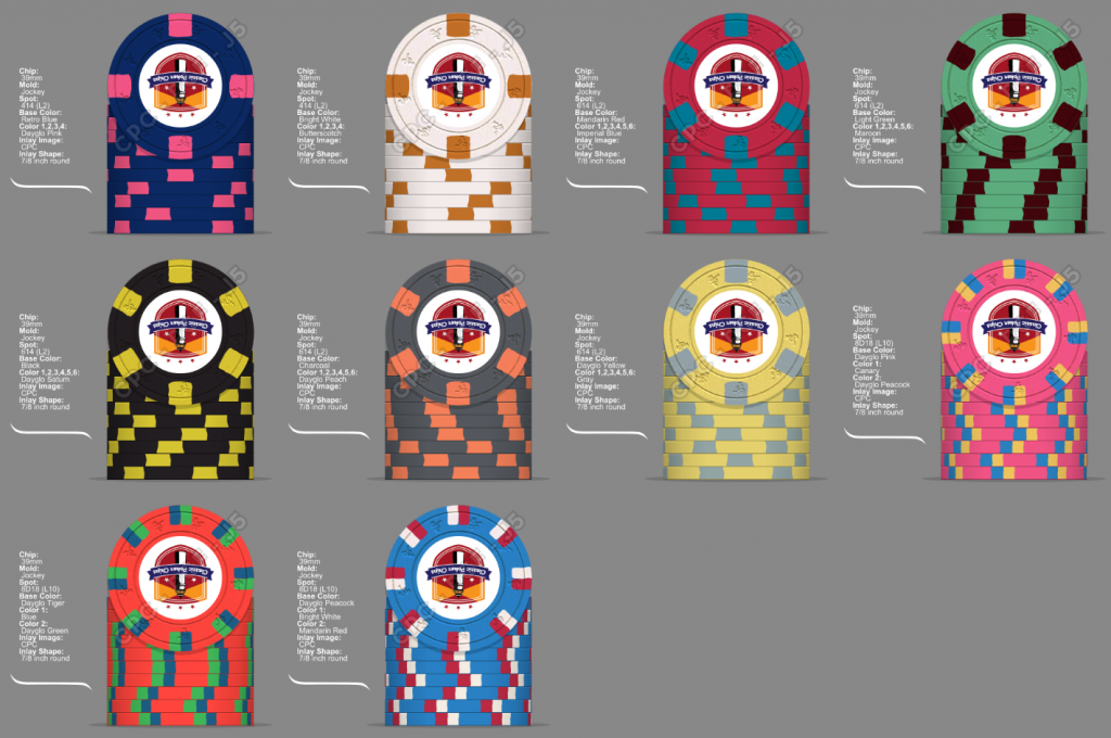
Inspired by the poker chip muse. They are beautiful. And no, I'm not crying, I just have something in my eye.
 
I have zero need for a tournament set, but they are still fun to mock up!!! I have always liked when tournament sets use the same edge spot pattern. This was a little tough making all the chips work together color wise. Not sure if there would be issues with the T100 & T500 chips.

IMG_3006.PNG
 
Playing with cali colors, odd spot patterns ($1 is a L11 according to the chip tool) and the depression era (can't afford them) ...

stacks_02.jpg

case_02.jpg

splash_02.jpg

samples_02.jpg

This is such a cool progression. I've never seen something like this before and it looks really really great.
 
Doing some nice graphics in Photoshop, getting them milled and labeled by Gear - instant HOF set! :D:ROFL: :ROFLMAO:


Just in case I get banned: See ya, folks! :confused:

Take those chips with an Iconic inlay, render that, and it might become more of a possibility.. (y) :thumbsup:
 
I was always a huge fan of the chips used in the Poker Superstars series (2004-2006). Never owned a real compression set, but these would be it if I ever do buy one (likely with a modified inlay for legal purposes). The purple chip's my favorite by far.

poker_superstars.png


Denoms
Black - 100
Purple - 500
Yellow - 1000
White - 5000
Orange - 25000
 
No inlay yet, but I am spit-balling a custom set idea........some might be able to figure out the theme..... ;)

Cash:

Inlay Cash.png


Tourney:

Inlay Tourney.png
 
I really love the design of the Horseshoe Cleveland/Cincinnati chips, both spots and inlay (I'm a sucker for black), but...
- I'm not too fond of buying used chips to play with, even if they're Paulsons
- The train for most of them has already departed, availability has gone down a bit and prices are beyond good and evil for those higher denom chips
- I don't like oversized chips, especially I don't like different sized chips mixed in a set
- I don't like all of the spots, and I like the Cleveland inlay style much more than the Cincinnati one

So I was thinking... why not have some custom lookalikes made by CPC? I've seen others had lookalike ("Horseshoe Card Room") inlays produced for re-labeling, so I guess copyright won't be an issue for this.

Of course they're not Paulsons, and it's a real shame you can't get this awesome looking 4TSA18 spot with the extremely desaturated colors on the primary Cleveland $100, but this way I can pick exactly the spots I want while still having an uniform design, uniform chip size, brand new chips, and you can actually get a decent amount of high denoms to make a tournament set without having to be a millionaire.

I've grabbed an incomplete set of samples of the real thing, still to be delivered, for reference.

Tournament:
horseshoe_tournament_21.png

100k chip likely not even going to get ordered for the set size I've planned for (T30k, 20 players), but I designed one anyway while I was at it.

Cash:
horseshoe_cash_25.png

(edited: real Horseshoe samples arrived. Fixed $5 and $25 colors to more accurately reflect the original)

This is something I will very likely actually roll sometime next year.
First in line is my yet-to-be-revealed "real" custom set (i.e. not copied/lookalike), getting ready to order soon.
 
Last edited:

Create an account or login to comment

You must be a member in order to leave a comment

Create account

Create an account and join our community. It's easy!

Log in

Already have an account? Log in here.

Back
Top Bottom