lulz. the chip tool is more fun than a barrel of monkeys.
You are using an out of date browser. It may not display this or other websites correctly.
You should upgrade or use an alternative browser.
You should upgrade or use an alternative browser.
Post mockups for fun/science? (10 Viewers)
- Thread starter lherron
- Start date
saleen121212
Full House
Quarter, dollar, 5, 20

Luvcasinochipsncekid
Two Pair
mashoo
3 of a Kind
Lofty and noble goals, but very difficult to successfully pull off without causing dirty stack or playability issues. Common newbie approach, too -- I think nearly every single one of us has given it a go at one time or another. Almost all attempts either fail, or could be improved upon by abandoning the effort.
Color-coordination -- both within a single chip and across a set -- is a real art form.
@Ray-Col 's Metronome set was very well done in this aspect imo. I do agree that it's very tough to pull off though.
I can’t stop mocking up sets! I really like what using a 1” inlay does with the 4v and 412 spot patterns. I think the 1” looks much better than the 7/8” on the small crown mold.
I don’t like reusing red but it looks so good on both the $5 & $100. The other red options don’t give as strong of a contrast.

I don’t like reusing red but it looks so good on both the $5 & $100. The other red options don’t give as strong of a contrast.
This looks very nice!
But I feel the inlay looks very busy with so many elements on one side. Would you consider:
1) Keep "The Mermaids Poker Reef" and the numerical denomination on one side, maybe with a small graphic (bubbles?) near the top.
2) Move the mermaid silhouette and the text denomination to the other side. The text can wrap around the curve of the chip wherever there is black space.
andy699669
3 of a Kind
Bounty chips based on the unused beta of ES T500, 39mm & 43mm hybrids.


Spot: 2V214
Base: White #FFFFFF
2V: Purple Mountain Majesty #997DBA (Original: Orchid)
214s: Lilac #CD97C9 (Original: Petunia)
If anyone can provide me the CMYK of the original colours, please let me know.
Spot: 2V214
Base: White #FFFFFF
2V: Purple Mountain Majesty #997DBA (Original: Orchid)
214s: Lilac #CD97C9 (Original: Petunia)
If anyone can provide me the CMYK of the original colours, please let me know.
Nex
Flush
Gray and Light Blue are barely distinguishable from each other if you put them side by side.
I hope you have a color sample set.
I hope you have a color sample set.
I *did* have a sample set for many years. I expect it to be almost a solid. 'm not sure if I will go that road or not. I will definitely buy another sample set if I decide to get serious about ordering. Any other color concerns?Gray and Light Blue are barely distinguishable from each other if you put them side by side.
I hope you have a color sample set.
Last edited:
5aces
Full House
You should also check DG Saturn - It is kind of green/yellow.I *did* have a sample set for many years. I expect it to be almost a solid. 'm not sure if I will go that road or not. I will definitely buy another sample set if I decide to get serious about ordering. Any other color concerns?
James McGill
High Hand
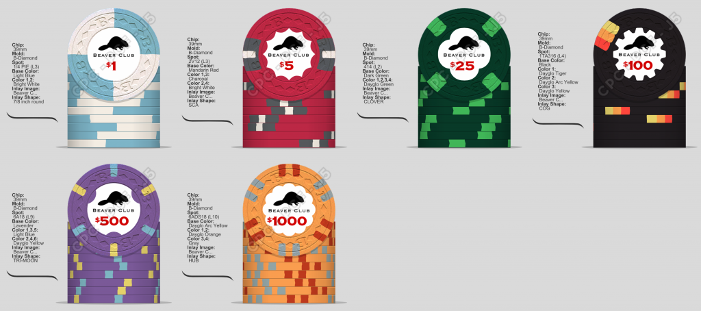
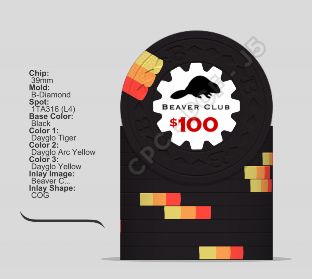
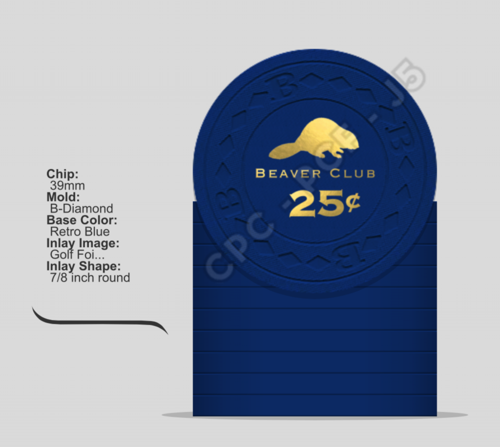
Wanted to get some feedback on my mock up set for my golfing group cash game. The original Beaver Club was formed in Canada by fur traders of the Northwest Company and Hudson Bay Company. I intend on having unique backside inlays for each denomination with some references to the lore of the original club. I was obviously inspired by the Rounders chips for the inlay. Also, I think I'd like to make a hot stamp fractional chip in the future. Oh, and hi, long time lurker, first time poster! 
James McGill
High Hand
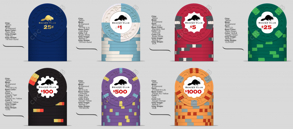
Here's the my mock again. Some changes: changed the mold color of the $25 chip to retro green, changed the spot pattern on the $1000, and added the fractional 25¢ hot stamped chip.
saleen121212
Full House
If I can't have some king 1s I can design a custom set around them

detroitdad
Royal Flush
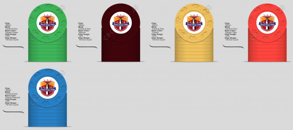
I know I'm in the minority. I like this mold. Thinking of a tourney set (even though I don't host tourney's lol).
Anyone have 10-20 of these that they could ship to me to shuffle for a few weeks?
Anyone have 10-20 of these that they could ship to me to shuffle for a few weeks?
detroitdad
Royal Flush
I have 20 I can bring to you Saturday.
excellent. I'll bring the TRK mold chips. I can't leave them @MatB is taking them back with him to lend to @Seeking Alpha Social Club
Seeking Alpha Social Club
4 of a Kind
Thank you!! Wrong Matt tagged I think, but we get itexcellent. I'll bring the TRK mold chips. I can't leave them @MatB is taking them back with him to lend to @Seeking Alpha Social Club
detroitdad
Royal Flush
dmalhi1
Flush
- Joined
- Oct 12, 2018
- Messages
- 1,317
- Reaction score
- 1,397
- Location
- North Delta (Vancouver), BC, Canada
Quarter, dollar, 5, 20View attachment 209475
who designed the insert? looks cool.
dmalhi1
Flush
- Joined
- Oct 12, 2018
- Messages
- 1,317
- Reaction score
- 1,397
- Location
- North Delta (Vancouver), BC, Canada
I know I'm in the minority. I like this mold. Thinking of a tourney set (even though I don't host tourney's lol).
Anyone have 10-20 of these that they could ship to me to shuffle for a few weeks?
View attachment 217405
new age dice chips. i approve
saleen121212
Full House
who designed the insert? looks cool.
@Gear
Updated set idea with new inlay. Working on replacing the ship with something else and need feedback on the whole Cali set. Denoms are quarter, 1, 5 and 20 so far. 1 is based on king one. Label based on bellagio with a small pirate theme. Maybe a treasure chest or capital T instead of the ship?
Not sold on brown spots on the yellow or spots on the frac
Nex
Flush
How about a line art drawing of the island?
saleen121212
Full House
How about a line art drawing of the island?
I mean I'm not above straight copying deadmans bay, @bentax1978. Still my favorite set on this forum. Could someone with some talent mock that up? Anna maria island, I have no idea how to just get the outline for it.
Nex
Flush
Not Dead Man's Bay… Tortuga, the island. La tortue. The tortoise.
saleen121212
Full House
Not Dead Man's Bay… Tortuga, the island. La tortue. The tortoise.
Now your on to something. @Gear what Nex said.
saleen121212
Full House
Or does anyone have a cool clip art of the island or a non cheesy turtle?
I mocked these up a while ago. Was gonna do a Tortuga Island tourney set. I just used some logo I found online. I wasn't to the point to have someone do up the proper inlays.Or does anyone have a cool clip art of the island or a non cheesy turtle?
Similar threads
- Replies
- 12
- Views
- 485
- Replies
- 97
- Views
- 10K
- Replies
- 169
- Views
- 25K
- Replies
- 10
- Views
- 2K
