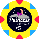
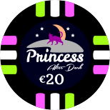
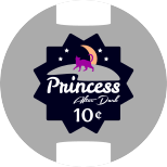
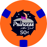
Princess' CatHouse (now Private Club) (2 Viewers)

So, the line-up is (I think) complete.

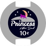
Princess-10c-Chip.png
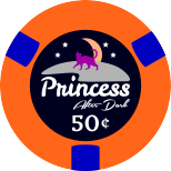
Princess-50c-Chip.png
Princess-$1-Chip.png
Princess-$5-Chip.png
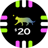
Princess-$20-Chip.png


Now, I'll work on the rolling edges.
 
Last edited:
I think I might reuse the label design of the tournament set on the cash set :

Princess-10c-Chip.png
Princess-50c-Chip.png
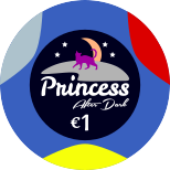
Princess-€1-Chip.png
Princess-€5-Chip.png
Princess-€20-Chip.png


I'll explore another idea and then decide.
 
And changing the cat color to match the chip main color ? (white or gray / orange / blue / yellow / green or pink)

If not I would go for all white 10c, but that's mostly me not wanting ton of colors on my inlays. Maybe the €1 in second place with the princess text in pink.
 
I like the 5 and 20, sad no quarter. What stakes are you playing?
 
I like the 5 and 20, sad no quarter. What stakes are you playing?

I plan to cover :
NL10 : 10c - 10c
NL20 : 10c - 20c (most of the time)
NL50 : 50c - 50c
NL100 : 50c - $1 (not sure my group will ever play these stakes but at least my set will allow it)
 
I plan to cover :
NL10 : 10c - 10c
NL20 : 10c - 20c (most of the time)
NL50 : 50c - 50c
NL100 : 50c - $1 (not sure my group will ever play these stakes but at least my set will allow it)
I think that 50c-50c will be a good idea for our next CG.
 
So I got the chips yesterday.
Shipping was very fast, very secured and no missing piece.
Regarding the chips themselves, 43mm with 25mm labels, I would not have expected them to be that nice and so great to handle.

There is however something which is not good. The color of the T25 is off compared to design files and also produced samples.
So I've sent them a mail to fix this chip. The problem is that in artificial light, the green T25 becomes too close to the grey T100 in my opinion. I hope I can get it fixed.

I'll post pics later.
 
Just pushing another design idea I had in mind.

With plain labels :

Princess-10c-Chip.png
Princess-50c-Chip.png
Princess-€1-Chip.png
Princess-€5-Chip.png
Princess-€20-Chip.png


With shaped labels:

Princess-10c-Chip-Shaped.png
Princess-50c-Chip-Shaped.png
Princess-€1-Chip-Shaped.png
Princess-€5-Chip-Shaped.png
Princess-€20-Chip-Shaped.png


--> note that I plan to make the cash set on these chips which have a marked central area.
polyclay_18_02.jpg


I've still to think about which direction to go...

I'm not satisfied anyway with this design yet. Color choice is quite difficult with a darker background which is required for the theme (after dark). Also, the faux-shaped inlay on the €20 is not rendering well at all if I keep the same back-ground color.

Maybe doing a full moon will be better with a black cat then but I really like the crescent moon :
path953.png
 
Last edited:
Maybe doing a full moon will be better with a black cat then but I really like the crescent moon :

Clearly full moon look better imho.

With plain labels :

Princess-10c-Chip.png
Princess-50c-Chip.png
Princess-€1-Chip.png
Princess-€5-Chip.png
Princess-€20-Chip.png


With shaped labels:

Princess-10c-Chip-Shaped.png
Princess-50c-Chip-Shaped.png
Princess-€1-Chip-Shaped.png
Princess-€5-Chip-Shaped.png
Princess-€20-Chip-Shaped.png


I like the 2 versions but maybe more the plain labels version. But not sure, hard to say only with design picture, without seeing in real.

PS : We feel your The post love with this 50¢. :)
 
PS : We feel your The post love with this 50¢. :)

Yes indeed !

Avantage of the plain label is that its content can be bigger. Which for a busy design is better for visibility purposes.

Shaped design would be perfect on PolyClay chips as there will be no issue of color matching.

So if I go in this design direction, it'll be the plain version.

But again, I'm not satisfied with it, even with the full moon.

I just wanted to show what I tried but currently I'm sticking with the "private club" design.
 
I think that the PolyClay platform is great for shaped inlay design.
I'm almost sure I'll go in that direction.
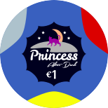
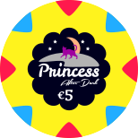
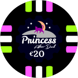
I re-thought my design and I'm pretty satisfied with this one :

Princess-10c-Chip.png
Princess-50c-Chip.png
Princess-€1-Chip.png
Princess-€5-Chip.png
Princess-€20-Chip.png

Princess-Dealer.png


With the mold and marked central area of these chips, I think this design will render quite well.
 
Last edited:
Some update...

So this was the sample I validated :

I decided to remove the gradient because they could not manage to have the gradient color on the label similar to the chip color.

Samples have been produced and validated. I asked them to make sure edges are properly aligned because on the produced sample I would not called it perfect.

View attachment 356851View attachment 356852View attachment 356854View attachment 356855

And this is what I got :

C69128B3-0F81-4378-B38C-E303F87BED11.jpeg


I was not happy with the green T25. Color seems too pale and in low light it was possible to get confused between the T25 and T100.

So basically they will get it redone. I’ve even had the possibility to tweek the colors. Here’s the validated sample for the new T25 :

373C64D1-7A5A-4A53-97E1-28C8C128ECD4.jpeg

65B6414C-3C9B-4FDF-ACCE-CDA585FCD64A.jpeg

C01B133C-A27E-44A2-883D-A1706DCB5062.jpeg


So they will produce and ship me the fixed T25 soon.

And together with the fixed chips, they will ship me a sample of the PolyClay for my cash set. The prototype has been done :

0077BA04-4A04-4067-8EE6-85E89C96BE71.jpeg


5ECE21D7-28F0-48BE-99D7-3B3F66F898A9.jpeg


CC4C3EB3-42A2-417D-9889-7BFA5A9D33A4.jpeg


Kid.
 
Thanks !

I’m curious to see in person how the wording « after dark » is visible.
 
So SunFly fixed my green. Now I’m happy with the result as I won’t have any issue in low / artificial light between the green and grey.

Here’re pics with the previous green, new green and grey for comparison.

2BE6BAB4-F823-4594-A8E0-82F62EFC41AC.jpeg

87F0E4EC-D6EB-46CD-9D7C-E42FB2AB036F.jpeg


I changed one of the spot too.
I’ll post a full pr0n soon.
 
I’ll sell the 6 « error » barrels so that anyone willing to order a custom set can test a barrel before pulling the trigger.
 

Create an account or login to comment

You must be a member in order to leave a comment

Create account

Create an account and join our community. It's easy!

Log in

Already have an account? Log in here.

Back
Top Bottom