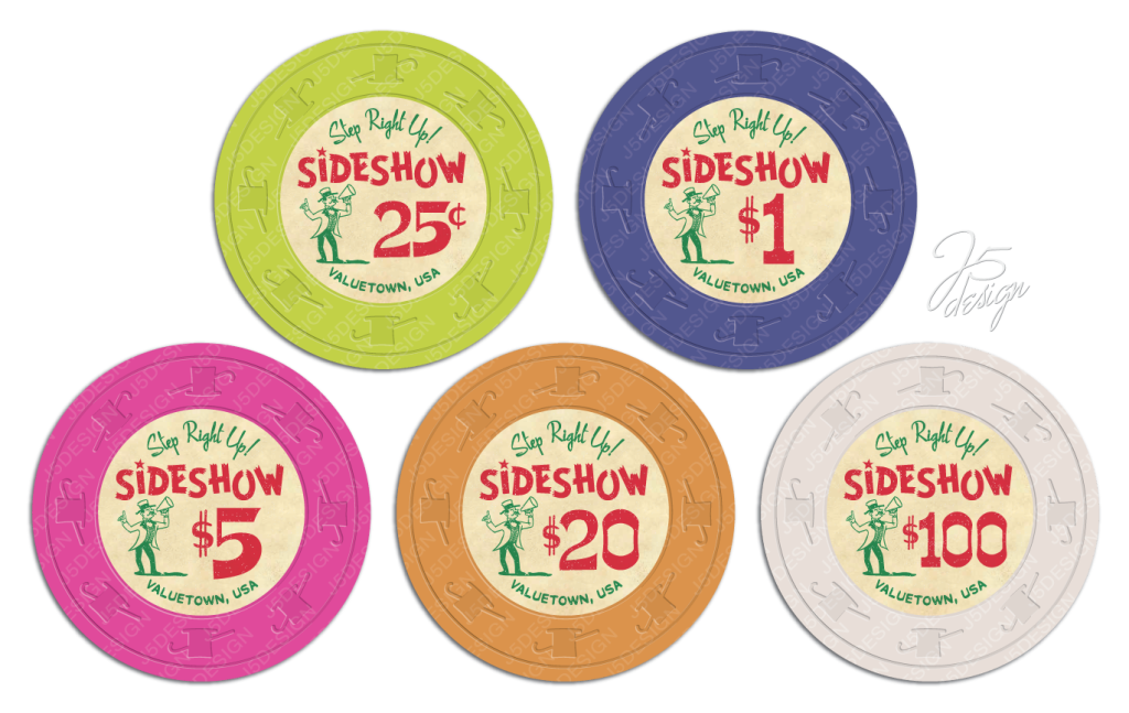
A few years ago I built a 40 person tourney set, Sideshow Poker. I'm really happy how it turned out. It's been in play more than a few times at my neighborhood monthly game and also was the guest set at @krafticus monthly game once last year. I have had lots of positive feedback. So I decided to try my hand at designing another custom set.
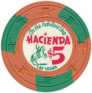
This time I wanted to do a cash set of solids as a companion set to the tourney. I spent quite a bit of time collecting and trying out different color combinations and coming up with the right look and feel. I ultimately "borrowed" the from an old-school Hacienda chip.

While my tourney set is more bright and colorful and playful, I wanted the cash set to have a darker, more of a old-school cigar-smoked filled card room feel while still maintaining the Sideshow moniker. So this is what I came up with.

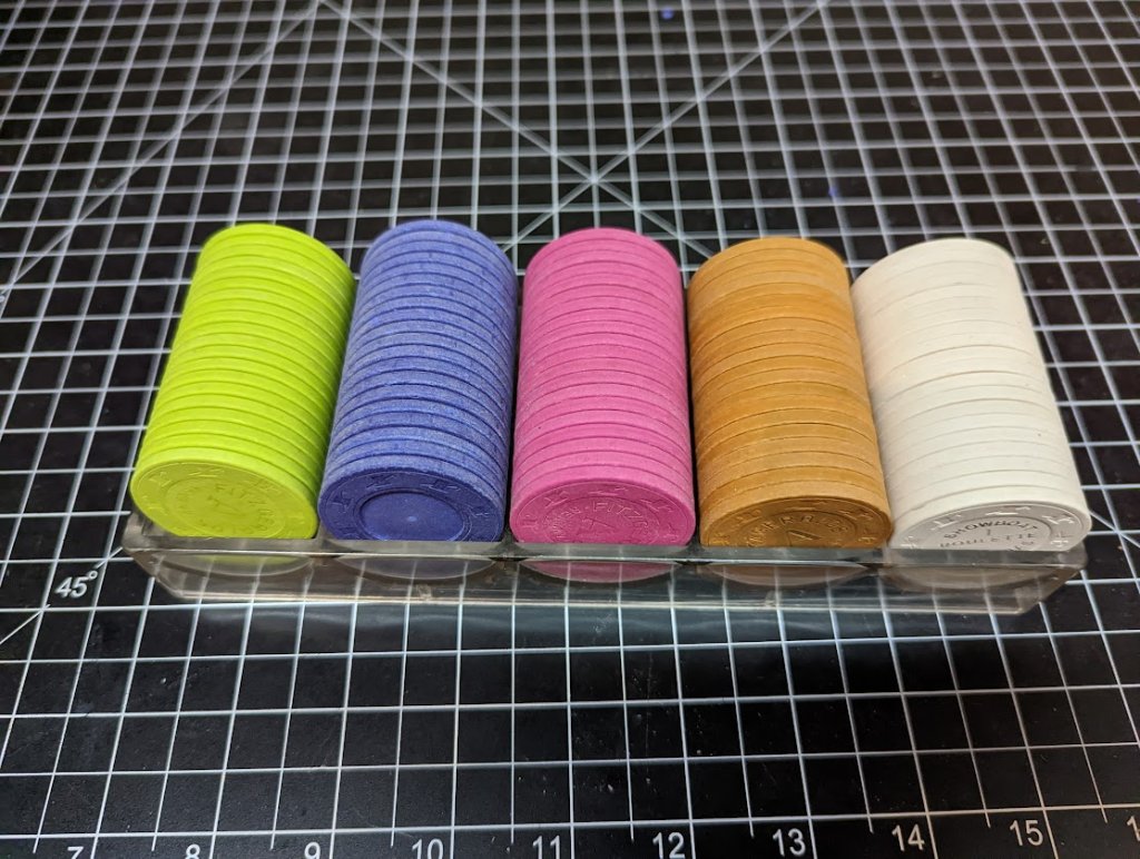
Currently the set will contain...
140 x $0.25
300 x $1
300 x $5
100 x $20
20 x $100
That should be more than adequate for any cash game I host in the foreseeable future.
The actual chips are in the same used but good condition as the tourney set, which is how I like my chips. I still need to mill a bunch of them and oil them all before I apply the labels. But I have time since I just put the order in with gear and it's going to be awhile before I receive them.

Just wanted to share what I have been working on. Once I get set fully milled, oiled and labeled, I'll be posting more pics.
Would love to hear what y'all think.
thanks for looking,
chris.
This time I wanted to do a cash set of solids as a companion set to the tourney. I spent quite a bit of time collecting and trying out different color combinations and coming up with the right look and feel. I ultimately "borrowed" the from an old-school Hacienda chip.
While my tourney set is more bright and colorful and playful, I wanted the cash set to have a darker, more of a old-school cigar-smoked filled card room feel while still maintaining the Sideshow moniker. So this is what I came up with.
Currently the set will contain...
140 x $0.25
300 x $1
300 x $5
100 x $20
20 x $100
That should be more than adequate for any cash game I host in the foreseeable future.
The actual chips are in the same used but good condition as the tourney set, which is how I like my chips. I still need to mill a bunch of them and oil them all before I apply the labels. But I have time since I just put the order in with gear and it's going to be awhile before I receive them.
Just wanted to share what I have been working on. Once I get set fully milled, oiled and labeled, I'll be posting more pics.
Would love to hear what y'all think.
thanks for looking,
chris.
