Venturalvn
Full House
Finally getting around to posting this backlogged project I've been kicking around behind the scenes for a while. Since we bought our house at the end of 2018 I've been looking for an excuse to create a new set to exist alongside The Beach, and it would appear the time is now to bring it to life.
I tried starting an idea thread a while ago, that more or less was a wash. Hey they can't all be winners!
https://www.pokerchipforum.com/threads/indian-casino-tribute-need-help-on-name-ideas.21338/
Background:
I grew up playing in Indian casinos in the southern California area when I was 18. As I was located in Santa Barbara for many years (The Beach!), Chumash casino was our regular stomping ground. We also frequented Morongo casino, and over the years have patronized San Manuel and Pechanga.
To that end, I wanted to create a set that paid tribute to the local tribes, as their lands are steeped in the culture in various areas of SoCal, and of course their gaming venues turned me into a gambling monster in a very formative time in life.
Location:
At the end of 2018 we bought our first house in a town called Simi Valley. This name is derived from a bastardization of the Chumash name Shiyimi Valley, aptly named for the type of clouds that (used to) hang over the valley.
There is a painted cave located in Simi Valley, with petroglyphs left over from the Chumash that used to inhabit the area. The location of it is no longer published and th land inaccessible in order to preserve it, however the photographs taken from inside show many symbols of the sun, mother Earth, condors, and many others.
Simi Valley also belongs to larger stretch of valley referred to by the Chumash tribe as Sky Valley, which stretches from Ventura County (where I grew up) all the way to the edge of the Los Angeles area.
The Chips:
Sun Fly Hybrid 39mm HB001
Sun Fly Hybrid 43mm HB005
This idea was first inspired by the Boardwalk GB when I got the 39mm and the PCF 43mm mold in my hands. As the casinos I got started in utilized RT Plastics for a while, I was planning on doing a mock RT plastic.
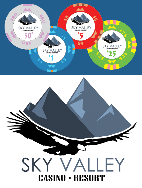
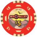
Over time it has morphed into a mock BJ V7, with some liberties taken in graphics. I'll be mixing edge symbols that aren't stock molds for BJ, as well as turning the face symbols into the mountain symbol on all chips to represent the valley.
The feel of the logo/inlay is meant to be reminiscent of older day Native American casino brands, while the logotype will mix in some modern elements that have been replacing them as they rebrand over the years. The California condor is a bird revered by many tribes, and the Chumash in particular even have a Condor Dance.
I also wanted to try to give a shot at a white inlay background. Doing the gradient on the Beach inlay seemed appropriate, but I wanted to go a different direction here. I want to keep the graphics exciting enough to carry a white background, but simple enough that I can reuse images for tap handles, pint glasses, and any other custom accoutrements that will arise that's needs a simplified scale.
I have a lot of work to do. There's a lot of updating to be done and tweaks to be made, so here goes nothin.
Initial mockup:
Last edited:

