Venturalvn
Full House
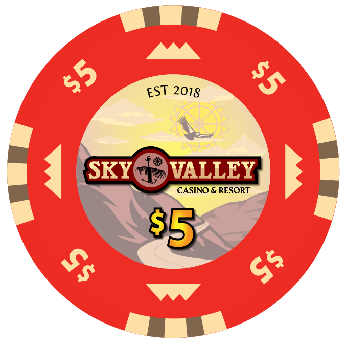
Trying something whacky with the sun petroglyph from the painted caves in the background. I kinda don't hate it.

Last edited:
Yeah first thing I noticed at print size was the petroglyph being too small. The digital resolution is hard to see in the screencap, but the stroking around the font is perfectly legible. The "casino & resort" is clearly too small. I might lower the points of the V and Y and run that the length of the inside as well, but am playing with options.Maybe make "Casino & Resort" the entire width of the standard? I don't know if you're going to see the whole petroglyph detail.
You've got a lot of graphic elements. Would you consider a different design on each face of the chip?
Thanks! I think this might be the last edit I do before contacting Sun-Fly. I drive myself nuts with the ticky tacky stuff. I think if it's legible and can also hold up to printing at 6'ish inches then I should be good.Looks pretty good!
If you say it, then I have to be happy with it. Considering you own one of the top 3 custom sets on the site, I might as well just send it off now if you hit it with a Love emojiLooks great man...latest labels and chips.
When you said a different design on each face, were you talking about the different offerings that BJ offers on the V7s? Diamond, double diamond, dots, triangle, double triangle, etc?
I appreciate that comment very much (I don’t believe it but I appreciate it) but don’t sell yourself short. The Beach chips are beautiful and very well done! You obviously know what you’re doing.If you say it, then I have to be happy with it. Considering you own one of the top 3 custom sets on the site, I might as well just send it off now if you hit it with a Love emoji
You've done a great job with this design, man! Honestly love it.Updated version per @72o suggestion. Zoomed out the mountains to give more depth.
Also started a convo with Sun-Fly today to figure out costs, shipping, artwork, etc...
View attachment 543110
Last decision I have for myself is whether or not to do the dots/dashes that are a trademark of the BJs. I often feel like they take up too much space on the rolling edge, so the chip base colors take a back seat. Since I'm doing a "faux" V7, I was leaning towards leaving them off so more of the base colors shines through.You've done a great job with this design, man! Honestly love it.

Edge spots FTW!! I might be super biased though
I was dead set on leaving the dots off but am having a change of heart seeing both rolling edges next to each other. I think the colorways alleviate a lot of the concerns I would normally have about muddy BJ V7 clarity issues...Hmm that's a tough decision as I feel like in this case, you still see enough of the base colors on the rolling edge to not be a bother. If I had to chose right now, I think I would leave off the dots/dashes. Part of the allure of hybrids (or any ceramic chip) is that you can do a lot with the rolling edge if so desired. It's not like the latest issues with the Matsui GB chips where you totally lose the base chip color.
Sorry for not helping...just need to think about it a bit.

Good call. Not that it matters, but I've come around to the idea of the busier design on the rolling edge (as long as it's not text). The only chip that may "lose" its base color in stacks would maybe be the frac. But the only solution I guess would be to have less purple edgespots. You could maybe try only having 3 purple spots but making them slightly larger and see how that works.Just heard back from Susie at Sun-Fly about pricing and freight. I thinned out the stripes on the rolling edge of the $5, and I'm moving forward with the BJ V7 style dots. I might tweak the red in the logo a little bit, but this time next week I plan to have my order in progress for HB001 .50-$5, and the oversized HB005 $25!
