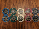
Some Decopunk chip design I made. (1 Viewer)

Antrooper

Two Pair
Supporter
Joined
May 23, 2024
Messages
374
Reaction score
299
Location
THE WOODLANDS
Greetings, as we went down this hole, one is inevitably trying to custom one's own set. Which I tried to make mine in a more Decopunk set. I'm pretty happy on the design, but trying to ask for y'all on the opinions. Thanks.

CHIPDESIGN_SET.png
download.png
 
Are you going to use matching colors for the stripes (e.g. lilac on the white chip above)? Or contrast them?
 
Are you going to use matching colors for the stripes (e.g. lilac on the white chip above)? Or contrast them?
Not really thinking that hard yet, I got like HSI $1s, and IG $25s, and I'm considering making them fracs.
 
Are you going to have any script/name on it? To me, its kinda screaming for some casino/hotel name in the middle of the chip at the bottom of the building and above the denom. If no name/script, consider making the building bigger and move it to the bottom of the chip and have the denom in the base of the building?
 
It reminds me a little bit of the Gatsby set I made eons ago:


1717981141122.png

Like others said, I think it could use a name. One option would be to do one side with the logo and name, and the other side with the logo and denomination.

Is this supposed to be an iconic building? Maybe a name linked to the building like The Empire Room or something like that. I also think it might be nice to have a different imposing structure on each chip along with the different colors.

All black chips may make it more likely for dirty stacks or difficulty differentiating chips when in a splashed pot. Just my 2 cents.
 
It reminds me a little bit of the Gatsby set I made eons ago:


View attachment 1341922

Like others said, I think it could use a name. One option would be to do one side with the logo and name, and the other side with the logo and denomination.

Is this supposed to be an iconic building? Maybe a name linked to the building like The Empire Room or something like that. I also think it might be nice to have a different imposing structure on each chip along with the different colors.

All black chips may make it more likely for dirty stacks or difficulty differentiating chips when in a splashed pot. Just my 2 cents.
Beautiful.
 
Are you going to have any script/name on it? To me, its kinda screaming for some casino/hotel name in the middle of the chip at the bottom of the building and above the denom. If no name/script, consider making the building bigger and move it to the bottom of the chip and have the denom in the base of the building?
That's the neat part, I'm still considering the names.
 
The denomination number should be centered before the dollar/cent symbol is added. Making the symbol smaller than the number is a standard that helps.
 

Create an account or login to comment

You must be a member in order to leave a comment

Create account

Create an account and join our community. It's easy!

Log in

Already have an account? Log in here.

Back
Top Bottom