Yes! This is a must havebomb omb is perfect for a bomb pot plaque or chip as well - just sayin
You are using an out of date browser. It may not display this or other websites correctly.
You should upgrade or use an alternative browser.
You should upgrade or use an alternative browser.
Interest Super Poker World - Mario Themed Table Topper (6 Viewers)
- Thread starter rjdev7
- Start date
you could also do a rebuy chip as:
An extra life!

An extra life!
The good ideas just keep coming!
Love these ideas. I’m done at the dealer button and seating tokens thoughThe good ideas just keep coming!
Pinesol13
Flush
Love these ideas. I’m done at the dealer button and seating tokens thoughBy all means, feel free to organize more buys in the meantime

I'm not committing to it yet, but I may do a cards mold chips and buttons group buy.....maybe.
Below are some rough drafts for buttons.
BOMB POT
BOUNTY
REBUY
SHOW'EM
I am stuck on ideas for an ALL IN button.....
LOVE
Maybe an all-in could be something with gold coins, like this:I'm not committing to it yet, but I may do a cards mold chips and buttons group buy.....maybe.
Below are some rough drafts for buttons.
BOMB POT
View attachment 758193
BOUNTY
View attachment 758194
REBUY
View attachment 758195
SHOW'EM
View attachment 758196
I am stuck on ideas for an ALL IN button.....
or this:
Pinesol13
Flush
Concept for the actual chips

holy sh*t I love this
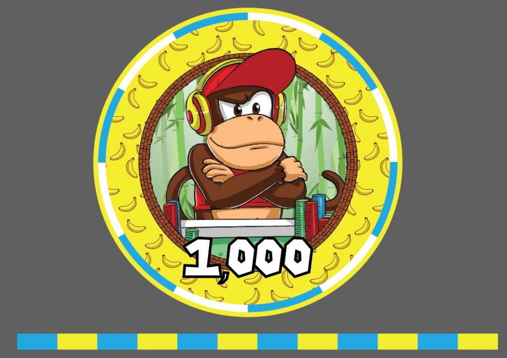
With this chip, you could say, “I raise you Three Diddy.”
Pinesol13
Flush
holy sh*t I love this
Thanks! Would not have been possible without your awesome artwork.
I'm thinking it would be cool to have a different background pattern for each character. Diddy's got the bananas, Mario could have a mushroom, Luigi a pipe, Princess a star, etc.....
I rethought the edges for Diddy. It's always kind of a gamble putting things on the edge artwork. Sometimes they just look a blobby mess...
I always knew Luigi was the cool one.Luigi a pipe,
I want these chips.
Yeah I really like this concept a lot, specifically tailoring the background to the character. My only ask is that we make this a cash set, or at least have options for cash OR tournament denominations.Thanks! Would not have been possible without your awesome artwork.
I'm thinking it would be cool to have a different background pattern for each character. Diddy's got the bananas, Mario could have a mushroom, Luigi a pipe, Princess a star, etc.....
I rethought the edges for Diddy. It's always kind of a gamble putting things on the edge artwork. Sometimes they just look a blobby mess...
View attachment 758272
Also, don't know if you meant for this to happen, but the brick border really has a "tribal" vibe to it, like Temple Run or something so it goes well with Diddy as a monkey. Really cool stuff all around IMO.
Pinesol13
Flush
Yeah I really like this concept a lot, specifically tailoring the background to the character. My only ask is that we make this a cash set, or at least have options for cash OR tournament denominations.
Also, don't know if you meant for this to happen, but the brick border really has a "tribal" vibe to it, like Temple Run or something so it goes well with Diddy as a monkey. Really cool stuff all around IMO.
Thanks, I did not really mean for the brick border to vibe specifically with Diddy. I just used the same border from your dealer button. My plan was to use the same border for all the other characters, but have different color and patterns for the background/borders.....but now you have me rethinking that.
As far as denominations, I was thinking cash set and tournament set. Below is an example of what I was thinking (although the chip designs have nothing to do with what the final designs will be, the colors are roughly what I was thinking.)
CASH SET
DK - 25c
Toad - $1
Mario - $5
Yoshi - $20
TOURNAMENT SET
Luigi - 25
Bowser - 100
Wario - 500
Diddy - 1,000
Peach - 5,000
* Koopa Troopa - non-denom chip. (will probably change him to a blue)
Pinesol13
Flush
Also, I meant to say, this lineup is by no means set in stone. I'm open to any and all feedback in regards to which character should be which denomination, and for color choices.
Especially from you @rjdev7 , if you have specific feelings on what character you want to see on a denomination let me know.
Especially from you @rjdev7 , if you have specific feelings on what character you want to see on a denomination let me know.
turboj623
Flush
I can already hear my wallet screaming at me with all of these updates. Or is that my wife?
Last edited:
Pinesol13
Flush
Last one I'm going to mock up today......probably
Pinesol13
Flush
Luigi loves the Pipe
Pinesol13
Flush
This one might be a little too busy
Pinesol13
Flush
Pinesol13
Flush
By no means perfect, but it's a start.
spartan037
Pair
@Pinesol13 for Luigi you should alternate between upside-down question marks and right side up question marks on the side section.
These are so f*cking cool. I'm not capable of saying no to buying some of these should someone step up and organize a group buy. Amazing job.
Pinesol13
Flush
@Pinesol13 for Luigi you should alternate between upside-down question marks and right side up question marks on the side section.
Yes, not sure why I did that for some, and not all. I am torn a little, I'm not sure I like the upside-down alternating look for some of them.
A couple of other critiques:
The Backgrounds
- Bowsers fire background is the only one thats not monochrome.
- Luigi and Bowsers backgrounds are a little too busy. Maybe if I change Luigis from white to dark green.
- Princess peach has a few spots that look a little blank, need to redo the star pattern.
The White Circle Borders
- Should I make these consistent, as in the number and length of the colored sections? I think more white is better (like princess).
The Edges
- I don't love that the 500, 1,000 and 5,000 have a lot of yellow and purple going on. I might change Princess from purple to more of a peach/orange.
- Do I alternate the icons to every other upside down?
- Probably need to make Luigis icons more bold, so the white doesn't disappear when printed
These are so f*cking cool. I'm not capable of saying no to buying some of these should someone step up and organize a group buy. Amazing job.
THANKS!
SixSpeedFury
Full House
WOW! You got some skills!Some of you asked to see the characters a bit more up close, so I'm sharing these here. I'm really pleased with how they turned out. If anyone ever needs graphic design / cartoonist I'd highly encourage you to hit up chocochino on Fiverr.com. Reasonably priced, delivered within 2 weeks, and the art work speaks for itself.
View attachment 749555View attachment 749556View attachment 749557View attachment 749558View attachment 749561View attachment 749562View attachment 749563View attachment 749564
Pinesol13
Flush
The coin value is nice
Pinesol13
Flush
Similar threads
- Replies
- 6
- Views
- 548
- Replies
- 7
- Views
- 511
- Replies
- 13
- Views
- 632
- Replies
- 5
- Views
- 848
- Locked
- Replies
- 0
- Views
- 474
