I'll wait til I'm a tiny bit closer to final. Then we won't have to re-eviscerate too much.
You are using an out of date browser. It may not display this or other websites correctly.
You should upgrade or use an alternative browser.
You should upgrade or use an alternative browser.
The Icon Set - Feedback Requested (1 Viewer)
- Thread starter TheLemursReturn
- Start date
Dang.... this could actually work...
bernielomax
Full House
What sort of feedback are you looking for? Specific to the theme or design? or both? Are you 100% set in the icons you have selected? Or are you looking for feedback in that area too?
I'll take every type of feedback you have. Just can't promise to follow through with everything.What sort of feedback are you looking for? Specific to the theme or design? or both? Are you 100% set in the icons you have selected? Or are you looking for feedback in that area too?
Not 100% set on the icons. I currently love the Batman and Mini chips. Could easily replace M&M and Spongebob if someone has an idea that fits. I have a half-done Pacman chip as a yellow option.
It might be hard for this forum to have icon ideas that fit because I do want them to pass my own personal "interesting/exciting" test. Happy to hear what you've got though.
Probably the #1 advice I *could* use right now is ideas for how to make the designs more consistent, so it's clear that they go together. Also basic stuff like dirty stacks, readable denoms, etc.
bernielomax
Full House
Ok, ultimately this needs to be a product you love, not other PCF members. Always remember that.
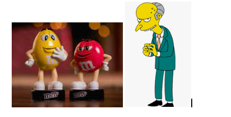
I think your icon selections need to have a more common theme. It looks like most of your icons are fictional icons. M&M’s and bitcoin don’t fit here. Maybe consider the M&M characters? If your last chip, instead of Bitcoin, if your trying to stay with “money” consider Mr. Burns or Scrooge Mcduck or even a cartoon Benjamin Franklin.

To me your chips look too busy. If you’re going to do a different icon on each chip, have you researched any of the other custom sets that did this? One that comes to mind for me that pulled off a different figure on each chip while maintaining consistency was Rosie’s Bayou. Could you potentially go with a smaller version of the individual icons. Have the name of the set on each chip along with the denomination?
https://www.pokerchipforum.com/threads/rosies-bayou.22309/
I think your icon selections need to have a more common theme. It looks like most of your icons are fictional icons. M&M’s and bitcoin don’t fit here. Maybe consider the M&M characters? If your last chip, instead of Bitcoin, if your trying to stay with “money” consider Mr. Burns or Scrooge Mcduck or even a cartoon Benjamin Franklin.
To me your chips look too busy. If you’re going to do a different icon on each chip, have you researched any of the other custom sets that did this? One that comes to mind for me that pulled off a different figure on each chip while maintaining consistency was Rosie’s Bayou. Could you potentially go with a smaller version of the individual icons. Have the name of the set on each chip along with the denomination?
https://www.pokerchipforum.com/threads/rosies-bayou.22309/
Thank you, these are incredibly helpful thoughts.Ok, ultimately this needs to be a product you love, not other PCF members. Always remember that.
I think your icon selections need to have a more common theme. It looks like most of your icons are fictional icons. M&M’s and bitcoin don’t fit here. Maybe consider the M&M characters? If your last chip, instead of Bitcoin, if your trying to stay with “money” consider Mr. Burns or Scrooge Mcduck or even a cartoon Benjamin Franklin.
View attachment 1016480
To me your chips look too busy. If you’re going to do a different icon on each chip, have you researched any of the other custom sets that did this? One that comes to mind for me that pulled off a different figure on each chip while maintaining consistency was Rosie’s Bayou. Could you potentially go with a smaller version of the individual icons. Have the name of the set on each chip along with the denomination?
https://www.pokerchipforum.com/threads/rosies-bayou.22309/
I toyed with using an M&M character but it was tough. I may revisit that to get most of the chips to be a character. I do think I have to keep Bitcoin though and there's no character for that, unfortunately.
Your idea to use smaller icons is definitely worth considering. I'll see what if I can whip up any interesting drafts. But I'll have to weigh that against the value I get from having the full chip used. For example, in my early versions of Spongebob, he basically IS the entire chip. And I kinda like that concept.
I've not totally solved the "inconsistent theme" challenge and I'm not sure that will ever be 100% possible given what I'm really wanting. But I'm pretty sure the actual artwork has made some major progress.
We ended up with a cross between the original super clean chips and the inlaid but busy second draft.
Possible challenges/questions:
- Is the new 25 too busy for a 25? Obviously there's an important reason for all the colors and it became of on my favorite chips. Just not sure if the 25 has to be simpler.
- Speaking of the 25.... Would it be crazy to plan on reusing the Monopoly theme with a 25k plaque? It could be even cooler there since it could look a lot like the game board and of course... if you get a 25k.... you pretty much have a monopoly on all the chips. The only reason I may want BOTH is because I love the chip and I wouldn't want it to appear as rarely as a 25k would.
- Pink and orange too similar?
Attachments
Last edited:
Just edited that to sneak in the red Show 'Em chip too.
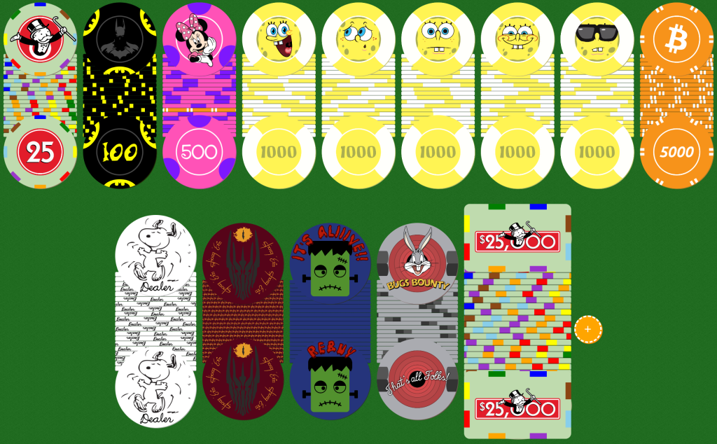
More updates. Big ones are several Spongebob faces for fun, the dealer button, and the 25k plaque. Then tons of little color/spacing/placement tweaks.
I still plan to do some edge text on the rebuy and change the $ to the monopoly money symbol on the plaque. Still need the correct edges for the plaque too.

I still plan to do some edge text on the rebuy and change the $ to the monopoly money symbol on the plaque. Still need the correct edges for the plaque too.
yeah don't dup the 25
What if I said we'd only use one or the other in any given tourney? Would that change anything?
Dezmond
Pair
More updates. Big ones are several Spongebob faces for fun, the dealer button, and the 25k plaque. Then tons of little color/spacing/placement tweaks.
I still plan to do some edge text on the rebuy and change the $ to the monopoly money symbol on the plaque. Still need the correct edges for the plaque too.
View attachment 1020202
When do we get to put our orders in for sample sets?
Dezmond
Pair
Ahhhhhhhhhh. I lost out.
Not to worry haha. I got at least an extra barrel of each and can sell off some samples after they arrive and I build my official/final breakdown set.
Should be in a month or two.
Dezmond
Pair
Thanks a bunch. Please let me know. These will go in the showcase for sure!Not to worry haha. I got at least an extra barrel of each and can sell off some samples after they arrive and I build my official/final breakdown set.
Should be in a month or two.
Similar threads
- Replies
- 4
- Views
- 354
- Replies
- 3
- Views
- 286
- Replies
- 30
- Views
- 2K
- Replies
- 6
- Views
- 795
- Replies
- 10
- Views
- 831

