-
This site contains affiliate links. If you choose to make a purchase after clicking a link, Poker Chip Forum may receive a commission at no additional cost to you. Thank you for your support!
You are using an out of date browser. It may not display this or other websites correctly.
You should upgrade or use an alternative browser.
You should upgrade or use an alternative browser.
The Pen CPC (3 Viewers)
- Thread starter Marhault
- Start date
FordPickup92
Royal Flush
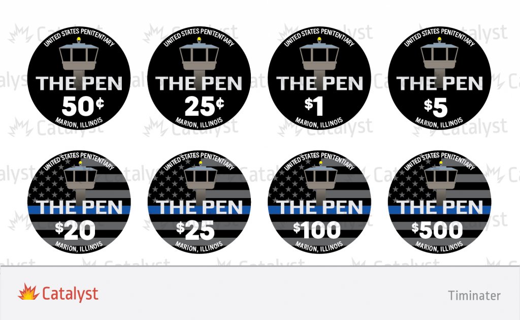
Here's some of the inlay revisions Tim has sent me. I'm letting them settle, figured I'd see what the experts think!
Obviously the top row is different options.
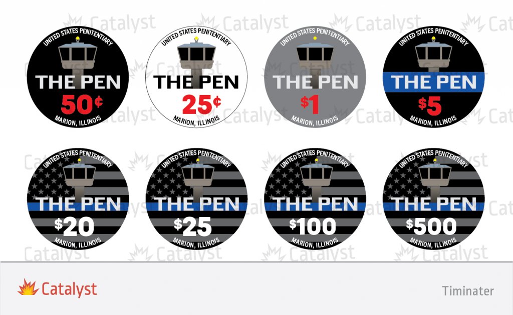
Obviously the top row is different options.
Any consideration for using different inlays on each side? I like the simplicity of the black background of the top left inlay with the perimeter tower, but then how about the alternate side with the thin blue line flag but without the perimeter tower? Maybe "THE PEN" above the line and denomination below, or just have the denomination nice and big.
Silver_Fiend
Flush
well, IF you were going to shift away from the flag version, I like the black with blue stripe
It's been discussed but I'm just not a fan of different inlays on each side. There are some magnificent customs out there with them but it's just not for me.Any consideration for using different inlays on each side? I like the simplicity of the black background of the top left inlay with the perimeter tower, but then how about the alternate side with the thin blue line flag but without the perimeter tower? Maybe "THE PEN" above the line and denomination below, or just have the denomination nice and big.
My first impression is I like the first 2 and the $5 but a little less. I don't think I like the red denoms though
FordPickup92
Royal Flush
My suggestion was for different inlays on each side as well, I know that's not everybody's thing, but I find it to be unique and useful when wanting to display a large amount of graphics or alot of graphic detail and still have a well displayed denominationAny consideration for using different inlays on each side? I like the simplicity of the black background of the top left inlay with the perimeter tower, but then how about the alternate side with the thin blue line flag but without the perimeter tower? Maybe "THE PEN" above the line and denomination below, or just have the denomination nice and big.
It's been discussed but I'm just not a fan of different inlays on each side. There are some magnificent customs out there with them but it's just not for me.
My first impression is I like the first 2 and the $5 but a little less. I don't think I like the red denoms though
Yeah I only suggested it because both the tower and flag seem like really important design elements to you, dual inlays would let you highlight each a little more prominently. That being the case, I think I'd stick with the original design.My suggestion was for different inlays on each side as well, I know that's not everybody's thing, but I find it to be unique and useful when wanting to display a large amount of graphics or alot of graphic detail and still have a well displayed denomination
RainmanTrail
Straight Flush
Here's some of the inlay revisions Tim has sent me. I'm letting them settle, figured I'd see what the experts think!
Obviously the top row is different options.
View attachment 608321
I like the one on the top left best. The flag background just looks too busy to me. Especially with the blue line going through the text in the middle. Another option would be to go with the clean logo on the top left on one side of the chip, and then on the other side you could put a flag. But I'd do the flag differently if so, and get rid of the tower on that side. So the flag is just in the background on the back maybe, but not taking up the entire space and not going through the text. That way, both sides look clean and you don't lose any of your key design elements.
RainmanTrail
Straight Flush
Something doesn't flow well to me between your $1 and your $5 though. The $1 uses really bright and bold colors, then the transition over to the $5 looks more like a retro-themed set with more earthy tones. I would either try to go with an all bright themed lineup or an all more muted tone lineup.
RainmanTrail
Straight Flush
I have two primary concerns with the lineup that I would change if it were my set. The first, as I mentioned above is having a vibrant $1 next to a retro looking $5, and the second is having a yellow $5 base next to a chip with another yellow spot in the $25. Here are two options I mocked up that address these with minor changes and which make the lineup flow better in my opinion.
Another option, if you really want to keep the DG Peacock $1 would be to completely change up the $5 (and maybe the $25 too) to make it more vibrant as well.
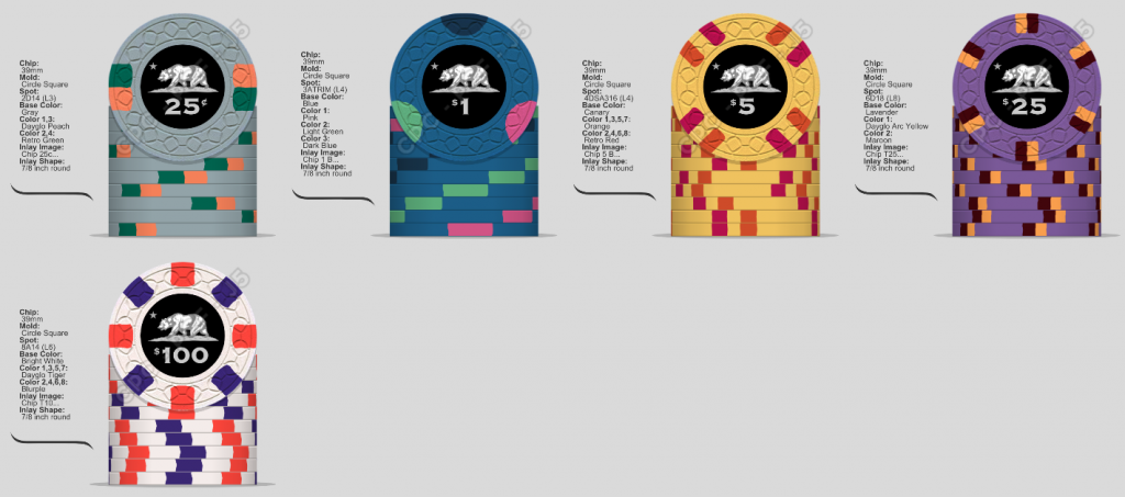
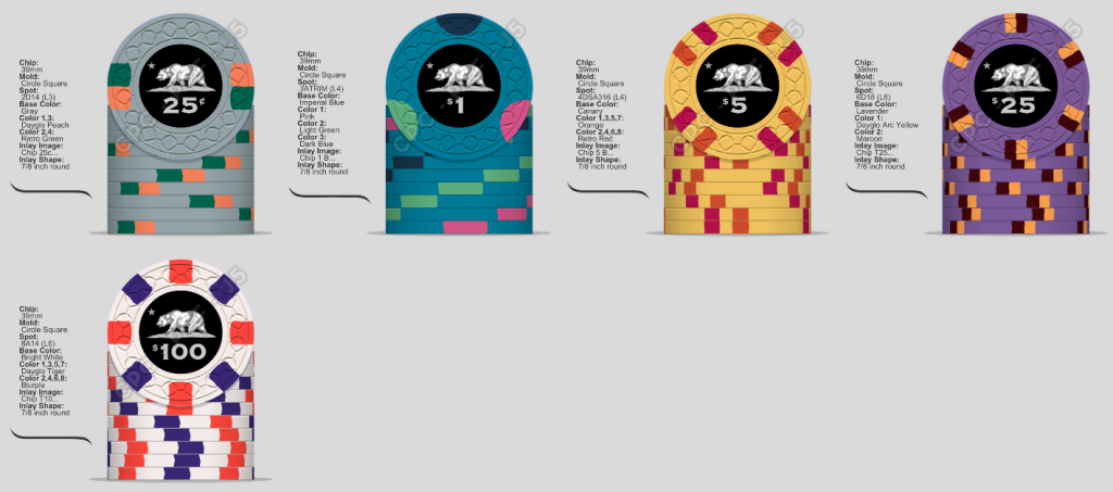
Another option, if you really want to keep the DG Peacock $1 would be to completely change up the $5 (and maybe the $25 too) to make it more vibrant as well.
RainmanTrail
Straight Flush
Here's something that keeps the vibrant DG Peacock $1 and uses something more vibrant for teh $5 & $25.
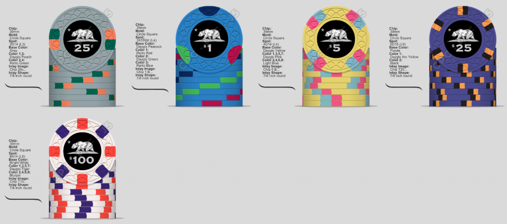
We discussed both peacock and imperial blue. I kinda like both I really like that 5 though you have mocked. One of the things that wasn't feeling right about the 5 to me was having "too much spot" felt like the spots were taking up too much real estate on the chip. I might have even looked at that spot pattern but not with those new colors but with the new colors I'm really liking that....like alot.I have two primary concerns with the lineup that I would change if it were my set. The first, as I mentioned above is having a vibrant $1 next to a retro looking $5, and the second is having a yellow $5 base next to a chip with another yellow spot in the $25. Here are two options I mocked up that address these with minor changes and which make the lineup flow better in my opinion.
Another option, if you really want to keep the DG Peacock $1 would be to completely change up the $5 (and maybe the $25 too) to make it more vibrant as well.
View attachment 608667
View attachment 608666
The $20 I'm not certain on. What do you think the issue of having a yellow spot next to a yellow chip in the lineup? Dirty stack issues or just a flow issue? I mean you've done this way more than I have I'm just genuinely curious.
I know DG yellow is becoming more popular but when I look at it in my sample it's just not doing it for me. I think the retro look has more appeal to me with small bright elements. So I'll probably look at the imperial blue for the one. I'll just need to look at my sample when I get home.Here's something that keeps the vibrant DG Peacock $1 and uses something more vibrant for teh $5 & $25.
View attachment 608668
Does a different design on each side of the chip cost more through CPC? Not saying I want to go that route just curious.I like the one on the top left best. The flag background just looks too busy to me. Especially with the blue line going through the text in the middle. Another option would be to go with the clean logo on the top left on one side of the chip, and then on the other side you could put a flag. But I'd do the flag differently if so, and get rid of the tower on that side. So the flag is just in the background on the back maybe, but not taking up the entire space and not going through the text. That way, both sides look clean and you don't lose any of your key design elements.
RainmanTrail
Straight Flush
We discussed both peacock and imperial blue. I kinda like both I really like that 5 though you have mocked. One of the things that wasn't feeling right about the 5 to me was having "too much spot" felt like the spots were taking up too much real estate on the chip. I might have even looked at that spot pattern but not with those new colors but with the new colors I'm really liking that....like alot.
The $20 I'm not certain on. What do you think the issue of having a yellow spot next to a yellow chip in the lineup? Dirty stack issues or just a flow issue? I mean you've done this way more than I have I'm just genuinely curious.
Ya, I really like the look of the split spots on the $5 better than the 4D14 too. As far as the yellow spots on the $20 go, it's just about flow to me. I try not to reuse the same color in my lineups (not always possible) and I try not to have 2 adjacent chips with the same or nearly the same colors side by side with one being the base and the other being a spot. So I would avoid DG Arc Yellow chip next to a chip with DG Peach spots for example, or a lavendar chip next to one with purple spots, or a DG Pink chip next to a chip with Pink spots, etc. But I wouldn't mind them both bieng in the same lineup, say one on the frac and the other in the $20 or $100. I just don't like when adjacent chips have very similar colors. But that's just me. Many I'm sure would disagree.
RainmanTrail
Straight Flush
No, same price.Does a different design on each side of the chip cost more through CPC? Not saying I want to go that route just curious.
Awesome. Thanks for the advice, I'm definitely gonna set up that 5 and let it simmer on me for a bit, first impression is I'm all over it though. I'm not too concerned with using the yellow on the 20 though because it is a slightly different yellow, might not look much different in a smaller spot though. The 20 was one of the first chips that really finalized in my mind so I'm not too keen on changing it but I'll definitely think about it.No, same price.
I think it will help to if I can finalize the inlay for sure because some of these chips look different with different inlays on them, at least to me anyway. I'm kinda leaning towards the one in the top left as well but with white denoms, the red denoms just aren't sitting well with me.
RainmanTrail
Straight Flush
Awesome. Thanks for the advice, I'm definitely gonna set up that 5 and let it simmer on me for a bit, first impression is I'm all over it though. I'm not too concerned with using the yellow on the 20 though because it is a slightly different yellow, might not look much different in a smaller spot though. The 20 was one of the first chips that really finalized in my mind so I'm not too keen on changing it but I'll definitely think about it.
I think it will help to if I can finalize the inlay for sure because some of these chips look different with different inlays on them, at least to me anyway. I'm kinda leaning towards the one in the top left as well but with white denoms, the red denoms just aren't sitting well with me.
I prefer white denoms on a black inlay as well.
These look great. I really prefer the lighter blue $1. And the black with blue stripe inlay as opposed to the flag. Can't wait to see these come to fruition!
- Mark
- Mark
So for me the inlay is between the top and the bottom. I think they're the 2 best out of the selection of choices.
What do you guys think about maybe trying to color match the denomination or the set name or both to the chip base colors? That was something I just thought of that might work...
RainmanTrail
Straight Flush
Only if using white inlays. Color matching on black & white looks bad IMO.What do you guys think about maybe trying to color match the denomination or the set name or both to the chip base colors? That was something I just thought of that might work...
Just read through this thread.
A couple things.
I love the theme. I used to work a week a month in Carbondale, so I know that area fairly well. 17th Street BBQ is my all time favorite bbq place in Illinois.
I like the color progression. I am a color traditionalist and prefer the standard casino chip colors, but I think this is really nice.
The inlays with the stars and stripes seem very busy and may or may not come through on the chips as well. Not sure. This forum is great at giving advice and guidance.
I love the inlay design with the guard tower and the blue horizontal line over a black base. Simple and really pops.
Again, stay safe down there, and love the theme.
Last edited:
davislane
Straight Flush
- Joined
- Jul 12, 2020
- Messages
- 9,999
- Reaction score
- 14,689
Any updates with this and will there be a sample set ordering thread?
It's in the upcoming CSQ rotation. I ordered enough for a few sample sets. I got you though. I owe you for hooking me up with some other stuff. When they come in I'll be in touchAny updates with this and will there be a sample set ordering thread?
davislane
Straight Flush
- Joined
- Jul 12, 2020
- Messages
- 9,999
- Reaction score
- 14,689
Awwww shucks. I still wish you hooked me up with the Royal Blue Colour sample chip before you sold your incomplete set!It's in the upcoming CSQ rotation. I ordered enough for a few sample sets. I got you though. I owe you for hooking me up with some other stuff. When they come in I'll be in touch
This ended up being the final design. I went with my gut on using DG peacock for the $1. I solicited tons of advice and took a ton of everyone's suggestions but there was a couple things that I struck me a certain way. @FordPickup92 helped me out a TON and we both agonized over the $5 and ultimately the $20 after the $5 was finalized. When I finally settled on the $20 I had all the sample chips in front of me and I really thought those 3 would be a good combo so I went with my gut.
Thanks for all the help he guys. I know I won't remember everyone but here are a few.
@FordPickup92
@RainmanTrail
@Beakertwang
@timinater
And several people I work with who aren't on the forums. If I forgot to give you a shout out I apologize it wasn't on purpose, this has been a long process lol.
Rbonus012
Full House
That $20 is absolute fire 
View attachment 691725
This ended up being the final design. I went with my gut on using DG peacock for the $1. I solicited tons of advice and took a ton of everyone's suggestions but there was a couple things that I struck me a certain way. @FordPickup92 helped me out a TON and we both agonized over the $5 and ultimately the $20 after the $5 was finalized. When I finally settled on the $20 I had all the sample chips in front of me and I really thought those 3 would be a good combo so I went with my gut.
Thanks for all the help he guys. I know I won't remember everyone but here are a few.
@FordPickup92
@RainmanTrail
@Beakertwang
@timinater
And several people I work with who aren't on the forums. If I forgot to give you a shout out I apologize it wasn't on purpose, this has been a long process lol.
Similar threads
- Replies
- 13
- Views
- 347
- Replies
- 7
- Views
- 505
