You are using an out of date browser. It may not display this or other websites correctly.
You should upgrade or use an alternative browser.
You should upgrade or use an alternative browser.
The Saloon - Taphouse and Casino (stones gambling hall inspired) (1 Viewer)
- Thread starter PlayerADK
- Start date
Awesome!
- Joined
- Nov 22, 2018
- Messages
- 14,681
- Reaction score
- 31,504
- Location
- 129 West 81st Street, Apartment 5B
Solid lineup there, and one sexy frac!
Schweeeeet! Nicely Done!!
PlayerADK
Flush
Thanks y'all!
Some specs:
Overlabels
All aligned front + back!
Weird/unnecessary set breakdown, don't judge haha
Might add onto the set eventually! I play a wide range of games, stakes, + with people who like to have a lot of chips in front of them but no limit games haha
Some specs:
Overlabels
All aligned front + back!
Weird/unnecessary set breakdown, don't judge haha
Might add onto the set eventually! I play a wide range of games, stakes, + with people who like to have a lot of chips in front of them but no limit games haha
Whoa these are mighty fine! Can't wait to see the whole set!!!
Bobb59
Full House
Excellent choice
Dodger
Flush
Looking good! Forget the sneak peak - let's see the whole set!!! 
i'm nobody
Flush
that frac is awesome.
PlayerADK
Flush
Edit: more pr0n for y'all!
View attachment 470473
View attachment 470479
View attachment 470480
View attachment 470481
View attachment 470482
View attachment 470483
View attachment 470484
View attachment 470485
View attachment 470486
View attachment 470487
View attachment 470488
Sorry - no splash pot pics just yet!
Sneak peek! More pr0n to come!
View attachment 470100
Shoutout to @Gear for the labels - excellent work as always! Testimonial coming to your thread soon.
Updated original post! Enjoy!
Eloe2000
Straight Flush
Congratulations! Long time in the making but well worth it. Fantastic work. Really like the final design. did you end up creating this design yourself after moving away from the one with the mountain etc?
Well done! Definitely a better inlay that the originals and the chips fits together great 
Nice flow and colors. This is how you make a set. Well done. Inlay looks great too.
PlayerADK
Flush
Thanks everybody! It was a super fun process and I am very happy with the end results!
I ended up finding the Stones Gambling Hall chips, both the Tavern and the Saloon, and really fell in love with the Saloon.
This is basically a recreation of their Saloon chips, but slightly different inlay and very different edge spots.
I decided that I loved this Saloon theme + logo better than my original mountain/beer designs.
I fooled around with the idea of adding small bottles/glasses/mugs to the designs for different denoms, but ultimately decided to keep it uniform. I am sure that a better designer could have come up with a fun and creative way to incorporate something like that, but I knew I'd love this simple design as well!
Thanks everybody for the feedback all throughout my design process! I'm sure I'll be adding onto this set to make a full 1000 chip set with many different cash and tournament options.
Congratulations! Long time in the making but well worth it. Fantastic work. Really like the final design. did you end up creating this design yourself after moving away from the one with the mountain etc?
I ended up finding the Stones Gambling Hall chips, both the Tavern and the Saloon, and really fell in love with the Saloon.
This is basically a recreation of their Saloon chips, but slightly different inlay and very different edge spots.
I decided that I loved this Saloon theme + logo better than my original mountain/beer designs.
I fooled around with the idea of adding small bottles/glasses/mugs to the designs for different denoms, but ultimately decided to keep it uniform. I am sure that a better designer could have come up with a fun and creative way to incorporate something like that, but I knew I'd love this simple design as well!
Thanks everybody for the feedback all throughout my design process! I'm sure I'll be adding onto this set to make a full 1000 chip set with many different cash and tournament options.
Eloe2000
Straight Flush
Thanks everybody! It was a super fun process and I am very happy with the end results!
I ended up finding the Stones Gambling Hall chips, both the Tavern and the Saloon, and really fell in love with the Saloon.
This is basically a recreation of their Saloon chips, but slightly different inlay and very different edge spots.
I decided that I loved this Saloon theme + logo better than my original mountain/beer designs.
I fooled around with the idea of adding small bottles/glasses/mugs to the designs for different denoms, but ultimately decided to keep it uniform. I am sure that a better designer could have come up with a fun and creative way to incorporate something like that, but I knew I'd love this simple design as well!
Thanks everybody for the feedback all throughout my design process! I'm sure I'll be adding onto this set to make a full 1000 chip set with many different cash and tournament options.
Well, great job. I really like how clean this design is. Well done.
codeman00
Flush
Wow!! Great job! Love the black frac! And the black/gray label design simplicity.
chipsncoffee
Two Pair
EDIT: Question sent in a PM.
Last edited:
davethesave
3 of a Kind
Awesome!
Love this!
Does overlabel ruin things or would most murder here to get he old labels off?
Love this!
Does overlabel ruin things or would most murder here to get he old labels off?
PlayerADK
Flush
Awesome!
Love this!
Does overlabel ruin things or would most murder here to get he old labels off?
For quality of chip - inlay replacement is better in basically every case.
Overlabels Pros + Cons
Pros:
- Faster
- Preserves underlying chip (and therefore it's original value)
- Cheaper? (if you decide to go with laminated or textured labels with inlay replacement, not a requirement)
Cons:
- Can be noticeable on top of chip
- Just doesn't look as good as full inlay replacement
Full Inlay Replacement Pros + Cons
Pros:
- Looks flawless
- Option to be laminated or textured labels
- Lays deeper set in the chip, less chance for peeling
Cons:
- Much more time consuming
- Lose some value of original inlay (this is semi-debatable if people always intend to relabel, but in general it's worth less when murdered)
- Can be more expensive
My reasoning for overlabels was mostly their value + laziness for realizing how difficult it can be to remove old inlays.
NomDeGuerre
Sitting Out
Those turned out amazingly. Great progression. One of the best relabel projects I've seen.
PlayerADK
Flush
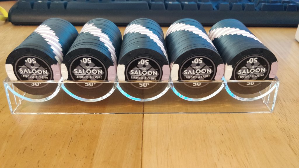
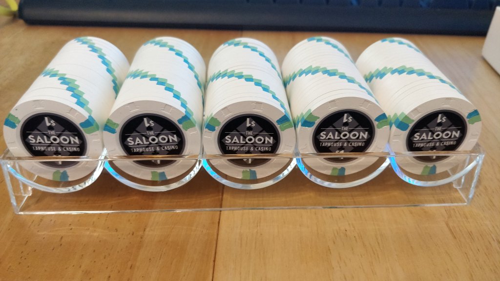
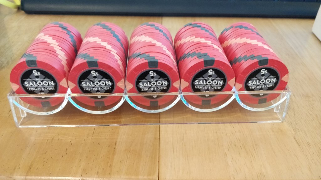
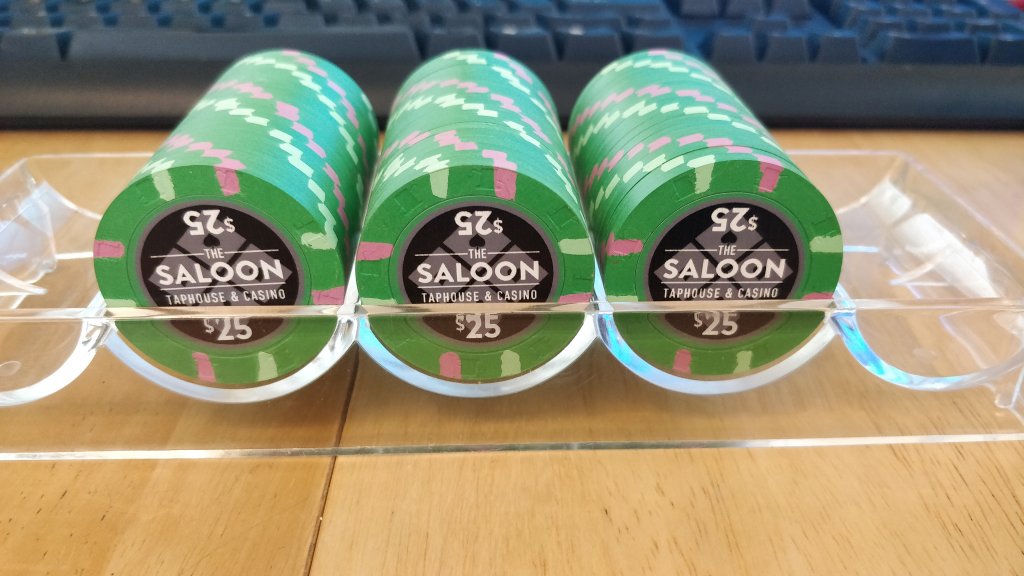
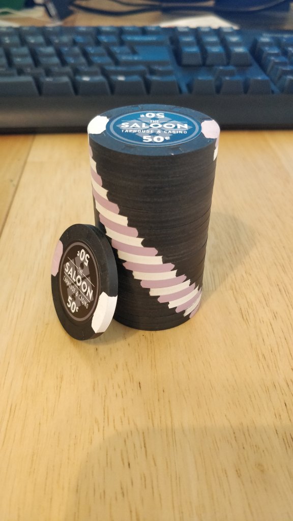
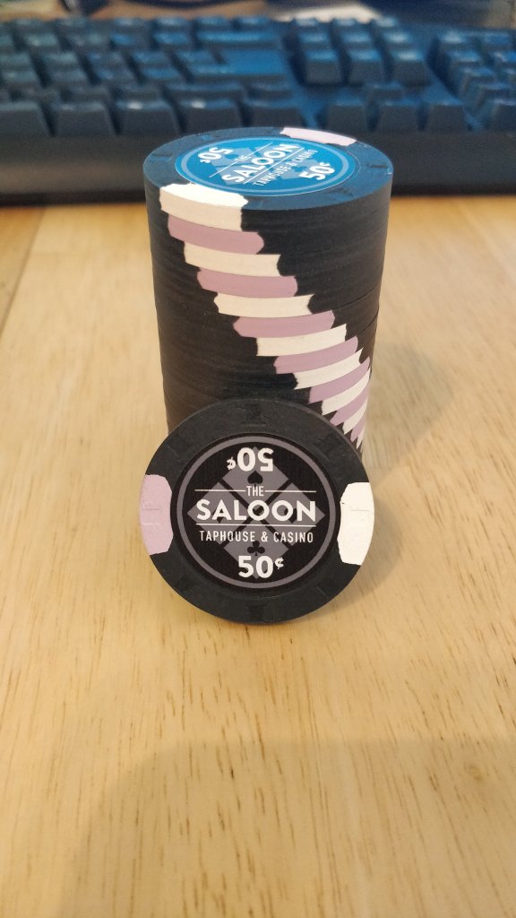
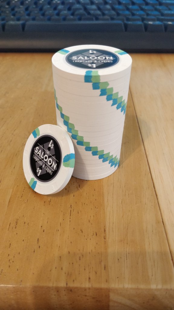
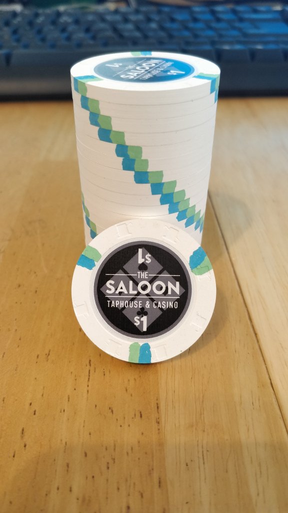
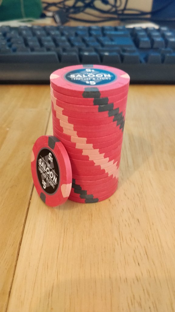
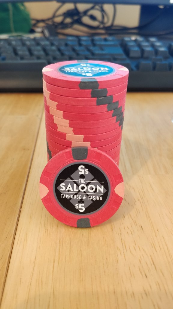
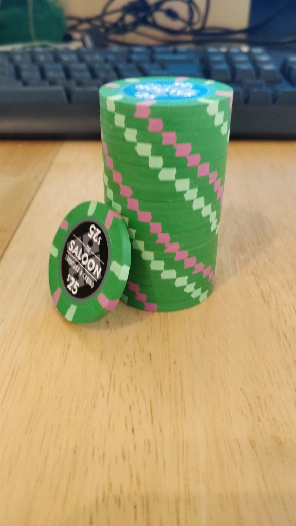
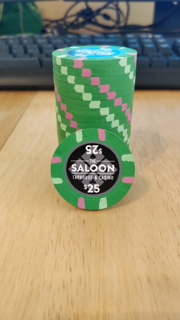
Just adding some more pr0n B) - couple bad pics that I didn't realize until I put the chips away, oh well 
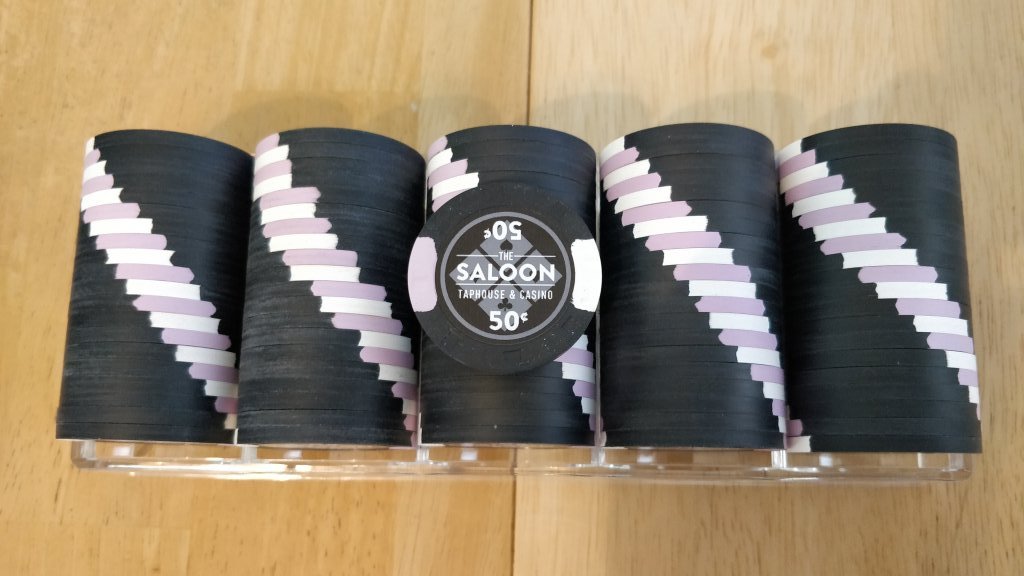
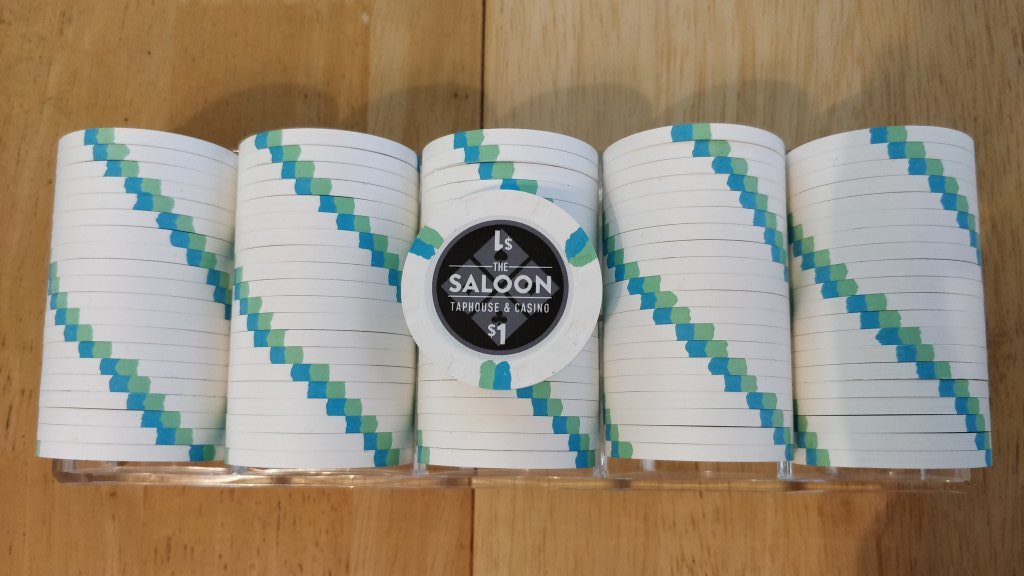
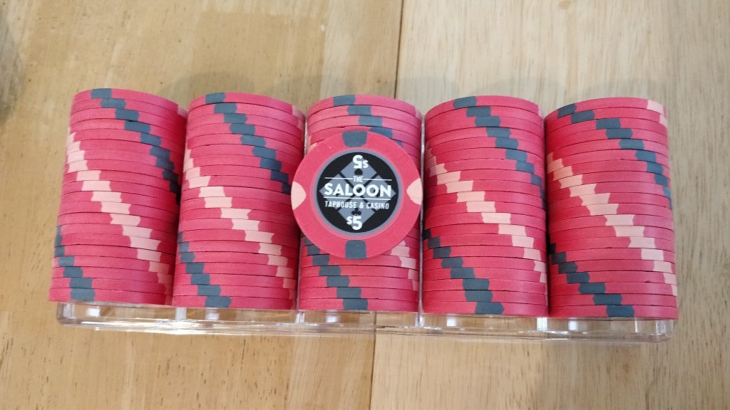
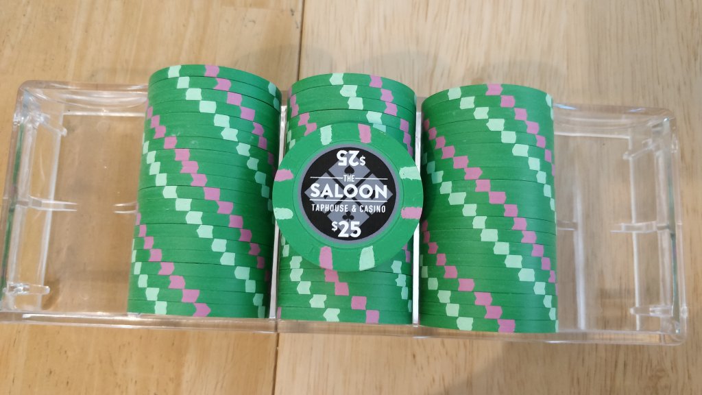


Dodger
Flush
Just adding some more pr0n B) - couple bad pics that I didn't realize until I put the chips away, oh well


Ooohhhh, that fiddy cent piece!
TheDuke
Full House
That white chip is a helluva chip! What was it originally?
The whole set works very well!
The whole set works very well!
Similar threads
- Replies
- 20
- Views
- 2K
- Replies
- 47
- Views
- 2K

