This will be my Home Tourney set (2 Viewers)

RoadRash

Sitting Out
Joined
Sep 28, 2020
Messages
26
Reaction score
64
Location
Sorryville, USA
This will be my home tourney set. It isn't very flashy, but I wasn't going for that. I just wanted something simple. I will also be using the same set for cash games, so I put the lower denoms in. I know I'm gonna get roasted over the blue chip (.25), but I didn't want to use currency symbols, so I had to run it that way. This used to be a template design of mine and I'd change only the name of the poker room for customers. Because people outside of the US bought my chips, most of my designs were without currency symbols. Since I quit that business I decided to change the colors and make a full set just for me. I never had my own set. My only goals with this set were a simple design and all denoms should be easily discernible in low light. 1000 and 5000 are probably the only ones to get mixed up, but I still doubt it. It will all depend on how well they print. I know they won't print anywhere near as colorful as this, so we will see. Anyway... let's hear the hate for the .25 chip (I'm open to suggestions, but 1/4 or and adding currency symbols doesn't work either). I have considered leaving it blank, which I may do (it can fill different roles then). Let me know.
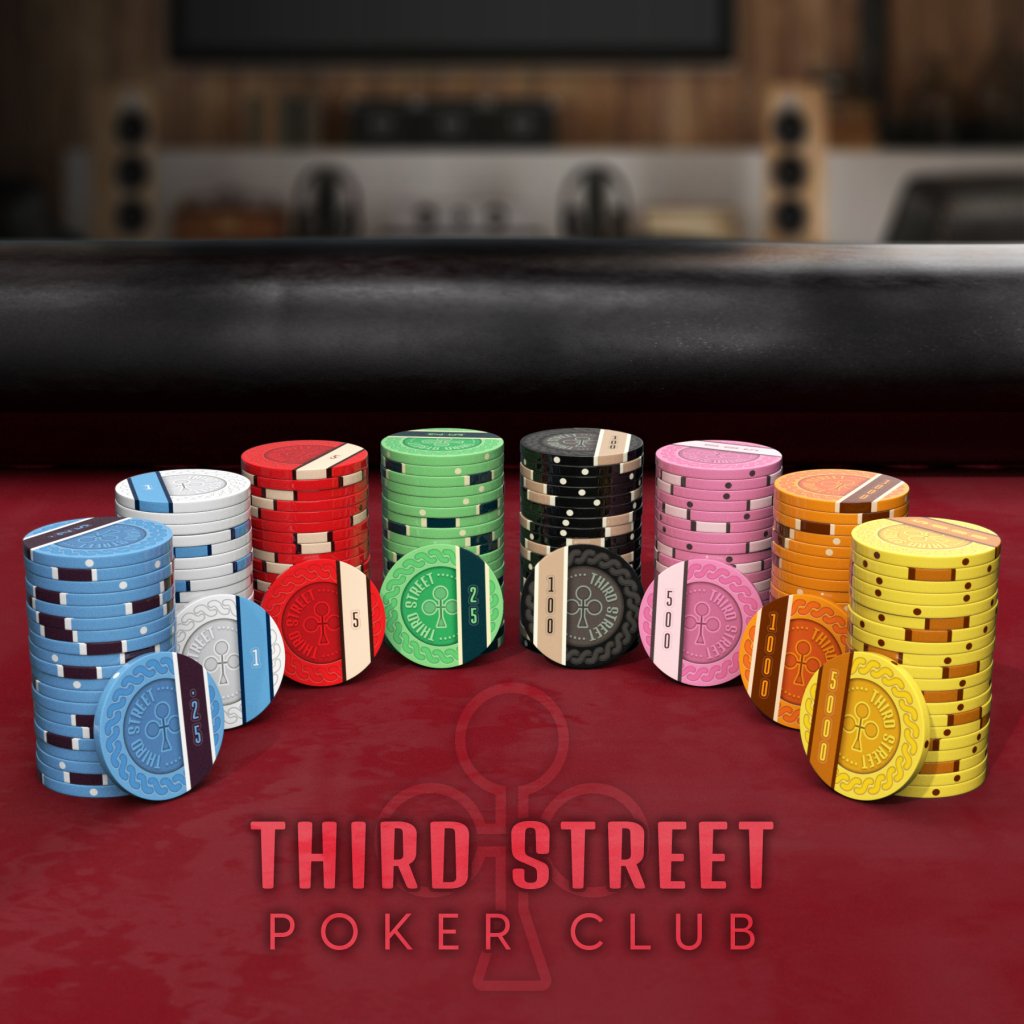
3rdStreet_Set.jpg
 
Why so many denoms for tourney?
It's my do-all set. I've never had a set before and can't really afford to do more than one. We usually start a cash game when 3 folks drop out of the tourney. We can color-up and drop the $5 chips on the cash table. We also don't always play tourneys. Some of my friends prefer 'Dealer Calls' and some of our Acey-Duecey games are legendary (with checks being written and other expensive unmentionables thrown in the pile). It covers them all, no matter how high or low the stakes are.
 
Nice design, the rollover sash-to-spots has always been a favorite of mine.

If using the set for both cash and tourney use, I recommend adding a 20 chip (for cash), so that you don't need any of the chips to do double-duty. It's an inexpensive security alternative to having different cash/tourney sets.

I'd ditch that .25 marking however -- it looks very funky simply because it's vertical. Making the chip unmarked allows you to define it as either a cash 25c or 50c as appropriate at the time, and could even be used as a tournament 25k or bounty chip if needed.
Thanks. I probably will leave it blank. I thought it would work out better for just what you mentioned. I remember too many times we wished we had a .50, 10 or 20 chip. We can alway steal a few blank ones from the cash game for the other roles you mentioned. I planned on getting a lot of those to begin with. I think it will be blank when they print. I may actually make two blank ones now that you mention it. I just have to work out another color that won't be easily confused with the others.
 
I may actually make two blank ones now that you mention it. I just have to work out another color that won't be easily confused with the others.
My suggestion is to make the blue and yellow chips as blanks (both good as frac colors, plus yellow is a good 20 or 25k). Then move the pink chip to 5000, and replace it with a purple or teal/turquoise 500. Or you could just make the new 5000 gray. Both pink and gray are common 5000 chip colors.
 
Also very interested in a sample set, if you order extras. I'm sure I'm not alone with that thought. :)
 
Also very interested in a sample set, if you order extras. I'm sure I'm not alone with that thought. :)
Thanks. I will likely order extras simply because of the aligned edges and the chances that there will be few less-than-perfect ones floating around in there, but they might all be just fine. I've printed this same style set for other customers at least half a dozen times. They are never perfectly aligned which would be an impossible ask, but I've only had to reorder 25 chips of one denomination for a customer who wasn't happy. You can't tell when they're stacked, so it doesn't really bother me, but with a design like this people will look at them a bit more. I won't be ordering until after I do my taxes, and that will kind of determine when I order.

I do think I will go with a gray or tan chip as an extra. I'm not sure exactly which ones I will be blank now, but I do like that idea of two non-denom chips. I'll just have to play with the colors and see which way I like it. Thanks for the input.
 
If you keep the .25 chip, you could try 0.25 instead.
Thanks. I did try that and didn't like it. With the text being vertical, every fractional or decimal option looks odd. I tried running the banner/sash horizontal, but it seemed less interesting. I am likely going to leave it blank. I have the blank file ready for the blue one and different, dark text version of the black chip, but I didn't render those yet. I'll probably do that tomorrow with another gray or tan chip (denominations may change). Thanks again.
 
We usually start a cash game when 3 folks drop out of the tourney. We can color-up and drop the $5 chips on the cash table.
If I were you, I'd have 100 as the lowest tourney denom. That way 0.25->25 will all be cash. Whether or not some 25000 chips are needed depends on the total number of chips in play. But if you're 10 players playing a freezout with 40 or 50k starting stacks, your total will be 400-500k. The 25k starts being useful at some point north of that.

I really like the design! You'll get no .25 hate from me! Maybe add the '0' though?
 
Last edited:
Very cool unique set. Don't know if I've ever seen asymmetrical edgespot alignment like that.
Thank you. I used to sell this design as a stock template from 2016 until I closed my store in 2020. People could order the set with their poker room name on it. I sold at least half a dozen sets like this (slightly darker colors and there was no $1 or 25¢ chip). Only two of my customers decided to pay for the aligned edges though. That always bothered me, because it was designed for that specifically. It was my best selling stock design regardless, but I never made one for myself. I decided to change it up a bit and make my own this year. Thanks again.
 
Last edited:
I decided to add the gray chip and rework the blue and yellow chips. The blue chip is now a 'less than' chip and the yellow is a 'more than' chip. I rendered them without anything on the banner and it just looked odd. I initially wanted X and XX, but the letter X in this font is indistinguishable from the letters H and K from any distance, so I couldn't use it. I tried a bunch of other symbols, but I landed on these. The arrows on the blue point inward (represent getting smaller) and the yellow point outward (represent getting bigger). The font I chose for the denoms doesn't have a lot of glyphs to choose from, so I was a bit limited.
 

Attachments

  • 3rdStreet_NewSet_Group2.jpg
    3rdStreet_NewSet_Group2.jpg
    122.8 KB · Views: 104
Love the design in general. It would drive me nuts to mix the 25 and under chips with the 100 and over chips (right banner vs left) but as long as you're running T100 tournaments I guess it works out.
 
How can we see your other designs?
I can't show them all. There actually aren't that many solid stock designs from my store because my favorites were not very popular with poker players/collectors. I truly dislike traditional poker chip designs. I try to make a completely unique chip, but they are rarely well-received in these communities. I will show some customer-favored designs here though.
• One is a Monogram design - it was a semi-custom option. Customers could change the letter in the monogram and choose any color scheme/denoms.
• The Phil Chips are my first full set design from about 20 years ago for a billiard hall that I also did the logo for.
• The Eleventh Hour design is a completely stock design - no mods - it had ten different natural materials and no denoms. Customers would choose the 'colors' they liked and build their own sets. It didn't sell well as a stock design. Many customers wanted to customize it, but I couldn't do it as easily with this design so I would've had to charge a bit more to customize it. It still sold, even internationally, but I think only a few sets of this one were sold.
• The 2nd Stone design was a 100% custom design that was never printed (so I can show it without worry). I lost the original design files in a hard drive crash. All I have now are some images I recovered from emails we exchanged. This image shows what the faces would have looked like with aligned and non-aligned edges. looking at it today, I'm glad we never printed it. It would have printed too dark and muddied the details.

I can't show my 100% custom designs that printed. Those folks asked for and paid for a 100% custom design that nobody else would have. Even though I know nobody here would steal the design(s), once it's on the web it's immediately stolen (as is the fate of the images I show below). It's a risk every artist in any field takes these days.

Anyway, here they are. Enjoy (or not).
 

Attachments

  • MonogramSC.jpg
    MonogramSC.jpg
    299.4 KB · Views: 96
  • PhilChips.png
    PhilChips.png
    223 KB · Views: 94
  • 11Hour_Set_samp.jpg
    11Hour_Set_samp.jpg
    57 KB · Views: 98
  • 2nd_Stone_eml.png
    2nd_Stone_eml.png
    104.1 KB · Views: 93
Love the design in general. It would drive me nuts to mix the 25 and under chips with the 100 and over chips (right banner vs left) but as long as you're running T100 tournaments I guess it works out.
Thank you. We have never played anything except T1000 tourneys. As enough players drop out of that, a cash game starts in the background. We'd usually color up the $5 chips and put them on the cash table (if we didn't have another set of chips). I can't afford two sets, so this will be my do-all set. A lot of times we just play cash games because it's more fun for our group. I just wanted one set that covers everything.

By the way, the banners are on the left side of the Face of the chip and on the right side of the Back. I only displayed them like that because the banners would be hidden on some of them if I laid them all out facing in one direction.
 
By the way, the banners are on the left side of the Face of the chip and on the right side of the Back. I only displayed them like that because the banners would be hidden on some of them if I laid them all out facing in one direction.
In that case I take everything back. My OCD is satisfied.
 

Create an account or login to comment

You must be a member in order to leave a comment

Create account

Create an account and join our community. It's easy!

Log in

Already have an account? Log in here.

Back
Top Bottom