Tilted Taiga 1st Chip Mockup (1 Viewer)

epicwin

Sitting Out
Joined
May 1, 2023
Messages
22
Reaction score
28
Location
Minnesota
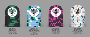
Hey everyone, this is my first mockup with chip colors and inlay design I put together. Some background: the colors are inspired by the Minnesota Timberwolves jersey colors. I picked “Taiga” because of the abundance of trees in my area. The dog has antlers because of an inside joke between me and my dad (when we come across a deer in the neighborhood he refers to them as “brown dog”).

I know it’s not entirely “traditional” but I am pretty happy with the color scheme (still open to feedback on that). I made a rough drawing for the inlays so if you guys see anything off or have any suggestions I would love to hear it.

Planning on getting these made on 43mm web mold. Still need to design the felt for a table I am DIYing but I am stuck on ideas for that. What do you all think?
 

Attachments

  • IMG_1858.png
    IMG_1858.png
    252.2 KB · Views: 182
Love the color progression on the trees, great work! As a suggestion, try to do blue on the $20 chip so that the number's clearer.
 
love the inlay.

base colors on .50 and 5 are way too close IMO. i would probably also avoid using green spots on both the .50 and 1, but that's more subjective.
 
Make the $ symbol smaller and center all denoms on the numbers only.
 
Just getting back to this. Thanks for the feedback guys. Made the currency symbols smaller, changed the base color for the $5, and changed the inlay color on the $20.

1726244630505.png
 
I'm just not feeling it.

You've got 4 denoms. One chip is black, one chip is almost-black, and one chip is dirty-white.

You may need to revisit your colour choices not only to enhance contrast, but to get more colour going on, period.
I hear ya. I really like the idea of matching the colors to my favorite sports team, but limiting myself to those colors is quite the challenge. I will have to play around with it a bit more to see if I can make it work.
 
I hear ya. I really like the idea of matching the colors to my favorite sports team, but limiting myself to those colors is quite the challenge. I will have to play around with it a bit more to see if I can make it work.

Just so you know, you're not the first person that has encountered this. Lots and lots of PCFers love to design around their favourite sports team, or school colours, or state flag, or whatever. Unfortunately it leaves too few colour options among lots of chips that need to easily distinguishable in pots and stacks. It's a near-impossible task sometimes.
 
Last edited:
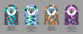
Just throwing another mockup out there

1726667893640.png
 

Attachments

  • 1726667760732.png
    1726667760732.png
    262.4 KB · Views: 21
thinking of stacks, instead of a ¢50 chip, I'd consider a ¢25 chip.

I've seen some cool monotone chip colors designs - grey on grey, blue on blue, pink on red, green on green.... grey on black... etc. You can add an accent color (thinking of the ¢50 chip and the $20 chip), add the accent color as the middle spot, and use monotones to flank the accent color.

¢50 chip - teal in the middle, $20 chip, pink in the middle.
 

Create an account or login to comment

You must be a member in order to leave a comment

Create account

Create an account and join our community. It's easy!

Log in

Already have an account? Log in here.

Back
Top Bottom