Working on Web Mold design (1 Viewer)

Thanks

What I'm thinking I might do for the background since there are only so many things I can come up with, is use the 100 on the 1, and then if i end up making a 25 cent I will use the 25$ for that, and then redo the 500 to use the 5 background.

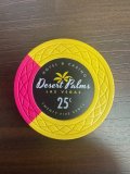
EDIT: If I did a quarter chip I think I would either make it a solid or do the pie type but in 4ths. Colors would be probably yellow to orange with maybe ocean blue/ice blue if i go with the pie type.

View attachment 1466752
That’s pretty good right there, personally I’m a little biased to having a solid chip at the absolute lowest possible denomination (if any at all) which for us is a nickel, because we mostly play 5c/10c.

But honestly, I like the idea of having some edge spots or flash, even on the lowest denomination.

Also just my 2 cents but I really like the look of that yellow chip with the two skinny edge spots. A part of me was even thinking it would look nice a little darker more like a Boston College golden yellow. I was wondering if this is your first custom set?
 
Last edited:
That’s pretty good right there, personally I’m a little biased to having a solid chip at the absolute lowest possible denomination (if any at all) which for us is a nickel, because we mostly play 5c/10c.

But honestly, I like the idea of having some edge spots or flash, even on the lowest denomination.

Also just my 2 cents but I really like the look of that yellow chip with the two skinny edge spots. A part of me was even thinking it would look nice a little darker more like a Boston College golden yellow. I was wondering if this is your first custom set?
So part of the reason the main chips have no currency on them is because they are ultimately designed for a 5cent/10cent game. I wanted to keep it open-ended though for use in a tournament, or for doing basically what I am doing now which is making even lower chips for a 25 cent/50 cent game if people wanted.

This is basically my first custom and so I am trying out all kinds of things. I will check that out on the other yellow as well.
 
I know we tend to think along traditional lines when creating sets which isn't a bad thing. However the whole draw for me with Tina's is being able to create the most complex unobtainable edge spots at no extra cost. A solid colored Tina chip to me seems like a shame.
 
Last edited:
I know we tend to think along traditional lines when creating sets which isn't a bad thing. However the whole draw for me with Tina's is being able to create the most complex unobtainable edge spots at no extra cost. A solid colored Tina chips to me seems like a shame.
Yes overall I would stick to at least the two narrow verticle edge spots i showed on the last page. I just was showing the one possibility of how I would do it if I was doing a solid.
 
I could see possibly going with a solid if I moved the edge spot color to the lettering, something like this:View attachment 1467649
Ideally I would do a faux hot stamp but that wouldn't be possible with the web mold.
I hear what @Huskerchipper is saying and I’m personally always biased to having some form of edge spots. But like you said why not mock it, and there is nothing wrong with going classic and having your lowest denomination chip solid.

Also I don’t know if this would fit your set but I did see this yesterday and it got me thinking about the other 4 quarter chip you mocked up.
 

Attachments

  • IMG_0762.jpeg
    IMG_0762.jpeg
    347.8 KB · Views: 25
Last edited:
I hear what @Huskerchipper is saying and I’m personally always biased to having some form of edge spots. But like you said why not mock it, and there is nothing wrong with going classic and having your lowest denomination chip solid.

Also I don’t know if this would fit your set but I did see this yesterday and it got me thinking about the other 4 quarter chip you mocked up.
Yeah I agree, I am trying make it traditional but also avoid at least a full blown solid.

This is was a have so far for a full blown cash set.

cash_set_mockup.png
 
Same! I'd tweak the 1s to blue edge spots so you don't have adjacent denoms with so much red AND blue being a historical $1 color.
I am personally biased to blue as a $1 color but for some reason I really like the white and red.

Also I was just looking at the side view of the edge spots and I really like the way the white cuts into the red on the $1 chip.
 
Hey I was wondering where you are in the process now, are you still tweaking and thinking or possibly pulling the trigger?
I already have some ordered of the fives, 25s, 100s, and 500s from the original post.

I’m still tweaking the design of course because I do like the of having just the backgrounds for the five ones 25s and hundreds repeating over the subsequent higher denominations. The ones in the hundreds, sharing a background design and so on. Depending on how well it all comes together, I will be releasing the full set designs for anyone who is interested and I’ll of course be posting pictures of how they look when I get them in
 
Same! I'd tweak the 1s to blue edge spots so you don't have adjacent denoms with so much red AND blue being a historical $1 color.
I agree about having the blue on the ones, but I accomplished that I have that on the background. I’m also keeping it that way because it is a tribute piece so it matches more with what the actual chip is. I agree if I was doing something completely different with the backgrounds I probably would be using the blue edge spots though.

But to me that combination that they use on those chips is really about the best one dollar chip I’ve ever seen
IMG_8953.jpeg
 
I agree about having the blue on the ones, but I accomplished that I have that on the background. I’m also keeping it that way because it is a tribute piece so it matches more with what the actual chip is.
I understand the desire to keep a chip similar to the tribute that inspired it. Vacillating between choices because of the same thing now.
 
I am personally biased to blue as a $1 color but for some reason I really like the white and red.

Also I was just looking at the side view of the edge spots and I really like the way the white cuts into the red on the $1 chip.
Personally I also prefer the blue as a base for the 1s like they do in Cali but luckily these white ones fit so perfectly. I will def. get a reader done but personally, since I live so close to Lake Charles if I need $1 chips I'll just buy the real ones. :D
 
I already have some ordered of the fives, 25s, 100s, and 500s from the original post.

I’m still tweaking the design of course because I do like the of having just the backgrounds for the five ones 25s and hundreds repeating over the subsequent higher denominations. The ones in the hundreds, sharing a background design and so on. Depending on how well it all comes together, I will be releasing the full set designs for anyone who is interested and I’ll of course be posting pictures of how they look when I get them in
Honestly can't wait to see the pics, when are the first chips supposed to be showing up?
 

Create an account or login to comment

You must be a member in order to leave a comment

Create account

Create an account and join our community. It's easy!

Log in

Already have an account? Log in here.

Back
Top Bottom