Mysticum
Pair
It's finally time to share my mockups with you all! I have worked very hard with these to incorporate some of the ideas I had, but I'm in no way any designer, which makes this process hard and complicated. The mockups will show this clearly, so keep this in mind that these are merely sketches and ideas that I've done to the best of my ability.
I need feedback and critism and suggestions!
I already what some of the points are going to be, and I will cover some of them later with explanations and motivation. But first, let's take a look at a sample set:

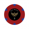
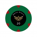
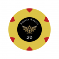
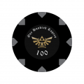
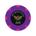
(Click on the images to see them full size!)
That's the baseline right now. Let's also take a look at some variations:
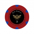
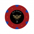
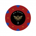
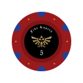
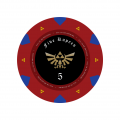
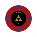
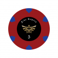
With that out of the way, let's try to explain what is going on in this design.
What the f**k is this?
This is my take on Zelda themed poker chips. I've always been a fan of the video games series and it has some of the best games of all times. After the idea of making a customized poker set spawned, I started to list all ideas I thought were feasible, and among them were something personal, something with my hometown, and something with a game theme. After all, the chips are going to be used with board games, so a n3rd theme wasn't a negative thing.
About the logo
This is publicly free vector graphics that I choose to use. Except one design that has the regular Triforce emblem. I did sketches with both of them, especially when I sketched for labels for Majestic/Royal chips, where I tried out the Triforce instead, as that was the original idea. This is how it turned out:
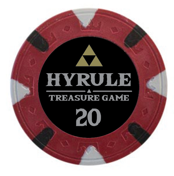
Not bad. I liked it, but after playing around a bit more, I think the bigger logo with the Hyrule emblem fits the design better. What do you think? Vote in the poll for this!
About the decoration in the outer ring
They are actually rupees! Here is how a rupee look in the games:

When I got this idea, I immediately became crazy about it, and I think that design choice is pretty much set in stone at this point, unless you really disagree. The thought is that the final design will incorporate rupees that runs from one side to the other, and thus becomes a full rupee. The side-edge will of course need to incorporate this.
Note that the current mockups only have the outer shape of a rupee. I think it works okay, but I want my final design to look more like a rupee and I need help from an actual designer with this.
Before this, I had some ideas with triangles that could be part of the Triforce:
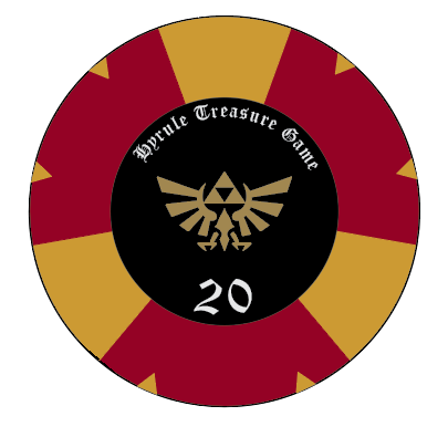

One thing I need help with, though is how "long" the rupee should be. Mathematically, the "length" is correct since the edge will take up some of the length, but thus, it looks short on the main sides. I'm thinking about making it longer than it really is since it could be a more logical and pleasing design. Here is a comparison:


Which looks better? Please vote for this in the poll!
Middle ring
Is a middle ring a good idea or not? In some ways, it can look classy, and add to the look. But sometimes, it becomes too much and very clustered. Here is an early sketch, followed by some of the latest ideas:
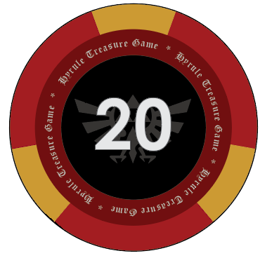


What do you think about the middle ring? Please vote for this in the poll!
Another option is to have a middle ring with decoration instead. Unfortunately, I'm unable to do this with my very limited skills.
Text decorations
A standard design is to have something like "Person's Card Room" or "Person's Game Room". I like that actually, so I thought how a game room in Hyrule would be described.
In A Link to the Past, there is a Treasure Chest Game, which is the closest to gambling in that game. In Ocarina of Time, some mini-games exists in Hyrule Castle. In the first Legend of Zelda, there is a "money making game". And in the latest Breath of the Wild, there is gambling game called "All or Nothing".
This resulted in the following ideas/suggestions:
Colors
I've already started a discussion about this, but the "problem" here is that I like to follow standards. And here two worlds collide because casinos/poker have its own standard, and Zelda has another one.
With the rupee decoration idea in place, however, I could incorporate both of the best worlds! The base color is the poker color and the rupee decoration, being a rupee, is the Zelda color for that value. Do you think that is a good match? No poll for this, leave a comment what works or not.
Only standards for 1/5/20/100 really. After that I took suggestion from @BGinGA to have pink rupee on purple chip for 500. I think it works well, but my SO disagree. She also thinks the 20 is ugly, but she hates yellow.
The 20 is the biggest problem. There is not really a standard, and I can either have Green as a 20, which is the "closest" to standard, or have another color completely. Personally, I think the yellow works well. Please vote for this in the poll!
The Label
Can't believe we haven't even touched upon the label yet, which could very well be the most important part. We have covered logo, and to be honest, I'm pretty satisfied with the Rupee text which works well as decoration text as well. Earlier sketches had some of the other texts as a ring decoration. (I wanted to show you, but I can only attach 20 picture apparently, so later then.)
One thing I wonder about is whether the label for value should be straight or, as now, curved, exactly as the text above is. Here is a comparison:


Please vote for this in the poll!
(I seem to have reached a limit for options in the poll, please leave a comment instead!)
Since I can't post more pictures, I think this will be enough for now.
Please leave your comments, but if not, please vote for what you think works or not. Your feedback is invaluable to me and I'm really counting on you guys
Other suggestions are welcome of course.
I should also mentioned that I hired some designers on Fiverr to help me sketch ideas. The results were very mixed (still awaiting the most expensive one), but it gave me some ideas along the way which was valuable.
Speaking of which, I will need help to finalize the design and polish further. Please give me a PM if you can help me with this.
I need feedback and critism and suggestions!
I already what some of the points are going to be, and I will cover some of them later with explanations and motivation. But first, let's take a look at a sample set:


(Click on the images to see them full size!)
That's the baseline right now. Let's also take a look at some variations:


With that out of the way, let's try to explain what is going on in this design.
What the f**k is this?
This is my take on Zelda themed poker chips. I've always been a fan of the video games series and it has some of the best games of all times. After the idea of making a customized poker set spawned, I started to list all ideas I thought were feasible, and among them were something personal, something with my hometown, and something with a game theme. After all, the chips are going to be used with board games, so a n3rd theme wasn't a negative thing.
About the logo
This is publicly free vector graphics that I choose to use. Except one design that has the regular Triforce emblem. I did sketches with both of them, especially when I sketched for labels for Majestic/Royal chips, where I tried out the Triforce instead, as that was the original idea. This is how it turned out:
Not bad. I liked it, but after playing around a bit more, I think the bigger logo with the Hyrule emblem fits the design better. What do you think? Vote in the poll for this!
About the decoration in the outer ring
They are actually rupees! Here is how a rupee look in the games:
When I got this idea, I immediately became crazy about it, and I think that design choice is pretty much set in stone at this point, unless you really disagree. The thought is that the final design will incorporate rupees that runs from one side to the other, and thus becomes a full rupee. The side-edge will of course need to incorporate this.
Note that the current mockups only have the outer shape of a rupee. I think it works okay, but I want my final design to look more like a rupee and I need help from an actual designer with this.
Before this, I had some ideas with triangles that could be part of the Triforce:
One thing I need help with, though is how "long" the rupee should be. Mathematically, the "length" is correct since the edge will take up some of the length, but thus, it looks short on the main sides. I'm thinking about making it longer than it really is since it could be a more logical and pleasing design. Here is a comparison:


Which looks better? Please vote for this in the poll!
Middle ring
Is a middle ring a good idea or not? In some ways, it can look classy, and add to the look. But sometimes, it becomes too much and very clustered. Here is an early sketch, followed by some of the latest ideas:


What do you think about the middle ring? Please vote for this in the poll!
Another option is to have a middle ring with decoration instead. Unfortunately, I'm unable to do this with my very limited skills.
Text decorations
A standard design is to have something like "Person's Card Room" or "Person's Game Room". I like that actually, so I thought how a game room in Hyrule would be described.
In A Link to the Past, there is a Treasure Chest Game, which is the closest to gambling in that game. In Ocarina of Time, some mini-games exists in Hyrule Castle. In the first Legend of Zelda, there is a "money making game". And in the latest Breath of the Wild, there is gambling game called "All or Nothing".
This resulted in the following ideas/suggestions:
- Hyrule Treasure Game
- Hyrule Money Making Game
- All-in or Nothing
- Hyrule Rupee Rush
Colors
I've already started a discussion about this, but the "problem" here is that I like to follow standards. And here two worlds collide because casinos/poker have its own standard, and Zelda has another one.
With the rupee decoration idea in place, however, I could incorporate both of the best worlds! The base color is the poker color and the rupee decoration, being a rupee, is the Zelda color for that value. Do you think that is a good match? No poll for this, leave a comment what works or not.
Only standards for 1/5/20/100 really. After that I took suggestion from @BGinGA to have pink rupee on purple chip for 500. I think it works well, but my SO disagree. She also thinks the 20 is ugly, but she hates yellow.
The 20 is the biggest problem. There is not really a standard, and I can either have Green as a 20, which is the "closest" to standard, or have another color completely. Personally, I think the yellow works well. Please vote for this in the poll!
The Label
Can't believe we haven't even touched upon the label yet, which could very well be the most important part. We have covered logo, and to be honest, I'm pretty satisfied with the Rupee text which works well as decoration text as well. Earlier sketches had some of the other texts as a ring decoration. (I wanted to show you, but I can only attach 20 picture apparently, so later then.)
One thing I wonder about is whether the label for value should be straight or, as now, curved, exactly as the text above is. Here is a comparison:


(I seem to have reached a limit for options in the poll, please leave a comment instead!)
Since I can't post more pictures, I think this will be enough for now.
Please leave your comments, but if not, please vote for what you think works or not. Your feedback is invaluable to me and I'm really counting on you guys
Other suggestions are welcome of course.
I should also mentioned that I hired some designers on Fiverr to help me sketch ideas. The results were very mixed (still awaiting the most expensive one), but it gave me some ideas along the way which was valuable.
Speaking of which, I will need help to finalize the design and polish further. Please give me a PM if you can help me with this.
