Yeah, the crown mold just didn't look right to me. I started with the Crown mold but didn't end up liking it lolYou have 'Crown' on the name, and you use Scroll mold?
You are using an out of date browser. It may not display this or other websites correctly.
You should upgrade or use an alternative browser.
You should upgrade or use an alternative browser.
Post mockups for fun/science? (29 Viewers)
- Thread starter lherron
- Start date
Might want to re-attach that pic as a standard png. So small.
Might want to re-attach that pic as a standard png. So small.
For some reason it wouldn't come out this way the first time
Nykem
Waiting List
Obsession got so bad, procrastination led me to model this imaginary Abbiati set

Nykem
Waiting List
Obsession got so bad, procrastination led me to model this imaginary Abbiati set
View attachment 1457107
Can recommend. Trying different colors and zooming around in renderview is so much fun

Nykem
Waiting List
Obsession got so bad, procrastination led me to model this imaginary Abbiati set
View attachment 1457107
Added dots on the edge, changed a few colors, I swear this is the last post for now

Fooling around a bit.

Version 1.0
Azure Isle, Trinidad and Tobago
View attachment 1437295
Feel free to drop some critique.
Will show some "better" Pictures when i find time.
I have mad respect for designers now. Tried to make my own inlay for my local university club for fun and it looks so bad I'm not even going to consider posting lol.
But we want to see!
Now you have to, so we can all make fun of you. Sorry, it's the rules.I have mad respect for designers now. Tried to make my own inlay for my local university club for fun and it looks so bad I'm not even going to consider posting lol.

I rage deleted the .psd file because it was so ugly and I can't believe I wasted time on it lol never again.
Edit: It's still in the paulson tool so here's a snip:
The design is straight from the University website, I just removed the oak tree and added a denomination and changed a few colors.
I was thinking about relabeling my china clay "phoenix cardroom" chips. with these but since now I know I don't know what I'm doing I'll leave them as-is.
A chipset is only as strong as the weakest chip ($25) so I did this as a mockup, clearly not viable lol so no further work done.
Last edited:
Honestly, that's not the worst we've seen.I rage deleted the .psd file because it was so ugly and I can't believe I wasted time on it lol never again.
Edit: It's still in the paulson tool so here's a snip:
The design is straight from the University website, I just removed the oak tree and added a denomination and changed a few colors.
I was thinking about relabeling my china clay "phoenix cardroom" chips. with these but since now I know I don't know what I'm doing I'll leave them as-is.
A chipset is only as strong as the weakest chip ($25) so I did this as a mockup, clearly not viable lol so no further work done.
View attachment 1466117
Nex
Flush
I've seen worse as well. This one would have had potential to flesh out.
Zoom the logo (do some cutouts on the outside rings to make it a little bigger), increase the font size. Add maybe one or two accent colors on the artwork to make it look less bland.
Zoom the logo (do some cutouts on the outside rings to make it a little bigger), increase the font size. Add maybe one or two accent colors on the artwork to make it look less bland.
sleepy595
New Member
drdr
Flush
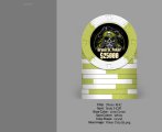
I like this, even though non standard base colours can annoy me. Not this time. Maybe I'm late. Wondering if changing the 5c base colour to pink may provide variety and reduce the repeat of green in the $1.Designed this retro-ish set playing around in the chip editor. First time designing this sort of thing but I don't think it's half bad.
Cool simple inlay too.
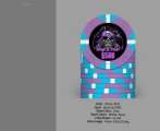
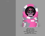
Working on a custom hybrid ceramic set on either web or sun mold. I have gone through a million different designs and themes until I saw a post @allforcharity wrote a couple of years ago, where he asked if anyone had done a design with radial gradients around the circumference of the chip. I needed to try that out.
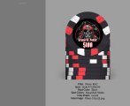
Placeholder name "Neon Flush".
Theme: Miami Vice, Synthwave, Neon


Placeholder name "Neon Flush".
Theme: Miami Vice, Synthwave, Neon
TrainWrecK
Sitting Out
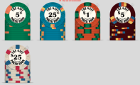
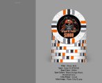
I I agree with ya mine just started to after joining this group just got done doing a mockup to kinda see what I wanted but happy with the colors just gotta figure out next steps to get them made to orderMy dive into poker chip obsession has just started, and I felt the urge to mockup a set that would suit the home game I currently play. We play .25/.25, $20 buy-in and we would never really use the $25 or $100 chips, but I had ideas enough for 6 chips rather than 4. I know that a Crown Casino set already exists out there, but I like the name and the idea for the inlay came from that.
View attachment 1456631
Attachments
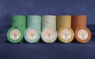
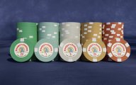
looking for thoughts/feedback suggestions on the following custom set with regards to colors and designs:


looking for thoughts/feedback suggestions on the following custom set with regards to colors and designs:
View attachment 1476117View attachment 1476119View attachment 1476120View attachment 1476121View attachment 1476122
tweeked Gene to be more centered....
PixelatedPunk
High Hand
Oh, those KISS chips are nice. I like the base colors, but I feel like the color1 and color2 should pop more. Your black chip with the red/yellow makes it really stand out, but all the other chips seem very subtle. But everything is subjective and I would rather the other colors make the chip pop. They still look awesome!
looking for thoughts/feedback suggestions on the following custom set with regards to colors and designs:
Start a separate design thread. You'll get loads of advice.
Really dig this! For the 1000, I might try a black-to-blue gradient to differentiate it a bit more from the green 25.Working on a custom hybrid ceramic set on either web or sun mold. I have gone through a million different designs and themes until I saw a post @allforcharity wrote a couple of years ago, where he asked if anyone had done a design with radial gradients around the circumference of the chip. I needed to try that out.
Placeholder name "Neon Flush".
Theme: Miami Vice, Synthwave, Neon
View attachment 1468761View attachment 1468762
Get samples. The difference between cpc mandarin and regular red is less pronounced than the tool shows.
Tell me you can't make up your mind without telling me you can't make up your mind... I'll start...

I am exploring way too many themes and if I could, I would order all the sets. But I can* only buy one set....
*= I could buy more, but my wife would probably leave me.
EDIT: Tonights Theme: The Flying Sausage!!
I think I landed on the label design. I am quite a fan of the animated short "Dog of Wisdom" where a dog in a plane meets the dog of wisdom. An aquired taste for sure.
I am sure I need to replace the blue on the label - it is quite distracting and could cause some issues telling 25c/$5 apart in a large pot.

Added some more denoms to accomodate a possible tourney set. I think I am ready to push the button on this set.

I am exploring way too many themes and if I could, I would order all the sets. But I can* only buy one set....
*= I could buy more, but my wife would probably leave me.
EDIT: Tonights Theme: The Flying Sausage!!
I think I landed on the label design. I am quite a fan of the animated short "Dog of Wisdom" where a dog in a plane meets the dog of wisdom. An aquired taste for sure.
I am sure I need to replace the blue on the label - it is quite distracting and could cause some issues telling 25c/$5 apart in a large pot.
Added some more denoms to accomodate a possible tourney set. I think I am ready to push the button on this set.
Last edited:
Zyerb
Sitting Out
I would love to see this come to life. This is the kind of thing I have been looking for.Working on a custom hybrid ceramic set on either web or sun mold. I have gone through a million different designs and themes until I saw a post @allforcharity wrote a couple of years ago, where he asked if anyone had done a design with radial gradients around the circumference of the chip. I needed to try that out.
Placeholder name "Neon Flush".
Theme: Miami Vice, Synthwave, Neon
View attachment 1468761View attachment 1468762
AlbinoDragon
Flush
Yes, though if you are looking for feedback and running feedback as you keep working on the design, it might be best to start your own thread for feedback on your design.Hi all, are inlays for non CPCs okay to post in here? I've been re-working a design and I'm not sure where the best place to get feedback on it is.
Similar threads
- Replies
- 12
- Views
- 475
- Replies
- 97
- Views
- 10K
- Replies
- 169
- Views
- 25K
- Replies
- 10
- Views
- 2K