themadnessbeast
Sitting Out
What I wish I had submitted for the BR Pro Poker contest.
Attachments
-
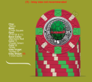
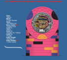 Bebop 25c.png119 KB · Views: 125
 -
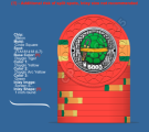
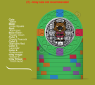
 Rock 25000.png111.3 KB · Views: 127
 -
 Mikey 5000.png115.1 KB · Views: 113
 -
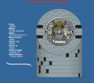
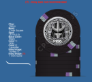
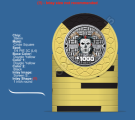 KC 1000.png110.4 KB · Views: 113
 -
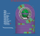 Don 500.png112.7 KB · Views: 108
 -
 Shredder 100.png95.3 KB · Views: 96
 -
 Splinter 25.png116.1 KB · Views: 103
 -
 Raph 5.png113.9 KB · Views: 101
 -
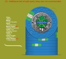 Leo1.png114.8 KB · Views: 134


")


")