There was a guy that used to render chips so we can see what they look like in stacks etc. Is he still around on PCF? I would be curious to see how these different color combo options come out. It may swing opinion to see all the chips in stacks.
You are using an out of date browser. It may not display this or other websites correctly.
You should upgrade or use an alternative browser.
You should upgrade or use an alternative browser.
43mm Project Discussion (43 Viewers)
- Thread starter Apache
- Start date
@Ray-ColThere was a guy that used to render chips so we can see what they look like in stacks etc. Is he still around on PCF? I would be curious to see how these different color combo options come out. It may swing opinion to see all the chips in stacks.
But he hasn't been on in almost a year.
I just noticed that all the chips have a 4x multiple on the edge spots other than the blue 25k. Maybe a 4TA316 edgepots instead for the blue?
Agreed. The Red 5 may also need some love. Looks plain/dull sitting next to the rest.
Poker Zombie
Royal Flush
Very interested in what is going on here.
Biggest concern for me right now is the coloring. CC is not always the most vibrant palette, and that is exactly what we are looking at here - bright vibrant colors.
I am in for 600 unless the prices come out stupid high, but I am keeping my excitement contained.
Biggest concern for me right now is the coloring. CC is not always the most vibrant palette, and that is exactly what we are looking at here - bright vibrant colors.
I am in for 600 unless the prices come out stupid high, but I am keeping my excitement contained.
Just a request -- it would be easier to track the project if the latest mock-ups (or the number of the post containing them) were in the OP. Thanks...
RowdyRawhide
Full House
Interesting...That may be one of the best red chips I have seen. The 5K seems a little ho hum to me in comparison (no offense tommy)Agreed. The Red 5 may also need some love. Looks plain/dull sitting next to the rest.
Poker Zombie
Royal Flush
It's funny how preferences are so subjective. The red $5 was the first one that I threw out from my (custom) breakdown.Interesting...That may be one of the best red chips I have seen. The 5K seems a little ho hum to me in comparison (no offense tommy)
The 5k is the easiest one for me to visualize, because the colors already exist.
Note how "washed out" the black looks. It may improve with oil, but the concerns in trying to replicate a digital image as a chips color are real. The above pic was washed to remove factory dust, but not oiled.
RowdyRawhide
Full House
Very few red chips turn my crank (green either). Part of the problem with those was the experimental cross hatching we (the community) tried on them, I oiled mine and they look much better after, at least that chip. I dont own any Majestics but they seem to have done a much better job on the colors....at least in the picturesIt's funny how preferences are so subjective. The red $5 was the first one that I threw out from my (custom) breakdown.
The 5k is the easiest one for me to visualize, because the colors already exist.
View attachment 226708
Note how "washed out" the black looks. It may improve with oil, but the concerns in trying to replicate a digital image as a chips color are real. The above pic was washed to remove factory dust, but not oiled.
Poker Zombie
Royal Flush
I agree the cross-hatching was an issue, but many of the colors are muted on the Majestics as well. Better, but not as much "pop" as you get in a computer generated image.
I agree the cross-hatching was an issue, but many of the colors are muted on the Majestics as well. Better, but not as much "pop" as you get in a computer generated image.
IMO, the best color palletes on the Majestics, in this order, are the orange, green, yellow then the blue (the blue sort of, the contrast on this chip between colors isnt great, but its a decent chip so I included it). The purple in the Majestics set is blaaaaah, the red too etc. The rest are uninspiring.
It would be great if this 43mm CC set includes those same bright, vibrant color palletes.
Last edited:
saleen121212
Full House
Here is the latest art. I tried to pay attention to all the posts and make everyone as happy as possible.
The $1000 chip is based on the $20 Aurora Star and the $25,000 is the Horseshoe. Also, I added a purple/pink chip to the lineup.
I do not see the need for any major changes here. Center artwork is next!
View attachment 226473
Sweet mother of good. Are you sure we have to have these be china clays? How do we get CPC or Paulson to make this lineup of beautiful chips. I don't know that I would change anything.
BukNaked36
Straight
I just think orange black and white is kind of plain relative to the other chips. I like playing around on Paletton.com for color schemes as shown below. So orange green blue, or orange green purple would be cool.
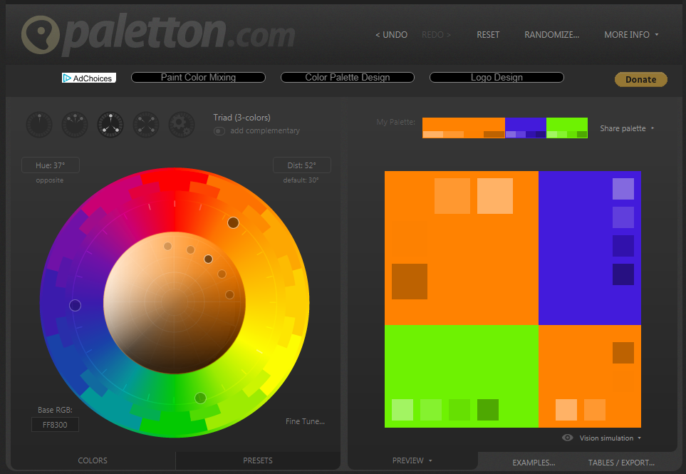
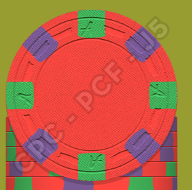
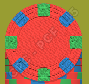
I just think orange black and white is kind of plain relative to the other chips. I like playing around on Paletton.com for color schemes as shown below. So orange green blue, or orange green purple would be cool.
View attachment 226719
View attachment 226718 View attachment 226720
Does this program also tell you which colors contrast each other the most. Besides vibrancy/pop, contrast is pretty important.
BukNaked36
Straight
It's just a website, feel free to go check it and see what you think.Does this program also tell you which colors contrast each other the most. Besides vibrancy/pop, contrast is pretty important.
pokerpig
Flush
Maybe just me but I'm not a fan of the "ROYAL" theme.
Maybe something like....
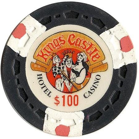
Maybe something like....
Last edited:
andy699669
3 of a Kind
I'd love to do it with Inkscape, but there would be a lot of limitations of what I can.There was a guy that used to render chips so we can see what they look like in stacks etc. Is he still around on PCF? I would be curious to see how these different color combo options come out. It may swing opinion to see all the chips in stacks.
bigdome1984
Pair
Is there an estimated timeline on this project?
I have been very busy with XMAS orders so this has been going a little slow. I will put more time into it next week.
For now let me know if you are happy with the art.
Should we change name to High Roller or go without a name? New name or layout etc.

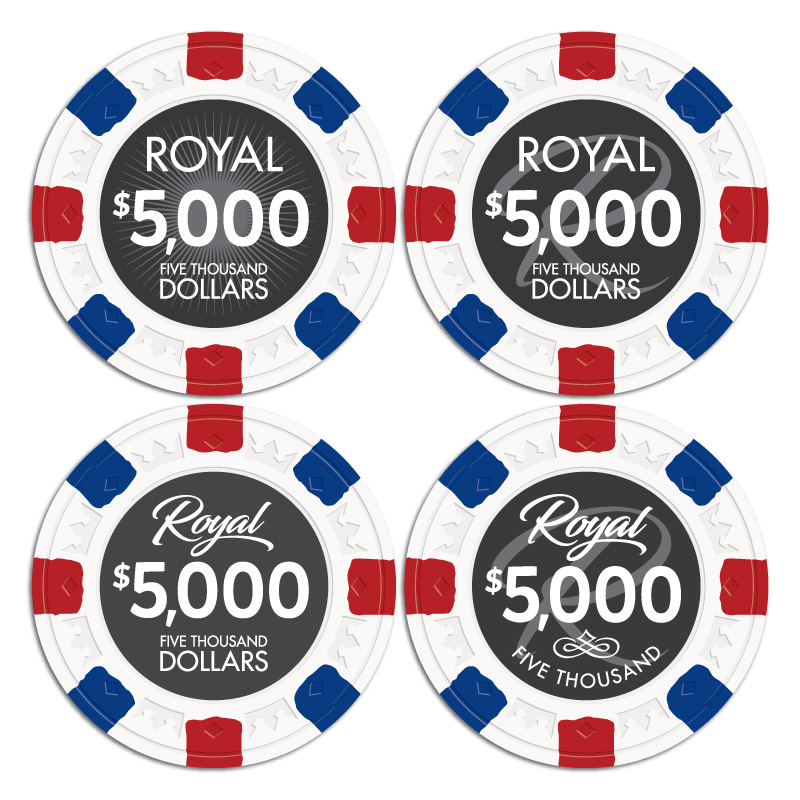
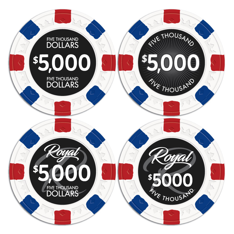
For now let me know if you are happy with the art.
Should we change name to High Roller or go without a name? New name or layout etc.
Last edited:
ranger764
Flush
Lower left
RowdyRawhide
Full House
No Name for me, I like the arched lettering, still niether here nor there on the water mark, Starburst feels a little busy to me
BukNaked36
Straight
Background
Script R looks classy
Sunburst is nice - I would typically expect this to be color matched to chip base color
Theme
Script Royal is classy
High Roller fits your chip theme
No theme is generic is boring
Takes on Royal
King, Queen, Monarch, Crown, Summit, Noble, Palace, Prince, Emperor, Lord
I like Summit –nice old school Vegas reference - the guys in the Rat Pack never called it the Rat Pack. They called it the Clan or the Summit. I don’t think The Clan would go over well.
Takes on High Roller
Whale, Millionaire, Million or Millions, Billionaire, Billion or Billions, Giant, Colossus, Hercules, Goliath, Leviathan, Titan, Jumbo
Quicksilver-75
4 of a Kind
Lol. I've never really looked at this inlay. The subtle boob-gawk and angry queen is hilarious.Maybe just me but I'm not a fan of the "ROYAL" theme.
Maybe something like....
View attachment 227541
Not to mention the maid is holding his staff..
andy699669
3 of a Kind
The font is "Blacksword" for the "Royal", right?
Just wondering if you guys would like to see more art.
I think an updated High Roller set might be good. (We will be keeping the same edge spots. That will not change)
Or a less themed chip.
If you guys are interested in seeing this let me know. If not I will go forward with the Royal layout.
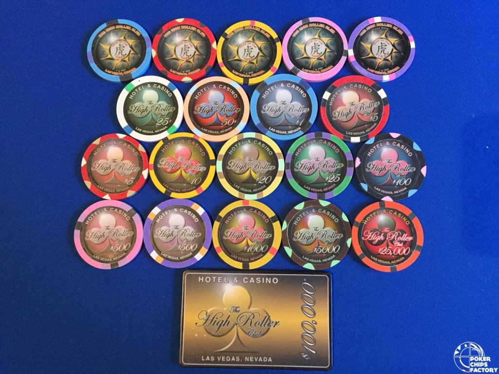
I think an updated High Roller set might be good. (We will be keeping the same edge spots. That will not change)
Or a less themed chip.
If you guys are interested in seeing this let me know. If not I will go forward with the Royal layout.
Poker Zombie
Royal Flush
I am basically following this for the blanks or relabel possibilities. Actual inlay matters zero to me. Edgespots look great. Hoping the actual colors are equally vibrant.
I am basically following this for the blanks or relabel possibilities. Actual inlay matters zero to me. Edgespots look great. Hoping the actual colors are equally vibrant.
This. I’m in for custom denom colors using whatever stock labels you bring out. Just waiting to see how this all pans out.
For the record though, I prefer the Royal design with smaller inlays. More chip area = more win IMO.
Last edited:
Also not to derail the art direction, but I just saw this thread. A Presidential chip set to go along with the latest plaques would be pretty sick. Just throwing it out there haha.
https://www.pokerchipforum.com/threads/presidential-cash-set-labels-help.36206/
https://www.pokerchipforum.com/threads/presidential-cash-set-labels-help.36206/
Similar threads
- Locked
- Replies
- 18
- Views
- 1K

