You are using an out of date browser. It may not display this or other websites correctly.
You should upgrade or use an alternative browser.
You should upgrade or use an alternative browser.
43mm Project Discussion (6 Viewers)
- Thread starter Apache
- Start date
i might be in the minority, however i really like the red 100k chip. I also liked @Quicksilver-75 's idea about alternating the spot pattern on the 100 (Full disclosure my set would start with the $1000 chip)
One of the most seemingly pointless scenes, but also one of my favourite ever.
They should have released an hour special of those two chatting. Tarantino is the dialogue boss.
Agree, one or the other (500, 1000) could be changed to either 614 or 6D18 so that both aren't 8-spotted.Sorry. Meant to say sim (similar) with spot pattern.
Suddenly I see why none of the boat chip lineups were flawless...
These are looking great, Josh. I’d love to see a lavender chip as well, don’t particularly love the blue $25k.
These are looking great, Josh. I’d love to see a lavender chip as well, don’t particularly love the blue $25k.
MoscowRadio
Flush
i might be in the minority, however i really like the red 100k chip. I also liked @Quicksilver-75 's idea about alternating the spot pattern on the 100 (Full disclosure my set would start with the $1000 chip)
Nope! I love that 100K chip as well!
@Johnny5 is a pro and knows what he is doing.
^^ That ^^
Or one can use the red chip as a Cali cash set quarter, if one does like it.Could make a great Cali cash set out of these and wouldn't need to use the red chip (not a fan of that spot pattern).
TheOctagon
Two Pair
Quick point before a more nuanced critique: some of these ideas are pushing the designs toward being Majestic clones. Blue on the 100 and dark green on the 25, specifically, will achieve this. That's not good nor bad, it just is worth pointing out.
Again, critique. The goal is to raise questions and illuminate concepts that would otherwise be missed in the design process and to bring a plurality of perspectives to the creator(s). I'm not here to "design on the fly" or worse, design by committee. Design is, ultimately, up to @Apache and @Johnny5 to produce and justify (and market, obviously). Objectivity is demanded, but I acknowledge a certain bias which I will attempt to eliminate until the final set is produced. I did, after all, post the Aria high roller cash chips a million times
---
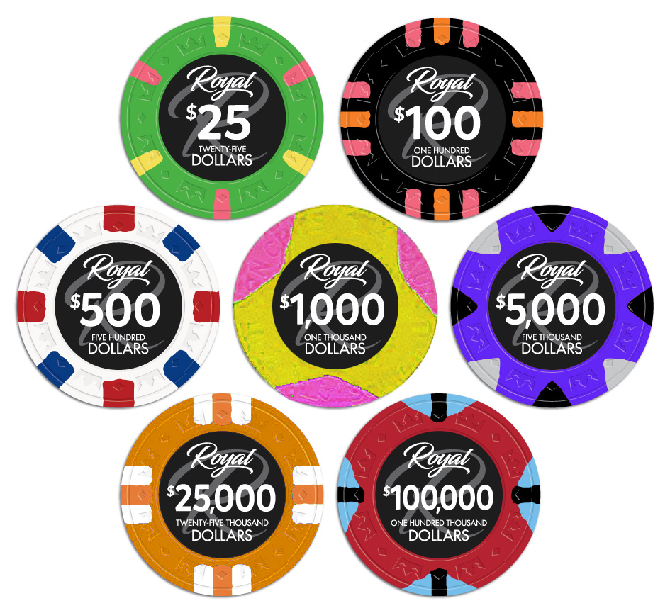
Green 25: A 6 spot pattern makes it unique among the group, and in the absence of a $5 favorably so. We've seen the yellow on the 25 before (Majestic) in this case, which is worth noting. Would it be interesting to consider (again, in the absence of a $5) a green with a single color spot pattern - even if it happens to be the yellow? I get that next to the 100 the pinks could get repetitive.
Black 100: Taking the juiciness of the edge spots from the Aria 5k "Melon" looks like a successful play here. That contrast should prove brilliant on the CC mold. I'm not sure based on the proof, but are there two shades of pink? Perhaps exploring a 3rd shade or a purple, as others have suggested, could take it to the next level. It could also over-complicate it. But, I like insane multi shade high contrast chips - so, bias acknowledged.
White 500: It's a perfect replica of the "flag" design. High contrast, bold spot pattern. I can't say much else than it's a solid and tested concept. Any amount of tweaking could reduce its effectiveness.
Yellow 1000: The one point to raise here is the potential for the contrast between the shades of purple and blue in the 8D18 pattern. The proof is clear, yet the product in hand could lose a bit of the luster. That is unless the CC coloring process has improved since the Majestics and Dunes runs which I have no knowledge of. Worth exploring would be the same shades with a different spot pattern (4V418) or the same pattern with higher contrast spots.
Orange 5000: It's creeping on its orange Majestic cousin here. I can't think of an interesting real world influence though, so the best critique I can offer is perhaps explore alternate spot coloration. 8v seems like a happy choice for this denom. It marks the end of the progression from the mid-tier journeyman chips [chips you reasonably could expect to see on a Craps table on any given Saturday in AC] to the unique high roller pieces [which are at the high limit Baccarat tables at Aria and basically nowhere else].
Blue 25K: This one is going somewhere, but I don't know if it's there yet. I would have to agree with some of the other ideas that this set is lacking a nice, rich purple (or even better - blurple) chip. Perhaps the 25K is where this fits best. If, however, the influence for the 25K is the Paulson Horseshoe secondary, then something to explore would be some more vibrant edge spot colors. Perhaps explore a 3-color edge spot concept with a complementary [and I mean that in the color wheel sense] color to the green. I don't know what that color is. That's up to you.
Red 100K: Another nailed design hailing from the high roller set. Red 100Ks are evocative of some of finest WSOP sets as well. I don't have a lot to offer on this design. It would probably fail as a $5 in this context. Not that it wouldn't make a great $5 on its own merits, but it seems more suited for a high roller chip than a journeyman typical $5 piece.
Looking good. Keep up the excellent work!
Or one can use the red chip as a Cali cash set quarter, if one does like it.
The 4T316 (which I love) looks a lot like the 4W in stacks but then when you look at the face of a 4W chip I'm like
It's like a V spot gone horribly wrong.
DeeVee8
Flush
Orange 5000: It's creeping on its orange Majestic cousin here. I can't think of an interesting real world influence though, so the best critique I can offer is perhaps explore alternate spot coloration. 8v seems like a happy choice for this denom. It marks the end of the progression from the mid-tier journeyman chips [chips you reasonably could expect to see on a Craps table on any given Saturday in AC] to the unique high roller pieces [which are at the high limit Baccarat tables at Aria and basically nowhere else].
.02, I've always loved orange chips with lavender and red spots. Oh, and now I have to trash my whole custom CC project and restart because of this
Attachments
Last edited:
MoscowRadio
Flush
I can’t stop thinking about how awesome it would be to see the 1k chip turned into the 8v with blurple and lavender spots. I don’t know if anyone has seen these chips, but I think they’re pretty alright. 

ekricket
Royal Flush
I can’t stop thinking about how awesome it would be to see the 1k chip turned into the 8v with blurple and lavender spots. I don’t know if anyone has seen these chips, but I think they’re pretty alright.
View attachment 225961
Are you shooting for The Majestic Star?
Perhaps a nice, bright pink 8d18 chip in there please Josh @Apache
Yes! Also agree...Would work for a 500 or 5,000 chip. Jbriod pic good sample but use 8d18 pattern. Anything Pink and Lavendar/purple base be great.

Here is a picture of the set. This is not final but shows where we are heading.
View attachment 225854
Best... china clay... color palette.... evar.
Not to confuse but just thinking out loud.
- Make the $1000 a tri-moon like National poker Series
- $5000 Blurple or purple instead of close to the existing Majestic orange chip
- and make the $25000 feel like a Nevada Lodge orange.
Not sure if these make sense, just like the spot variety. Just to get ideas flowing.
I'm sure Apache and Johnny5 will come up with something awesome...as usual.
Not to confuse but just thinking out loud.
- Make the $1000 a tri-moon like National poker Series
- $5000 Blurple or purple instead of close to the existing Majestic orange chip
- and make the $25000 feel like a Nevada Lodge orange.
Not sure if these make sense, just like the spot variety. Just to get ideas flowing.
I'm sure Apache and Johnny5 will come up with something awesome...as usual.
View attachment 225995
Best... china clay... color palette.... evar.
Plaid strangely gets a sense of deja vu...
DeeVee8
Flush
Are we still on the "one year away" timetable? 'Cuz I check my front porch today. Just...y'know...in case. 
BukNaked36
Straight
I like the pink and yellow on green 25, but think that BGinGA's idea of a 4V418 would be better - or maybe a 3V318 would be interested just to do something a little different.
Like the blurple or purple 5000 above better than the orange just because the orange looks just like the standard Majestic. Maybe kick the purple down to the 500 and the white up to the 5,000 to get back to more standard colors
Also think the spots on the 100 need some work as suggested by Quicksilver.
Like the pink on yellow combo and could get rid of the pink on the 100 to avoid having too much pink in the set.
I still think the red chip is weak for a top end chip
Last edited:
I have gone through the posts and I will have J5 update the set. Might take a few days but I will post when I have new art.
Hopefully you aren't going with that NPS looking 1K and will also keep a blue chip somewhere in the set.
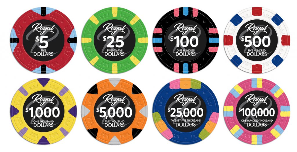
Here is the latest art. I tried to pay attention to all the posts and make everyone as happy as possible.
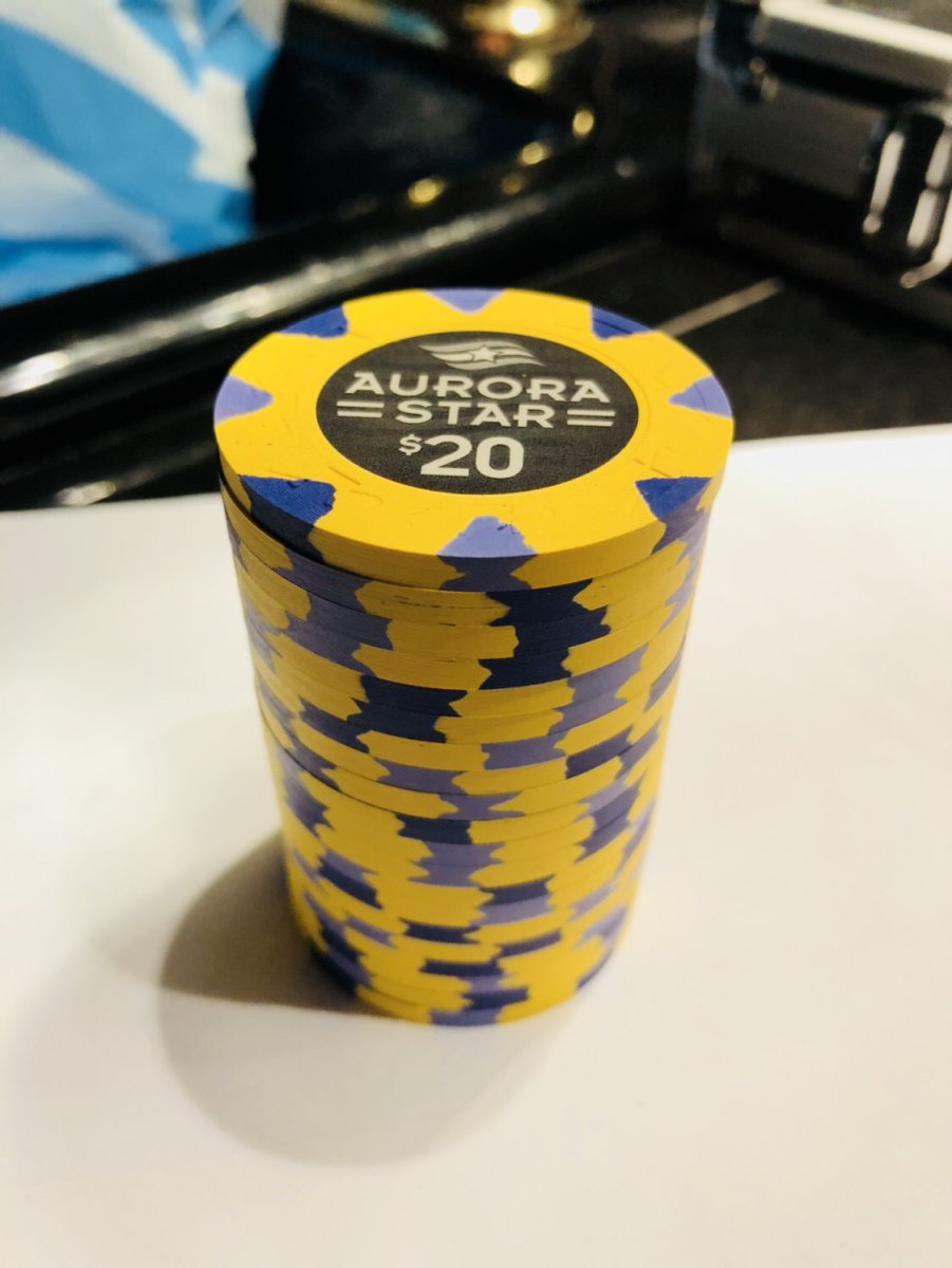
The $1000 chip is based on the $20 Aurora Star and the $25,000 is the Horseshoe. Also, I added a purple/pink chip to the lineup.
I do not see the need for any major changes here. Center artwork is next!

The $1000 chip is based on the $20 Aurora Star and the $25,000 is the Horseshoe. Also, I added a purple/pink chip to the lineup.
I do not see the need for any major changes here. Center artwork is next!
SeanGecko
4 of a Kind
Very nice
DeeVee8
Flush
Dig it. My tournament set would be black for 100's, white for 500's, orange for 1k's, red for 5k's and green for 25k. No repeat on the edge spots.
Last edited:
Megsy9
High Hand
Wasn’t planning on picking up China clays but these look really good
Similar threads
- Replies
- 12
- Views
- 437
- Replies
- 1
- Views
- 287

