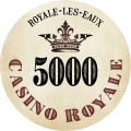
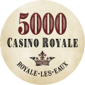
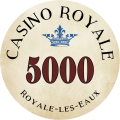
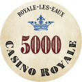
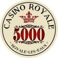
Extremely early in the process. Let me know your thoughts/opinions.
-
This site contains affiliate links. If you choose to make a purchase after clicking a link, Poker Chip Forum may receive a commission at no additional cost to you. Thank you for your support!
You are using an out of date browser. It may not display this or other websites correctly.
You should upgrade or use an alternative browser.
You should upgrade or use an alternative browser.
Casino Royale tribute idea that I've been kicking around.... (1 Viewer)
- Thread starter allforcharity
- Start date
i think silhouette or just outline of the building might work better. It looks a bit busy with all the detail
RichMahogany
Straight Flush
Should say Royale Les Faux 
Amish Rabbi
Straight
I don't think the detail is going to come across on a chip sized label
plaques though...
plaques though...
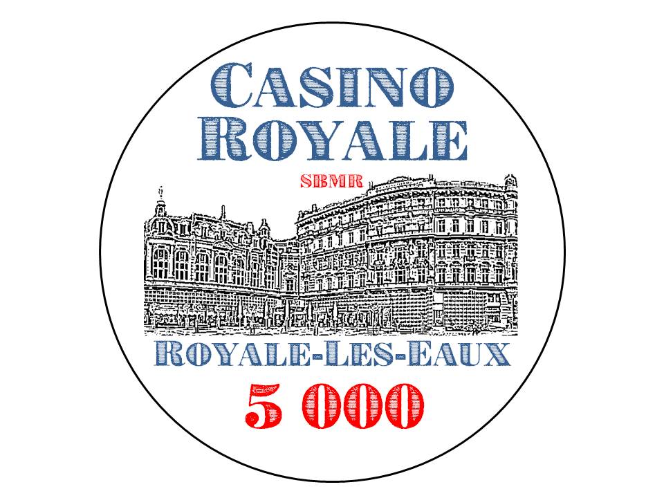
I wish I could get an architectural line drawing of the façade of the building, it would make it much simpler. As it is, I just took a picture of (part) of the building in question and used free online conversion software to flatten it into a black-and-white drawing.
The plan behind the chips:
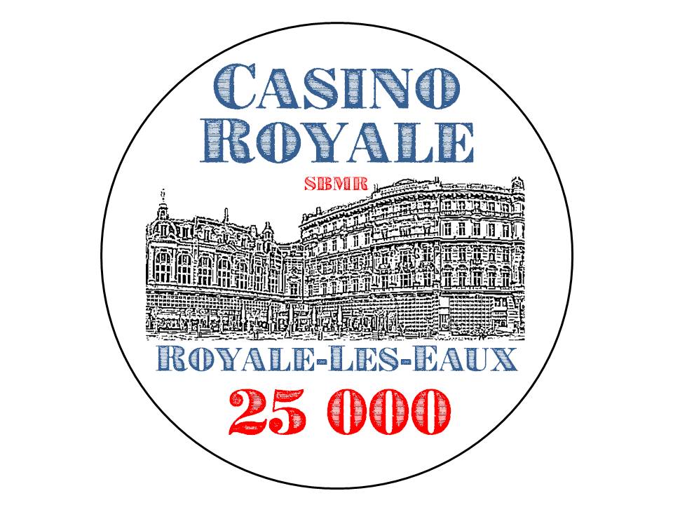
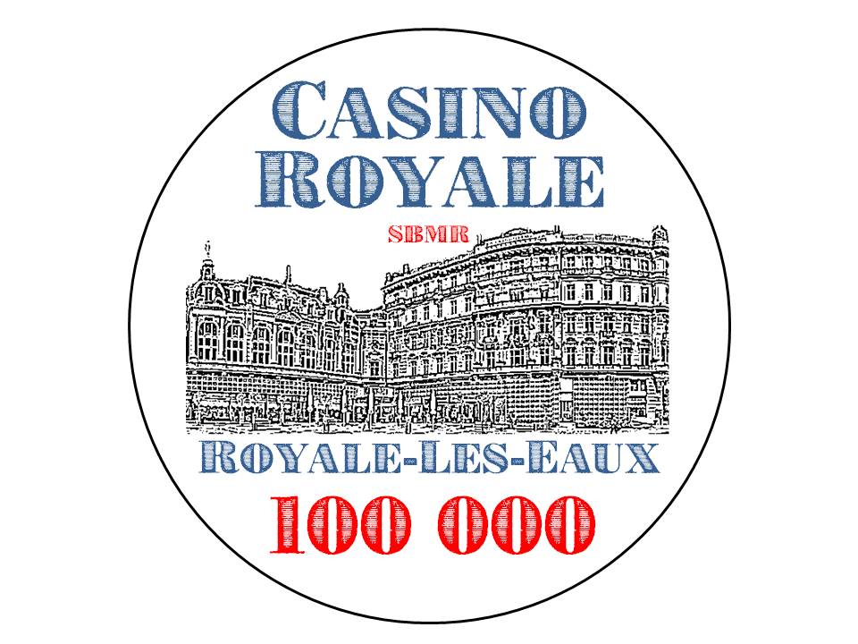
I'd love to have a set of custom chips where I can re-create the poker tournament that was done in Casino Royale (2006). The plan is to use CPC Large Crown mold, and to pay slight homage to the chips from the production design (and I believe were made by Cartamundi and are the 14g ones you see available from Apache and other retailers) at least as far as the base colours. The above is just a preliminary inlay design (7/8"). Eventually, I will need 200 each of $5k, $25k, and $100k chips. I will also need about 160 plaques split between $500k (60) and $1MM (100). This is to replicate the 10-player table with 10MM initial buy-in (starting stacks of 20/20/14/6/5 of 5k/25k/100k/500k/1MM) with an additional 60x 100k to colour up all the 5k and 25k, and 50 extra 1MM plaques to allow for one-time rebuy of 5MM for each player.
Elements of the chip design:
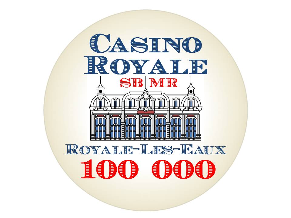
The building that is represented in the graphics is the Grand Hotel Pupp in Czech Republic, which was used for the exterior shots of the fictional Casino Royale in Montenegro in the movie. However, the setting in the original Casino Royale novel as written by Ian Fleming was a fictional seaside spa town in Northern France called Royale-Les-Eaux (supposedly financed by Saudis for the elite American and European clientele). The SBMR stands for La Societe des Bains de Mer de Royale, which is an obvious play on La Societe des Bains de Mer et du Cercle des Etrangers de Monaco, a.k.a. SBM, the luxury resort corporation based in Monaco that runs the main hotel, casino, and opera house in the real-life principality. Colours on the inlay are primarily blue, white, and red, representative of the colours of the French flag. I wouldn't mind it looking like a traditional wine label, also, so am contemplating turning the building from black lines into a more lighter brownish colour.
Don't even get me started on the Les Ambassadeurs tribute baccarat plaque set that's also in the back of my mind.
doublequeen
Pair
Love the idea behind this set ... Casino Royale is One of my Favorite 007 Movies 
Tried a new graphic
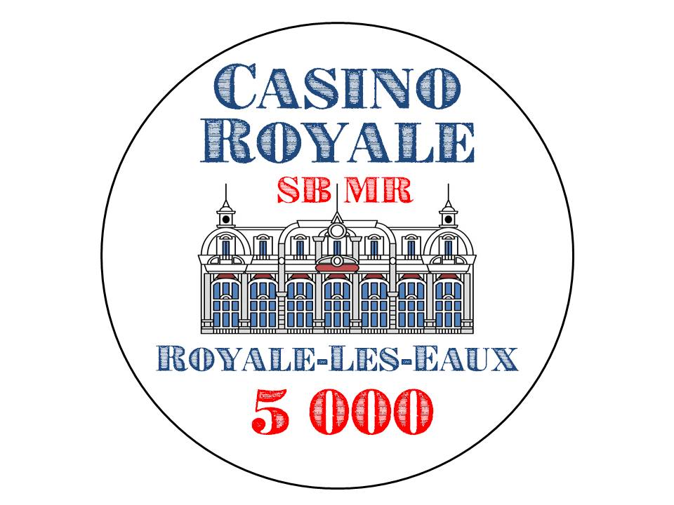
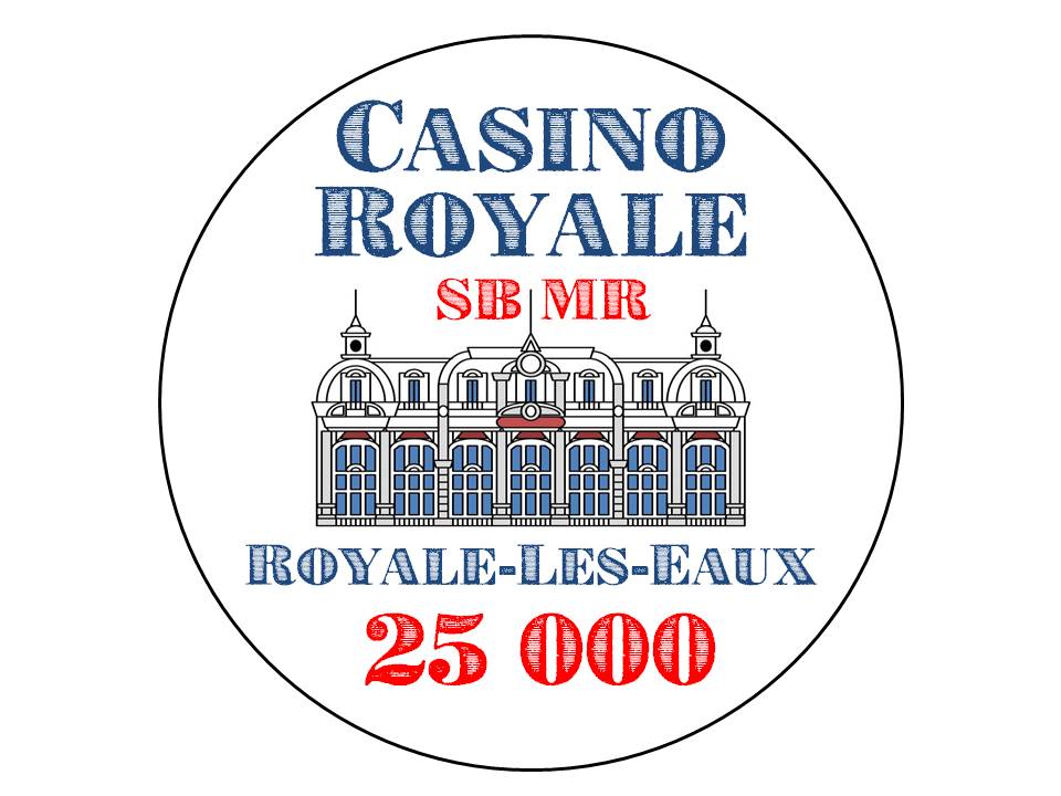
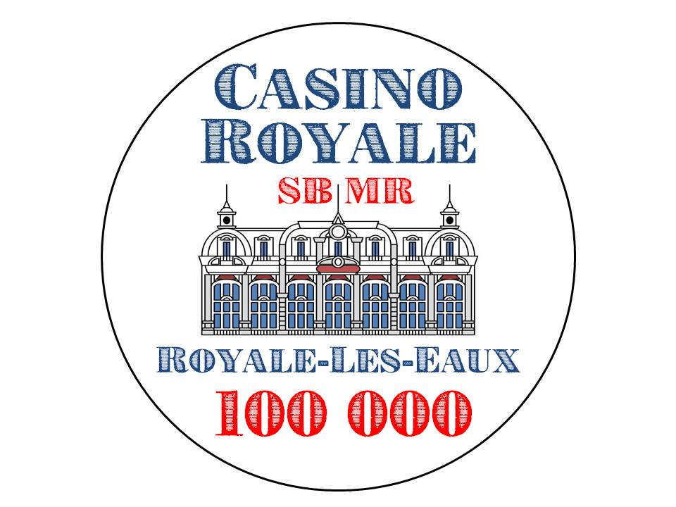
I like this one much better. What did you have in mind? Paulson relabel? Sun Fly?
Amish Rabbi
Straight
better for sure, just needs a fake texture added (or the rest of the text cleaned up)
judgeanjury
Flush
The new one looks awesome
I like this one much better. What did you have in mind? Paulson relabel? Sun Fly?
CPC Large Crown. Edge spots still to be determined. Round labels only. Base colours will roughly match the tourney chips used in the movie (Greenish 5k, Pinkish 25k, Blackish 100k).
I just rewatched the movie. Chip stacks during play were ridiculously huge - I'm sure this was done just for effect rather than reflect reasonable tournament/cash play. And besides, I can't really wrap my head around the game as presented: was it a standard tournament game that allowed a single rebuy all the way up to the 500,000/1,000,000 blind level (which was when they finally removed the 25k chips from play)? Or was it actually a cash game with increasing blinds and a limited buy in? Well, some silliness for sure, and the minutiae doesn't serve to drive the plot, so the screenwriters and production designers can be forgiven.
Amish Rabbi
Straight
The logic is big stacks look better on camera lol
better for sure, just needs a fake texture added (or the rest of the text cleaned up)
Do you mean a background texture for the inlay as a whole? Or a modification of the text as presented?
Oh yeah, there's still a lot of blank space on the inlay - I was thinking of looking for some simple baroque flourishes for the cardinal points.
Amish Rabbi
Straight
I just mean that the building is clean straight smooth colours and the text looks worn/vintage. should both have the same look IMODo you mean a background texture for the inlay as a whole? Or a modification of the text as presented?
Oh yeah, there's still a lot of blank space on the inlay - I was thinking of looking for some simple baroque flourishes for the cardinal points.
I think a background pattern like this behind the whole thing (but more subdued obviously, would suit it
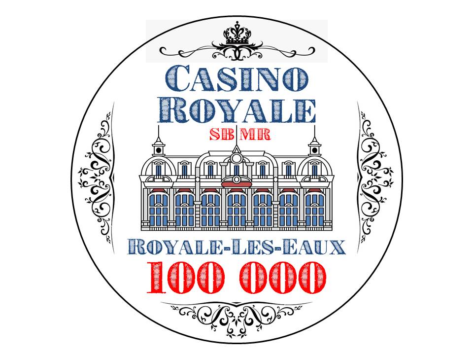
Played around with some flourishes.
SteveHNo96
Flush
I don't dislike this. It has a cool design to it. VERY Traditional but I appreciate that's what they're going for.
doublequeen
Pair
The design is sick (I would definitely like to have a sample set  )
)
I took it as a tournament with a single rebuy option when watching the movie (which has happened around ten times by now )
)
was it a standard tournament game that allowed a single rebuy all the way up to the 500,000/1,000,000 blind level (which was when they finally removed the 25k chips from play)? Or was it actually a cash game with increasing blinds and a limited buy in? Well, some silliness for sure, and the minutiae doesn't serve to drive the plot, so the screenwriters and production designers can be forgiven.
I took it as a tournament with a single rebuy option when watching the movie (which has happened around ten times by now
I took it as a tournament with a single rebuy option when watching the movie (which has happened around ten times by now)
Yeah, but then Bond tips the dealer with a 500,000 plaque which is essentially worthless because it's NCV, and all the money is being held in escrow by a Swiss bank for which he has the only knowledge of the password to allow fund transfer. So, no tips for the casino staff after all!
GenghisKhan
Full House
- Joined
- Nov 7, 2014
- Messages
- 2,897
- Reaction score
- 4,705
Each time you modify the design, print it out at 7/8" size, cut it out and place it on a chip.
Will give you a better idea IRL how everything looks. (I'm thinking text size, readability, how busy/crammed does everything look?)
Especially since adding the flourishes has decreased the denom and text size.
I think it's too busy with the flourishes.
Maybe, also try with flourishes, but with less text? Not sure how attached you are to SBMR and to Royale-les-Eaux.
I definitely love post #8 though before adding the flourishes.
Maybe use opening sequence grafic from "Casino Royal" movie
Likely way too complicated from a printing (and my design-skill) POV.
I like the design, but I feel like the bright colors and cartoony look on the casino don't fit in with the flourishes and fancy text on the chip. I'm not too sure about what else you could do, but I did like the idea of a silhouette.
PokerChipsDesign
Straight
You might want to use this font : Ecuyer Dax
https://www.dafont.com/fr/ecuyer-dax.font?fpp=200&text=CASINO+ROYALE
https://www.dafont.com/fr/ecuyer-dax.font?fpp=200&text=CASINO+ROYALE
You might want to use this font : Ecuyer Dax
https://www.dafont.com/fr/ecuyer-dax.font?fpp=200&text=CASINO+ROYALE
Thank you, this may look much cleaner!
Looking forward to seeing the final design.
My earlier iterations before I settled on a different style for the 2015 set.
View attachment 466124View attachment 466125View attachment 466126View attachment 466127View attachment 466128View attachment 466129
View attachment 466130
Fantastic!
Yes, I also was considering a brown parchment-like gradient for the inlay. Was considering the rampant beast over a fleur-de-lys, but already have too many graphic elements so may need to shelve that. I'll have to skip the Latin, too, but that's okay - I've already got "Orbis Non Sufficit" on my ceramic blackjack set on the rolling edge (and besides, that's Bond's family motto, technically without link to the fictional casino).
Your plaques are serialized? Random or sequential?
Sequential, I think. The Blades ones were. These might have been '007', not sure nowFantastic!
Yes, I also was considering a brown parchment-like gradient for the inlay. Was considering the rampant beast over a fleur-de-lys, but already have too many graphic elements so may need to shelve that. I'll have to skip the Latin, too, but that's okay - I've already got "Orbis Non Sufficit" on my ceramic blackjack set on the rolling edge (and besides, that's Bond's family motto, technically without link to the fictional casino).
Your plaques are serialized? Random or sequential?
Updated font, no flourishes, test gradient
Amish Rabbi
Straight
Cleaner font matches much better
Similar threads
- Replies
- 6
- Views
- 342
- Poll
- Replies
- 11
- Views
- 937

