I think I'm just about there on the inlay design
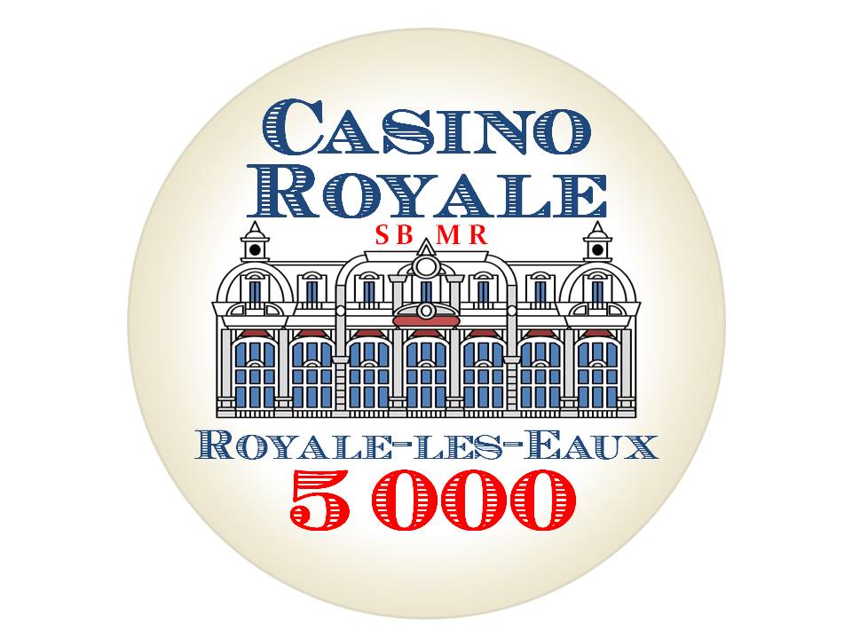
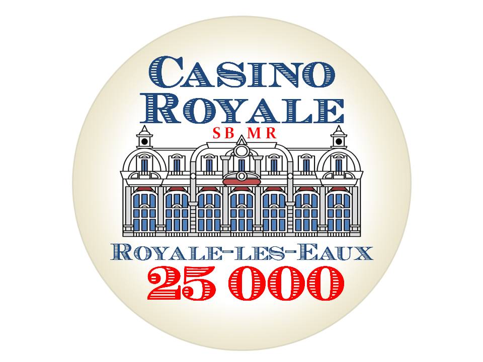
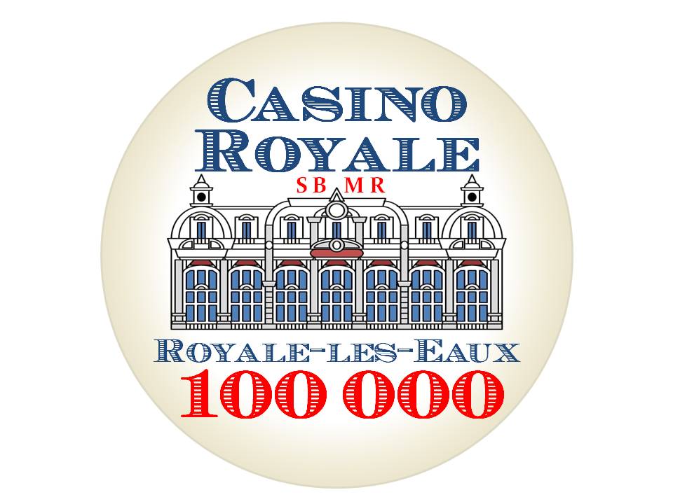
-
This site contains affiliate links. If you choose to make a purchase after clicking a link, Poker Chip Forum may receive a commission at no additional cost to you. Thank you for your support!
You are using an out of date browser. It may not display this or other websites correctly.
You should upgrade or use an alternative browser.
You should upgrade or use an alternative browser.
Casino Royale tribute idea that I've been kicking around.... (1 Viewer)
- Thread starter allforcharity
- Start date
Really like the inlays. Still the same plan for the CPC edge spots and Large Crown mold?
Cleaned up the plaques a bit
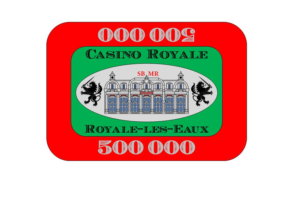
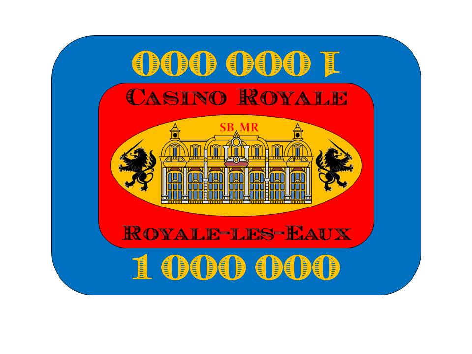
Really like the inlays. Still the same plan for the CPC edge spots and Large Crown mold?
Large Crown mold, yes. I may still play around with the edge spots a bit.
Colquhoun
4 of a Kind
Have you considered a black background? It always adds a bit of upscale and class to something. Plus, it makes the casino look like its lit at night.
Just a thought....
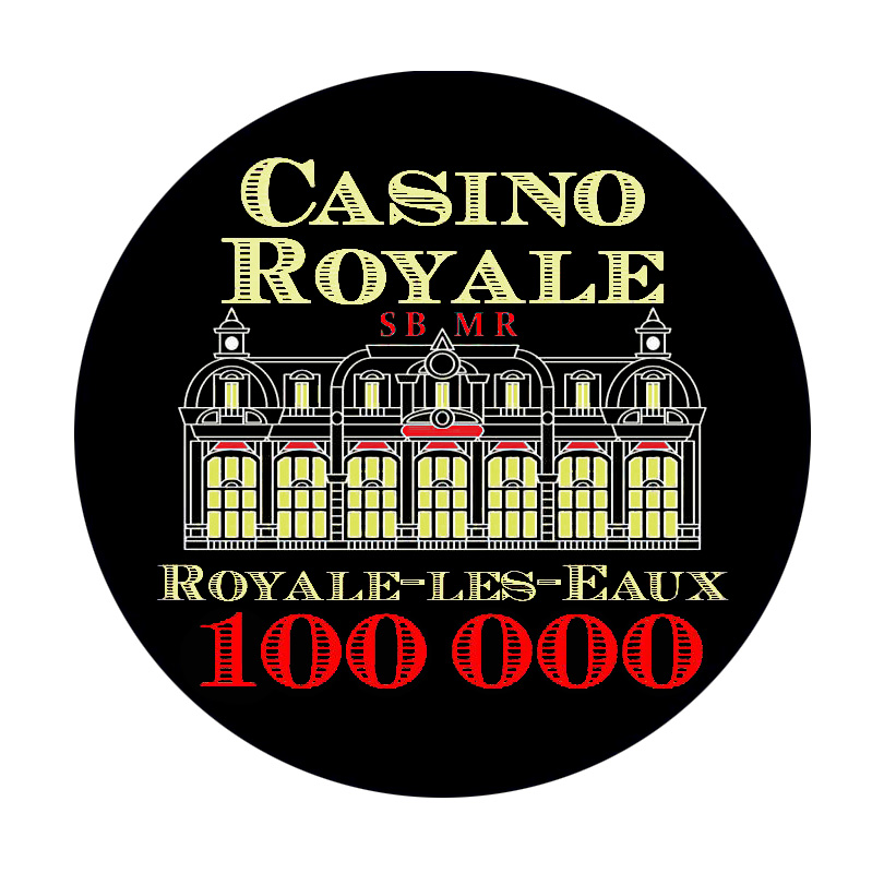
Just a thought....
Have you considered a black background? It always adds a bit of upscale and class to something. Plus, it makes the casino look like its lit at night.
Just a thought....
Thank you, it looks very nicely done! I do not think that a black background will work for me, since one of my base colours (and largest quantity chip) will be black and the inlay will just blend right in, which is not an effect that I want. Also, black background inlays look too "modern" and I want to have the feel of a little history in the design. I am going with a light background with the gradient parchment effect.
Have you considered a black background? It always adds a bit of upscale and class to something. Plus, it makes the casino look like its lit at night.
Just a thought....
View attachment 592187
I just had a thought. Maybe I should do this for a dealer button? Cut cards?
For sure for cut cards. Could you do a double sided dealer button that played a bit with that james bond intro shot at the start of ever film?I just had a thought. Maybe I should do this for a dealer button? Cut cards?
For sure for cut cards. Could you do a double sided dealer button that played a bit with that james bond intro shot at the start of ever film?
I'm intrigued by the acrylic dealer buttons that @Potsie1 said were going to be available soon.
I assume you're referring to the gun barrel graphic sequence?
Yeah on both accounts. I can't wait until Potsie starts selling those. I'm a big fan of thick hockey style dealer buttons maybe from my background with craps on the on/off buttons.I'm intrigued by the acrylic dealer buttons that @Potsie1 said were going to be available soon.
I assume you're referring to the gun barrel graphic sequence?
Thanks, the gun barrel sequence, I couldn't for the life of me think of how to describe that.
I guess it may come down to 'do you want someone to know this is affiliated with James Bond automatically, or are they going to have to know that it's just a reference to a fictional casino in a fictional town in a fiction movie. I could see playing it either way TBH. The art/chips look legit enough, kinda like CDI actually, that I think you could make both work.
Variant on your spots using the same color pallete and the 3/4/6 you were working around.
Adjusted plaque colours to be visually closer to their inspiration:
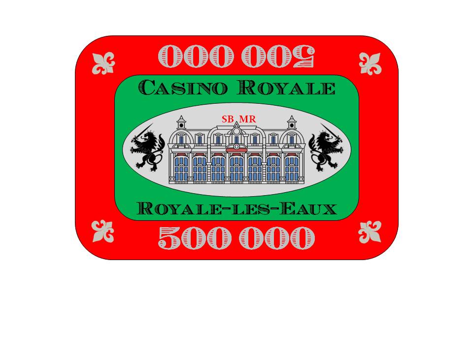
Closer to the movie before, but I think these look better.Adjusted plaque colours to be visually closer to their inspiration:
View attachment 593408
View attachment 593409
Flourishes an fleurs de lis - yea or nay?
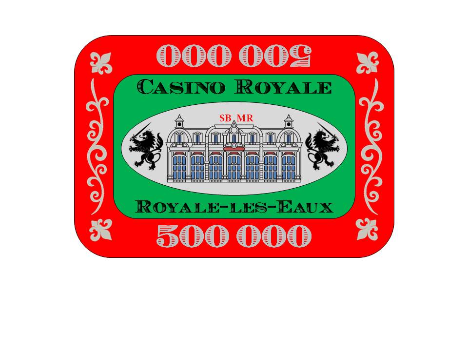
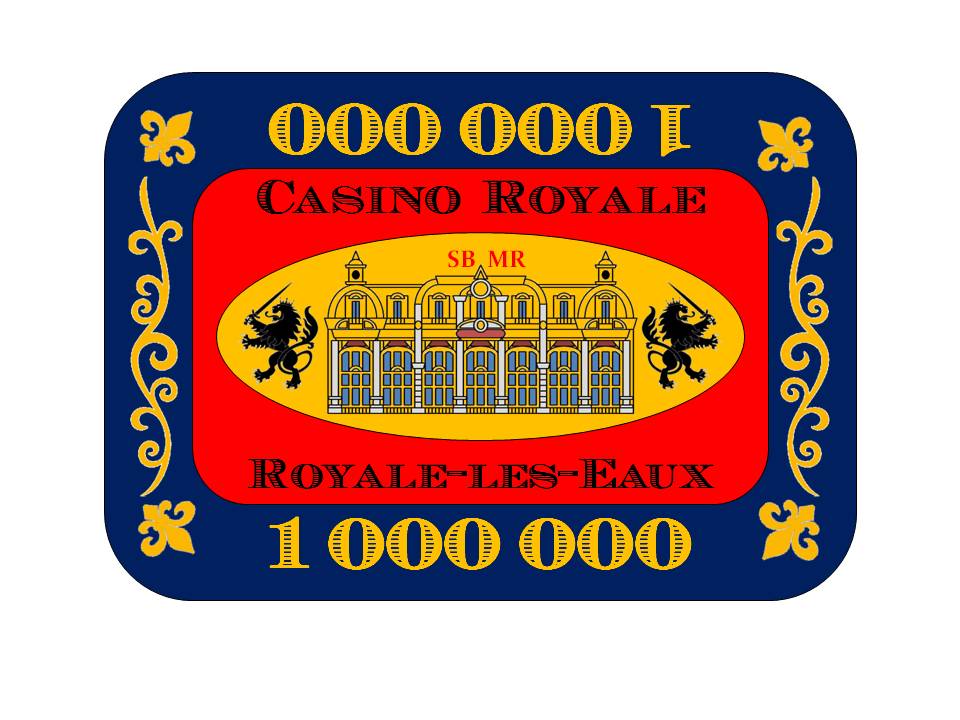
I'd say yea, but point them outward towards the corner.
I'd say yea, but point them outward towards the corner.
I tried that, but once the flourish was in place the FDL direction looked wrong. Try looking at it from the short end down rather than the long end down and see if that makes a difference to your perspective.
Amish Rabbi
Straight
Flourish w/o FDL I like
JesterTX
Flush
Very Nice design!!! Like it better than the first.
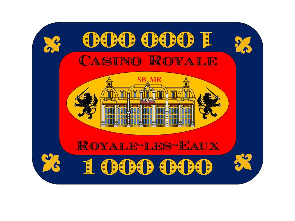
Latest iteration. Pulled back on the "thickness" of the fonts, some recolour, reoriented FDL and thinner flourish. I'll probably ask MSK to outline the text and numbers in black to make it more readable.
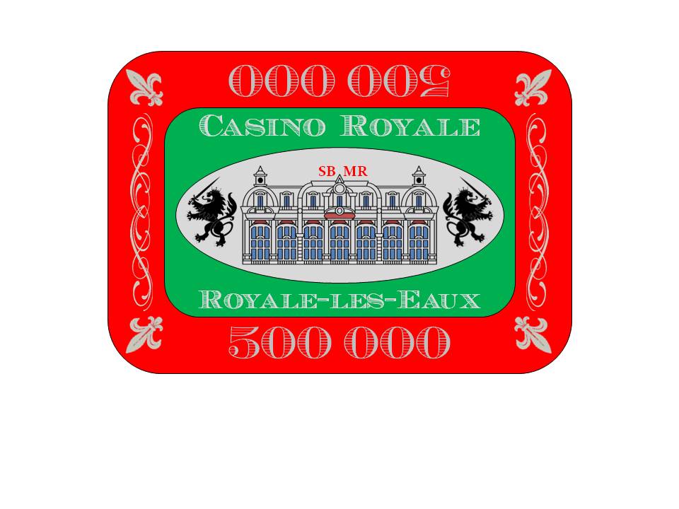
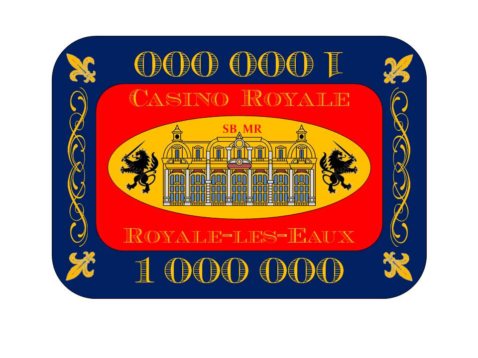
Latest iteration. Pulled back on the "thickness" of the fonts, some recolour, reoriented FDL and thinner flourish. I'll probably ask MSK to outline the text and numbers in black to make it more readable.
View attachment 602818
View attachment 602819
Really nice. Text on the bottom is challenging to read, but your idea of outlining in black may fix that.
Alexeberlin
Pair
The yellow text on the red background of the 1mill is hard to make out
The yellow text on the red background of the 1mill is hard to make out
Yes, for some reason it looks better on the PowerPoint file and then gets washed out on conversion to jpeg. I'll probably get it outlined in black (or switch to black) depending on how the actual mockups look.
I know you were planning on going CPC LC mold for these but wonder if they wouldn't look great with a much lower price point as a Sunfly Hybrid.
I know you were planning on going CPC LC mold for these but wonder if they wouldn't look great with a much lower price point as a Sunfly Hybrid.
They might indeed look very good as a Sun-Fly hybrid. But this is my chance to get a true custom clay, and I'm going to take it. Especially since I don't need more than 800 chips, which will keep finals costs down to what I would consider a reasonable level. Besides, it will check off something on my "chipping Nirvana" list!
heh, reasonable level... might need to turn in your cardThey might indeed look very good as a Sun-Fly hybrid. But this is my chance to get a true custom clay, and I'm going to take it. Especially since I don't need more than 800 chips, which will keep finals costs down to what I would consider a reasonable level. Besides, it will check off something on my "chipping Nirvana" list!
Looking amazing!! You've done a great job with the design through your many iterations! Those plaques look really sharp. What design tool are you using? You mentioned Power Point to input into the CPC tool but are you also using Power Point for the design creation itself?
Looking amazing!! You've done a great job with the design through your many iterations! Those plaques look really sharp. What design tool are you using? You mentioned Power Point to input into the CPC tool but are you also using Power Point for the design creation itself?
As embarrassing as it is to admit it, yes, I'm using PowerPoint for the design. It would have been just as easy, and probably much better looking, if I did it in Illustrator. But, alas, I must do with what I have. I did also use GIMP to help manipulate some of the graphic elements so I could port it into PowerPoint, though. And I'm using GIMP heavily to prepare the art for my roulette labels (see the other appropriate threads).
When I submit the art to the respective companies, I would ask for a little clean-up help.
Haha.. well you are still way ahead of me. I'll have to research this GIMP as the only one I'm familiar with is the one from Pulp Fiction and I've got a sneaking suspicion that is not what you are referring to...As embarrassing as it is to admit it, yes, I'm using PowerPoint for the design. It would have been just as easy, and probably much better looking, if I did it in Illustrator. But, alas, I must do with what I have. I did also use GIMP to help manipulate some of the graphic elements so I could port it into PowerPoint, though. And I'm using GIMP heavily to prepare the art for my roulette labels (see the other appropriate threads).
When I submit the art to the respective companies, I would ask for a little clean-up help.
Haha.. well you are still way ahead of me. I'll have to research this GIMP as the only one I'm familiar with is the one from Pulp Fiction and I've got a sneaking suspicion that is not what you are referring to...
The interface for GIMP seems to look similar to Inkscape.
Similar threads
- Replies
- 6
- Views
- 548
