I am in the final stages of design for a cash and tourney CPC set, and just want to make sure no major faux pas on my design plans, including your opinions on edge spots, and how the inlays will turn out as far as font and color/visibility with CPC printing methods. I think I am ok as far as avoiding dirty stacks, but let me know if you disagree.
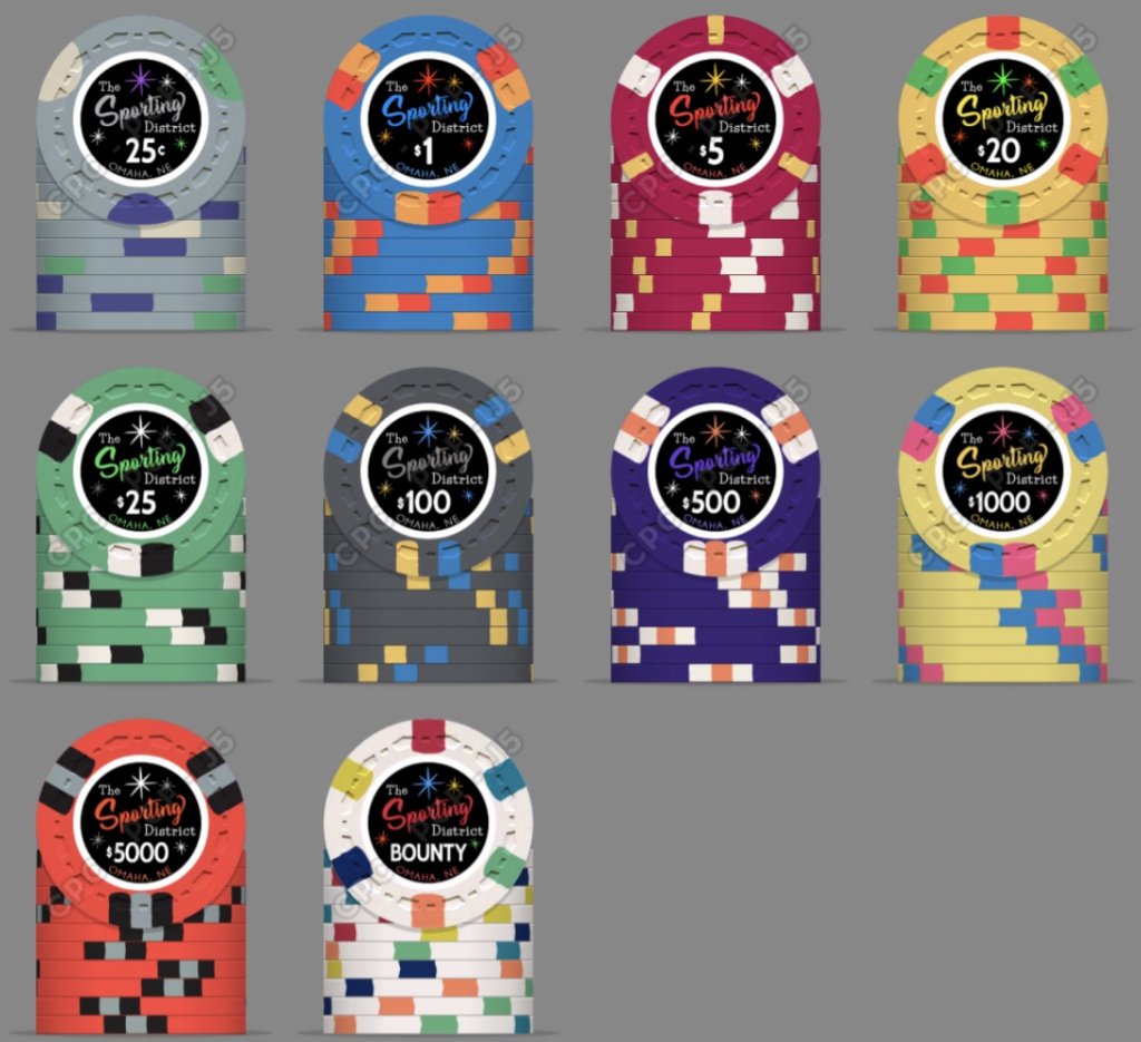
Here is my mock up:

Theme:
I didn’t want to use my name or anything too personal on these. I wanted to create something that would outlast me and maybe have meaning for others that I wasn’t related to, in case my kids don’t end up playing poker and they don’t want them. Some of the loose themes I started with focused on things like underground cardrooms and cocktail lounges. I also thought maybe some kind of nod to my hometown may be a good reference for a chip design. Outside of the 6 years I lived in Chicago, I have spent most of my life in Omaha, NE. Both of my kids were born here and the roots have only grown deeper. Even if I move later, there will always be a connection.
Although today it is now considered a fairly conservative city, from its inception through the turn of the 19th century, Omaha was considered a “wide open” town, meaning that “gambling of all sorts was accepted either openly or in closed quarters.” In the late 1800s, Omaha had more illicit gambling activity than any city west of the Mississippi. Contrast these descriptions to about 100 years later when plans to build a casino in Omaha were proposed and subsequently shot down by a conservative majority (notabley including former husker coach and then-congressional rep Tom Osborne). I felt like I wanted some connection to that more seedy past gambling history represented in this set.
From the late 1880s until around 1930, there was a part of town that was basically a tolerated vice district called “The Sporting District.” The term “Sporting” was a common euphemism in the U.S. in the 19th century for illicit but more or less “tolerated” (ie overlooked by what sounded like corrupt politicians) immoral activities, including gambling, speakeasys, brothels, etc., and many cities in the US had their own “Sporting District.” In Omaha, the Sporting District had multiple named gambling halls including places called “The Midway” or “Diamond Gambling Hall.”
So I thought “The Sporting District” would be a good reference to the Omaha gambling scene of the past. I liked the euphemism of referring to drinking and gambling as “Sporting,” and in my “Sporting District” the “district” is a part of the house (my basement) where the “sports” are pretty tame rec room fare and include poker, billiards, football watching parties, etc...but the euphemism is still present in that drinking and gambling are often involved .
.
Base colors and edge spots:
My cash set design is pretty standard. I thought about doing something like a Cali colored set, but ultimately thought I would go with a more standard set of base colors given this will be a “forever” set. Both sets initially had a spot progression but i ended up dropping this for the tourney set and went with a “tri edge” theme, using 3 different spot patterns, two of which repeat but not in back-to-back chip denom progression. I think this gives some continuity which I like in tourney sets but still some variance to still give it some interest. I also think the $1,000 stands out so much that it didn’t matter if it was a step back in complexity.
Inlay:
The inlay graphics were courtesy of @MoscowRadio, who was a great help with the design and I would highly recommend him to anyone looking for a graphic design artist.

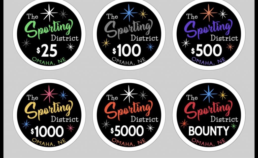
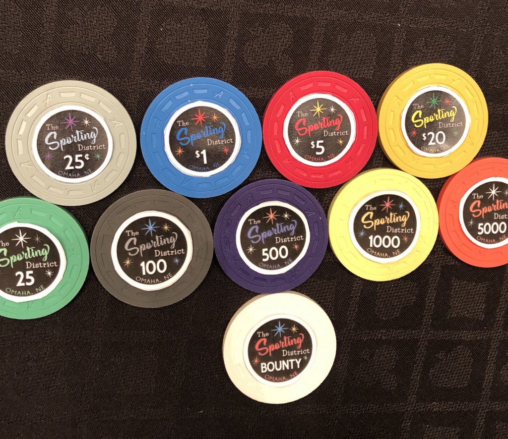
The inspiration for the inlay design came from a few classic custom sets, including “the capital room” “the signal room” “the lounge,” among others. I definitely wanted a black inlay with the white outer rim which I think makes just about any chip look gorgeous. I wanted a simple but classy design with either a “Starry night” effect kind of like the Stardust, the capital room, etc. to help give it that “cocktail lounge” feel. “Sporting” was to be in cursive to give it some of that euphemistic emphasis, with “the” and “district” in more of a formal, block style lettering. It was James’ idea to have “sporting” match the base color of the chips and for the stars to match with the edge spots, which I think looks fantastic. I wanted the denom to be prominent and somewhat reminiscent of the “Aria” inlay: very easy to read for gameplay and white on black to really give it some “Pop.“ I think the Inlay turned out so great that I almost debated whether I even need edge spots for my tourney set. Here is an example of some I printed out on CPC samples, bear in mind the color of my printer is somewhat faded:


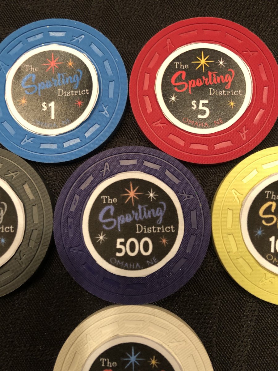
As you can see, “Omaha, NE” comes out a little dark in color. The font looks fine on the mock ups...I am not sure if this is a function of a mediocre printer or if it really is too dark. One option I was considering was to go with a gray which would stand out more but still be darker than the actual denom. Note the above tourney inlays were at a stage where we were thinking about leaving the “$” off the denom for tourney chips. Ultimately I thought I might regret leaving them off.
Let me know what you think!
Jason
Here is my mock up:
Theme:
I didn’t want to use my name or anything too personal on these. I wanted to create something that would outlast me and maybe have meaning for others that I wasn’t related to, in case my kids don’t end up playing poker and they don’t want them. Some of the loose themes I started with focused on things like underground cardrooms and cocktail lounges. I also thought maybe some kind of nod to my hometown may be a good reference for a chip design. Outside of the 6 years I lived in Chicago, I have spent most of my life in Omaha, NE. Both of my kids were born here and the roots have only grown deeper. Even if I move later, there will always be a connection.
Although today it is now considered a fairly conservative city, from its inception through the turn of the 19th century, Omaha was considered a “wide open” town, meaning that “gambling of all sorts was accepted either openly or in closed quarters.” In the late 1800s, Omaha had more illicit gambling activity than any city west of the Mississippi. Contrast these descriptions to about 100 years later when plans to build a casino in Omaha were proposed and subsequently shot down by a conservative majority (notabley including former husker coach and then-congressional rep Tom Osborne). I felt like I wanted some connection to that more seedy past gambling history represented in this set.
From the late 1880s until around 1930, there was a part of town that was basically a tolerated vice district called “The Sporting District.” The term “Sporting” was a common euphemism in the U.S. in the 19th century for illicit but more or less “tolerated” (ie overlooked by what sounded like corrupt politicians) immoral activities, including gambling, speakeasys, brothels, etc., and many cities in the US had their own “Sporting District.” In Omaha, the Sporting District had multiple named gambling halls including places called “The Midway” or “Diamond Gambling Hall.”
So I thought “The Sporting District” would be a good reference to the Omaha gambling scene of the past. I liked the euphemism of referring to drinking and gambling as “Sporting,” and in my “Sporting District” the “district” is a part of the house (my basement) where the “sports” are pretty tame rec room fare and include poker, billiards, football watching parties, etc...but the euphemism is still present in that drinking and gambling are often involved
Base colors and edge spots:
My cash set design is pretty standard. I thought about doing something like a Cali colored set, but ultimately thought I would go with a more standard set of base colors given this will be a “forever” set. Both sets initially had a spot progression but i ended up dropping this for the tourney set and went with a “tri edge” theme, using 3 different spot patterns, two of which repeat but not in back-to-back chip denom progression. I think this gives some continuity which I like in tourney sets but still some variance to still give it some interest. I also think the $1,000 stands out so much that it didn’t matter if it was a step back in complexity.
Inlay:
The inlay graphics were courtesy of @MoscowRadio, who was a great help with the design and I would highly recommend him to anyone looking for a graphic design artist.
The inspiration for the inlay design came from a few classic custom sets, including “the capital room” “the signal room” “the lounge,” among others. I definitely wanted a black inlay with the white outer rim which I think makes just about any chip look gorgeous. I wanted a simple but classy design with either a “Starry night” effect kind of like the Stardust, the capital room, etc. to help give it that “cocktail lounge” feel. “Sporting” was to be in cursive to give it some of that euphemistic emphasis, with “the” and “district” in more of a formal, block style lettering. It was James’ idea to have “sporting” match the base color of the chips and for the stars to match with the edge spots, which I think looks fantastic. I wanted the denom to be prominent and somewhat reminiscent of the “Aria” inlay: very easy to read for gameplay and white on black to really give it some “Pop.“ I think the Inlay turned out so great that I almost debated whether I even need edge spots for my tourney set. Here is an example of some I printed out on CPC samples, bear in mind the color of my printer is somewhat faded:
As you can see, “Omaha, NE” comes out a little dark in color. The font looks fine on the mock ups...I am not sure if this is a function of a mediocre printer or if it really is too dark. One option I was considering was to go with a gray which would stand out more but still be darker than the actual denom. Note the above tourney inlays were at a stage where we were thinking about leaving the “$” off the denom for tourney chips. Ultimately I thought I might regret leaving them off.
Let me know what you think!
Jason

