Daniel's Saloon - Custom CPC Cash Set, HHR, 3916 (1 Viewer)

How much smaller? The c of the cent chips has a little "decal" as part of the font. I think if I go too small it could be mixed up with an € symbol.

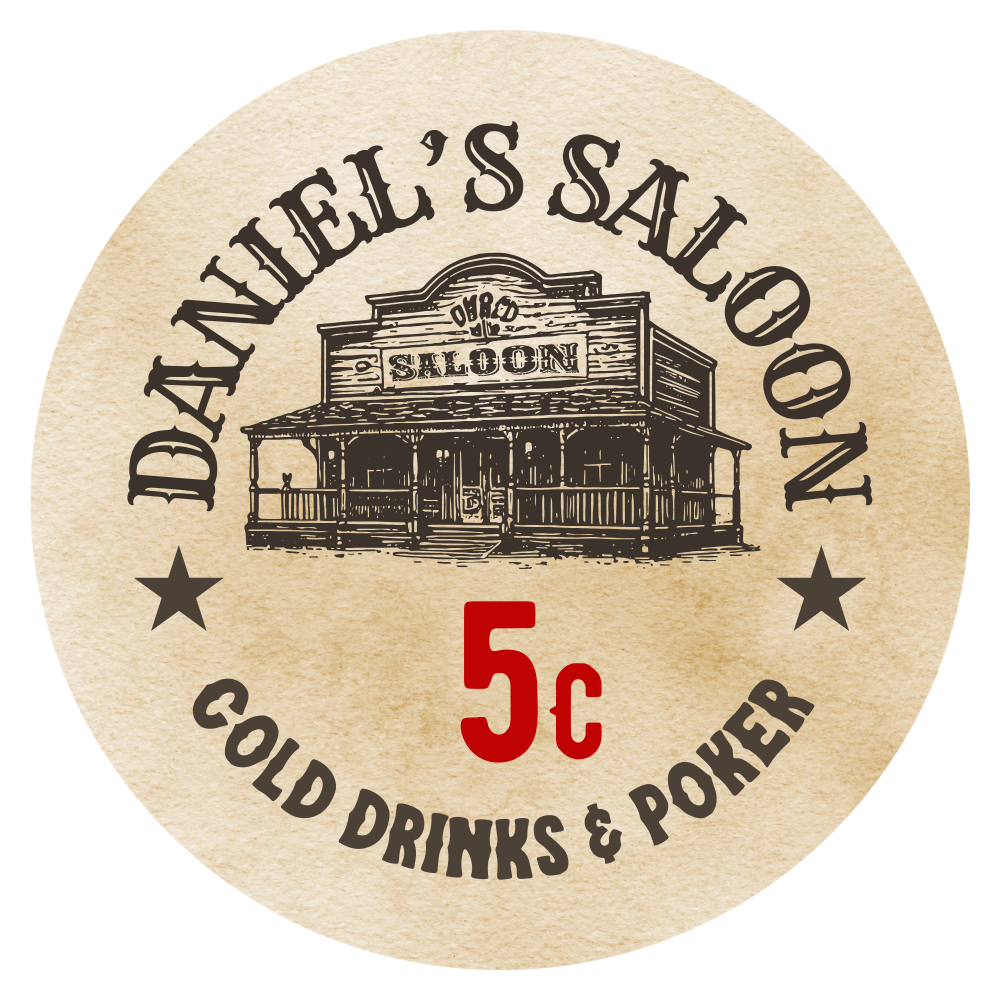
However, gave it a shot, smaller symbol and denom in the center:

1.png
"The Saloon so nice they named it twice."

Seriously though, nice and clean inlay. I prefer this iteration of the denominations by quite a lot.
 
Great Design as I already told you several times. Just one thing that bugs me - the letters in "DRINKS" look kind of squeezed compared to "COLD" and "POKER" ..

Als wäre der Zeichenabstand kleiner, wenn du verstehst, was ich meine.
 
Great Design as I already told you several times. Just one thing that bugs me - the letters in "DRINKS" look kind of squeezed compared to "COLD" and "POKER" ..

Als wäre der Zeichenabstand kleiner, wenn du verstehst, was ich meine.

I had to double check it because you're right, it looks like it. But - same spacing for all the letters. It just looks that way because of the letters in each word. the L and O in cold are causing a lot of empty space if you know what I mean.
 
I took your input to heart and kept working on the inlay. Made the graphic smaller and made it sit higher in the inlay so the lower border makes a line with the D and N from the upper text, basically splitting the inlay in the upper half with top text and graphic and lower half with bottom text and denom.

Also, I switched the currency symbols to sit on the top half relatively to the denom.

daniel’s saloon (16).png
daniel’s saloon (15).png
daniel’s saloon (14).png
daniel’s saloon (13).png
daniel’s saloon (12).png


Great feedback from you guys, thank you very much.
 
Also a nice way to do it. I tried it, but I prefer the uniform look of the symbol on the same side, plus with the font I used, I feel that it's easy enough to tell c and € apart.
Put the cent symbol to the bottom and the euro symbol to the top. Your players will catch on to which is which very quickly.
 
IMO the chip colours and symbols are enough to differentiate between a 5c and 5e chip, so no need to have c symbols lower...unless you want them less uniform (#teamocd here ;) ).

Now to contradict my OCD, I understand what you're trying to do by splitting it into a top and bottom half by lining up the bottom of the saloon image with the writing, but you're leaving a lot of unused space on an already small inlay. I'm not sure if this is a good thing or not. The saloon is already very detailed and would be more legible if it's larger, but the alignment is kinda nice?
 
I also like the sign higher up, or more centered vertically. I don't recall many chip sets with it lower, but check the chip db/HOF to get an idea...
I misunderstood this post from you.

I thought you were referring to the saloon.

I‘m currently in the gym but later I will try to revert the size of the graphic and compare it with all currency symbols at the top vs cents bottom.
Cents on the top as well would give some more space to slide the denom down a bit so make space for the larger saloon.
 
Somehow I can't upload images into the tool anymore, it just keeps loading without anything happening. So can't post full mock-ups at the moment but I am currently playing around with different color options.

Few thoughts:

I didn't notice it at first, but I used only weighted colors, which I like when I think about it. Love the look of the flakes when inspecting a chip close-up. Also, for the retro look, I think the flashy vibrant DG stuff doesn't really work anyways.

I like the idea of having the edge spot in a darke color of the same "Family" than the base color. Keeps it simple and fits the theme imo. However, I also find it to be a bit boring (?), not sure about this. I haven't found any combination that doesn't follow this rule that I like.
I am a huge fan of the Suicide Queen set, and I could copy all of those color combinations and would love the set. But I don't know if that's the ultimate goal. I want something that I came up with myself, so I'd prefer to avoid that...

Even though I think a butterscotch base looks lovely, I tried to have the yellow as a base instead of spot, and switched the 1€ to white/gray.

Alt.png


I like this as well. Another thing I thought about is changing the order of the colors. My current players are familiar with 5ct being red, 20ct being green.

Alt2.png


I find this maybe a bit boring, having mostly red, gree and white chips in play. Yellow and Lavender fracs with a more traditional white 1, red 5 and green 20 is higher on my list atm.
 
Somehow I can't upload images into the tool anymore, it just keeps loading without anything happening. So can't post full mock-ups at the moment but I am currently playing around with different color options.

Few thoughts:

I didn't notice it at first, but I used only weighted colors, which I like when I think about it. Love the look of the flakes when inspecting a chip close-up. Also, for the retro look, I think the flashy vibrant DG stuff doesn't really work anyways.

I like the idea of having the edge spot in a darke color of the same "Family" than the base color. Keeps it simple and fits the theme imo. However, I also find it to be a bit boring (?), not sure about this. I haven't found any combination that doesn't follow this rule that I like.
I am a huge fan of the Suicide Queen set, and I could copy all of those color combinations and would love the set. But I don't know if that's the ultimate goal. I want something that I came up with myself, so I'd prefer to avoid that...

Even though I think a butterscotch base looks lovely, I tried to have the yellow as a base instead of spot, and switched the 1€ to white/gray.

View attachment 1295927

I like this as well. Another thing I thought about is changing the order of the colors. My current players are familiar with 5ct being red, 20ct being green.

View attachment 1295928

I find this maybe a bit boring, having mostly red, gree and white chips in play. Yellow and Lavender fracs with a more traditional white 1, red 5 and green 20 is higher on my list atm.
I have exactly the same idea for a tournament set project my choice is also for a combo yellow/light chocolate :tup:
 
I'm a big fan of the suicide queens too, especially the yellow base with green spots.

Choosing weighted colors because you prefer the brass flakes is fair, but choosing them because they're weighted (like I did with my first set that's been sold and relabeled) is a mistake IMO. I wouldn't rule out the retro colours.

Most veteran chippers will say your workhorse(s) should be a colour (and spot pattern) you want to see most of the time, and build the rest of the set around that.

Theme is super important too me. Obviously the mold works perfectly, but what about colours? If you want to keep the base colors on theme with western movies I can only remember poker scenes will use red, blue, white, and more rarely yellow (maybe brown/black?). I don't remember seeing a green chip. Of course I could be completely wrong but you can do your own research if you're interested. These would have been solid chips, but keeping the spots simple and in the same colour group as the base doesn't stray too far from this.

Regardless of the colours you choose, your friends will adjust. You can even help them adjust by communicating the theme to them and why you chose those colours. Take the theme a step further and use $ signs instead of Euros and tell them it's a 1:1 exchange rate too.

Finally, I will challenge your entire theme because you said you came up with it a couple months ago. I like westerns too, but not enough to spend 1000s of dollars on a set of poker chips that will survive longer than I will. I would want something very meaningful vs something I like as I'm a bit of a minimalist. I hope you like westerns a LOT more than I do, or you're like other chippers that just want a variety of cool sets :)
 
Last edited:
I'm a big fan of the suicide queens too, especially the yellow base with green spots.
Couldn’t agree more. The white/grey 5c, blue/mandarin 20c and yellow/green 1e would be such a lovely combination. Also in regards of what you said below, these three denoms are the main chips we use in our games, 20c and 1e mostly. Just gorgeous chips and the set was certainly an inspiration for the general 3916/312 spot use.

Choosing weighted colors because you prefer the brass flakes is fair, but choosing them because they're weighted (like I did with my first set that's been sold and relabeled) is a mistake IMO. I wouldn't rule out the retro colours.
Only some retro colors that I liked for this set: retro red, retro green, retro lavender, dg orange. But as I said I do like the brass.

Most veteran chippers will say your workhorse(s) should be a colour (and spot pattern) you want to see most of the time, and build the rest of the set around that.
And imo they would be right. That’s why I am playing around for the 5c/20c/1e.

Finally, I will challenge your entire theme because you said you came up with it a couple months ago. I like westerns too, but not enough to spend 1000s of dollars on a set of poker chips that will survive longer than I will. I hope you like westerns a LOT more than I do :)
I like the way you think and I can‘t agree more that the theme should be well thought through in regards of the money spent.
I can reassure you (and me, lol) that I‘m certain that this is the right theme.
I‘ve had plenty of other great ideas, all with personal meaning. This was the only one that I am willing to spend that amount of money on.
 
Splitting hairs imo, both look great. I’m personally a fan of the 3916 spot, but 312 is nice too and only L1 (vs L2 for 3916).
Newer to custom chips - can someone explain the difference between L1 & L2, and the 312 v 3916?
 
Newer to custom chips - can someone explain the difference between L1 & L2, and the 312 v 3916?
L1, L2, L3, etc. refers to different pricing levels with CPC. The higher the level, the more expensive the chip.

The difference between 312 and 3916 is slight. 312 is a bit more "squared off" on the corners and follows the curve of the inlay. 3916 is a bit more rounded off. Check out @Sprouty's post above for a good example of the difference between the two edge spots (3916 is the first chip, 312 the second): https://www.pokerchipforum.com/thre...om-cpc-cash-set-hhr-3916.117206/#post-2411525
 
Thinking about it... you should try to print your latest Inlays with your Printer at home. I dont think you can see much details of the Saloonbuilding.
 
L1, L2, L3, etc. refers to different pricing levels with CPC. The higher the level, the more expensive the chip.

The difference between 312 and 3916 is slight. 312 is a bit more "squared off" on the corners and follows the curve of the inlay. 3916 is a bit more rounded off. Check out @Sprouty's post above for a good example of the difference between the two edge spots (3916 is the first chip, 312 the second): https://www.pokerchipforum.com/thre...om-cpc-cash-set-hhr-3916.117206/#post-2411525
Got it, appreciate the explanation!
 
"The Saloon so nice they named it twice."

Seriously though, nice and clean inlay. I prefer this iteration of the denominations by quite a lot.
I'm happy I listened to the advice. Sometimes you just worked on a single piece of design for so long you're getting blind towards it, if you know what I mean.

I really like the look of these! One tiny nit pick: I would bring the ‘S in Daniel’s closer. It probably has to be done manually.

On the building, what does it say above saloon?
I see what you mean. And I love that people have the same ocd-tendencies as me. I tried splitting it into three bricks of text, but that makes it a real pain in the ass to do the circular arrangement. Instead, I added a second space in between which makes it easier to read it as two separate words.
daniel’s saloon (1).png

Thinking about it... you should try to print your latest Inlays with your Printer at home. I dont think you can see much details of the Saloonbuilding.
I've checked with David and he said it should be fine. Plus, even if there are some imperfections due to fine lines etc. I actually don't mind that look. Makes it look like it was stamped maybe.
 
Do CPC HHR chips have a recessed inlay?

I've seen chips that have a recess, others don't. Couldn't figure out the manufacturer though.
 
I’d recommend nudging the € denoms to the left a touch. It’s an eyeball thing, but the weight of the denom with the € is right of center. If you nudge it left a touch the numbers won’t be centered, but it might feel better.
 
I’d recommend nudging the € denoms to the left a touch. It’s an eyeball thing, but the weight of the denom with the € is right of center. If you nudge it left a touch the numbers won’t be centered, but it might feel better.
agree 100%.
 
I’d recommend nudging the € denoms to the left a touch. It’s an eyeball thing, but the weight of the denom with the € is right of center. If you nudge it left a touch the numbers won’t be centered, but it might feel better.
Or decrease the size of the euro symbol? Looking at my Club 72 inlay, the proportion of $ to denomination is smaller than this, and as far as I can tell the denoms are centered?

OP, HHR has a very slight recessed center. Why do you ask? Although it's a no brainer for your theme, you still may want to get samples.

Also if you don't have colour samples, you must understand that the colours on the chip designer vary as monitors/screens are different. For accuracy you should look at samples in your poker room's lighting vs. natural lighting.
 
Somehow I can't upload images into the tool anymore, it just keeps loading without anything happening. So can't post full mock-ups at the moment but I am currently playing around with different color options.

Few thoughts:

I didn't notice it at first, but I used only weighted colors, which I like when I think about it. Love the look of the flakes when inspecting a chip close-up. Also, for the retro look, I think the flashy vibrant DG stuff doesn't really work anyways.

I like the idea of having the edge spot in a darke color of the same "Family" than the base color. Keeps it simple and fits the theme imo. However, I also find it to be a bit boring (?), not sure about this. I haven't found any combination that doesn't follow this rule that I like.
I am a huge fan of the Suicide Queen set, and I could copy all of those color combinations and would love the set. But I don't know if that's the ultimate goal. I want something that I came up with myself, so I'd prefer to avoid that...

Even though I think a butterscotch base looks lovely, I tried to have the yellow as a base instead of spot, and switched the 1€ to white/gray.

View attachment 1295927

I like this as well. Another thing I thought about is changing the order of the colors. My current players are familiar with 5ct being red, 20ct being green.

View attachment 1295928

I find this maybe a bit boring, having mostly red, gree and white chips in play. Yellow and Lavender fracs with a more traditional white 1, red 5 and green 20 is higher on my list atm.
Apparently not being able to load inlays into the tool is a common issue for anyone wondering. It appears that more people share the problem.
 
If I hadn’t accidentally read this on the forum that these are different spots, I would never have understood this. :ROFL: :ROFLMAO:
IMG_20240401_230956_edit_88146746636549.jpg

And I also constantly catch myself thinking that the font for the currency does not fit into the theme. It's like he's from another era.
 

Create an account or login to comment

You must be a member in order to leave a comment

Create account

Create an account and join our community. It's easy!

Log in

Already have an account? Log in here.

Back
Top Bottom