I have all the info and pics here:
https://www.pokerchipforum.com/threads/harrahs-new-orleans-tournament-showcase-and-info.121290/
Great gallery!
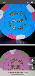
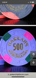
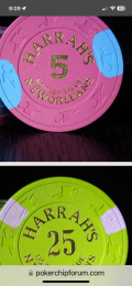
Only just noticed this… I wonder why the typeface for the denoms on the 25 and the 25K is not consistent with the rest.
The rest of the set uses a blocky, sans serif display font for the numerals, whereas the two denoms above use a serif face.
The blocky numerals are themselves slightly inconsistent in their widths and shapes, but that was probably due to space considerations. See for example the 5 on the T5 vs. the 500. But they are all roughly in a similar camp, unlike the serif denoms.
Odd.
(This is why no one will buy these and I will have to scoop them all up in pity for Jim.)
Last edited:


