Help with Cycling Themed CPC Set (1 Viewer)

cpac54

4 of a Kind
Supporter
Joined
Mar 8, 2018
Messages
7,419
Reaction score
23,146
Location
Zurich, Switzerland
So I'm finally taking the plunge and putting together a custom CPC set.

It will be a tournament set with a cycling theme. A while back I posted a first mock up and background for the theme here

Inlay will be done by the one and only J5 Design and will be based on classic cycling posters/advertisements.

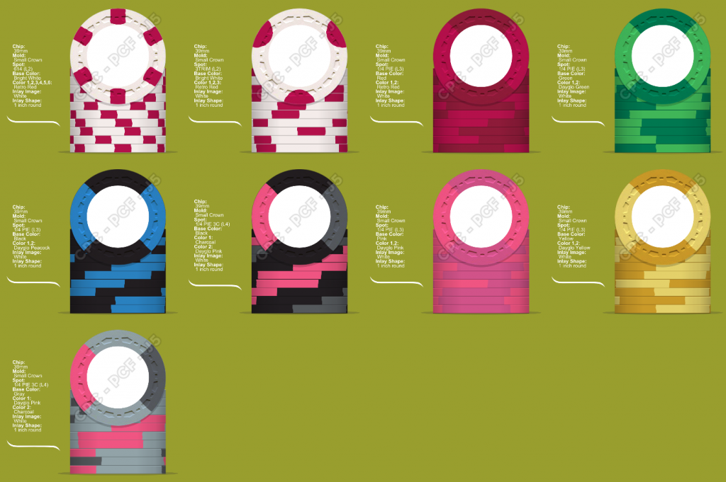
Currently here with the chip design:
1581177684077.png


Each chip mimics a famous jersey from the world of cycling:
Bounty Chip: The Climbers Jersey from the Tour de France (leaning towards version 2 here)
T5: The Leaders Jersey from the Vuelta Espana (Tour of Spain)
T25: The Best Sprinter Jersey from Tour de France
T100: Version 1: Colours of my favourite pro team (Team Sky)
T100: Version 2: Colours of our club jersey (Rapha Cycling Club or RCC)
T500: Leaders Jersey from the Giro d'Italia (tour of Italy)
T1000: Leaders Jersey Tour de France
T5000: Primary Jersey from our Cycling Club (RCC)


Where I could use the expert input of my fellow PCFers is with the following:

1. Which version of the T100 works best, "Black/Blue" or "Black/Grey/Pink"?
- Option 1 represents the colours of my favourite pro cycling team, while option 2 has the colours of my cycling club. My first choice was for option 2, but am worried about dirty stack issues with the T100 and T500 in that case.

2. TITLE!
- in order to move forward with inlay design, I am going to have to settle on a name. Currently I have a few ideas, but would be open and thankful for all input!
- Peloton Poker Club
- Chapeau Cycle & Card Club
- The Bicycle Lounge
- Big Ring Poker

- Pédaleur de Chance (the lucky pedaler)

Thanks for your input! Much appreciated :)
 
Cool Idea!! I just looked at the link you had posted previously in the CPC Mock-Ups idea link. Will be watching to see how it progresses!!
 
I am a huge pro cycling fan and think this has great potential. It is very difficult to design any set without inlays somewhat mocked up. If it were me, I'd use whatever photoshop skills to piece something together before settling on chip colors and spots. I think that you might want to consider not using a team sky jersey as they change...remember that it is your set and you are not married to the standard chip colors, however all the colors are there red, green, blue, yellow. Make it yours in place of trying to match the standard colors to a particular event jersey. Either go with team jerseys or stick with grand tour editions. Mixing dilutes the concept...and I really like the concept. What an opportunity to use dot chips man.

general
vuelta - red
giro - pink
tdf - yellow

points
giro - cyclamen
tdf - green
vuelta - also green

mountains
giro - blue
tdf - polka dot red
vuelta - polka dot blue

edit: - I'd love to see new original art too (in place of copying existing bike art)...Good luck!
 
I've been a cycling fan most of my adult life (former cat 3 racer). Until recently, all the doping has finally cause me to lose interest. Clearly you love the sport. Will be following to see final product.


Viva Sparticus!
 
I've been a cycling fan most of my adult life (former cat 3 racer). Until recently, all the doping has finally cause me to lose interest. Clearly you love the sport. Will be following to see final product.


Viva Sparticus!

I had the chance to meet and chat with Sparticus a few years ago at one of his inaugural "Chasing Cancellara" events here in Switzerland. Despite having been retired for almost a year and gaining 10kg, he beat almost everyone up the Oberalp Pass. What surprised me was how much he seemed to enjoy engaging with the participants that day - talking about their cycling stories, getting their feedback on the event, etc. He came across as a genuinely great guy.
 
Wow, I bet that was cool. In his interviews with English television, he seemed like a very likeable guy, and great teammate. I loved watching him in the Classics.
 
So with the help of J5, I've made some progress on the design of the set. I've settled on the name "Pédaleur de Chance" (Lucky Pedaler).

I've received the first rough draft of a few ideas for the inlays. Here are my initial thoughts:

1) My initial thought was to have a different inlay design for each denomination, but now I wonder if it would just pull the set together better to stick with one inlay and just colour match somehow to each denom?

2) I wonder if colour-matching the landscape doesn't lead a bit towards overkill with one single colour - would it be perhaps better to keep a more "natural" landscape or even a greyscale one and only colour match the denomination or something smaller?


Here are the initial design ideas from J5 (just colour matched to one denom atm) and the edge spots for each denom that I had in mind (white bounty + T5 through T5000, incl two versions of a potential T100):

Being my first custom set, I'd be very grateful for any and all feedback with regards to the design (inlay or edgespots, which ones you all like best, what you like, what could be improved, etc.)

cycling mock up 1.png


mockup without inlays.png


Thanks everyone!
 
Last edited:
Dirty stack issue with all of the pink?

Yeah, that was the reason I mocked up the blue/black T100. Not sure what I could do with the T500 and T5000 though as the jerseys I want to tribute both have pink as a major colour in them.
 
This is a great start. And John does excellent work, as many around here know.

I like either of the top two inlays...but having the denom off center would drive me nuts. I prefer the yellow throughout all chips and color match the mountains as done on the top right inlay.

As @RocAFella1 said, too much pink. And you are missing two of the best colors from CPC: arc yellow and tiger. Is it possible to find jerseys that you like with any bright orange? :)
 
Love the artwork. Top left is my favourite.

You could still to a single colour for most of the inlay and maybe colour match the sky, if you don't want to go overboard with colour matching. I did that with my custom set.

In terms of the colours, there is too much red and pink for my liking also.
 
I think some good points were brought up re: the colour mix of the set. Indeed, after not having looked at them for a while, I too had the feeling the edge spots were a bit too "blah" and had too much colour repetition.

Here's a re-working of the denominations (I've dropped the T5, re-worked the T100 completely to include Red (Tour of Spain) and have a couple new versions of the T500):

TdF V3 new colours.png
 
This is a great start. And John does excellent work, as many around here know.

I like either of the top two inlays...but having the denom off center would drive me nuts. I prefer the yellow throughout all chips and color match the mountains as done on the top right inlay.

As @RocAFella1 said, too much pink. And you are missing two of the best colors from CPC: arc yellow and tiger. Is it possible to find jerseys that you like with any bright orange? :)

After looking at my samples today, I think I can safely integrate arc yellow into the T1000 and still have a good tribute to the Tour de France Yellow Jersey. :tup:
 
I think some good points were brought up re: the colour mix of the set. Indeed, after not having looked at them for a while, I too had the feeling the edge spots were a bit too "blah" and had too much colour repetition.

Here's a re-working of the denominations (I've dropped the T5, re-worked the T100 completely to include Red (Tour of Spain) and have a couple new versions of the T500):

View attachment 443687
I prefer the retro lavender version of the T500. That is a great color, but there is not as much contrast. Tough call.
 
Not sure I'd go for blood doping as the t100 :ROFL: :ROFLMAO:

Plus it's probably still a bit too close to the pink chip
 

Create an account or login to comment

You must be a member in order to leave a comment

Create account

Create an account and join our community. It's easy!

Log in

Already have an account? Log in here.

Back
Top Bottom