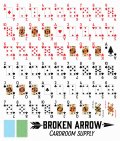
The clubs/spades are still hard to distinguish at long range but the changes Justin made with the new slimmer spade index pip (on the newer versions) makes it somewhat easier, not great, but easier. As well the squared off font makes the middle cards (some changes on the 5 were done as well) look similar but it doesn't take a lot to count pips on the board cards, however when spreading cards in your hand they can be tricky.
As far as the feel and handling I think Justin knocked it out of the park, these cards feel & handle great.
Hopefully newer versions can address some of the issues some are having such as a more standard style font for the index.
Personally I think he should use the arrowhead (as on the AOS) for the spade pip, I think that would make these decks unique and easier to distinguish from the club pip. Also need more bridge/jumbo color backs.


