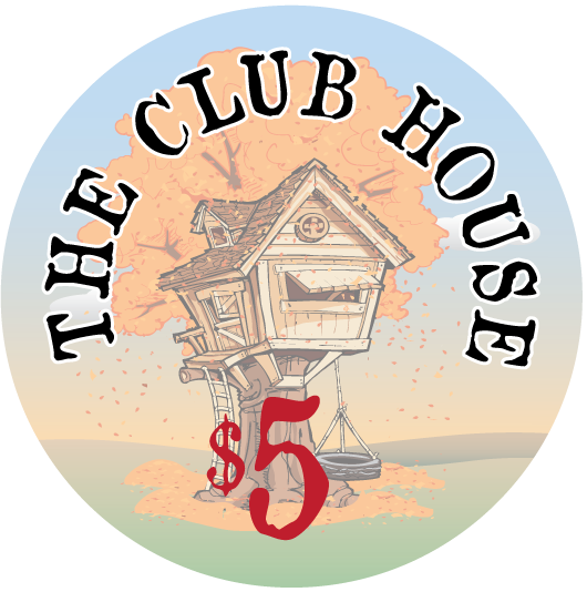
My custom chip mock up, (now with dealer button)-- feedback please (1 Viewer)

Rhodeman77

Straight Flush
Supporter
Joined
Nov 11, 2014
Messages
8,813
Reaction score
25,241
Location
Cleveland
Here is the mock up of the chips for my custom set.

It will be Cali colors, after reading the other thread about $5 chips I have come up with a couple of $5 chips. As of right now I am leaning towards the Canary, but the Butterscotch is growing on me.

The denoms will be $1 $5 $20 & $100

I have my ideas for the inlay and will be contacting designers this week. The basic idea though is 4 seasons of an apple tree. So each chips will have the same tree in different seasons. I.E. Covered in snow (blue winter chip), in bloom (lavender/green chip), full of apples (white/red chip), and fall (canary or butterscotch chip).

So let me know what you think of base and spot color combinations with the inlay idea in mind.

Second edit to show FINAL inlays:
IMG_2563.PNG
IMG_2564.PNG
IMG_2565.PNG
IMG_2566.PNG
IMG_2567.PNG
IMG_2568.PNG
IMG_2569.PNG
IMG_2570.PNG
 
Last edited:
I like the spot progression (and the theme).
The canary and butterscotch are both great for fall colors. I'm leaning toward canary but can't say why. It just seems to fit
 
Love the theme, can't wait to see beginnings of the artwork. Love that both of your $5s contain maroon which is one of my favorites and seems be be somewhat underused IMO. Alternate options on the $5 (just because I'm not personally a huge fan of CPC yellows :) )... first one fits your theme better, second one just hurts my eyes in such a good way :D

IMG_1846.jpg

IMG_1847.jpg
 
@Ronoh I will have to order another sample set dayglow Saturn isn't in the sample set I have. But it seems to have a slight greenish tint on my screens when I mocked it up. Can anyone confirm that?
 
@Ronoh I will have to order another sample set dayglow Saturn isn't in the sample set I have. But it seems to have a slight greenish tint on my screens when I mocked it up. Can anyone confirm that?

Dayglo Saturn is definitely on the green side.

Edit: pm me your address and I'll drop one in the mail for you
 
I really like where you're going with the set man...

As Fink wrote, CPC yellows are not super great, although two of my customs are Cali with yellow $5s (DG and Canary), LOL!!! Both your options (and Fink's suggestions) would work great for that chip.

Now, when it comes to CPC, one of the main things I always pay attention to is contrast... No matter how awesome the chips are, if they present a problem while playing, no bueno...

So on that regard, although the $20 has the green spots, the Blurple spots on the $1 makes those singles "purplish" to me... Both chips are great but I'd personally look for a little more contrast between the $1 and $20...
 
The dayglo yellow looks bright but I prefer to stay with the weighted colors for the base colors, well except for the bright white. It's so much better than the regular white that it is worth an extra $63 per rack for it.
 
I like the canary $5 over the butterscotch. And "true" Cali colors usually have a black $20 and purple $25, no?
IMG_7171.PNG
 
I really like where you're going with the set man...

As Fink wrote, CPC yellows are not super great, although two of my customs are Cali with yellow $5s (DG and Canary), LOL!!! Both your options (and Fink's suggestions) would work great for that chip.

Now, when it comes to CPC, one of the main things I always pay attention to is contrast... No matter how awesome the chips are, if they present a problem while playing, no bueno...

So on that regard, although the $20 has the green spots, the Blurple spots on the $1 makes those singles "purplish" to me... Both chips are great but I'd personally look for a little more contrast between the $1 and $20...
Yeah I agree with Paulo FWIW.

Maybe make blurple the base color for the $20 and make lavender the spot color on the dollar? I think you can use a nice dark color for the $20 seeing as all your other base colors are light. Oh and I love canary so that is the clear winner for me.

Rhodeman.png
 
I like the canary $5 over the butterscotch. And "true" Cali colors usually have a black $20 and purple $25, no?
View attachment 90103

I was trying to do a black $20, but wasn't finding a way to have it fit the theme of the set. The $20 chip is to be the Spring chip so I want it to be bright/colorful.

I like the first mock up a lot, but I don't want to repeat the exact spot pattern as the $5.
 
Yeah I agree with Paulo FWIW.

Maybe make blurple the base color for the $20 and make lavender the spot color on the dollar? I think you can use a nice dark color for the $20 seeing as all your other base colors are light. Oh and I love canary so that is the clear winner for me.

View attachment 90105

I like the Blurble as a base color a lot! But does it cause issues with the $1 chip?
 
I like the concept, and the theme. A few pieces of advice from my point of view...

1) I would change the background color in the mockup tool to gray or light gray - that olive green color is really throwing off the contrast for me. It might help you to see things in a new light.

2) I would try to focus on earthy tones throughout the set, as your theme is rather earth friendly (I would probably avoid DG Peacock as an edge spot option for this reason).

3) I'd swap out the bright white for white on the $100. I think it goes better with the set if you're going with a butterscotch $5 and earthy tones

4) I would change up either the edge spots on the $20 or the $100 as they are too similar for my tastes
 
Last edited:
A little more background on the inlay design.

So it isn't just a tree, but a treehouse. When I was about 10 my dad and uncle built a tree house for my brothers and sister and I. We practically lived in it for the next few years.

Before I got hooked on poker I was an avid (understatement) Magic the Gathering player. One of my favorite Magic cards was Mishra's factory. There are 4 versions of the cards, one for each season.

Here are some google images that are along the lines of what I am thinking for the inlay and the MtG card.

IMG_2481.PNG
IMG_2482.PNG
IMG_2483.PNG
IMG_2484.PNG
IMG_2485.PNG
IMG_2486.PNG
IMG_2487.PNG
IMG_2488.PNG
 
Here is the mock up of the chips for my custom set.

It will be Cali colors, after reading the other thread about $5 chips I have come up with a couple of $5 chips. As of right now I am leaning towards the Canary, but the Butterscotch is growing on me.

The denoms will be $1 $5 $20 & $100

I have my ideas for the inlay and will be contacting designers this week. The basic idea though is 4 seasons of an apple tree. So each chips will have the same tree in different seasons. I.E. Covered in snow (blue winter chip), in bloom (lavender/green chip), full of apples (white/red chip), and fall (canary or butterscotch chip).

So let me know what you think of base and spot color combinations with the inlay idea in mind.

View attachment 90083
I love the 1 and butterscotch 5 in the op. The purple chip needs different spots with more green. For some reason, the blue spot in the white chip doesn't seem to fit.
 
I like the last line up but what about adding a little more color to the spring chip. When you think of spring most often associated with flowers, pastels so maybe a dayglo pink or something with a little more pop of color instead of the chocolate.

Edit: much like 72o did but I like the dayglo green over light green.
 
I love the 1 and butterscotch 5 in the op. The purple chip needs different spots with more green. For some reason, the blue spot in the white chip doesn't seem to fit.

I was trying to avoid green in that chip altogether because it is a $20 chip and wanted to avoid the confusion of people thinking it is a $25 chip but ran out of options so using it as spot color is the compromise.

Any recommendations to of what to change on the blue spot on the $100 chip?

I love the "flag" chips in many sets and this is my version. I am open to a different spot if it looks good.
 
I like the last line up but what about adding a little more color to the spring chip. When you think of spring most often associated with flowers, pastels so maybe a dayglo pink or something with a little more pop of color instead of the chocolate.

Edit: much like 72o did but I like the dayglo green over light green.

Better?

IMG_2489.jpg


I agree the dayglo pink looks more like a flower.

The one reason I like the chocolate spot is that combined with the green spot around it it gives the idea of a tree trunk and the canopy of leaves.
 
Which spot looks better on the $100 chip, the blue or butterscotch?

This is going to be for the SUMMER season chip.

Edit for clarification
IMG_2490.jpg
 
Last edited:
The one reason I like the chocolate spot is that combined with the green spot around it it gives the idea of a tree trunk and the canopy of leaves.

I get that and thought you might be going for that, but think it stands out more especially being next to the maroon and orange on the 5. Going off the monitor don't have my CPC sample sets in front of me to compare.

I like the peacock more on the 100 but butterscotch isn't bad either. Think I just like bright spots that stand out, the butterscotch is more subtle, guess it's how much flash/pop you want. Although now thinking about it being a winter chip maybe a subtle is the way to go. Maybe a grey? Although maybe it's suppose to be a fire to keep you warm in the winter in which case red/butterscotch (tiger?) is appropriate.
 
A little more background on the inlay design.

So it isn't just a tree, but a treehouse. When I was about 10 my dad and uncle built a tree house for my brothers and sister and I. We practically lived in it for the next few years.

Before I got hooked on poker I was an avid (understatement) Magic the Gathering player. One of my favorite Magic cards was Mishra's factory. There are 4 versions of the cards, one for each season.

Here are some google images that are along the lines of what I am thinking for the inlay and the MtG card..... View attachment 90266

I really like #5. Simple enough to look good when scaled down, and leave room to incorporate chip colors
 

Create an account or login to comment

You must be a member in order to leave a comment

Create account

Create an account and join our community. It's easy!

Log in

Already have an account? Log in here.

Back
Top Bottom